
포스팅 목적
📖React App에 TailwindCSS를 Styled Components와 사용하는 방법을 알아보자.
사용 이유
- TailwindCSS를 단독으로 사용 할 경우 태그 내에 작성되는 className이 많아져 가독성 저해
- 유지보수 시 해당 태그를 코드 내에서 식별하여 className을 수정해주어야하는 번거로움 발생
- 동일 컴포넌트를 중복하여 사용 할 경우에 대한 편의성 도모
- Styled Components의 in-JS 문법을 활용하여 동적인 스타일 적용 가능
- 코드의 가독성 및 유지보수성 향상
위와 같은 이유로 React App에서 TailwindCSS를 단독으로 사용하는 것이 아니라 Styled Components와 사용하기로 결정했다.
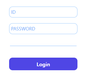
아래의 사진을 구현하기 위해 Tailwind를 단독으로 사용했을 때와 그렇지 않았을 때를 비교해보자.
(🫡테스트용으로 구현한 코드이니 개선할 부분은 댓글 부탁드립니다.)
⚡️ 사용 전
<div className='w-full flex flex-col items-center gap-5'>
    <input
        type='text'
        className='w-60 border-blue-300 border focus:outline-none focus:border-blue-500 focus:border focus:shadow-md rounded-xl p-1.5 placeholder-blue-400 focus:placeholder:opacity-0 text-md'
        placeholder='ID'
    />
    <input
        type='password'
        className='w-60 border-blue-300 border focus:outline-none focus:border-blue-500 focus:border focus:shadow-md rounded-xl p-1.5 placeholder-blue-400 focus:placeholder:opacity-0 text-md'
        placeholder='PASSWORD'
    />
</div>
<hr className='w-2/3 border m-0 p-0 border-blue-200'/>
<div className='w-full flex justify-center items-center'>
    <button
        className='w-60 p-2 bg-indigo-600 rounded-xl text-white font-bold text-lg hover:bg-indigo-800 hover:scale-105 hover:transition'
    >
        Login
    </button>
</div>
⚡️ 사용 후
import tw from "tailwind-styled-components";

const Input = tw.input`
    w-60
    border-blue-300
    border
    rounded-xl
    p-1.5
    placeholder-blue-400
    text-md

    focus:outline-none
    focus:border-blue-500
    focus:shadow-md
    focus:placeholder:opacity-0
`;

const Button = tw.button`
    w-60
    p-2
    bg-indigo-600
    rounded-xl
    text-white
    font-bold
    text-lg

    hover:bg-indigo-800
    hover:scale-105
    hover:transition
`;

... 생략
<div className='w-full flex flex-col items-center gap-5'>
  <Input type='text' placeholder='ID'/>
  <Input type='password' plcaeholder='PASSWORD'/>
</div>
<div className='w-full flex justify-center items-center'>
  <Button>Login</Button>
</div>
전체적인 코드의 라인 수는 많아졌을지는 몰라도 코드의 가독성 자체는 Tailwind + Styled Components를 사용하는게 훨씬 좋다고 생각된다.
기능소개
⚡️ Transient Props
interface ButtonProps {
  	// DOM으로 인식하지 않도록 '$'표시
	$flag: boolean
}

const Button = tw.button<ButtonProps>`
	flex
	${(p) => (p.$flag ? 'bg-blue-300' : 'bg-blue-400')}
`
위와 같이 Props를 선언해주고 상태를 판단하여 동적으로 스타일을 적용하고 싶은 경우 Props로 전달된 변수를 이용 할 수 있다. 사용은 아래와 같다.
<Button $flag={true} />
<Button $flag={false} />

// 해석
<button class='flex bg-indigo-300'>
  ...
</button>
<button class='flex bg-indigo-400'>
  ...
</button>
한가지 주의해야하는 사실은 다음과 같이 tailwind의 코드를 분리해서 조건을 부여하면 안된다는 것이다.
// X
bg-indigo-${p => p.$flag ? '300' : '400'}

// O
${p => p.$flag ? : 'bg-indigo-300' : 'bg-indigo-400'}
한번 정확하게 작성하고 오래도록 오류없이 사용하자.
⚡️ Extends
하나의 컴포넌트를 상속의 개념처럼 사용 할 수 있다.
const DefaultContainer = tw.div`
	flex
	items-center
`

const RedContainer = tw(DefaultContainer)`
	bg-red-300
`
위와 같이 작성하면 DefaultContainer의 스타일을 그대로 적용받고 배경 색상만 추가된 RedContainer가 선언되는 것이다.
⚡️ Styled Components 확장
filter: blur(1px);위와 같은 css는 tailwind에서는 적용되지 않는다 따라서 커스텀해서 사용해야하는 스타일이 있다면 다음과 같이 수행하면 된다.
const StyledComponentWithCustomCss = styled.div`
    filter: blur(1px);
`

const  = tw(StyledComponentWithCustomCss)`
   flex
`
위 코드를 설명하면 다음과 같다. filter:blur(1px);은 css이기 때문에 Styled Components로 선언해준다. 이후 tailwind 컴포넌트에 extends해주면 적용이 가능하다. 해석하면 아래와 같은 코드가 나온다.
<div class="flex" style="filter: blur(1px);">
    ...
</div>
마무리
이렇게해서 Tailwind와 Styled Components를 사용하여 React App의 스타일을 적용하는 방법에 대해 알아보았다. 코드의 가독성과 유지보수성을 향상시킬 수 있다는 측면에서 만족스러운 결과를 얻었고, 커스텀이 가능하다는 측면 또한 크게 다가왔던 것 같다.
이제 위에서 알아본 기능들을 토대로 새로운 프로젝트를 시작하려한다.
그럼 이만.👊🏽