ConstraintLayout은 기존의 여러 가지 ViewGroup들보다 좀 더 유연하게 화면을 만들 수 있게 해줍니다.
이번 글에서는 ConstraintLayout의 사용 방법과 동작 원리를 빠르게 훑어보겠습니다.
사용법
Adding Depdencies
2019년 5월 9일 기준으로 2.0.0의 베타 채널이 배포되었습니다.
dependencies {
    implementation "androidx.constraintlayout:constraintlayout:2.0.0-beta1"
}
AndroidX를 사용하지 않는 분들은 아래 링크에서 Dependency를 추가해주세요.
https://androidstudio.googleblog.com/2019/05/constraintlayout-200-beta-1.html
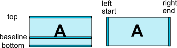
Relative Positioning
이름에서도 알 수 있듯이 ConstraintLayout는 기본적으로 여러 가지 Constraint의 조합으로 구성됩니다.
이에 따라 기본적으로 뷰의 위치를 다른 뷰에 상대적으로 지정하게 됩니다. 아래 그림에서 가능한 몇 가지 Constraint를 확인할 수 있습니다.
다음과 같은 방법으로 Relative Positioning을 적용할 수 있습니다.
app:layout_constraint[Base]_to[Target]Of

ex)
app:layout_constraintLeft_toRightOf="@+id/top_view"
app:layout_constraintTop_toTopOf="parent"
Centering & Bias
좌우, 혹은 상하로 Constraint를 정의하면 가운데로 정렬됩니다.
android:layout_width="wrap_content"
android:layout_height="wrap_content"
app:layout_constraintLeft_toLeftOf="parent"
app:layout_constraintRight_toRightOf="parent"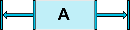
이 때 정렬되는 위치를 bias를 통해서 결정할 수 있습니다.
app:layout_constraintHorizontal_bias="0.3"
app:layout_constraintVertical_bias="0.6"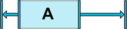
Circular Constraints
뷰를 원형으로 배치할 수도 있습니다. 개인적인 경험에 의하면 자주 사용되지는 않는 것 같습니다.
app:layout_constraintCircle="@+id/target_view"
app:layout_constraintCircleRadius="48dp"
app:layout_constraintCircleAngle="45"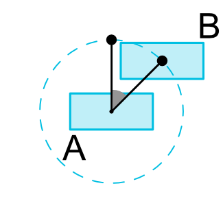
Demension Constraints
ConstraintLayout에서는 뷰의 크기를 결정하는 여러 가지 방법을 제공합니다.
- 특정한 크기를 명시
WRAP_CONTENTMATCH_CONSTRAINT(0dp)
WRAP_CONTENT + Constraint
ConstraintLayout 내에서 WRAP_CONTENT를 사용하면 기본적으로 크기에 대한 제한이 적용되지 않습니다.
WRAP_CONTENT를 사용함과 동시에 크기에 대한 제한을 걸고 싶다면 아래 속성을 사용하세요.
app:layout_constrainedWidth=”true|false”
app:layout_constrainedHeight=”true|false”
크기 제한이 적용되지 않은 경우

크기 제한이 적용된 경우

MATCH_CONSTRAINT
ConstraintLayout에서는 뷰의 너비와 높이를 지정하는 특별한 방법이 하나 있는데, 바로 MATCH_CONSTRAINT입니다.
android:layout_width="0dp"
android:layout_height="0dp"
app:layout_constraintTop_toTopOf="parent"
app:layout_constraintBottom_toBottomOf="parent"
app:layout_constraintLeft_toLeftOf="parent"
app:layout_constraintRight_toRightOf="parent"
값을 0dp로 지정하면, "Constraint에 따라서 뷰의 크기를 결정하겠다"라는 뜻이 됩니다.
ConstraintLayout에서는 MATCH_PARENT를 권장하지 않습니다. 대신, 위와 같이 MATCH_CONSTRAINT를 설정하고 Centering을 하면 MATCH_PARENT와 동일한 효과를 얻을 수 있습니다.
MATCH_CONSTRAINT Modifier
크기를 MATCH_CONSTRAINT로 지정했을 때의 기본적인 동작은 "남은 공간을 모두 채우는 것"입니다. 이 동작을 바꾸기 위한 몇 가지 속성이 있습니다.
크기의 하한 / 상한 설정
다음 속성들은 크기의 하한과 상한을 정하는데 사용됩니다.
app:layout_constraintWidth_min="100dp"
app:layout_constraintWidth_max="240dp"
app:layout_constraintHeight_min="50dp"
app:layout_constraintHeight_max="300dp"
퍼센트로 크기 설정
부모 뷰의 크기에 따라 크기를 결정하는 퍼센트 관련 속성도 있습니다.
app:layout_constraintHeight_percent="0.5"
app:layout_constraintHeight_percent="0.3"
비율로 크기 설정
가로 세로의 비율을 지정하는 속성입니다. 가로 세로 순서를 명시적으로 선언할 수도 있습니다.
app:layout_constraintDimensionRatio="(W|H,)[width]:[height]"

ex)
app:layout_constraintDimensionRatio="2:1"
app:layout_constraintDimensionRatio="H,16:9" <!-- height:width -->
이런 속성들을 조합하면 복잡한 UI를 비교적 쉽게 구성할 수 있습니다.
<!-- 높이의 20%만큼 크기를 가지는 정사각형을 그림  -->
android:layout_height="0dp"
app:layout_constraintHeight_percent="0.2"
app:layout_constraintDimensionRatio="1:1"
Chains
두 뷰가 서로 연결되어 있을 경우 Chain이 생성됩니다. 생성된 Chain은 여러 뷰끼리 묶어서 처리하고 싶을 때 유용합니다.
<Button
  android:id="@+id/button1"
  app:layout_constraintLeft_toRightOf="@+id/button2"
  app:layout_constraintRight_toRightOf="parent"/>

<Button
  android:id="@+id/button2"
  app:layout_constraintRight_toLeftOf="@+id/button1"
  app:layout_constraintLeft_toLeftOf="parent"/>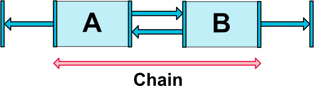
Chain Types
Chain의 기본 동작은 서로의 간격이 일정하도록 유지되는 CHAIN_SPREAD입니다. Chain의 동작을 변경하고 싶다면, 다음과 같이 Chain Style을 설정하면 됩니다. weight, bias 등 다른 속성도 함께 사용 가능합니다.
app:layout_constraintHorizontal_chainStyle="packed|spread|spread_inside"
app:layout_constraintVertical_chainStyle="packed|spread|spread_inside"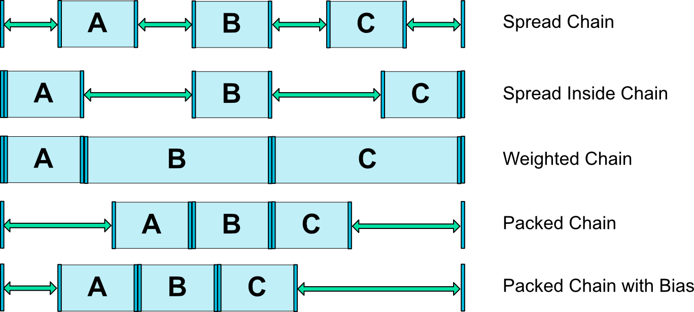
Optimization
ConstraintLayout 내부에서 여러 Constraint를 처리할 때 다양한 최적화가 들어가는데, 이러한 최적화에 대한 수준을 설정할 수 있습니다. 근데.. 이건 저도 언제 어떻게 써야할지 모르겠네요.
app:layout_optimizationLevel="none|standard|direct|barrier|chain|dimensions"Helper Objects
ConstraintLayout으로 화면을 설계할 때 도움을 주는 특별한 오브젝트도 몇 가지 있습니다. 이 뷰들은 기본적인 Visibility가 GONE으로 처리되어 있어 유저에게는 보이지 않고, 레이아웃을 설계할 때만 보입니다.
ConstraintLayout 1.1에서 제공되는 Helper Object는 다음과 같습니다. 이것들을 어떻게 쓸 수 있을지 하나씩 알아보도록 할게요.
- Barrier
- Guideline
- Group
Barrier
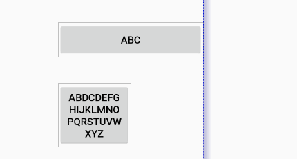
가령 아래와 같이 두 개의 뷰의 내용이 달라질 경우, 한 뷰에만 Constraint를 적용하면 서로 중첩되는 경우가 생길 수 있습니다.

Barrier는 이렇게 여러 뷰에 대한 Constraint를 묶어서 정의하고 싶을 때 사용합니다. 다른 뷰에서 Barrier를 Constraint의 대상으로 지정할 수 있기 때문에, Barrier 안쪽에서 변화가 생겨도 유연한 대처가 가능합니다.
일반적인 뷰와 같은 방법으로 선언합니다. 너비와 높이는 MATCH_PARENT로만 하지 않으면 딱히 상관 없는 것 같아요.
<androidx.constraintlayout.widget.Barrier
  android:layout_width="wrap_content"
  android:layout_height="wrap_content"
  app:barrierDirection="end"
  app:barrierMargin="16dp"
  app:constraint_referenced_ids="button1,button2"/>
방향 설정
Barrier가 적용되는 방향은 다음과 같이 설정할 수 있습니다. 위의 사례에서는 end 방향으로 Barrier를 적용했습니다.
app:barrierDirection="top|bottom|left|right|start|end"ID 지정
어떤 뷰를 포함시킬지는 constraint_referenced_ids 속성을 통해서 지정할 수 있는데, 일반적으로 id를 지정할 때와는 다르게 @+id/를 생략하고 id만 입력해야 합니다.
<Button
  android:id="@+id/button1"/>
<Button
  android:id="@+id/button2"/>

app:constraint_referenced_ids="button1,button2"
마진 설정
만약 Barrier와 포함된 뷰 사이에 margin을 넣고 싶다면, barrierMargin을 사용하면 됩니다.
app:barrierMargin="12dp"Preview
Barrier를 사용하면, Android Studio의 Preview에서 다음과 같은 모습을 볼 수 있습니다.

Guideline
말 그대로 화면을 그릴 때 좀 더 편하게 가이드라인을 만들 수 있습니다. Sketch, Photoshop같은 디자인 툴을 사용해봤다면 익숙하게 느껴질 수 있을 것 같아요.
다음은 Android Studio의 Preview에서 나타나는 가이드라인의 모습입니다.

역시 일반적인 뷰와 비슷하게 정의합니다. 너비와 높이는 무엇을 하던지 방향에 따라 0dp 혹은 부모의 너비/높이로 고정됩니다.
<androidx.constraintlayout.widget.Guideline
  android:layout_width="0dp"
  android:layout_height="0dp"
  android:id="@+id/guideline"
  android:orientation="horizontal"
  app:layout_constraintGuide_percent="0.3" />
방향 설정
LinearLayout의 방향을 설정하는 것과 동일하게 android:orientation을 이용합니다.
android:orientation="horizontal|vertical"위치 설정
다음과 같이 시작점 혹은 끝점을 기준으로 위치를 설정할 수 있습니다. 시작점은 방향이 세로일 경우 왼쪽, 방향이 가로일 경우 위쪽이 되는데, 안드로이드 뷰 시스템의 원점이 좌측 상단이어서 그런 것으로 보입니다.
app:layout_constraintGuide_begin="24dp"
app:layout_constraintGuide_end="16dp"
크기를 설정할때와 동일하게 퍼센트로도 위치를 설정할 수 있습니다.
app:layout_constraintGuide_percent="0.3"여담
1.1 버전이 나오기 이전에는 다음과 같이 껍데기 View를 하나 만들어서 가이드라인으로 활용했습니다. 본질적으로는 차이가 없지만, 자체적으로 지원해주는 것을 사용하는게 훨씬 좋겠죠?
<View
  android:id="@+id/reference_point"
  android:layout_width="0dp"
  android:layout_width="0dp"
  app:layout_constraintTop_toTopOf="parent"
  app:layout_constraintBottom_toBottomOf="parent"
  app:layout_constraintVertical_bias="0.3"/>
Group
레이아웃을 작성하다가 로딩 페이지같은 것을 추가해야 하는 경우가 있습니다. 그런 경우 일반적으로 다음과 같이 로딩 페이지에 해당하는 뷰 그룹을 만들게 됩니다.
<LinearLayout
  android:id="@+id/loading_screen"
  android:orientation="vertical">
  <TextView
    android:text="Loading..."/>
  <ProgressBar/>
</LinearLayout>
이 방법도 나쁘지는 않지만, Group을 활용하면 ConstraintLayout만을 활용해서 로딩 페이지를 만들어볼 수 있습니다.
<androidx.constraintlayout.widget.Group
  android:id="@+id/loading_group"
  android:layout_width="wrap_content"
  android:layout_height="wrap_content"
  app:constraint_referenced_ids="progress,loading_text"/>
View쪽에서는 이 그룹을 이용해서 로딩 화면의 Visibility를 설정하면 됩니다.
// Make all views in loading group invisible
binding.loadingGroup.visibility = View.INVISIBLE
여담
Group은 정말 간단한 객체입니다. 코드를 보면, Group이 하는 일은 단순히 자신의 visibility와 elevation을 각각의 View에 설정하는 것 밖에 없습니다. 그러니 너무 많은 것을 기대하지는 마세요 :)
@Override
public void updatePreLayout(ConstraintLayout container) {
    int visibility = getVisibility();
    float elevation = 0;
    if (android.os.Build.VERSION.SDK_INT >= android.os.Build.VERSION_CODES.LOLLIPOP) {
        elevation = getElevation();
    }
    for (int i = 0; i < mCount; i++) {
        int id = mIds[i];
        View view = container.getViewById(id);
        if (view != null) {
            view.setVisibility(visibility);
            if (elevation > 0 && android.os.Build.VERSION.SDK_INT >= android.os.Build.VERSION_CODES.LOLLIPOP) {
                view.setElevation(elevation);
            }
        }
    }
}
코드로 작성하기
여러 Constraint들을 코드로 작성해야할 때도 있습니다. 이 경우 코드의 변화에 따라 동적으로 화면을 변화시키는 것이 가능하죠.
이를 위해서는 ConstraintSet을 사용할 수 있습니다.
먼저 ConstraintSet을 만들고 기존의 ConstraintSet으로 부터 값을 복사합니다.
val constraintLayout: ConstraintLayout
val set = ConstraintSet()
set.clone(constraintLayout)
여기서 개별 뷰가 아니라 ConstraintLayout 자체에 접근하는 것에 유의하세요. Constraint는 개별 뷰가 가지고 있는 것이 아니라 ConstraintSet이 모두 관리합니다.
간단한 사용 예를 보면 다음과 같습니다.
set.connect(
    R.id.button1,
    ConstraintSet.RIGHT,
    R.id.button2,
    ConstraintSet.LEFT
)

set.setDimensionRatio(
    R.id.button2,
    "2:1"
)<Button
android:id="@+id/button1"
app:layout_constraintRight_toLeftOf="@+id/button2"/>
<Button
android:id="@+id/button2"
app:layout_constraintDimensionRatio="2:1"/>코드로 작성하는 것은 굉장히 번거롭기 때문에 일일히 코드로 작성하는 경우는 거의 없긴 합니다. 하지만 XML에서 가능한 것들은 전부 코드로도 가능합니다. 더 많은 걸 해보고 싶다면 ConstraintSet 문서를 확인해보세요.
Further Resources
ConstraintLayout을 사용해서 화면을 그리는 방법에 대해서 더 알고싶으신 분들은 아래의 안드로이드 공식 문서를 참고하세요.