Getting Started
styled-components utilises tagged template literals to style your components. It removes the mapping between components and styles.
Adapting based on props
You can pass a function ("interpolations") to a styled component's template literal to adapt it based on its props.
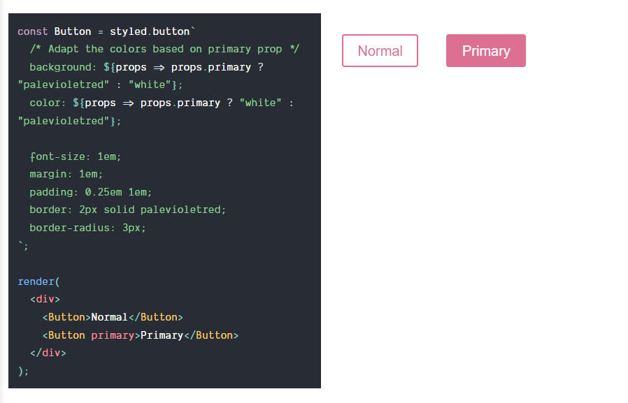
https://styled-components.com/docs/basics#adapting-based-on-props
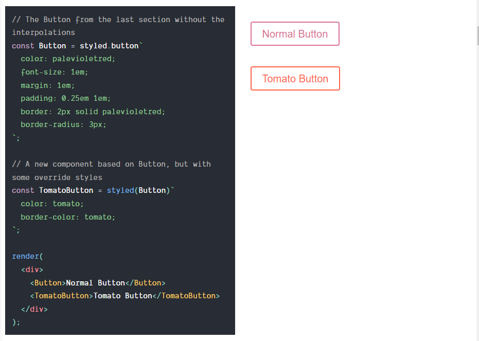
Extending Styles
To easily make a new component that inherits the styling of another, just wrap it in the styled() constructor.
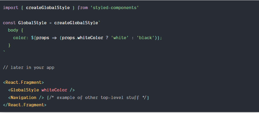
createGlobalStyle
Normally, styled components are automatically scoped to a local CSS class and therefore isolated from other components. In the case of createGlobalStyle, this limitation is removed and things like CSS resets or base stylesheets can be applied.
사용시 지켜야 될 규칙
- Returns a StyledComponent that does not accept children.
- Place it at the top of your React tree.
TypeScript
1. Create a declarations file
the first step is creating a declarations file. Let's name it styled.d.ts
for example.
// import original module declarations
import 'styled-components';

// and extend them!
declare module 'styled-components' {
  export interface DefaultTheme {
    borderRadius: string;

    colors: {
      main: string;
      secondary: string;
    };
  }
}
2. Create a theme
Now we can create a theme just by using the DefaultTheme declared at the step above.
// my-theme.ts
import { DefaultTheme } from 'styled-components';

const myTheme: DefaultTheme = {
  borderRadius: '5px',

  colors: {
    main: 'cyan',
    secondary: 'magenta',
  },
};

export { myTheme };
3. Styling components
import styled from 'styled-components';

// theme is now fully typed
export const MyComponent = styled.div`
  color: ${props => props.theme.colors.main};
`;
4. Using custom props
import styled from 'styled-components';
import Header from './Header';

interface TitleProps {
  readonly isActive: boolean;
}

const Title = styled.h1<TitleProps>`
  color: ${(props) => (props.isActive ? props.theme.colors.main : props.theme.colors.secondary)};
`;