개발자는 디자이너가 아티스트가 아니다. 하지만 CSS를 다루기 위해서 때때로 디자이너 또는 아티스트의 역할을 맡아야하는 경우가 종종 생긴다.
이번 단원에서는 기능적인 것 뿐만 아니라 시각적으로도 매력적인 페이지를 만들 수 있는 방법들을 알아보자. 이번 챕터에서는 다음 내용들을 주로 다루게 될 것이다.
- gradients
- drop shadows
11.1 Gradients
background 프로퍼티는 아래와 같이 다양하게 사용될 수 있다.
background-image: 파일 또는 생성된 이미지 그라데이션에서 이미지 지정background-position: BG 이미지의 초기 위치 세팅background-size: 요소 안의 BG 이미지의 크기 지정background-repeat: 전체 요소를 다 채우기 위해 이미지를 반복할지 여부 정하기background-origin: 요소의 border-box, padding-box(초기값) 또는 content-box에 대한 BG의 상대적 위치 정하기background-clip: 요소의 border-box(초기값), padding-box 또는content-box를 BG가 채울지 여부 정하기background-attachment: 요소를 따라서 BG 이미지를 스크롤 업/다운 시킬지 혹은 뷰포트 내에 고정시킬지 정하기 (fixed값을 사용하면 페이지의 성능에 안 좋은 영향을 미칠 수 있음)background-color: BG 이미지 뒤로 깔리는 배경색 정하기
이 중에 background-image를 사용하여 해당 url의 image를 보여주는 방법도 있지만 gradient 기능을 사용할 수도 있다.
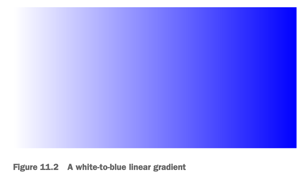
.fade {
  height: 200px;
  width: 400px;
  background-image: linear-gradient(to right, white, blue);
}
linear-gradient: angle, starting color, endig color
angle: to right, to bottom right,
- 90deg, 180deg도 가능 - clockwise
- deg 대신에 rad, turn, grad 등 다양하게 쓸 수 있음
11.1.1 다중 색상 (color stop) 만들기
.fade {
  height: 200px;
  width: 400px;
  background-image: linear-gradient(90deg, red, white, blue);
  // 위 코드와 아래 코드와 동일하다
  background-image: linear-gradient(90deg, red 0%, white 50%, blue 100%)
}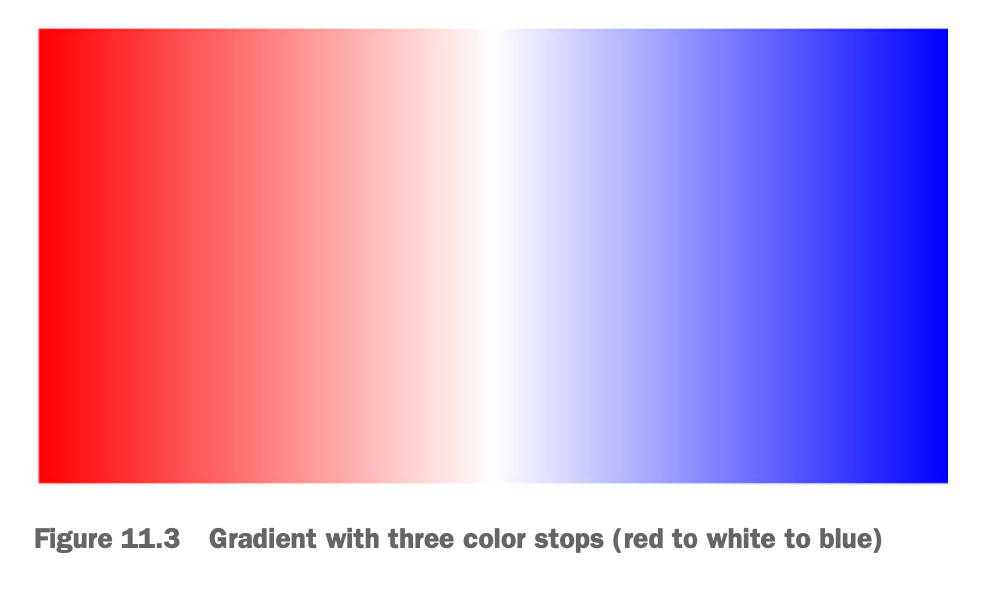
색상은 콤마(,)를 이용해서 무한으로 추가가 가능하다. 모든 색상을 같은 너비로 스프레드(spread)한다.
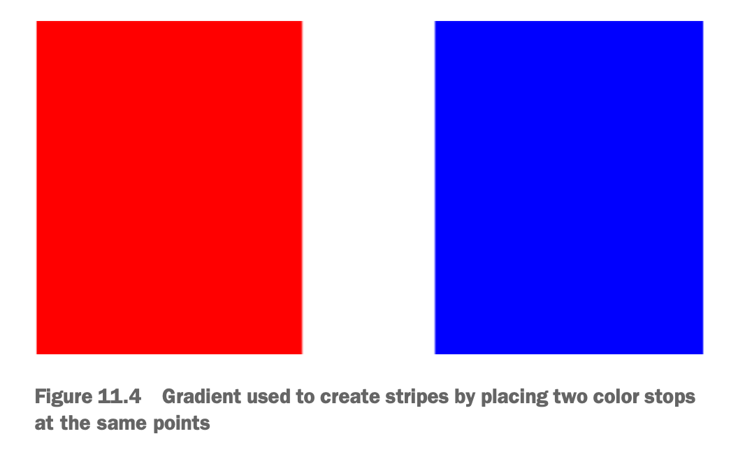
위 케이스는 그라데이션을 만드는 경우지만, 색상을 구분되게 처리할 수도 있다.
.fade {
  height: 200px;
  width: 400px;
  background-image: linear-gradient(90deg,
    red 40%, white 40%,
    white 60%, blue 60%);
}
첫 번째 색상인 red의 color stop 40% 지점이다. 다음 색상인 white는 40%에서 60%까지 차지한다. 마지막 색상인 blue의 color stop은 60%이다.
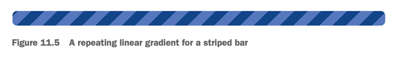
ex) 반복되는 gradient 만들기 (feat. progress bar)
.fade {
  height: 1em;
  width: 400px;
  background-image: repeating-linear-gradient(-45deg,#57b, #57b 10px, #148 10px, #148 20px);
  border-radius: 0.3em;
  }
11.1.2 radial gradient 사용하기
A 포인트에서 시작해서 B 포인트에서 끝나는 gradient 말고 A 포인트에서 시작해서 사방 외곽으로 퍼지는 radial gradient도 있다.
.fade {
  height: 200px;
  width: 400px;
  background-image: radial-gradient(white, blue);
}- A 포인트가 요소의 중심에 위치해서 균일하게 주위로 퍼지는 것이 default 값이다.
11.2 Shadows
box-shadow: 1em 1em black (horizontal, vertical, color)
box로부터 horizontal과 vertical 방향으로 그림자가 얼마나 이동을 했는지
box-shadow: 2px 2px 2px 1px black
// offset(x), offset(y), blur radius, spread radius, color- spread radius: 그림자의 크기. 양수일 경우 요소보다 커지고 음수일 경우 요소보다 작아짐
11.2.1 gradient와 shadow의 depth 정하기
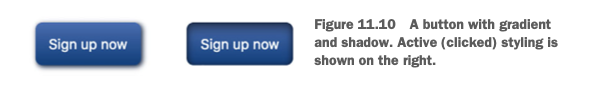
(좌) 누르기 전 버튼 (우) 눌렀을 때 버튼
:active 되었을 때 inset을 이용해서 2개의 그림자가 요소 내부에 그려지도록 함
- 첫 번째 inset shadow: offset zero, blur 0.5em
- 두 번째 inset shadow: offset(y)로 0.5em 이동, blur 1em, 검정색의 40% 투명도
==> 버튼이 눌리는 느낌 표현
11.2.2 평면 요소 디자인
gradient나 shadow는 스키오모피즘(skeuomorphism)뿐만 아니라 평면 디자인 연출에도 쓰일 수 있다.
스키오모피즘: 디지털 디자인에서 사용되는 용어로, 실제 세계의 물리적인 객체나 재료의 모양, 질감, 속성을 모방하여 디자인하는 것을 의미
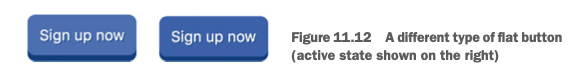
.button {
  padding: 0.8em;
  border: 0;
  font-size: 1rem;
  color: white;
  border-radius: 0.5em;
  background-color: #57b;
  box-shadow: 0 0.4em #148;
  text-shadow: 1px 1px #148;
}
.button:active {
  background-color: #456ab5;
  transform: translateY(0.1em);
  box-shadow: 0 0.3em #148;
}- blur나 shadow를 실제와 같이 구현하기 보다는 디지털스러운 이미지를 구현
- text shadow
transform: translateY(0.1em): 눌렀을때 아래로 이동box-shadow:0 0.3em #148: 눌렀을때 offset(y) 0.4em => 0.3em으로 줄여서 줄어든(눌린) 느낌 연출
11.3 Blend modes
background-image에 여러 이미지를 쓰는 것도 가능하다
Q) 만일 아래 코드를 실행하면 어떻게 될까 ?
background-image: url(bear.jpg), linear-gradient(to bottom, #57b, #148);A) bear.jpg가 linear gradient를 가려서 linear gradient는 보이지 않게 됨
여러가지 background-image를 보여주기 위해 쓸 수 있는 것이 Blend mode 이다!
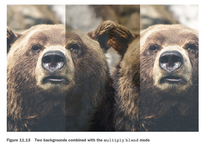
.blend {
    min-height: 400px;
    background-image: url(images/bear.jpg), url(images/bear.jpg);
    background-size: cover;
    background-repeat: no-repeat;
    background-position: -30vw, 30vw;
    background-blend-mode: multiply;
}background-image에 2개의 이미지를 적용시킴background-position: 배경이미지 위치를 나타낸다. 콤마(,)를 통해 첫번째 이미지와 두번째 이미지의 위치를 나타냄background-size:cover은 요소 전체를 채우는 효과,contain은 이미지가 다 보이되 가로,세로 비율에 따라 요소를 다 가리지 않을 수도 있음background-blend-mode: 틴트, 노이즈, 대비(contrast) 등 다양한 효과줄 수 있음
11.3.1 Tinting an image
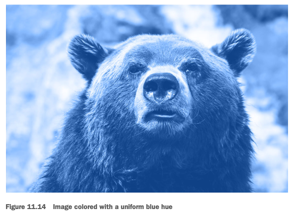
.blend {
    min-height: 400px;
    background-image: url("images/bear.jpg");
    background-color: #148;
    background-size: cover;
    background-repeat: no-repeat;
    background-position: center;
    background-blend-mode: luminosity;
}
background-blend-mode: luminosity: 기존 이미지이 밝기(brightness)와 대비(contrast)를 조절하여 효과주기- 앞쪽 레이어(곰 이미지)로부터 명도(luminosity)를 가져와서 뒷쪽 레이어(파란색 배경)의 색조(hue)와 채도(saturation)와 혼합하기
11.3.2 Blend mode 타입 이해하기
11.3.3 이미지 질감처리
Blend mode로 질감(texture)처리도 할 수 있다.
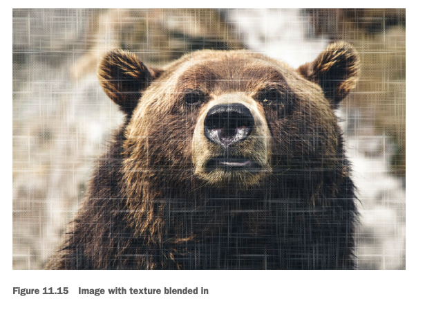
.blend {
  min-height: 400px;
  background-image: url("images/scratches.png"), url("images/bear.jpg");
  background-size: 200px, cover;
  background-repeat: repeat, no-repeat;
  background-position: center center;
  background-blend-mode: soft-light;
}- 캔버스 느낌이 나는 사진(images/scratches.png)과 곰 사진(images/bear.jpg)를 불러온다
- 캔버스 사진 크기는 200px, 곰 사진은 cover로 지정
- 캔버스 사진은 200px 크기로 타일처럼 연출됨
11.3.4 Mix blend mode
background-blend-mode