
0710 css 반응형 태안관광
💡 10:10~11:15 진행4칸 배너 가로 4개에서 세로 꽉찬 4칸으로 바꾸기
- float에 after 주는 이유, after {content:””; clear:both; display: block}
- display:flex 적용시 중요한 점. 가로 세로
- 정렬시 사용하는 속성.
- 자식 요소 투명해질 때 해결법과 html 구조 변경.
p를 추가한 이유
자식도 투명될 때 해결법
- opacity - rgba() 알파값 조절
- 배경 사진만 알파값 안되므로 새로운 자식 만들어서 단색 배경 추가.
수정
#rcm{text-align: center;}
#rcm h2{font:36px 'jalnan';padding-top: 70px;}
#rcm .wrap > p{font-size:18px; margin-bottom: 30px;}
#rcm li a p{width: 100%; height: 100%; display: flex; justify-content: center; align-items: center; }
#rcm li a:hover p{background:rgba(0,0,0,0.7); }
#rcm span{color:#FFF; font-size:30px; font-weight: bold;}
#rcm li{background: #000; float:left; width: 280px; height: 400px; margin-right: 20px; border-radius: 20px; overflow: hidden;}
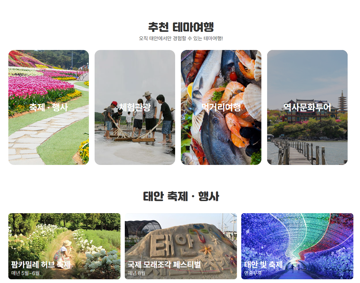
#rcm li:nth-child(1) a{background: url("../images/rcm_img1.png")no-repeat center;}
#rcm li:nth-child(2) a{background: url("../images/rcm_img2.jpg")no-repeat center;}
#rcm li:nth-child(3) a{background: url("../images/rcm_img3.png")no-repeat center;}
#rcm li:nth-child(4) a{background: url("../images/rcm_img4.png")no-repeat center;}
#rcm a:visited, #rcm a:link{display: block; height: 100%; display: flex; justify-content: center; align-items: center; transition:0.3s;}
#rcm a:focus, #rcm a:active, #rcm a:hover{transform: scale(1.1);}기존
#rcm{text-align: center;}
#rcm h2{font:36px 'jalnan';padding-top: 70px;}
#rcm p{font-size:18px; margin-bottom: 30px;}
#rcm span{color:#FFF; font-size:26px; font-weight: bold;}
#rcm li{background: #000; float:left;  width: 280px; height: 400px; margin-right: 20px; border-radius: 20px; overflow: hidden;}
#rcm li:nth-child(1) a{background: url("../images/rcm_img1.png")no-repeat center;}
#rcm li:nth-child(2) a{background: url("../images/rcm_img2.jpg")no-repeat center;}
#rcm li:nth-child(3) a{background: url("../images/rcm_img3.png")no-repeat center;}
#rcm li:nth-child(4) a{background: url("../images/rcm_img4.png")no-repeat center;}

#rcm a:visited, #rcm a:link{display: block; height: 100%; display: flex; justify-content: center; align-items: center; transition:0.3s;}

#rcm a:focus, #rcm a:active, #rcm a:hover{transform: scale(1.1); opacity: 0.7;}
반반 모바일에서 세로형으로
💡 11:40 - 12:40
반응형 사이즈값
vwvh와 퍼센트의 차이점
wrap
1200px ,100%
ul → 100%
li → 4개 각각 25%
- 반응형시
.wrap값max,min사용 - 미디어쿼리 코드 정렬 방법

meta-tony_v0.5