
[ML] Boston 데이터 전처리
Kaggle Boston 데이터를 이용하여 전처리를 시도해보자.
지금 실력에서 모든 칼럼을 전처리 할 수 없지만 일단 배운 만큼 시도해보도록 하자.
0. 구글 마운트 및 환경 설정하기.
# 구글 마운트하기.
from google.colab import drive
drive.mount('/content/drive')

# 모든 열 확인하기.
pd.set_option("display.max_columns", None)

# 기본적인 라이브러리 불러오기.
import numpy as np
import pandas as pd
import matplotlib.pyplot as plt
import seaborn as sns
1. 데이터 불러오기.
train=pd.read_csv("/content/drive/MyDrive/Colab Notebooks/Step 1. 머신러닝/data/boston/train.csv")
test=pd.read_csv("/content/drive/MyDrive/Colab Notebooks/Step 1. 머신러닝/data/boston/test.csv")

train.head()
test.head()
2. 유의미한 칼럼 찾기.
2-1. 상관 관계 분석하기.
일단 어떤 칼럼들이 유의미한지 살펴보기 위하여 상관 관계를 분석해보자. 상관 계수를 구하고 히트맵을 통하여 한 눈에 볼 수 있도록 하자.
train_corr=train.corr()

plt.figure(figsize=(10, 10), dpi=200)
sns.set(font_scale=0.5)

_=sns.heatmap(train_corr, annot=True, fmt=".1f")
plt.show()
너무 칼럼이 많기 때문에 상관 계수가 큰 순서대로 정렬하여 어떤 칼럼이 의미가 있는지 살펴보자. 나는 상관 계수가 0.5 이상인 칼럼만 가져와서 feature에 넣어주었다.
feature=list(train_corr.loc[:, "SalePrice"].abs().sort_values(ascending=False)[: "YearRemodAdd"].index)
feature # 유의미한 칼럼
Id 칼럼은 제거하고, 그림을 그리기 위하여 feature를 이용하여 plot_train이라는 새로운 데이터 프레임을 만들자.
train.drop("Id", axis=1, inplace=True)

plot_train=train[feature]
plot_train # 그래프를 그리기 위한 데이터 프레임
2-2. 회귀 분석을 통하여 더 유의미한 칼럼 찾기.
Boston 데이터는 집값 예측 데이터이므로, 회귀 분석에 해당된다. 그러므로 regplot을 이용하여 잘 예측된 그래프를 찾는다면 위에서 찾은 feature 중에서도 더욱 유의미한 칼럼이 있는지 확인할 수 있다.
- 여러 그래프를 그리기 위하여 plt.subplot를 이용하였다. idx는 1 이상의 숫자부터 가능하기 때문에, (idx+1)을 이용한다.
plt.subplot(row, col, idx + 1) # idx는 1 이상- idx와 칼럼 이름을 같이 나타내기 위하여 enumerate를 이용하였다.
_=plt.figure(figsize=(30,30), dpi=200)

for idx, col in enumerate(feature[1:]):
    ax1=plt.subplot(5, 2, idx+1) # plt.subplot(row, col, idx : 1 ~ 10)
    sns.regplot(x=col, y=feature[0], data=plot_train, ax=ax1)
plt.show()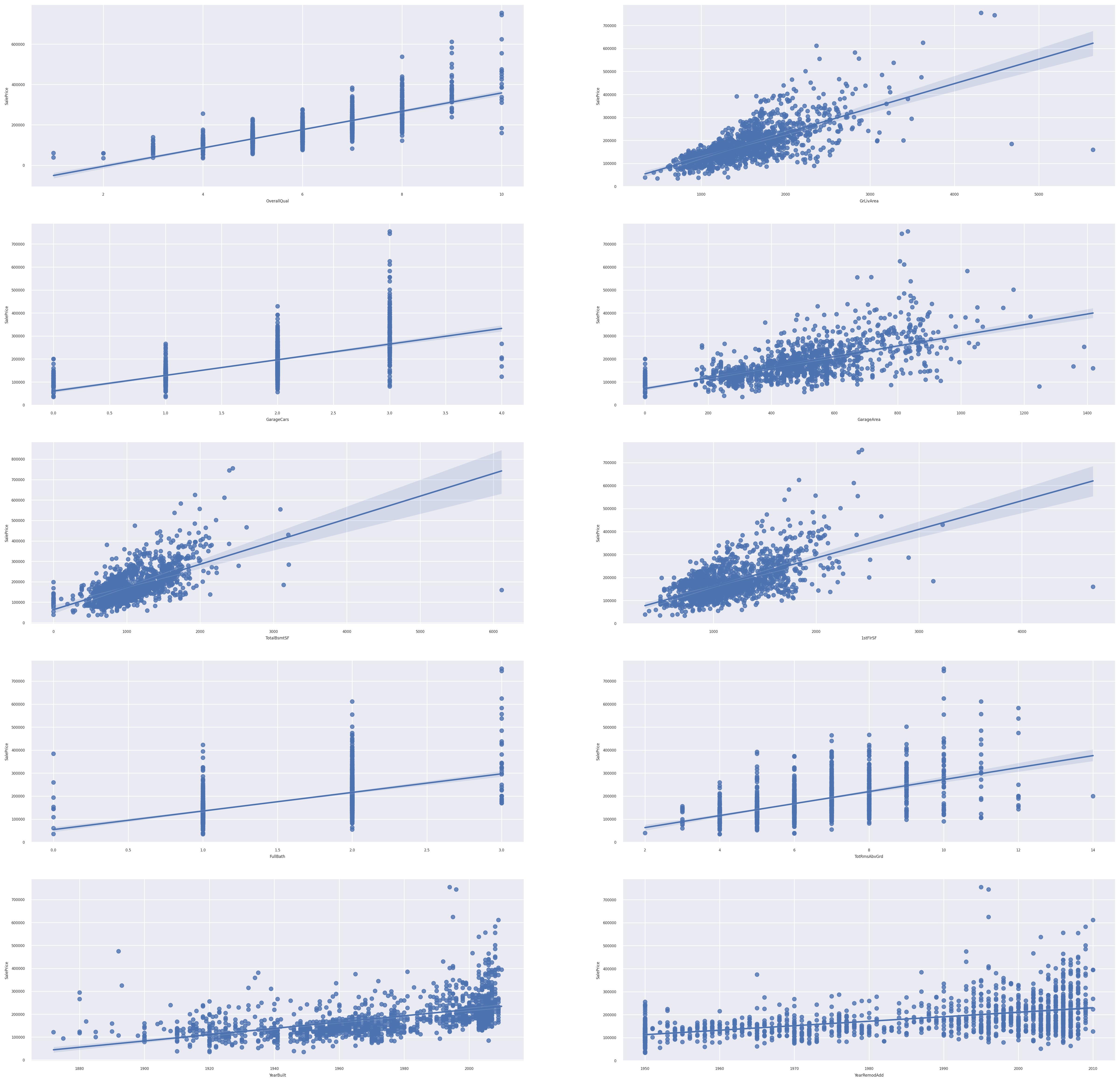
(idx+1)이 2,4,5,6,9가 선형 관계가 뚜렷하다. 따라서 idx가 1,3,4,5,8의 칼럼들이 뚜렷하다.
new_feature=[]

for idx in [1,3,4,5,8]:
    new_feature.append(feature[1:][idx])
print(new_feature)
new_feature에 선형 관계가 뚜렷한 칼럼만 가져왔다. 이러한 경향성을 보았을 때 나중에 모델 선택과 학습을 선형 회귀 모형을 이용하면 좋은 결과를 얻어낼 수 있을 것이다.
3. 데이터의 분포 알아보기.
plt.figure(figsize=(10,10), dpi=200)
_=sns.displot(data=train, x="SalePrice")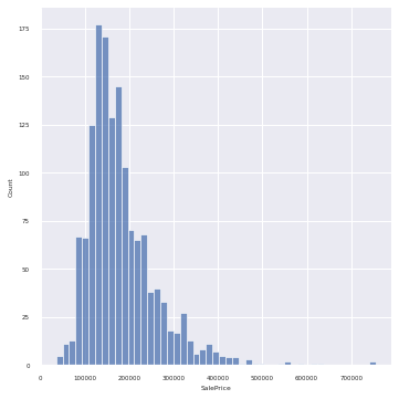
SalePrices는 무난한 분포를 보여주고 있다.
4. 데이터 전처리하기.
4-1. 결측치 처리하기.
from sklearn.impute import SimpleImputer

# 결측치가 있는 것만 가져오기.
train.loc[:, train.isnull().sum()!=0].info()
train.isnull().sum()[train.isnull().sum()!=0]
결측치가 있는 칼럼의 정보와 결측치 수만 가져왔다.
수치형 데이터와 범주형 데이터를 나눠서 결측치 처리를 할 것이다.
- 수치형 데이터에는 평균을 넣을 것이다.
- 범주형 데이터에는 가장 빈도가 높은 값을 넣을 것이다.
# 수치형 데이터 결측치 처리하기.
sm=SimpleImputer(strategy="mean")
result=sm.fit_transform(train[["LotFrontage", "MasVnrArea", "GarageYrBlt"]])
train[["LotFrontage", "MasVnrArea", "GarageYrBlt"]]=result

# 범주형 데이터 결측치 처리하기.
cat_list=list(train.isnull().sum()[train.isnull().sum()!=0].index)
cat_list # 리스트
sm = SimpleImputer(strategy="most_frequent")
result=sm.fit_transform(train[cat_list])
train[cat_list]=result
결측치를 모두 처리하고, 결측치가 있는지 확인해보자.
train.isnull().sum().sum() # 결측치 아예 제거했다.위의 코드의 결과는 0이다. 결측치가 모두 처리되었다.