Code States
Front-end boost camp
Today
I
Learned
🍒 48일차 페어 과제 리뷰~ 각 기능 구현하기
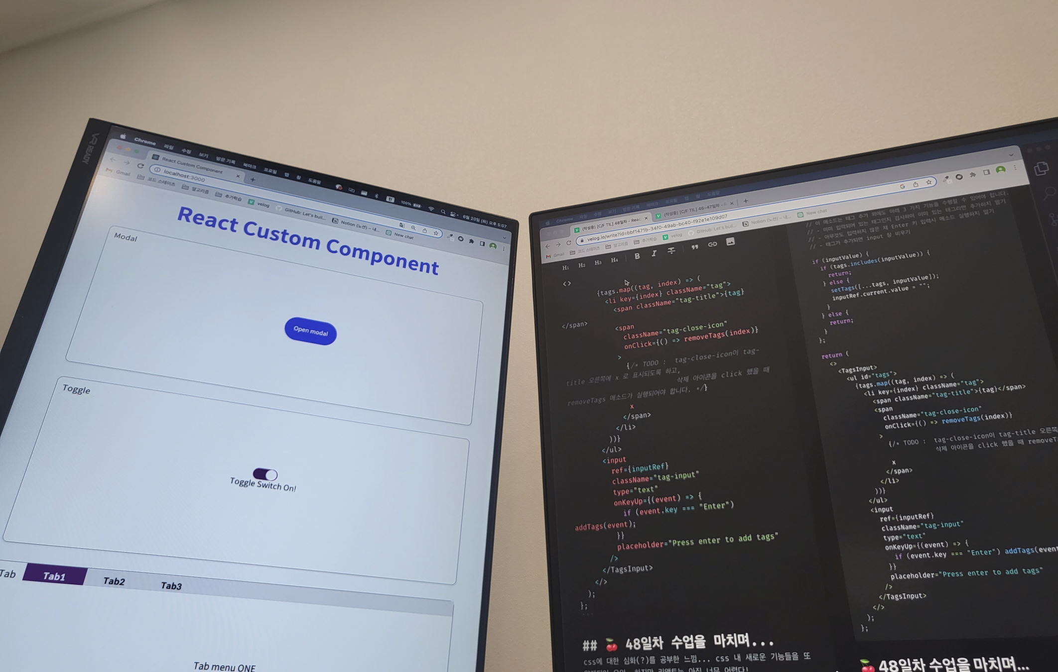
🍒 Modal
import { useState } from 'react';
import styled from 'styled-components';

export const ModalContainer = styled.div`
  // TODO : Modal을 구현하는데 전체적으로 필요한 CSS를 구현합니다.
  display: flex;
  justify-content: center;
  align-items: center;
  height: 100%
`;

export const ModalBackdrop = styled.div`
  // TODO : Modal이 떴을 때의 배경을 깔아주는 CSS를 구현합니다.
  position: fixed;
  background-color: rgba(0, 0, 0, 0.5);
  top: 0;
  bottom: 0;
  left: 0;
  right: 0;

  display: flex;
  justify-content: center;
  align-items: center;

  z-index: 1;
`;

export const ModalBtn = styled.button`
  background-color: var(--coz-purple-600);
  text-decoration: none;
  border: none;
  padding: 20px;
  color: white;
  border-radius: 30px;
  cursor: grab;
`;

export const ModalView = styled.div.attrs((props) => ({
  // attrs 메소드를 이용해서 아래와 같이 div 엘리먼트에 속성을 추가할 수 있습니다.
  role: 'dialog',
}))`
  // TODO : Modal창 CSS를 구현합니다.

  display: flex;
  justify-content: center;
  align-items: center;
  flex-direction: column;

  background-color: lightgray;
  width: 300px;
  height: 150px;

  border-radius: 20px;

  & > button {
    border: none;
    margin-bottom: 20px;
  }
`;

export const Modal = () => {
  const [isOpen, setIsOpen] = useState(false);

  const openModalHandler = () => {
    // TODO : isOpen의 상태를 변경하는 메소드를 구현합니다.
    setIsOpen(!isOpen)
  };

  return (
    <>
      <ModalContainer>
        <ModalBtn onClick={openModalHandler}
        // TODO : 클릭하면 Modal이 열린 상태(isOpen)를 boolean 타입으로 변경하는 메소드가 실행되어야 합니다.
        >
          {isOpen ? 'Opened!' : 'Open modal'}
        </ModalBtn>
        {isOpen ? (
          <ModalBackdrop onClick={openModalHandler}>
            <ModalView>모달이야</ModalView>
          </ModalBackdrop>
        ) : null}

        {/* TODO : 조건부 렌더링을 활용해서 Modal이 열린 상태(isOpen이 true인 상태)일 때만 모달창과 배경이 뜰 수 있게 구현해야 합니다. */}
      </ModalContainer>
    </>
  );
};
🍒 Toggole
import { useState } from 'react';
import styled from 'styled-components';

const ToggleContainer = styled.div`
  position: relative;
  margin-top: 8rem;
  left: 47%;
  cursor: pointer;

  > .toggle-container {
    width: 50px;
    height: 24px;
    border-radius: 30px;
    background-color: #8b8b8b;
    transition: 0.5s;
    // TODO : .toggle--checked 클래스가 활성화 되었을 경우의 CSS를 구현합니다.
    &.toggle--checked {
    background: purple;
    }
  }

  > .toggle-circle {
    position: absolute;
    top: 1px;
    left: 1px;
    width: 22px;
    height: 22px;
    border-radius: 50%;
    background-color: #ffffff;
    transition: 0.5s;
    // TODO : .toggle--checked 클래스가 활성화 되었을 경우의 CSS를 구현합니다.
    &.toggle--checked {
    /* transform: translateX(26px); */
    left : 27px;
    }
  }
`;

const Desc = styled.div`
  // TODO : 설명 부분의 CSS를 구현합니다.
  display: flex;
  justify-content: center;
`;

export const Toggle = () => {
  const [isOn, setisOn] = useState(false);

  const toggleHandler = () => {
    // TODO : isOn의 상태를 변경하는 메소드를 구현합니다.
    setisOn(!isOn)
  };

  return (
    <>
      <ToggleContainer onClick={toggleHandler}
        // TODO : 클릭하면 토글이 켜진 상태(isOn)를 boolean 타입으로 변경하는 메소드가 실행되어야 합니다.
      >

        {/* TODO : 아래에 div 엘리먼트 2개가 있습니다. 각각의 클래스를 'toggle-container', 'toggle-circle' 로 지정하세요. */}
        {/* TIP : Toggle Switch가 ON인 상태일 경우에만 toggle--checked 클래스를 div 엘리먼트 2개에 모두 추가합니다. 조건부 스타일링을 활용하세요. */}
        <div className={`toggle-container ${isOn ? "toggle--checked" : ""}`}/>
        <div className={`toggle-circle ${isOn ? "toggle--checked" : ""}`}/>
      </ToggleContainer>
      {isOn ? (
        <Desc onClick={toggleHandler}> Toggle Switch On!</Desc>
      ) : (
      <Desc onClick={toggleHandler}> Toggle Switch Off!</Desc>
      )}
      {/* TODO : Desc 컴포넌트를 활용해야 합니다. */}
      {/* TIP:  Toggle Switch가 ON인 상태일 경우에 Desc 컴포넌트 내부의 텍스트를 'Toggle Switch ON'으로, 그렇지 않은 경우 'Toggle Switch OFF'가 됩니다. 조건부 렌더링을 활용하세요. */}
    </>
  );
};
🍒 Tab
import { useState } from 'react';
import styled from 'styled-components';

// TODO: Styled-Component 라이브러리를 활용해 TabMenu 와 Desc 컴포넌트의 CSS를 구현합니다.

const TabMenu = styled.ul`
  background-color: #dcdcdc;
  color: rgba(73, 73, 73, 0.5);
  font-weight: bold;
  display: flex;
  flex-direction: row;
  justify-items: center;
  align-items: center;
  list-style: none;
  margin-bottom: 7rem;

  .submenu {
    ${'' /* 기본 Tabmenu 에 대한 CSS를 구현합니다. */}
    display: flex;
    justify-content: space-around;
    width: 100px;
    height: 30px;
    padding: 10px;
    font-size: 15px;
  }

  .focused {
    ${'' /* 선택된 Tabmenu 에만 적용되는 CSS를 구현합니다.  */}
    color: white;
    background: purple;
  }

  & div.desc {
    text-align: center;
  }
`;

const Desc = styled.div`
  text-align: center;
`;

export const Tab = () => {
  const [currentTab, setCurrentTab] = useState(0);
  // TIP: Tab Menu 중 현재 어떤 Tab이 선택되어 있는지 확인하기 위한
  // currentTab 상태와 currentTab을 갱신하는 함수가 존재해야 하고, 초기값은 0 입니다.

  const menuArr = [
    { name: 'Tab1', content: 'Tab menu ONE' },
    { name: 'Tab2', content: 'Tab menu TWO' },
    { name: 'Tab3', content: 'Tab menu THREE' },
  ];

  const selectMenuHandler = (index) => {
    setCurrentTab(index);
    // TIP: parameter로 현재 선택한 인덱스 값을 전달해야 하며, 이벤트 객체(event)는 쓰지 않습니다
    // TODO : 해당 함수가 실행되면 현재 선택된 Tab Menu 가 갱신되도록 함수를 완성하세요.
  };

  return (
    <>
      <div>
        <TabMenu>
          {/*TODO: 아래 하드코딩된 내용 대신에, map을 이용한 반복으로 코드를 수정합니다.*/}
          {/*TIP: li 엘리먼트의 class명의 경우 선택된 tab 은 'submenu focused' 가 되며,
                  나머지 2개의 tab은 'submenu' 가 됩니다.*/}
          {menuArr.map((el, index) => (
            <li
              className={currentTab === index ? "submenu focused" : "submenu"}
              onClick={() => selectMenuHandler(index)}
            >
              {el.name}
            </li>
          ))}
        </TabMenu>
        <Desc>
          {/*TODO: 아래 하드코딩된 내용 대신에, 현재 선택된 메뉴 따른 content를 표시하세요*/}
          <p>{menuArr[currentTab].content}</p>
        </Desc>
      </div>
    </>
  );
};
🍒 Tag
import { useState, useRef } from 'react';
import styled from 'styled-components';

// TODO: Styled-Component 라이브러리를 활용해 여러분만의 tag 를 자유롭게 꾸며 보세요!

export const TagsInput = styled.div`
  margin: 8rem auto;
  display: flex;
  align-items: flex-start;
  flex-wrap: wrap;
  min-height: 48px;
  width: 480px;
  padding: 0 8px;
  border: 1px solid rgb(214, 216, 218);
  border-radius: 6px;

  > ul {
    display: flex;
    flex-wrap: wrap;
    padding: 0;
    margin: 8px 0 0 0;

    > .tag {
      width: auto;
      height: 32px;
      display: flex;
      align-items: center;
      justify-content: center;
      color: #fff;
      padding: 0 8px;
      font-size: 14px;
      list-style: none;
      border-radius: 6px;
      margin: 0 8px 8px 0;
      background: var(--coz-purple-600);
      > .tag-close-icon {
        display: block;
        width: 16px;
        height: 16px;
        line-height: 16px;
        text-align: center;
        font-size: 14px;
        margin-left: 8px;
        color: var(--coz-purple-600);
        border-radius: 50%;
        background: #fff;
        cursor: pointer;
      }
    }
  }

  > input {
    flex: 1;
    border: none;
    height: 46px;
    font-size: 14px;
    padding: 4px 0 0 0;
    :focus {
      outline: transparent;
    }
  }

  &:focus-within {
    border: 1px solid var(--coz-purple-600);
  }
`;

export const Tag = () => {
  const inputRef = useRef(null);

  const initialTags = ['CodeStates', 'kimcoding'];

  const [tags, setTags] = useState(initialTags);
  const removeTags = (indexToRemove) => {
    const filteredTags = tags.filter((el, index) => index !== indexToRemove);
    setTags(filteredTags);
      // TODO : 태그를 삭제하는 메소드를 완성하세요.
  };

  const addTags = (event) => {

    let inputValue = event.target.value;
    // TODO : tags 배열에 새로운 태그를 추가하는 메소드를 완성하세요.
    // 이 메소드는 태그 추가 외에도 아래 3 가지 기능을 수행할 수 있어야 합니다.
    // - 이미 입력되어 있는 태그인지 검사하여 이미 있는 태그라면 추가하지 말기
    // - 아무것도 입력하지 않은 채 Enter 키 입력시 메소드 실행하지 말기
    // - 태그가 추가되면 input 창 비우기

    if (inputValue) {
      if (tags.includes(inputValue)) {
        return;
      } else {
        setTags([...tags, inputValue]);
        inputRef.current.value = "";
      }
    } else {
      return;
    }
  };

  return (
    <>
      <TagsInput>
        <ul id="tags">
          {tags.map((tag, index) => (
            <li key={index} className="tag">
              <span className="tag-title">{tag}</span>
              <span
                className="tag-close-icon"
                onClick={() => removeTags(index)}
              >
                {/* TODO :  tag-close-icon이 tag-title 오른쪽에 x 로 표시되도록 하고,
                            삭제 아이콘을 click 했을 때 removeTags 메소드가 실행되어야 합니다. */}
                x
              </span>
            </li>
          ))}
        </ul>
        <input
          ref={inputRef}
          className="tag-input"
          type="text"
          onKeyUp={(event) => {
            if (event.key === "Enter") addTags(event);
          }}
          placeholder="Press enter to add tags"
        />
      </TagsInput>
    </>
  );
};
🍒 48일차 수업을 마치며...
css에 대한 심화(?)를 공부한 느낌... css 내 새로운 기능들을 또 알게되어 유익, 하지만 리액트는 아직 너무 어렵다!

[무엥일기] 무엥,,, 내가 머쨍이 개발자가 될 수 이쓰까,,,