HTML/CSS/JS
📝 잘 알고있는 내용이니
새로 알게된 + 중요한 내용 위주로 정리함!
- Front Course Part 01
Starbucks Website 예제
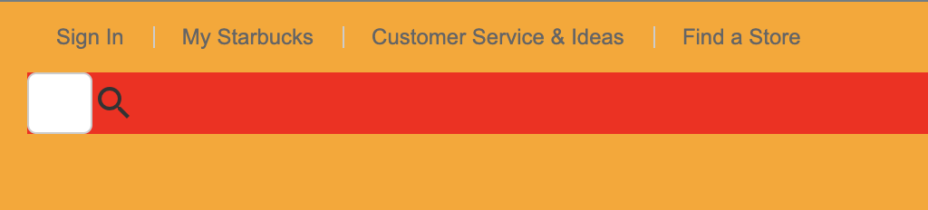
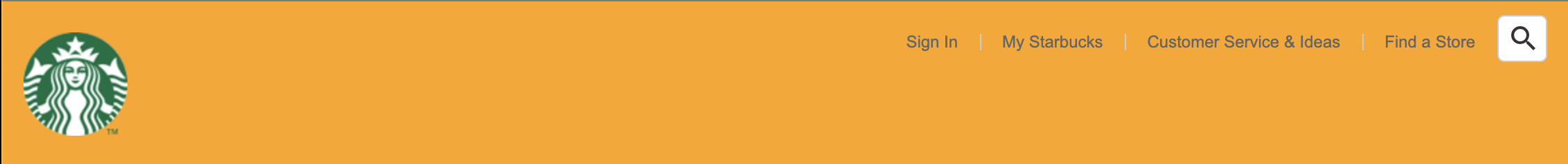
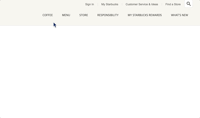
Search
- 클릭시 width가 자연스럽게 늘어가는 이펙트.
- transition과
:focus가상 클래스를 이용함.
header .sub-menu .search input {
width: 36px;
height: 34px;
padding: 4px 10px;
border: 1px solid #ccc;
box-sizing: border-box;
border-radius: 5px;
background-color: #fff;
color: #777;
font-size: 12px;
transition: width .4s;
}
header .sub-menu .search input:focus {
width: 190px;
border-color: #669900;
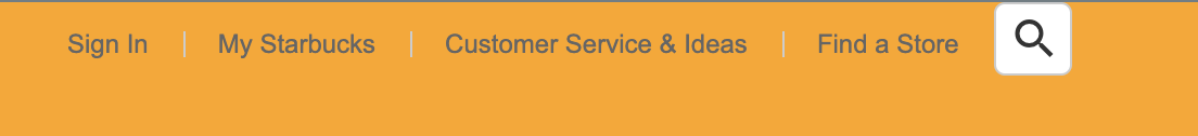
}search 아이콘 위치 지정
position: absolute를 이용함.
header .sub-menu .search .material-icons {
  position: absolute;
  height: 24px;
  top: 0;
  bottom: 0;
  margin: auto;
}
height는 icon의 크기.
-> google material icons의 기본 font-size인 24px.
search 창 이동
side-menu에 display: flex를 설정하여
search input이 가로정렬되도록 함.
여기서 문제는 search 아이콘을 클릭하면 변화가 없고
input 부분을 클릭해서 변화가 생김. (input이 focus 일때 변화하기 때문)
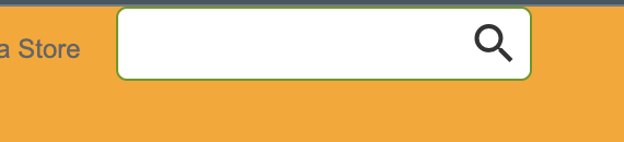
-> 돋보기 아이콘 클릭시 input 요소에 포커스가 가도록
강제로 focus를 해줘야 함.
-> JavaScript로 할 수 있다.
javascript
프로젝트 루트 폴더에 /js 폴더 생성 후 main.js 파일 작성.
DOM 요소 선택
const searchEl = document.querySelector('.search');
// const searchInputEl = document.querySelector('.search input');
const searchInputEl = searchEl.querySelector('input');
.search input 으로 검색하는 것 보다는
searchEl.querySelector('input') 과 같이 검색하는 것이 효율적임.
EventListener
searchEl.addEventListener('click', function () {
    searchInputEl.focus();
})
js에서 focus() 함수는 해당 요소에 포커스를 해줌.
(대표적인 예로 input 요소가 있음)
- 이제 돋보기 아이콘 클릭 시 input이 포커스가 되고,
transition이 발생한다.
input focus 이벤트
searchInputEl.addEventListener('focus', function () {
  searchEl.classList.add('focused');
  searchInputEl.setAttribute('placeholder', '통합검색'); // HTML 속성을 설정
});
input이 focus 되었을 때
1. 돋보기 아이콘 - focused 라는 클래스명을 추가함
2. setAttribute() 함수 - HTML 어트리뷰트를 설정함.
input blur 이벤트
searchInputEl.addEventListener('blur', function () {
  searchEl.classList.remove('focused');
  searchInputEl.setAttribute('placeholder', '');
});
input이 blur 되었을 때 (= focus의 반대 개념. focus를 잃을 때)
1. 돋보기 아이콘 - focused 라는 클래스명을 제거함
2. setAttribute() 함수 - HTML 어트리뷰트를 설정함.
-> placeholder을 ''로 수정
CSS 추가
- focused 라는 클래스를 가지면
-> 아이콘이 사라지게 설정.
opacity: 0으로 지정.
display: none이나 visibility: none 등은
transition이 적용 안됨.
header .sub-menu .search .material-icons {
	...
  transition: all .4s;
}

header .sub-menu .search.focused .material-icons {
  opacity: 0;
}
sub-menu 위치
header .sub-menu {
  position: absolute;
  top: 10px;
  right: 0;
  display: flex;
}- 헤더의 우측에 위치하도록
Position: absolute로 위치 지정해줌.
Header 배경색
header {
    background-color: #f6f5f0;
    border-bottom: 1px solid #c8c8c8;
}
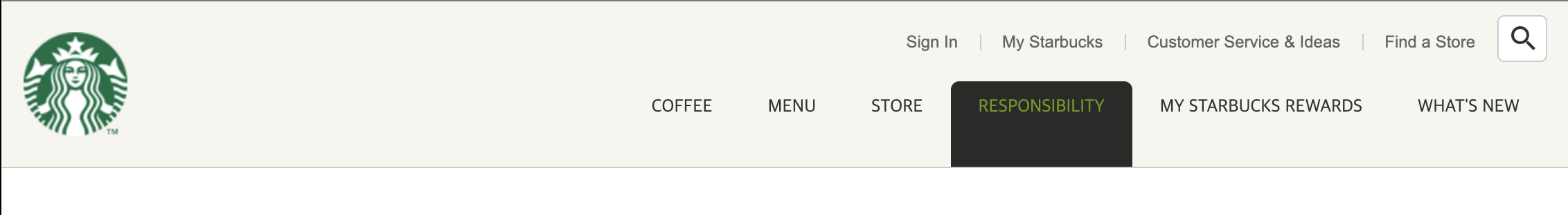
메인 메뉴
- 드롭다운 메뉴로 구현.
html
        <ul class="main-menu">
          <li class="item">
            <div class="item__name">COFFEE</div>
            <div class="item__contents">

            </div>
          </li>
          <li class="item">
            <div class="item__name">MENU</div>
            <div class="item__contents">

            </div>
          </li>
          <li class="item">
            <div class="item__name">STORE</div>
            <div class="item__contents">

            </div>
          </li>
          <li class="item">
            <div class="item__name">RESPONSIBILITY</div>
            <div class="item__contents">

            </div>
          </li>
          <li class="item">
            <div class="item__name">MY STARBUCKS REWARDS</div>
            <div class="item__contents">

            </div>
          </li>
          <li class="item">
            <div class="item__name">WHAT'S NEW</div>
            <div class="item__contents">

            </div>
          </li>
        </ul>
hover 스타일링
header .main-menu .item:hover .item__name {
  background-color: #2c2a29;
  color: #669900;
  border-radius: 6px 6px 0 0;
}
main-menu 위치 이동
header .main-menu {
  position: absolute;
  display: flex;
  bottom: 0;
  right: 0;
  z-index: 1;
}
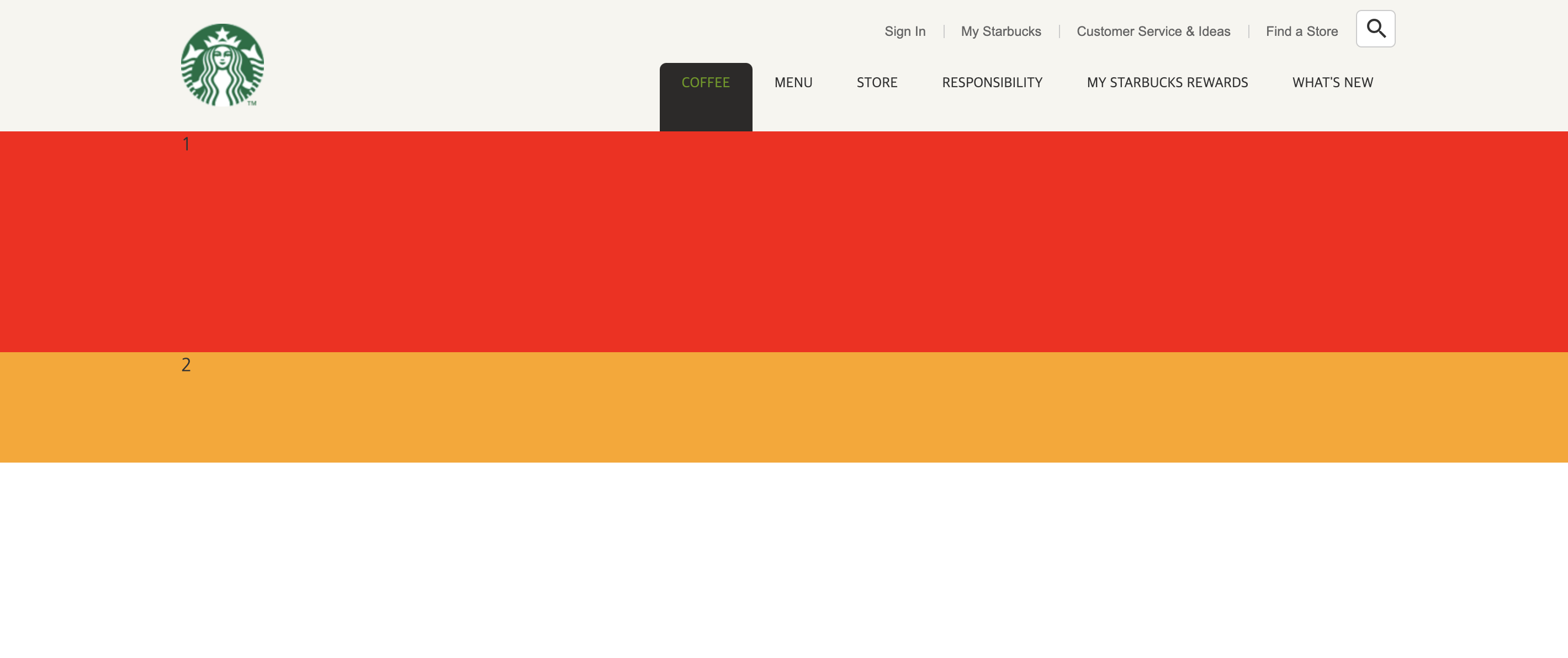
드롭다운 메뉴
header .main-menu .item .item__contents {
  width: 100%;
  position: fixed;
  left: 0;
}

header .main-menu .item .item__contents .contents__menu {
  background-color: red;
  height: 200px;
}

header .main-menu .item .item__contents .contents__texture {
  background-color: orange;
  height: 100px;
}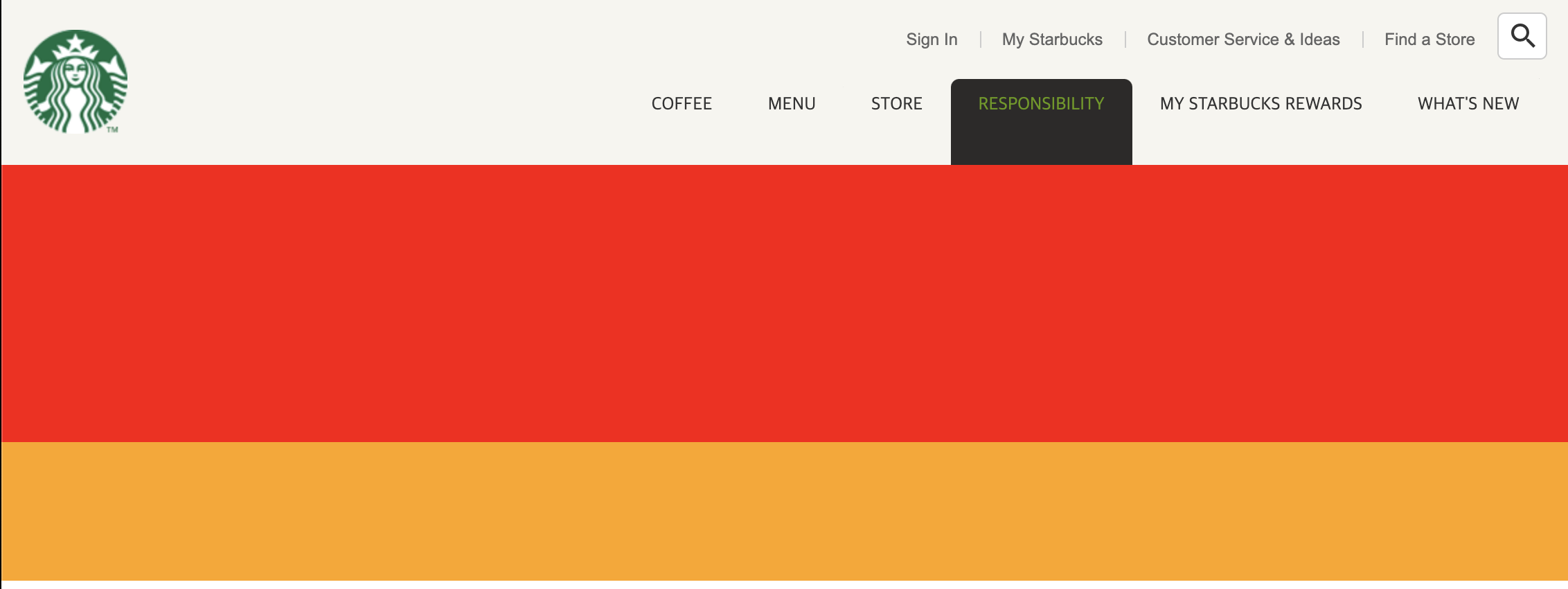
display 설정
item__contents를 처음에는display: none으로 했다가- hover시에는
display: block이 되서 보여지도록.
header .main-menu .item .item__contents {
	...
  display: none;
}

header .main-menu .item:hover .item__contents {
  display: block;
}
- hover시에 드롭다운이 나타나게 된다.
inner 설정
inner클래스를 추가해서 가운데에 위치할 수 있도록.
header .inner {
  position: relative;
  width: 1100px;
  height: 120px;
  margin: 0 auto;
}
-> height: 120px 는 공통이 아니기 때문에
공통 스타일을 따로 선언해줘야 함.
/* COMMON */
.inner {
  position: relative;
  width: 1100px;
  margin: 0 auto;
}- 기존 헤더의 inner은 따로 자식선택자 기호(>)로 구분해준다.
header > .inner {
  height: 120px;
}
메인메뉴 완성
- 나머지 내용 입력 후 css 완성
header .main-menu .item .item__contents .contents__menu > ul > li ul li:hover {
  color: #669900;
}
BEM
= Block Element Modifier
HTML 클래스 작명법.
-
요소__일부분
: 언더바 기호로 요소의 일부분을 표시함.
예>container__name -
요소--상태
: 대시 기호로 요소의 상태를 표시함.
예>btn--primary,btn-success등
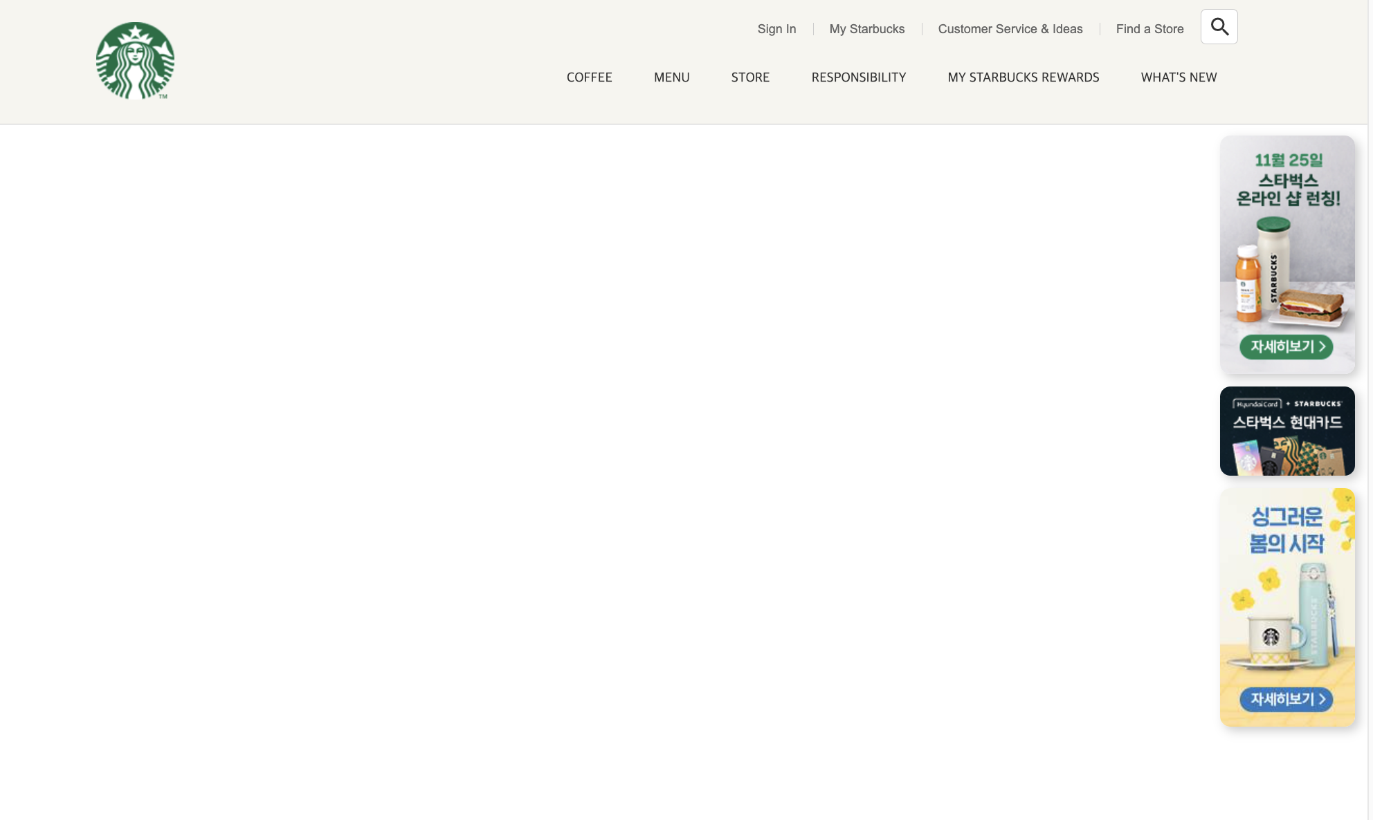
Badge
🔻 html
<div class="badges">
  <div class="badge">
    <img src="./images/badge1.jpg" alt="Badge" />
  </div>
  <div class="badge">
    <img src="./images/badge2.jpg" alt="Badge" />
  </div>
  <div class="badge">
    <img src="./images/badge3.jpg" alt="Badge" />
  </div>
</div>
-> header 내부에 inner 다음에 위치.
🔻 css
header .badges .badge {
  border-radius: 10px;
  overflow: hidden;
}
-> img를 조정하려 할 때, 상위 div의 border-radius를 조정한 후
반드시 overflow: hidden 을 해줘야 한다.
header .badges .badge {
  border-radius: 10px;
  overflow: hidden;
  margin-bottom: 12px;
  box-shadow: 4px 4px 10px rgba(0, 0, 0, 0.2);
  cursor: pointer;
}
position fixed
스크롤을 해도 해당 위치에 계속 고정되어 있는 배지.
header {
  width: 100%;
  position: fixed;
  top: 0;
  background-color: #f6f5f0;
  border-bottom: 1px solid #c8c8c8;
}
부모 요소인 header에 position: fixed를 준다.
badges는 position: absolute인 상태.
-> 참고로 position: fixed로 바뀌면 width: auto가 되어
최소한으로 줄어드려고 한다.
따라서 width: 100%를 지정해줘야 한다.
스크롤 사라지게 구현
- 일정 높이 이상 스크롤 다운하면 배지가 사라지도록.
- javascript를 사용하여 구현 가능.
main.js 수정
const badgeEl = document.querySelector('header .badges');

window.addEventListener('scroll', function (e) {
    console.log('hi');
})
함수가 반복해서 실행이 되어 웹사이트가 무거워지면 화면 버벅임 현상이 발생함.
따라서 외부 라이브러리를 사용하여 막아줄 수 있음.
lodash.js
-> copy script tag를 클릭하여
main.js 위에 붙여넣으면 된다.
const badgeEl = document.querySelector('header .badges');

window.addEventListener('scroll', _.throttle(function () {
    console.log('scroll');
}, 300));
-> _.throttle() 이라는 함수 안에 핸들러 함수를 입력하고,
두번째 인자로 숫자(=300)를 넣어준다.
✅ 300ms 단위로 부하를 줌 - 0.3초에 한 번만 실행되게 해준다!
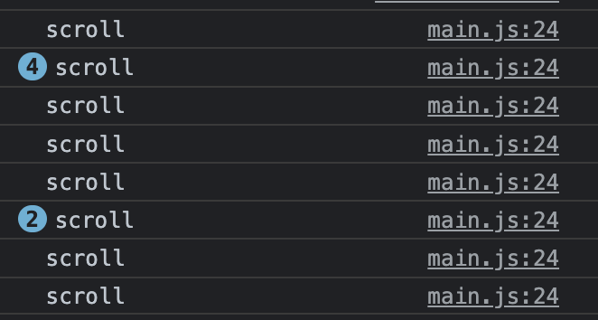
- Lodash 라이브러리는 스크롤 이벤트에 많이 사용된다!
if-else 문을 활용해서 배지를 사라지고 나타나게 하자.
window.addEventListener('scroll', _.throttle(function () {
    console.log(window.scrollY);

    if (window.scrollY > 500) {
        badgeEl.style.display = 'none';
    } else {
        badgeEl.style.display = 'block';
    }
}, 300));
GSAP 라이브러리
- 배지가 사라질 때 더 자연스럽게 하기 위해.
- javascript 애니메이션 라이브러리
main.js 수정
if (window.scrollY > 500) {
    // gsap.to(요소, 지속시간, 옵션)
    gsap.to(badgeEl, 0.6, {
        opacity: 0
    });
gsap.to()
gsap.to(요소, 지속시간, 옵션);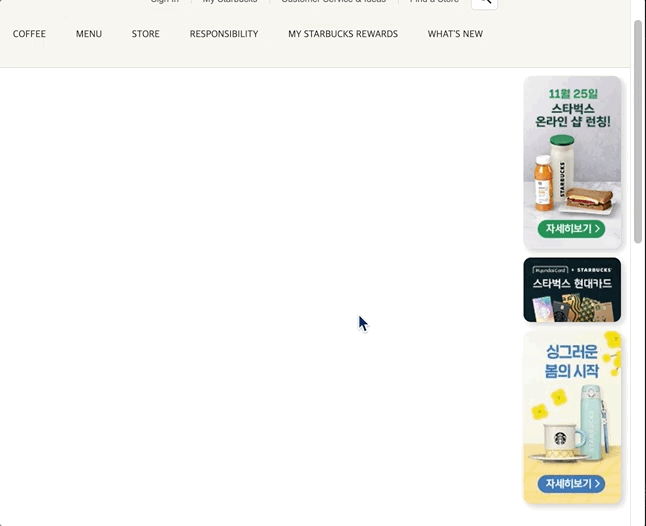
-> opacity:0 으로 자연스럽게 사라지게 된다.
스크롤을 다시 올려서 scrollY가 500 미만이 될 때도
opacity:1 으로 자연스럽게 나타난다.
그러나 중간 과정에서 opacity만 0이고 실제로 요소가 사라진 것은 아니다.
-> 실제로 화면에서 사라지게 display: none을 추가해주면 된다.
window.addEventListener(
  'scroll',
  _.throttle(function () {
    console.log(window.scrollY);
    if (window.scrollY > 500) {
      // gsap.to(요소, 지속시간, 옵션)
      gsap.to(badgeEl, 0.6, {
        opacity: 0,
        display: 'none',
      });
    } else {
      gsap.to(badgeEl, 0.6, {
        opacity: 1,
        display: 'block',
      });
    }
  }, 300)
);