앱 개발
- Android
- 프로그래밍 언어
1) JAVA :
2) Kotin : - 개발 툴: Android SDK (Google)
- IOS
- 프로그래밍 언어
1) Objective-C
2) Swift - 개발툴: XCode (Apple), macOS에서만 개발할 수 있음.
- React Native
- 프로그래밍 언어 : Javascript(facebook)
- Flutter
- 프로그래밍 언어: Dart(Google)
- Dart는 Java 기반의 언어.
Flutter?
Flutter의 장점
- 빠르다
- 자료를 쉽게 얻을 수 있다.
구글이 지원하고 있으며, 공식문서 및 커뮤니티가 잘 되어 있다. - 다양한 환경에서 사용가능하다.
IOS, android 등
Flutter 단점
- Dart 학습
flutter는 dart를 프로그래밍 언어로 사용하기 때문에 dart를 알아야 개발을 할 수 있다 - 성능에 있어 Native보다 떨어진다.
native 보다 느리가.
Flutter 구성
- Widget
- Flutter의 구성요소를 위젯(widget)이라 함.
Flutter 위젯(widget)
0. 위젯(Widget)이란?
- UI를 구축할 수 있는 기능
1. Scaffold 위젯
- 페이지에서 위젯을 쉽게 만들 수 있도록 틀을 잡아줌.
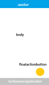
Scaffold(
	appBar: //상단 바,
    body: //화면 중앙에 가장 큰 면적,
    bottomNavigationBar: //하단바,
    floatingActionButton://우측 하단
)
2. Text
텍스트 위젯
-
style: 꾸밀 때 사용하는 기능.
-
Textstyle: 텍스트를 꾸밀 때 사용.
	📌 자동완성 기능
	ctrl/cmd +s : 코드 띄어쓰기 자동완성
	ctrl+ Spave : 코드 자동완성
Text(
	style:textStyle(
    fontsize: 15,//크기
    fontWeight: FontWeight.bold,//두께
    color: Collors.amber, //색
    )
)
3. Column
- 위젯을 세로로 나열.
Column(
  children: [ // 자식 위젯들
    Text("위젯1"),
    Text("위젯2"),
  ],
),- Wrap with column
: Column위젯에 Text위젯이 포함되도록 함.
📌 리펙터- 좌측에 위치한 전구 아이콘💡 클릭
- 마우스 우측 클릭> [Refactor] 선택
- Ctrl+shift+R
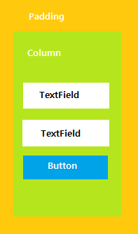
4. TextField
- Text를 사용자에게서 입력 받을 때 사용.
- decoration: UI 생성하는 기능
- obscureText: 입력받은 글자를 안 보이게 하는 기능
body: Column(
	children: [
		Text(
        	"Hello world",
            style: Textstyle(fontSize: 28),
        ),
        TextField(
        	decoration: InputDecoration(
        		labelText: "이메일"
        	),
        ),
        TextField(
        	obscureText: true
        	decoration: InputDecoration(
        		labelText: "비밀번호"
        	),
        ),
       ],
      )
     )
5. Button
-
버튼
1) 볼록버튼
2) 텍스트 버튼
3) 아이콘 버튼 -
onpressed : 클릭이벤트를 처리하는 역할
-
child : 버튼 속의 내용.
// 볼록 버튼
ElevatedButton(
  onPressed: () {},//클릭 이벤트
  child: Text('Elevated Button'), //버튼 속 내용
),

// 텍스트 버튼
TextButton(
  onPressed: () {},
  child: Text('Text Button'),
),

// 아이콘 버튼
IconButton(
  onPressed: () {},
  icon: Icon(Icons.add),
),
6.Appbar
- 상단의 appbar와 관련된 위젯
- centerTitle: true, // 가운데 정렬
AppBar(
	centerTitle: true, // 가운데 정렬
	title: Text(
	"Hello world",
    style: TextStyle(fontsize: 28),
    ),
),
body column ~
7. Padding
- 위젯과 가장자리 사이의 여백 조절하는 기능
- wrap with padding : padding으로 감싸기
- EdgeInsets :
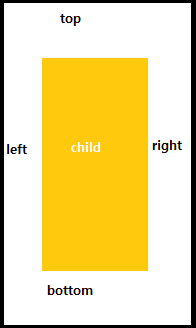
1) 모든 방향에 적용
EdgeInsect.all(5)2) 특정한 방향에만 적용
EdgeInsect.only(
	left: 8,
    right: 8,
)
3) 위아래 또는 좌우 적용
EdgeInscets.symmrtric(
	vertical: 8,
    horizontal: 8,
)
~//Appbar
body : Padding(
padding: const EdgeInsets.all(10),
child: Column(
children: [
TextField(
decoration: InputDecoration(
labelText: "이메일:,
),8. Container
-
섹션을 지정 (여러 children을 모아 하나의 섹션으로 만들어 줌)
-
예를 들어, body에서 section1, section2...
-
자식 위젯들을 커스터마이징 할 수 있는 위젯 클래스
-
여백, 간격, 테두리, 배경색 추가를 할 수 있음
-
wrap with Container
Container(
  width: 200, // 폭
  height: 200, // 높이
  color: Colors.amber, // 박스 색상
  child: Text("I Love Flutter!"), // 자식 위젯
),- width: double.infinity : 폭과 버튼이 최대크기로 변경됨
- margin: container 바깥 부분에 여백을 추가할 때 사용
9. 이미지 추가
- Image.network("URL") : 이미지 추가
- SingleChildScrollView: child가 화면에 넘칠 때, 스크롤하여 이미지를 볼 수 있게 함.
참고 - https://flutter-ko.dev/docs/development/ui/layout
- https://nero-angela.notion.site/Flutter-1-bd4444b5745444e8a777bd543b8529f4#18c9bee537934099ad1dbae3071b954b
공부에는 끝이 없다