Modal 적용하는 3가지 방법
들어가며
클론 코딩으로 시작하는 Next.js에서, Modal을 구현하는 방법에 대해 적혀져있었다. 그동안 계속 컴포넌트내에서 state를 활용한 Modal만 사용하다가 여러 방법이 있어서 이참에 정리해보았다.
모달이란?
Modal: 화면 위에 화면을 띄워 사용자의 이목을 집중시키는 방식

위와 같은 화면을 Modal이라고 부른다.
주로 회원가입, 로그인 화면을 띄울 때 사용한다.
컴포넌트 내에서 적용하기
가장 간단한 방법으로, boolean값과 Modal Element의 position을 fixed로 주어 나타내는 방법이다.
회원가입이나 로그인 버튼을 누르면 boolean을 true로, Modal 창의 X 버튼을 누르면 false로 하는 식으로 구현한다.
- 장점: 간단하게 만들 수 있다.
- 단점: 매번 새롭게 만들어야 한다.
2. 리액트 포털 사용하기
React Portal?
포털: 부모 컴포넌트의 DOM 계층 외부에 있는 DOM 노드로 자식을 렌더링하는 방법
컴포넌트를 부모 컴포넌트 바깥에 렌더링 해준다.
여기서 바깥은 부모 컴포넌트와 형제 관계 위치에서 렌더링을 해준다는 것이다.
<div id="root">...</div>
<div id="modal">...</div>
root와 modal은 형제처럼 보이지만 실제 React 코드 내에선 modal은 root 안에서 보여지는 자식 컴포넌트이고, 렌더링만 root의 바깥에서 이루어지고 있다.
사용하는 이유
React는 렌더링의 구조가 tree구조로, 부모 컴포넌트가 렌더링된 후 자식 컴포넌트가 렌더링이 된다.
그러나 이런 특징이 불편함을 줄 때도 있다. 예를 들어, modal은 부모 컴포넌트의 style 속성에 제약을 받아 modal style 디자인을 할 때 후처리를 해주어야 한다.
위와 같은 상황에선 portal을 통해 독립적인 구조(형제 관계) & 부모-자식 관계를 동시에 유지하는 방법이 더 유용하다.
사용 방법
ReactDOM.createPortal(child, container)- 첫 번째 인자로 리액트 컴포넌트를 받는다.
- 두 번째 인자로 리액트 컴포넌트를 넣을 DOM을 받는다.
(1) Modal이 렌더링 될 위치 지정하기
// pages/_app.tsx
const app = ({Component,pageProps}: AppProps) => {
 return (
 	<>
   	  <GlobalStyle />
   	  <Component {...pageProps} />
      <div id="modal" />
    </>
 );
}
pages/_app.tsx에 Modal이 렌더링되도록 하였다(root에 렌더링되도록)
(2) Modal 컴포넌트를 만들어, child로 컴포넌트를 받아 div id="modal"에 렌더링 되도록 하기
// components/Modal.tsx
// styled-components 생략

// children props type 지정, ReactNode 내에는 string, number 등등이 있음
interface IProps {
  children: React.ReactNode;
  closePortal: () => void;
}

// props.children: 태그와 태그 사이의 모든 내용을 표시하기 위해 사용되는 특수한 props
function Modal({ children, closePortal }: IProps) {

  // 값 저장 용도라면 string, number 등으로 / DOM 접근 용도라면 Element
  const ref = useRef<Element | null>(); // querySelector에 마우스를 올리면 Element
  const [mounted, setMounted] = useState(false);

  useEffect(() => {
    setMounted(true);
    if (document) { // DOM이 존재한다면?
      const dom = document.querySelector('#modal');
      ref.current = dom;
    }
  }, []);

  if (ref.current && mounted) {
    return createPortal(
      <Container>
        <BackGround onClick={closePortal} />
        {children}
      </Container>,
      ref.current,
    );
  }
  return null;
}

export default Modal;
(3) SignUp 컴포넌트를 만들고 Modal props.children으로 전달
// SignUp Component의 코드는 생략
// components/Header.tsx

/* ... */
  {modalOpened && (
    <Modal closePortal={() => setModalOpened(false)}>
      <SignUp /> // Modal의 props.children으로 들어감
    </Modal>
  )}
</Container>
결과
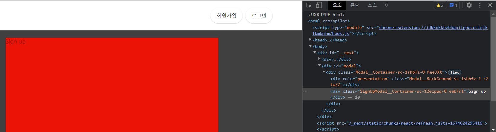
결과를 보면 div id='modal'의 자식으로 Modal을 작성하지 않았는데 React Portal에 의해 Modal이 자식으로 렌더링 된 것을 볼 수 있다.
단점
부모에 상태를 하나 만들고 props로 mordalOpened state를 바꾸는 함수를 전달해야해서 번거롭다.
3. Hooks로 만들기
가장 재사용성과 코드 가독성이 높은 방법이다.
hooks 폴더 내에 커스텀 hooks을 만든다.
// hooks/useModal.tsx
import React, { useRef, useEffect, useState } from 'react';
import { createPortal } from 'react-dom';
import styled from 'styled-components';

const Container = styled.div`
  width: 100%;
  height: 100%;
  display: flex;
  justify-content: center;
  align-items: center;
  position: fixed;
  top: 0;
  left: 0;
  z-index: 11;
`;

const Background = styled.div`
  position: absolute;
  width: 100%;
  height: 100%;
  background-color: rgba(0, 0, 0, 0.75);
`;

const useModal = () => {
  const [modalOpened, setModalOpened] = useState(false);
  const openModal = () => {
    setModalOpened(true);
  };

  const closeModal = () => {
    setModalOpened(false);
  };

  interface IProps {
    children: React.ReactNode;
  }

  function ModalPortal({ children }: IProps) {
    const ref = useRef<Element | null>();
    const [mounted, setMounted] = useState(false);

    useEffect(() => {
      setMounted(true);
      if (document) {
        const dom = document.querySelector('#modal');
        ref.current = dom;
      }
    }, []);

    if (ref.current && mounted && modalOpened) {
      return createPortal(
        <Container>
          <Background onClick={closeModal} />
          {children}
        </Container>,
        ref.current,
      );
    }
    return null;
  }

  return {
    openModal,
    closeModal,
    ModalPortal,
  };
};

export default useModal;
useModal을 사용하여 모달을 열고 닫는 함수와 모달 콘텐츠를 표시해줄 컴포넌트를 불러올 수 있다.
// components/Header.tsx
import Link from 'next/link';
import React from 'react';
import styled from 'styled-components';
import Airbnb from './svg/Airbnb';
import SignUpModal from './auth/SignUpModal';
import useModal from '@/hooks/useModal';

/* ... */

function Header() {
  const { openModal, ModalPortal } = useModal();
  return (
    <Container>
      <Link href="/">
        <LogoWrapper>
          <Airbnb />
        </LogoWrapper>
      </Link>
      <Auth>
        <Signup onClick={openModal}>회원가입</Signup>
        <Signin>로그인</Signin>
      </Auth>
      <ModalPortal>
        <SignUpModal />
      </ModalPortal>
    </Container>
  );
}

export default Header;
useModal Hook을 통해 모달을 여닫는 것과 콘텐츠를 띄우는 것을 한 줄로 표현할 수 있다.
