시작에 앞서,
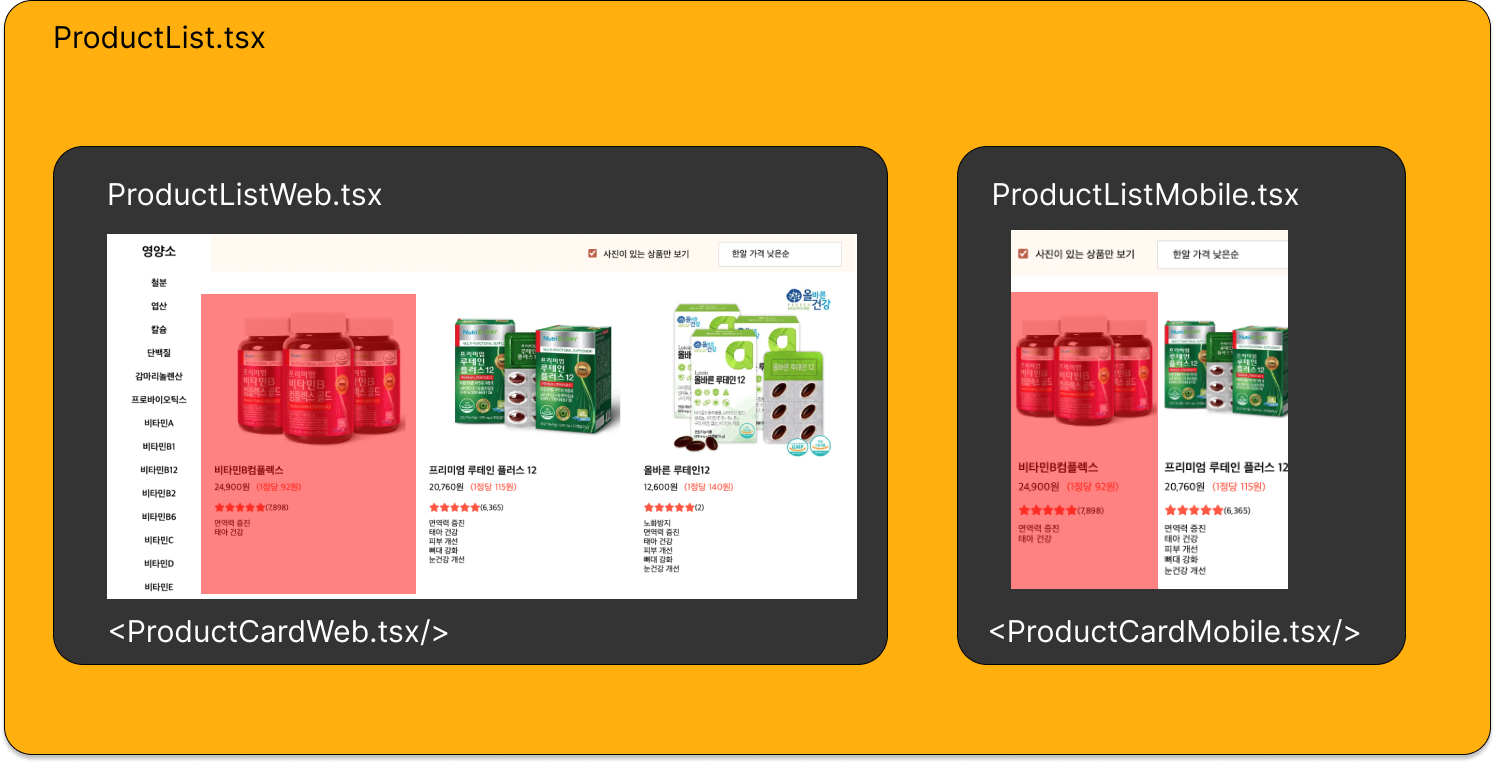
필잇 프로젝트를 진행하면서 모바일과 웹버전에 각각 크기에 맞는 Product Card 컴포넌트를 제작해야 했다. 현재는 모바일 버전과 pc버전을 각각 제작을 하다보니 수정을 할때 두번씩 수정해야한다는 문제점이 생겼다. 예를들어, 1정당 가격을 빨간색으로 수정을 하거나 건강목표 대신 핵심성분으로 수정을 할때마다 product-card-web, product-card-mobile 두개의 컴포넌트에 각각 들어가서 로직을 변경했고, 두번씩 수정을 해야해서 번거로운것 뿐 아니라 오류가 생길 가능성이 그만큼 늘기 때문에 이점을 수정하고자 한다.
처음에 이걸 두개로 제작을 한 이유는 가로 사이즈에 따라 변경 가능한 component를 개발할줄 몰라서였다. 공부를 하던중, styled-component에 prop을 전달해서 클라이언트의 가로 사이즈에 맞는 컴포넌트가 개발 가능하다는 사실을 알게 되었고 내 프로젝트에 적용하면 딱이다 싶어서 적용을 해보려한다.
Styled-components란?
이번 프로젝트에 styled-components를 적용해서 디자인을 적용했는데, styled-component란 CSS in JavaScript 기술로, 자바스크립트 내에 CSS를 작성하는 라이브러리다. 스타일 정의를 CSS파일이 아닌 JavaScript로 작성된 컴포넌트에 바로 삽입하는 스타일 기법이다.
Styled-component의 가장 큰 장점은, 자바스크립트 파일 내에 존재하기 때문에 유지 보수가 쉽다는것이다. 기존에 css를 보면, style.css파일에 css파일이 존재하고, class name을 통해 연동을 해서 css를 입히기 때문에, html에 있는 클래스 이름을 기억해서 css파일에서 찾아서 수정을 해야했던 것에 비해, styled component는 보통 같은 파일내이 존재하고, 만약 파일이 너무 커지면 같인 폴더 내에 파일을 배치하는것이 권장되기 때문에 멀지 않은곳에서 찾을 수 있다.
또한, 일반적인 css를 사용할 경우, 계속해서 클래스 이름을 생각해서 만들어 내야하는데, 프로젝트의 크기가 커질수록 중복이 되는 클래스 이름을 실수로 만들수도 있다. 하지만 styled-components는 새로운 모델을 생성할때마다 임의의 클래스 이름을 부여해서 사용자가 보다 쉽게 컴포넌트를 만들고 수정할 수 있게 만들어준다.
스타일 컴포넌트 작성 방법
import styled from 'styled-components'
const Base = styled.div`
	width: 100vw;
	height: 100vh;
	display: flex;
	justify-content: center;
	align-item: center;
`
const StyledButton = styled.button`
	width: 100px;
	height: 40px;
	border: none;
	background-color: tomato;
`

function Home(){
	return (
    	<Base>
      		<StyledButton>카운터</StyledButton>
      </Base>
    );
}
이런식으로 작성하면 Home이라는 함수에서 Base와 StyledButton을 불러와서 css를 입히는 방식이다. 이때 props를 각 컴포넌트에게 전달해서 가로사이즈를 조정하거나 폰트사이즈를 조정할 수 있다
import styled from 'styled-components'
import { useMediaQuery } from "react-responsive";


const Base = styled.div`
	width: 100vw;
	height: 100vh;
	display: flex;
	justify-content: center;
	align-item: center;
`
const StyledButton = styled.button`
	width: ${(props)=> props.isMobile ? 50px : 100px };
	height: 40px;
	border: none;
	background-color: tomato;
`

function Home(){
  	//화면이 600px보다 작은지 아닌지 알아내는 함수
    const isMobile = useMediaQuery({
    query: "(max-width:600px)",
  });
	return (
    	<Base>
      		<StyledButton isMobile={imMobile}>카운터</StyledButton>
      </Base>
    );
}
위에 함수를 보면 Styled Button 에 isMobile 메소드를 전달해서 모바일이라면 가로사이즈 50px짜리 버튼을, 아닐 경우엔 100px의 버튼을 생성하는 예시이다.
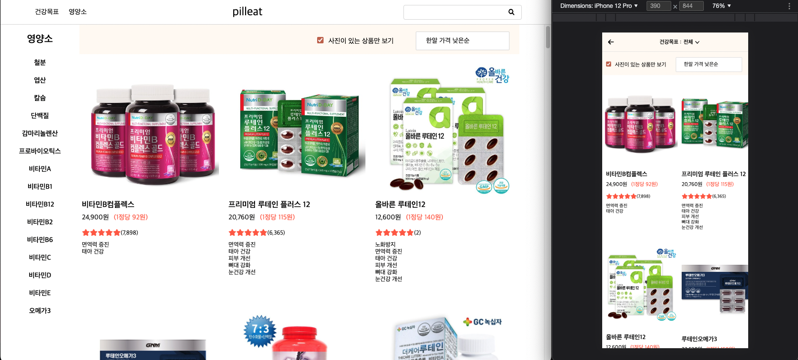
AS-IS
본격적으로 현재 상태와 어떻게 컴포넌트를 재활용할지를 생각해보자.
현재 폴더 트리를 보면 이렇다
위에 빨간 영역이 각각 왼쪽이 웹, 오른쪽이 모바일이고 코드를 보면 이렇다
import styled from "styled-components";
import { Link } from "react-router-dom";
import { numberWithCommas } from "./Functions";
import { FontAwesomeIcon } from "@fortawesome/react-fontawesome";
import { faStar } from "@fortawesome/free-solid-svg-icons";

const ProductCard = styled.div`
  overflow: hidden;
  display: flex;
  flex-direction: column;
  flex-grow: 1;
  margin: 20px 5px;
  flex-basis: 270px;

  :hover {
    cursor: pointer;
  }
  img {
    width: 100%;
    height: 100%;
    background-color: white;
    border: none;
  }
`;

const ProductCardImageBox = styled.div`
  min-height: 240px;
  height: 100%;
  max-height: 280px;

  img {
    width: 100%;
    height: 100%;
    object-fit: contain;
  }
  div {
    display: flex;
    justify-content: center;
    align-items: center;
    background-color: white;
  }
`;

const ProductNoImage = styled.div`
  width: 100%;
  height: 100%;
  display: flex;
  justify-content: center;
  align-items: center;
  img {
    width: 100%;
    height: 100%;
    object-fit: contain;
  }
`;

const ProductTextBox = styled.div`
  width: 100%;
  height: 70%;
  padding: 10px 0px;
  h1 {
    font-size: 16px;
    margin-bottom: 10px;
    font-weight: 600;
  }

  span {
    margin-bottom: 10px;
    font-size: 12px;
  }
`;

const PriceBox = styled.div`
  width: 100%;
  display: flex;
`;

const PillPrice = styled.p`
  font-size: 14px;
  margin-bottom: 16px;
  color: tomato;
  margin-left: 10px;
`;

const ReviewBox = styled.div`
  width: 100%;
  display: flex;
  span {
    margin-top: 3px;
  }
`;

function ProductCardWeb({
  id,
  thumbnail,
  name,
  price,
  pillPrice,
  coupangReviewCount,
  featureArray,
  productShapeConditionName,
}: {
  id: string;
  thumbnail: string;
  name: string;
  price: string;
  pillPrice: string;
  coupangReviewCount: string;
  featureArray: any[];
  productShapeConditionName: string;
}) {
  return (
    <>
      <Link to={`/product/${id}`} key={id}>
        <ProductCard>
          <ProductCardImageBox>
            {thumbnail === null ? (
              <ProductNoImage>
                <img src="https://buytamine.s3.ap-northeast-2.amazonaws.com/img/shared/noImage200.png"></img>
              </ProductNoImage>
            ) : (
              <img src={thumbnail}></img>
            )}
          </ProductCardImageBox>
          <ProductTextBox>
            <h1>{name}</h1>

            {price ? (
              <PriceBox>
                {price ? <p>{numberWithCommas(price)}원</p> : null}
                {pillPrice ? (
                  productShapeConditionName === "분말" ? (
                    <PillPrice>
                      (10g당 {numberWithCommas(pillPrice)}원)
                    </PillPrice>
                  ) : (
                    <PillPrice>
                      (1정당 {numberWithCommas(pillPrice)}원)
                    </PillPrice>
                  )
                ) : null}
              </PriceBox>
            ) : null}
            <ReviewBox>
              <FontAwesomeIcon color="tomato" icon={faStar}></FontAwesomeIcon>
              <FontAwesomeIcon color="tomato" icon={faStar}></FontAwesomeIcon>
              <FontAwesomeIcon color="tomato" icon={faStar}></FontAwesomeIcon>
              <FontAwesomeIcon color="tomato" icon={faStar}></FontAwesomeIcon>
              <FontAwesomeIcon color="tomato" icon={faStar}></FontAwesomeIcon>
              {coupangReviewCount ? (
                <span>({numberWithCommas(coupangReviewCount)})</span>
              ) : null}
            </ReviewBox>

            <div>
              {featureArray.length > 0
                ? featureArray.map((feature) => (
                    <div key={feature.id}>
                      <span>{feature?.displayText}</span>
                    </div>
                  ))
                : null}
            </div>
          </ProductTextBox>
        </ProductCard>
      </Link>
    </>
  );
}

export default ProductCardWeb;
import styled from "styled-components";
import { Link } from "react-router-dom";
import { numberWithCommas } from "./Functions";
import { FontAwesomeIcon } from "@fortawesome/react-fontawesome";
import { faStar } from "@fortawesome/free-solid-svg-icons";

const ProductCard = styled.div`
  overflow: hidden;
  display: flex;
  flex-direction: column;
  flex-grow: 1;
  margin: 0px;
  flex-basis: 150px;

  :hover {
    cursor: pointer;
  }
  img {
    width: 100%;
    height: 100%;
    background-color: white;
    border: none;
  }
`;

const ProductCardImageBox = styled.div`
  min-height: 240px;
  height: 100%;
  max-height: 280px;

  img {
    width: 100%;
    height: 100%;
    object-fit: contain;
    top: 0;
  }
  div {
    width: 100%;
    height: 100%;
    display: flex;
    justify-content: center;
    align-items: center;
    background-color: white;
  }
`;

const ImageBox = styled.div`
  min-height: 240px;
  height: 100%;
  max-height: 280px;

  img {
    width: 100%;
    height: 100%;
    object-fit: contain;
    position: relative;
  }
`;

const HfMark = styled.div`
  width: 20px;
  height: 20px;
  position: absolute;
  z-index: 10;
  right: 0;
  top: 0;
  img {
    width: 100%;
    height: 100%;
    object-fit: contain;
  }
`;

const ProductNoImage = styled.div`
  width: 100%;
  height: 100%;
  display: flex;
  justify-content: center;
  align-items: center;
  img {
    width: 100%;
    height: 100%;
    object-fit: contain;
  }
`;

const ProductTextBox = styled.div`
  width: 100%;
  height: 70%;
  padding: 10px 10px;
  h1 {
    font-size: 16px;
    margin-bottom: 10px;
    font-weight: 600;
  }

  span {
    margin-bottom: 10px;
    font-size: 12px;
  }
`;

const PriceBox = styled.div`
  width: 100%;
  display: flex;
`;

const PillPrice = styled.p`
  font-size: 14px;
  margin-bottom: 16px;
  color: tomato;
  margin-left: 10px;
`;

const ReviewBox = styled.div`
  width: 100%;
  display: flex;
  span {
    margin-top: 3px;
  }
`;

function ProductCardMobile({
  id,
  thumbnail,
  name,
  price,
  pillPrice,
  coupangReviewCount,
  featureArray,
  productShapeConditionName,
}: {
  id: string;
  thumbnail: string;
  name: string;
  price: string;
  pillPrice: string;
  coupangReviewCount: string;
  featureArray: any[];
  productShapeConditionName: string;
}) {
  return (
    <>
      <Link to={`/product/${id}`} key={id}>
        <ProductCard>
          <ProductCardImageBox>
            {thumbnail === null ? (
              <ProductNoImage>
                <img src="https://buytamine.s3.ap-northeast-2.amazonaws.com/img/shared/noImage200.png"></img>
              </ProductNoImage>
            ) : (
              <ImageBox>
                <img src={thumbnail}></img>
              </ImageBox>
            )}
          </ProductCardImageBox>
          <ProductTextBox>
            <h1>{name}</h1>

            {price ? (
              <PriceBox>
                {price ? <p>{numberWithCommas(price)}원</p> : null}
                {pillPrice ? (
                  productShapeConditionName === "분말" ? (
                    <PillPrice>
                      (10g당 {numberWithCommas(pillPrice)}원)
                    </PillPrice>
                  ) : (
                    <PillPrice>
                      (1정당 {numberWithCommas(pillPrice)}원)
                    </PillPrice>
                  )
                ) : null}
              </PriceBox>
            ) : null}
            <ReviewBox>
              <FontAwesomeIcon color="tomato" icon={faStar}></FontAwesomeIcon>
              <FontAwesomeIcon color="tomato" icon={faStar}></FontAwesomeIcon>
              <FontAwesomeIcon color="tomato" icon={faStar}></FontAwesomeIcon>
              <FontAwesomeIcon color="tomato" icon={faStar}></FontAwesomeIcon>
              <FontAwesomeIcon color="tomato" icon={faStar}></FontAwesomeIcon>
              {coupangReviewCount ? (
                <span>({numberWithCommas(coupangReviewCount)})</span>
              ) : null}
            </ReviewBox>

            <div>
              {featureArray.length > 0
                ? featureArray.map((feature) => (
                    <div key={feature.id}>
                      <span>{feature?.displayText}</span>
                    </div>
                  ))
                : null}
            </div>
          </ProductTextBox>
        </ProductCard>
      </Link>
    </>
  );
}

export default ProductCardMobile;
두가지 컴포넌트의 차이는
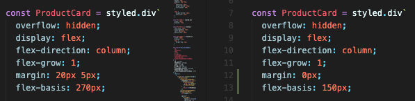
flex basis와 margin인데, 저 두개의 요소 때문에 컴포넌트를 두개로 만드는건 상당한 비효율이라고 생각하기 때문에 두가지 요소를 합쳐서 ProductCard 컴포넌트로 통일하면서 양쪽에서도 잘 반응하는 컴포넌트를 만드려 한다.
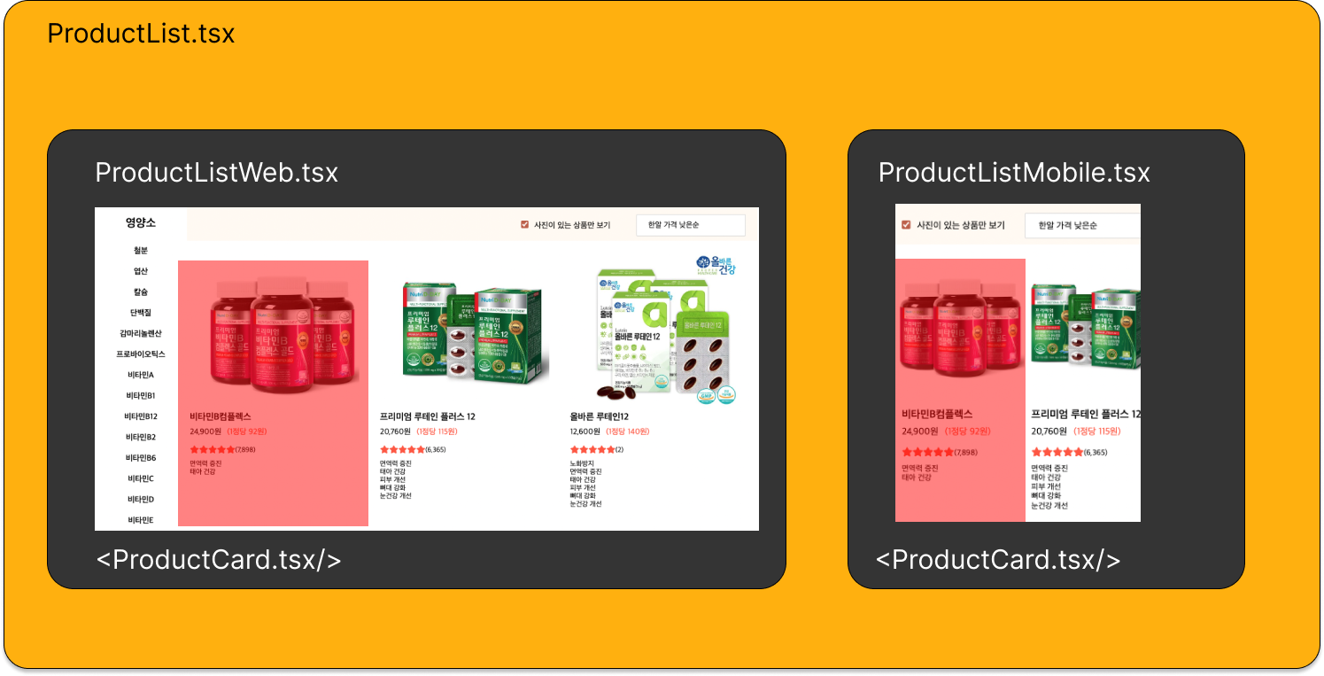
TO-BE
앞선 포스팅에서 알 수 있듯, 목표는 한가지 컴포넌트로 통일하면서 화면 사이즈에 맞는 프러덕트 카드를 구현하는 것이다.
import styled from "styled-components";
import { Link } from "react-router-dom";
import { numberWithCommas } from "./Functions";
import { FontAwesomeIcon } from "@fortawesome/react-fontawesome";
import { faStar } from "@fortawesome/free-solid-svg-icons";

interface IContainerProps {
  flexBasis: string;
  marginTop: string;
  marginLeft: string;
}

const ProductCard = styled.div<IContainerProps>`
  overflow: hidden;
  display: flex;
  flex-direction: column;
  flex-grow: 1;
  margin: ${(props) => props.marginTop} ${(props) => props.marginLeft};
  flex-basis: ${(props) => props.flexBasis};

  :hover {
    cursor: pointer;
  }
  img {
    width: 100%;
    height: 100%;
    background-color: white;
    border: none;
  }
`;

const ProductCardImageBox = styled.div`
  min-height: 240px;
  height: 100%;
  max-height: 280px;

  img {
    width: 100%;
    height: 100%;
    object-fit: contain;
  }
  div {
    display: flex;
    justify-content: center;
    align-items: center;
    background-color: white;
  }
`;

const ProductNoImage = styled.div`
  width: 100%;
  height: 100%;
  display: flex;
  justify-content: center;
  align-items: center;
  img {
    width: 100%;
    height: 100%;
    object-fit: contain;
  }
`;

const ProductTextBox = styled.div`
  width: 100%;
  height: 70%;
  padding: 10px 0px;
  h1 {
    font-size: 16px;
    margin-bottom: 10px;
    font-weight: 600;
  }

  span {
    margin-bottom: 10px;
    font-size: 12px;
  }
`;

const PriceBox = styled.div`
  width: 100%;
  display: flex;
`;

const PillPrice = styled.p`
  font-size: 14px;
  margin-bottom: 16px;
  color: tomato;
  margin-left: 10px;
`;

const ReviewBox = styled.div`
  width: 100%;
  display: flex;
  span {
    margin-top: 3px;
  }
`;

function ProductCardWeb({
  id,
  thumbnail,
  name,
  price,
  pillPrice,
  coupangReviewCount,
  featureArray,
  productShapeConditionName,
  flexBasis,
  marginTop,
  marginLeft,
}: {
  id: string;
  thumbnail: string;
  name: string;
  price: string;
  pillPrice: string;
  coupangReviewCount: string;
  featureArray: any[];
  productShapeConditionName: string;
  flexBasis: string;
  marginLeft: string;
  marginTop: string;
}) {
  return (
    <>
      <Link to={`/product/${id}`} key={id}>
        <ProductCard
          flexBasis={flexBasis}
          marginTop={marginTop}
          marginLeft={marginLeft}
        >
          <ProductCardImageBox>
            {thumbnail === null ? (
              <ProductNoImage>
                <img src="https://buytamine.s3.ap-northeast-2.amazonaws.com/img/shared/noImage200.png"></img>
              </ProductNoImage>
            ) : (
              <img src={thumbnail}></img>
            )}
          </ProductCardImageBox>
          <ProductTextBox>
            <h1>{name}</h1>

            {price ? (
              <PriceBox>
                {price ? <p>{numberWithCommas(price)}원</p> : null}
                {pillPrice ? (
                  productShapeConditionName === "분말" ? (
                    <PillPrice>
                      (10g당 {numberWithCommas(pillPrice)}원)
                    </PillPrice>
                  ) : (
                    <PillPrice>
                      (1정당 {numberWithCommas(pillPrice)}원)
                    </PillPrice>
                  )
                ) : null}
              </PriceBox>
            ) : null}
            <ReviewBox>
              <FontAwesomeIcon color="tomato" icon={faStar}></FontAwesomeIcon>
              <FontAwesomeIcon color="tomato" icon={faStar}></FontAwesomeIcon>
              <FontAwesomeIcon color="tomato" icon={faStar}></FontAwesomeIcon>
              <FontAwesomeIcon color="tomato" icon={faStar}></FontAwesomeIcon>
              <FontAwesomeIcon color="tomato" icon={faStar}></FontAwesomeIcon>
              {coupangReviewCount ? (
                <span>({numberWithCommas(coupangReviewCount)})</span>
              ) : null}
            </ReviewBox>

            <div>
              {featureArray.length > 0
                ? featureArray.map((feature) => (
                    <div key={feature.id}>
                      <span>{feature?.displayText}</span>
                    </div>
                  ))
                : null}
            </div>
          </ProductTextBox>
        </ProductCard>
      </Link>
    </>
  );
}

export default ProductCardWeb;
이렇게 props를 통해 margin과 기본 길이를 컴포넌트에 parameter로 전달해주면 반응형 컴포넌트 제작이 가능하다.
마무리,
재사용 가능한 컴포넌트라고 한다면, 이렇게 여러가지 요소를 가지고와서 제작되는 컴포넌트 뿐 아니라 구매하기 버튼, 필터링 버튼 등, 자주 사용되는 버튼을 모바일과 웹 사이즈로 나누고, 스몰 미디엄 라지 등으로 각 버튼에 엄격함(strict)을 추가해서 전반적인 사이트를 일관성 있게 바꿀수 있다.
이러한 작업을 디자인 시스템이라고 하는데 일단 버튼부터라도 시작을 해서 전반적인 사이트의 통일감을 줘보는 작업을 해봐야겠다.