
📝 레이아웃
- 사전적 의미 : 배치, 정리
- 기술적 의미 : 구성 요소를 제한된 공간에 효율적으로 배치하는 것을 의미
📌 화면 배치 방법(형식) : display 속성
요소가 화면에 어떻게 보여질지 형식을 지정하는 속성
💡 block
화면을 수직 분할(행을 나눔)
- width / height 속성 사용 O
💡 inline
화면을 수평 분할
(하나의 행의 컬럼을 나눔 == 글자처럼 생각하면 됨)
+ width / height 속성 사용 X
💡 inline-block
inline의 수평 분할 + block의 크기 조정
💡 none
화면의 요소가 표시되지는 않으나 존재는 하고 있는 상태
💡 flex
요소의 정렬되는 방향, 요소 간의 간격을 유연하게 처리하는 형식
✏️ 예시
- html
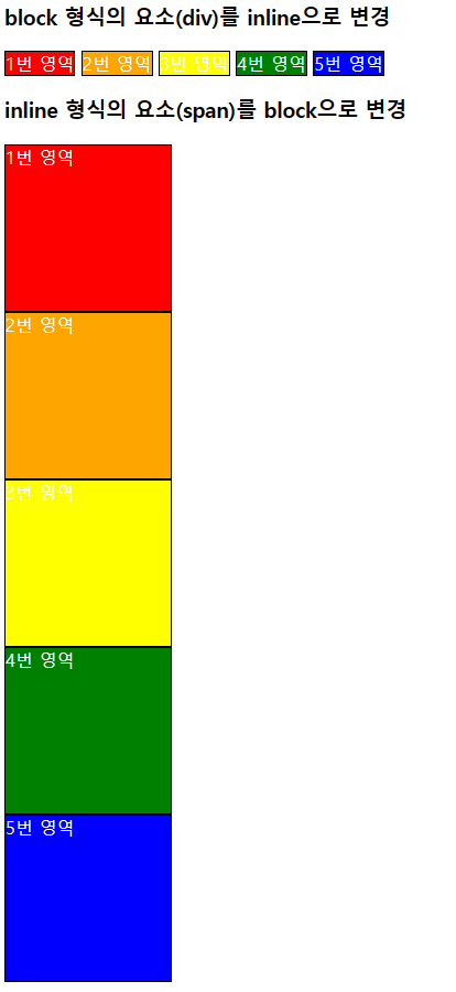
<h3>block 형식의 요소(div)를 inline으로 변경</h3>
<div class="block area1 inline">1번 영역</div>
<div class="block area2 inline">2번 영역</div>
<div class="block area3 inline">3번 영역</div>
<div class="block area4 inline">4번 영역</div>
<div class="block area5 inline">5번 영역</div>
<h3>inline 형식의 요소(span)를 block으로 변경</h3>
<span class="area1 block">1번 영역</span>
<span class="area2 block">2번 영역</span>
<span class="area3 block">3번 영역</span>
<span class="area4 block">4번 영역</span>
<span class="area5 block">5번 영역</span>
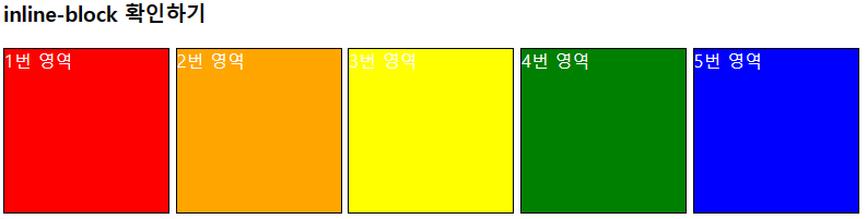
<h3>inline-block 확인하기</h3>
<div class="area1 block inline-block">1번 영역</div>
<div class="area2 block inline-block">2번 영역</div>
<div class="area3 block inline-block">3번 영역</div>
<div class="area4 block inline-block">4번 영역</div>
<div class="area5 block inline-block">5번 영역</div>- css
.area1{ background-color: red;}
.area2{ background-color: orange;}
.area3{ background-color: yellow;}
.area4{ background-color: green;}
.area5{ background-color: blue;}

.block{
    border: 1px solid black;
    width: 150px;
    height: 150px;
    color: white;

    display: block; /* 요소 형식을 block으로 변경 */
}

.inline{
    display: inline; /* 요소 형식을 inline으로 변경 */
}

.inline-block{
    display: inline-block;
    /* 요소 형식을 inline-block으로 변경 */
}
📌 화면(영역) 분할
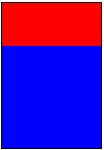
💡 상하 2분할
✏️ 준비물
- 감싸는 영역 요소
- 내부에 영역을 분할할 요소
- display : block
- 크기 단위(고정(px)/가변(%))
✏️ 예시
- html
    <!-- 감싸는 영역 요소 -->
    <div id="container-1">

        <!-- 내부에 영역을 분할할 요소 -->
        <div class="div-1"></div>
        <div class="div-1"></div>

</div>- css
/* 감싸는 영역 요소 */
#container-1{
    border: 3px solid black;
    width: 323px;
    height: 472px;
}

/* 내부에 영역을 분할할 요소 */
.div-1{
    /* 고정 크기 단위
    -> 감싸는 영역의 크기가 변하면 다시 계산(힘듦 ㅠㅠ)
    */

    /* width: 300px;
    height: 250px; */

    /* 가변 크기 단위(%)
    -> 화면이나 감싸는 영역의 크기에 비례해서 크기가 자동 계산
    */
    width: 100%; /* 323px * 100% / 100 = 323px */
    height: 50%; /* 472px * 50% / 100 = 236px */
}

/* 위쪽 분할 요소 */
#container-1 > .div-1:first-of-type{
    background-color: red;
    height: 30%;
}

/* 아래쪽 분할 요소 */
#container-1 > .div-1:last-of-type{
    background-color: blue;
    height: 70%;
}
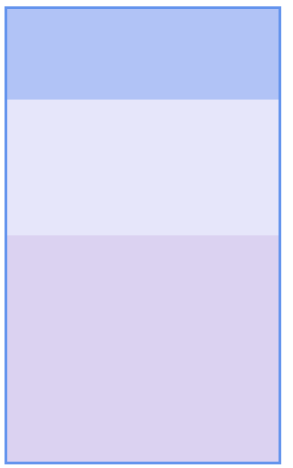
💡 상하 3분할
✏️ 준비물
- 감싸는 영역(부모) 요소 id : container-2
- 화면 분할 요소 class : div-2
- 분할 비율 -> 20 : 30 : 50
- 배경색 자유롭게
✏️ 예시
- html
    <!-- 감싸는 영역 요소 -->
    <div id="container-2">

        <!-- 내부에 영역을 분할할 요소 -->
        <div class="div-2"></div>
        <div class="div-2"></div>
        <div class="div-2"></div>

</div>- css
/* 상하 3분할(20:30:50) */
#container-2{
    border: 3px solid rgb(100, 148, 237);
    width: 300px;
    height: 500px;
}

/* block 형식의 요소는
    별도의 width가 지정되지 않으면 항상 100%다.
*/


/* .div2{
    width: 100%;
} */

#container-2 > .div-2:nth-child(1){
    background-color: rgba(100, 136, 237, 0.5);
    height: 20%;
}

#container-2 > .div-2:nth-child(2){
    background-color:lavender;
    height: 30%;
}

#container-2 > .div-2:nth-child(3){
    background-color:rgba(190, 173, 230, 0.548);
    height: 50%;
}
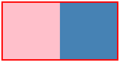
💡 좌우 2분할
✏️ 준비물
- 감싸는 영역 요소
- 내부에 영역을 분할할 요소
- 크기 단위(고정(px)/가변(%))
- display : inline-block (약간 문제점이 있을 수 있음)
✏️ 예시
- html
    <!-- 감싸는 영역 요소 -->
    <div id="container-3">

        <div class="div-3"></div><div class="div-3"></div>
        <!-- 내부의 두 요소 사이에 엔터 == 한 칸 띄어쓰기 -->
</div>- css
/* 좌우 2분할 */
#container-3{
    border: 5px solid red;
    width: 400px;
    height: 200px;
}

.div-3{ /* 내부 */
    width: 50%;
    height: 100%;

    display: inline-block;
}

#container-3 > .div-3:first-child{
    background-color: pink;
}

#container-3 > .div-3:last-child{
    background-color: steelblue;
}
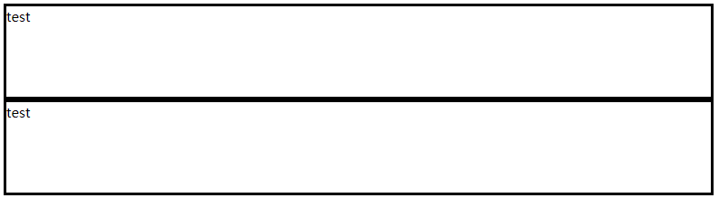
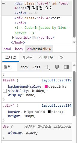
💡 display : none
요소는 존재하지만 화면에는 보이지 않음(투명 X)
-> visibility : hidden; (투명 O)
✏️ 예시
- html
    <div class="div-4">test</div>

    <div class="div-4" id="test4">css가 적용될 요소</div>

<div class="div-4">test</div>- css
/* display : none; visibility : hidden; */
.div-4{
    border: 3px solid black;
    height: 100px;
}

#test4{
    background-color: deeppink;

    /* 요소가 투명한 색으로 변했다! */
    /* visibility : hidden; */

    /* 요소는 존재하지만 화면에 보이지 않음(영역도 차지하지 않는다.) */
    display: none;
}
- 브라우저에서 f12를 눌러 개발자 도구로 보았을 때
풀스택 개발자 기록집 📁