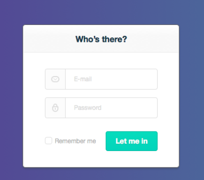
이미지 출처: https://dribbble.com/shots/1730719-Login-form
따라한 모습
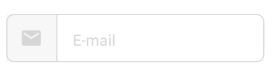
코드
@Composable
fun CustomTextField(
    placeHolderMsg: String,
    iconRes: ImageVector
) {
    val textState = remember { mutableStateOf(TextFieldValue()) }

    Row(
        modifier = Modifier
            .height(50.dp).width(270.dp)
            .border(1.dp, VeryLightGrey_type2, RoundedCornerShape(8.dp))
            .background(VeryLightGrey_type3),
        verticalAlignment = Alignment.CenterVertically
    ) {
        Box() {
            Icon(
                modifier = Modifier
                    .padding(start = 14.dp, end = 14.dp),
                imageVector = iconRes,
                contentDescription = iconRes.toString(),
                tint = VeryLightGrey_type2
            )
        }
        Divider(
            modifier = Modifier
                .fillMaxHeight()
                .width(1.dp)
        )
        TextField(
            value = textState.value,
            onValueChange = { textState.value = it },
            shape = RoundedCornerShape(4.dp),
            placeholder = { Text(placeHolderMsg) },
            singleLine = true,
            colors = TextFieldDefaults.textFieldColors(
                backgroundColor = Color.White,
                focusedIndicatorColor = Color.Transparent,
                unfocusedIndicatorColor = Color.Transparent,
                cursorColor = Color.Black,
                focusedLabelColor = Color.Black,
                unfocusedLabelColor = Color.LightGray,
                placeholderColor = VeryLightGrey_type2
            )
        )
    }
}
색상 theme/Color.kt
val VeryLightGrey_type2 = Color(0xFFD6D6D6)
val VeryLightGrey_type3 = Color(0xFFF7F7F7)
승언