CSS Flexbox
출처: https://studiomeal.com/archives/533
출처: https://studiomeal.com/archives/197
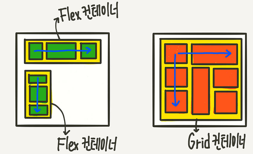
flexbox
- Element를 한 방향으로 정리 할 때 편리
- 한 방향 레이아웃 시스템(1차원)
container에 적용하는 속성들
.container {
	display: flex;
   	flex-direction: column; // flex아이템이 가로로 표시(option: row, row-reverse, column-reverse 등)
    flex-wrap: nowrap; // 화면 크기가 줄었을 때, flex아이템이 숨겨짐(option: nowrap, wrap 등)
    justify-content: flex-start; // float생각 하면 쉬움(flex-start==float: left),
    // (option: flex-start, flext-end, center,
	// space-between(item 사이의 빈 공간을 떨어트림),
    // space-around(between과 비슷한데, 양끝에 부분에도 여백을 줌))

	align-items: stretch; // justify-content가 가로축을 기준으로 하면, 세로축을 기준으로 정렬
    // (option: stretch, flex-start, flex-end, center)
    align-content: flext-start // flex-wrap: wrap 상태일때 사용
    //(option: flex-start,flex-end, center, space-between, space-around)
}
item에 적용하는 속성
.item {
	flex-grow: 1 // 여백을 각아이템이 비율에 맞춰 나눠가짐 (ex. item.nth-child(1) = 1,
	// item.nth-child(2) = 2, item.nth-child(3) = 1이면 1:2:1로 공간을 차지함)
    flex-basis: auto // (option: auto, 0)
    // 0으로 설정하면 전체를 0으로 해서 1:2:1로 나눠가짐
    flex-shrink: 1;
    align-self: center; // (option: flex-start, center, flex-end) 자기 자신의 정렬
    order: 1; // 배치 순서
}

좋은 소스 코드를 연구하는 개발자