[문제 복습 8/25일.금]
-
히스토그램은 자료가 연속적이여야 한다.
-
shape=cty에서만 에러남. (숫자라서)연속형
- ggplot(mpg,aes(displ,cty,shape=cty))+geom_point()
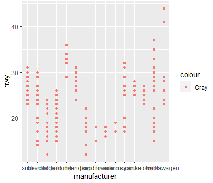
- 산점도 색상 그레이인가? -> (x)
- ggplot(data=mpg,aes(x=manufacturer, y=hwy, color="Gray"))+geom_point()
: aes(안에 들어가야한다.)
4.+labs 'gplot'라고 제목 추가하고 x,y축 라벨명 변경하고 싶다.
:xlabs( ), ylabs( ) / labs(title = 'gplot', x = , y = )
5.y:count , x:차종,
: ggplot(mpg,aes(x=manufacturer))+geom_bar()
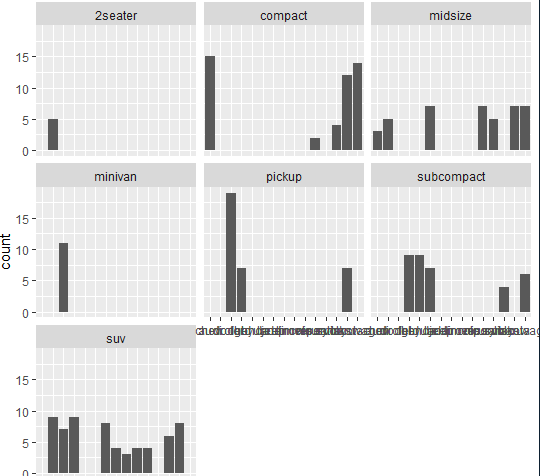
- ggplot(mpg, aes(manufacturer)) + geom_bar() + facet_wrap(vars(class)): class별로 따로따로 보겠다.
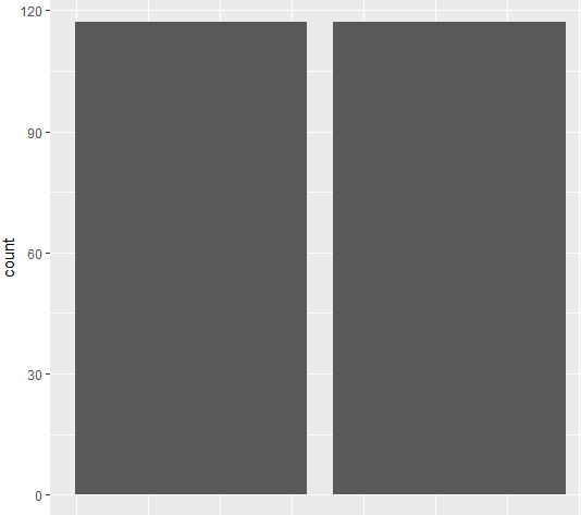
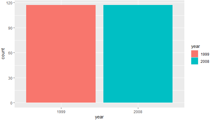
- ggplot(data=mpg,aes(x=year))+geom_bar()
-
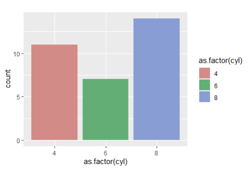
unique(mpg$year)#[1] 1999 2008 *year:int형 -
ggplot(mpg, aes(x = as.factor(year))) + geom_bar()
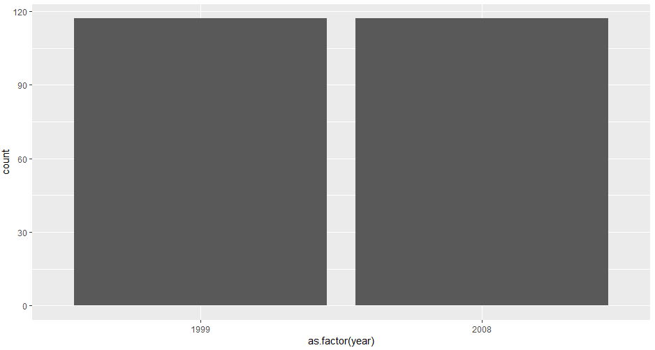
:mpg $ year<-as.factor(mpg $ year)
- ggplot(data=mpg,aes(x=year,fill=year))+geom_bar()
- ggplot(mpg,aes(x=class))+geom_histogram() <- 오류남
- ggplot(mpg,aes(x=class))+geom_histogram(
stat = "count")
- ggplot(drugs,aes(x=drug,y=effect)) + geom_bar() <-오류남
- ggplot(drugs,aes(x=drug,y=effect)) + geom_bar(s`tat='identity')
- ggplot(drugs,aes(x=drug,y=effect)) + geom_
col()
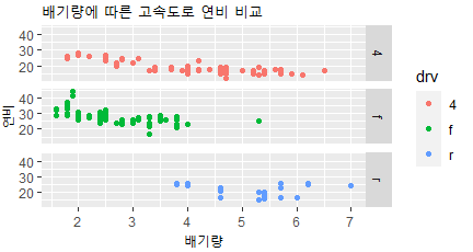
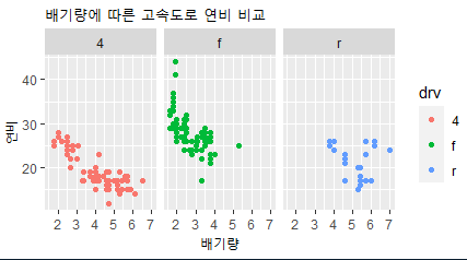
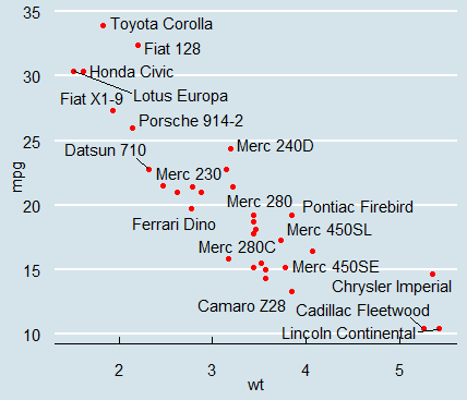
- ggplot(mpg, aes(x= displ, y= hwy, color= drv))+ geom_point() + labs(title= "배기량에 따른 고속도로 연비 비교", x= '배기량', y= '연비')
- ggplot(mpg, aes(x= displ, y= hwy, color= drv))+ geom_point() + labs(title= "배기량에 따른 고속도로 연비 비교", x= '배기량', y= '연비')+
facet_grid(drv~.)
- ggplot(mpg, aes(x= displ, y= hwy, color= drv))+ geom_point() + labs(title= "배기량에 따른 고속도로 연비 비교", x= '배기량', y= '연비')+
facet_wrap(.~ drv)
<진도>
-
install.packages("gapminder")
-
library(gapminder)
-
data(package="gapminder")
-
names(gapminder)
[1] "country" "continent"
[3] "year" "lifeExp"
[5] "pop" "gdpPercap" -
glimpse(gapminder)
Rows: 1,704
Columns: 6
$ country "Afghanist…
$ continent Asia, Asia…
$ year 1952, 1957…
$ lifeExp 28.801, 30…
$ pop 8425333, 9…
$ gdpPercap 779.4453, …
-
g <- gapminder %>%
filter(year == 2007) %>%
group_by(continent) %>%
summarise(lifeExp = median(lifeExp)) -
g
-
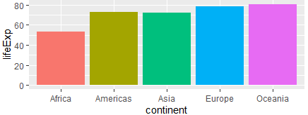
ggplot(g, aes(x=continent, y=lifeExp, fill=continent))+ geom_col()
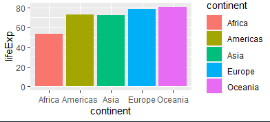
#범례 안보이게
ggplot(g, aes(x=continent, y=lifeExp, fill=continent))+ geom_col() + theme(legend.position = "none")
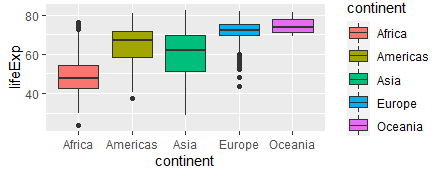
- gapminder |> ggplot( aes(x=continent, y=lifeExp, fill=continent))+
geom_boxplot()
-
install.packages("plotly")
-
library(plotly)
-
plotly
-
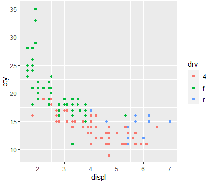
mpg |> ggplot(aes(x=displ,y=cty,color=drv))+geom_point()
-
ggplotly(mpg |> ggplot(aes(x=displ,y=cty,color=drv))+geom_point()):정보를 보여줌
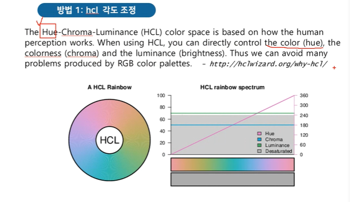
- Hue : 색을 다양하게
- mtcars $ cly=
as.factor(mtcars$cly) - mtcars $ cly
:> mtcars $ cyl
[1] 6 6 4 6 8 6 8 4 4 6 6 8 8
[14] 8 8 8 8 4 4 4 4 8 8 8 8 4
[27] 4 4 8 6 8 4
Levels: 4 6 8
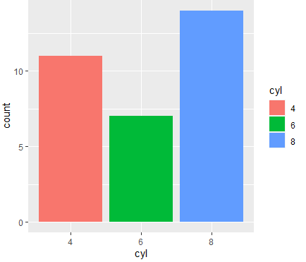
- ggplot(mtcars ,aes(x = cyl,fill=cyl)) + geom_bar()+
scale_color_hue(h= c(0,360)+5,c=50,l=65)
#FFFFFF
포토샵.색지정. hex.
<기본값>
-
ggplot(mtcars, aes(x=cyl,fill=cyl))+geom_bar()
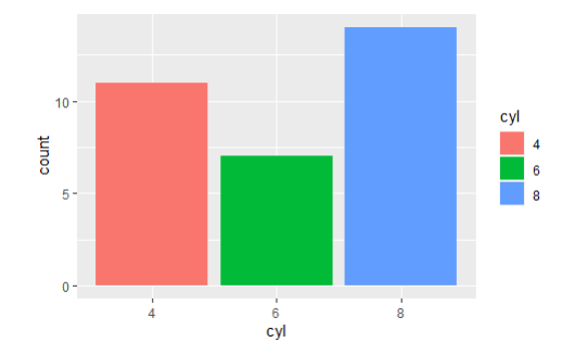
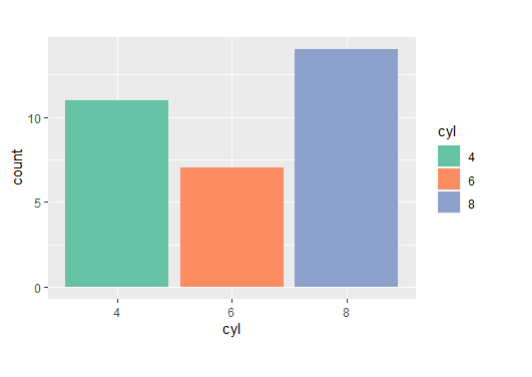
<hcl 각도조정>
-
ggplot(mtcars, aes(x=cyl,fill=cyl))+geom_bar()+
scale_fill_hue(h=c(180,300))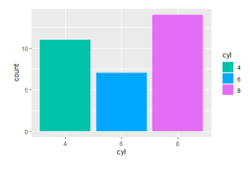
-
ggplot(mtcars, aes(x=cyl,fill=cyl))+geom_bar()+
scale_fill_hue(c=50)
<palette set이용>
-
ggplot(mtcars, aes(x=cyl,fill=cyl))+geom_bar()+
scale_fill_brewer(palette = "Set1")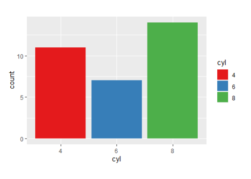
- ggplot(mtcars, aes(x=cyl,fill=cyl))+geom_bar()+
scale_fill_brewer(palette = "Set2")
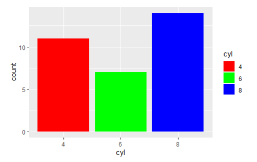
<직접지정>
ggplot(mtcars, aes(x=cyl,fill=cyl))+geom_bar()+scale_fill_manual(values = c("red","green","blue"))
<기본값>
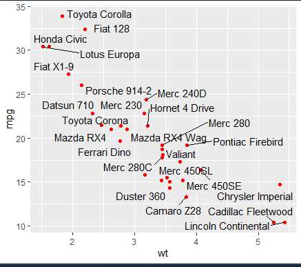
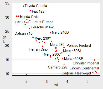
- ggplot(mtcars,aes(wt,mpg))+geom_point()
- ggplot(mtcars,aes(wt,mpg))+
geom_point(color='red') - ggplot(mtcars,aes(wt,mpg))+
geom_point(color='red')+
geom_text_repel(aes(label=rowname))
:텍스트를 label=rowname 값으로 만들겠다.
- ggplot(mtcars,aes(wt,mpg))+
geom_point(color='red')+
geom_text_repel(aes(label=rowname))+
theme_economist()
:배경 지정 값
- ggplot(mtcars,aes(wt,mpg))+
geom_point(color='red')+
geom_text_repel(aes(label=rowname))+
theme_economist_white()
:배경 흰색으로 지정 값
<한국복지패널 데이터 분석>
<성별에 따른 월급 차이>
(1). foregin 패키지 설치
- install.packages("fofreign")
- library(foreign)
- foreign
- library(dplyr)
- library(gglot2)
-[칼럼의 갯수, 변수의 갯수]
- colnames(welfare)
- ncol(welfare)
- dim(welfare)[2]
*length(names(welfare))
-[데이터 파악]
str(): 데이터 속성 출력
summary(): 요약통계량
names(): 이름만 추출
glimpse():
plot():
#spss 데이터 읽어오고 살펴보기
- raw_welfare <- read.spss("Koweps_hpc10_2015_beta1.sav")
#복사본 만들기
- welfare <- as.data.frame(raw_welfare)
#변수 이름바꾸기
-
welfare <- welfare %>%
rename( gender= h10_g3, birth= h10_g4,
marriage= h10_g10, religion= h10_g11,
income= p1002_8aq1, job= h10_eco9,
region= h10_reg7) %>%
select(gender, birth, marriage,
religion, income, job, region) -
welfare$income <- ifelse(
is.na (welfare $ income), 0, welfare $ income)
-
table(welfare $ gender)
-
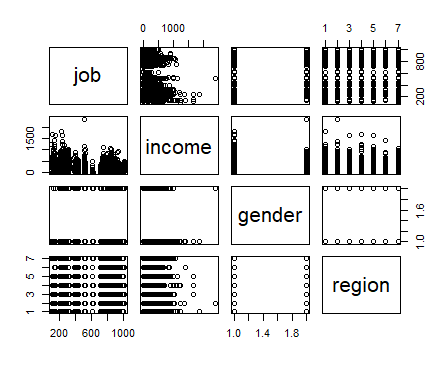
plot(welfare)
#유용한 데이터.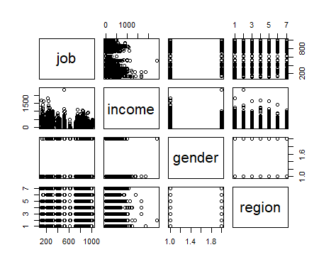
#[데이터 살펴보기]
-
pairs(job~ income+gender+region, data=welfare)
-
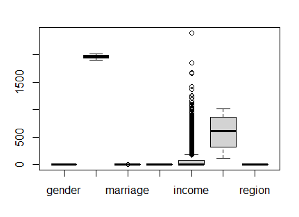
boxplot(welfare)
-
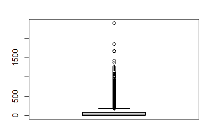
boxplot(welfare $ income)
-
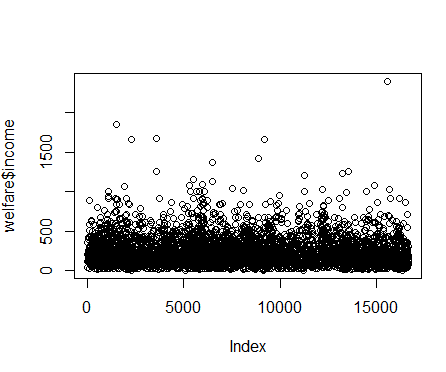
plot(welfare$income)
-
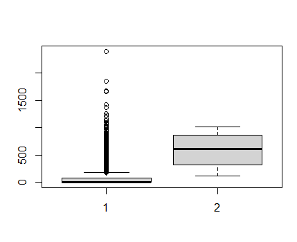
boxplot(welfare $ income, welfare $ job)
-
sum(is.na(welfare))
-
is.na(welfare)
-
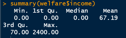
summary(welfare $ income)
-
mean(welfare $ income)
:[1] 67.1905 -
mean(welfare $ income, na.rm=T)
:[1] 67.1905 -
range(welfare $ income)
:[1] 0 2400 -
min(welfare $ income,na.rm=T)
:[1] 0 -
max(welfare $ income,na.rm=T)
:[1] 2400
#[성별로 이름 붙이기]
- welfaregender==1,"male","female")
- welfare$gender
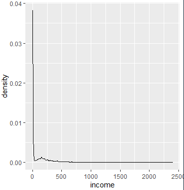
- ggplot(data=welfare,aes(x=income))+geom_density()
#남자따로 여자따로 구하기
-
ggplot(data=welfare,aes(x=income))+geom_density()
-
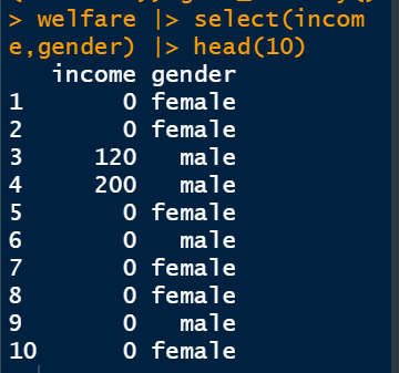
welfare |> select(income,gender) |> head(10)
-
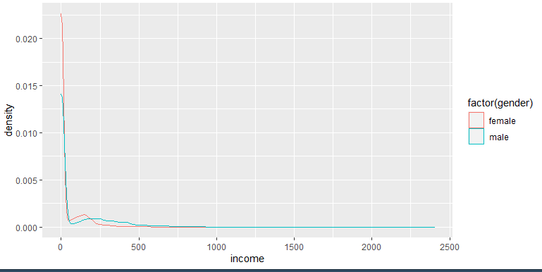
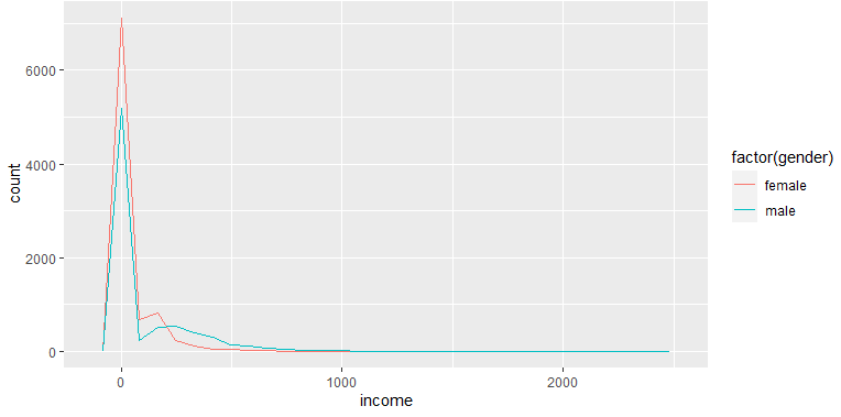
ggplot(data=welfare, aes(x=income,color= factor(gender)))+geom_density()
#빈도수 출력
- ggplot(data=welfare, aes(x=income,color= factor(gender)))+geom_freqpoly()
<데이터프레임으로 만들어 달라.>
-
table(welfare $ gender)

-
mode(table(welfare $ gender))

-
typeof(table(welfare $ gender))

-
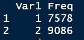
as.data.frame(table(welfare $ gender)) <- 데이터베이스 만드는법
-
gender <- as.data.frame(table(welfare $ gender))
-
gender
<막대그래프 그려주세요>
-
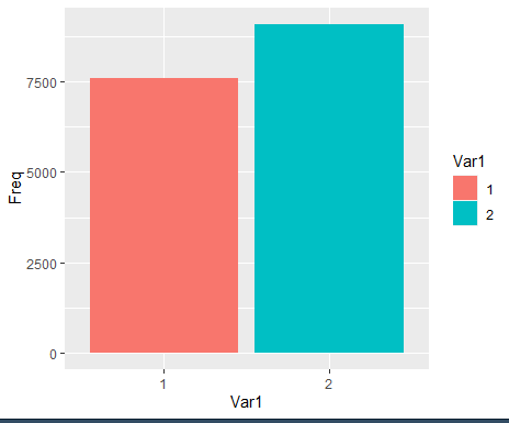
gender |> ggplot(aes(x=Var1,y=Freq ,fill=Var1))+geom_col()
-
gender %>% ggplot(
data= gander, aes(x=Var1,y=Freq ,fill=Var1))+geom_bar()<-오류임
-> x,y를 둘다 지정하면 col로 해야함.
-> 파이프를 넣을려면 data를 빼주어야 한다.
<칼럼이름바꾸기(성별,수입)>
-
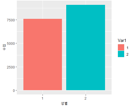
gender %>% ggplot(aes(x = Var1, y = Freq, fill = Var1)) + geom_col() +
labs(x = "성별", y = "수입")
-
names (gender) <- c("성별","수입")
*gender

-
gender %>% ggplot(aes(x = 성별, y = 수입, fill = 성별)) + geom_col()

<색추가해라>
- ggplot(data=welfare, aes(x=gender))+geom_bar()
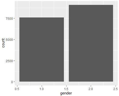
- ggplot(data=welfare, aes(x=gender,fill=
as.factor(gender)))+geom_bar()
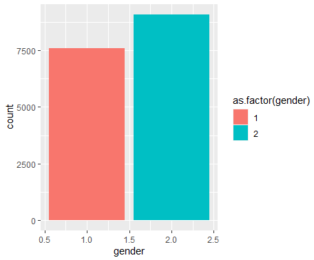
- ggplot(data=welfare, aes(x=gender,
fill=gender))+geom_bar() <- 오류임.
-> gender가 숫자형이라 백터로 형 변환함.
-> as.는 변환하겠다는 의미!
-
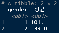
welfare %>% group_by(gender) %>% summarise(평균 = mean(income, na.rm = T))
: -> na 값들은 뺴고 칼럼의 값을 평균내주어라.
-
table(welfare $ income)
-
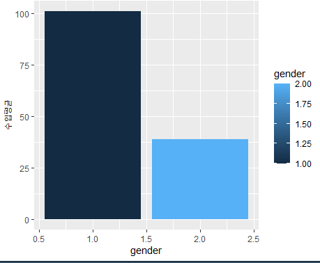
welfare %>% group_by(gender) %>%
summarise(수입평균 = mean(income,na.rm=T)) %>%
ggplot(aes(x=gender, y=수입평균, fill=gender)) + geom_col()
<na를 0으로 대체합시다>
-
welfare $ income<- ifelse(welfare $ income
==NA,0,welfare $ income) <- 오류남
-> na는 결측치 특정상 비어있어서 물음 자체가 안됨!!
-> 무조건 할당되어서== na로 하면 안됨!! na 값 찾을때is.na() 써야함. -
welfare $ income <- ifelse(
is.na(welfare $ income), 0, welfare $ income)
:함수로 빈값을 찾아라 라고 알려줌. -
is.na()
:사용할 수 없음 / 결측값
<0을 na로 대체합시다>
-
welfare $ income <- ifelse(welfare $ income
== 0), NA, welfare $ income) -
welfare $ income
