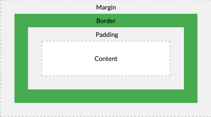
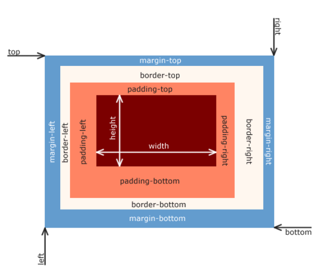
- 모든 HTML 요소는 Box 형태의 영역을 가짐
- box는 Content, Padding, Border, Margin으로 구성됨
| element | description |
|---|---|
| Content | 요소의 텍스트나 이미지 등 실제 내용이 위치하는 영역, width, height property를 가짐 |
| Padding | border 안쪽에 위치하는 요소의 내부 여백 영역, padding property 값 = padding 영역의 두께, 기본 색 = 투명색, 요소에 적용된 배경의 색, 이미지는 padding 영역까지 적용 |
| Border | 테두리 영역, border property 값 = border 영역의 두께 |
| Margin | border 바깥쪽에 위치하는 요소의 외부 여백 영역, margin property 값 = margin 영역의 두께, 기본 색 = 투명색, 배경색 지정 불가능 |
- 모든 box model property (margin, padding, border, box-sizing 등)는 상속되지 X
- 브라우저는 box 모델의 크기(dimension)와 property(색, 배경, 모양 등), 위치를 근거로 하여 랜더링을 실행함
- 웹디자인 : content를 담을 box 모델 정의하고, CSS property를 통해 스타일과 위치 및 정렬을 지정하는 것
<!DOCTYPE html>
<html>
  <head>
    <style>
      div {
        /* 배경색 지정 - 컨텐츠와 패딩 영역에 적용됨 */
        background-color: lightgray;
        /* 컨텐츠 영역의 너비 */
        width: 300px;
        /* padding 영역의 두께 */
        padding: 25px;
        /* 테두리 : 두께 형태 색상 */
        border: 25px solid navy;
        /* margin 영역의 두께 */
        margin: 25px;
      }
    </style>
  </head>
  <body>
    <h2>Box Model</h2>

    <div>
      In web development, the CSS box model refers to how HTML elements are modeled in browser engines and how the dimensions of those HTML elements are derived from CSS properties. It is a fundamental concept for the composition of HTML webpages.
    </div>
  </body>
</html>
1. width / height property
- weight와 height는 요소의 너비와 높이를 지정하는데 사용
- 실제 content > width와 height로 지정한 content 영역인 경우, content 영역을 넘치게 되므로 주의
<!DOCTYPE html>
<html>
  <head>
    <meta charset="UTF-8">
    <style>
      div {
        width: 300px;
        height: 100px;
        background-color: cornsilk;
        border: 5px solid navy;
      }
    </style>
  </head>
  <body>
    <div>
      In web development, the CSS box model refers to how HTML elements are modeled in browser engines and how the dimensions of those HTML elements are derived from CSS properties. It is a fundamental concept for the composition of HTML webpages.
    </div>
  </body>
</html>- overflow: hidden;을 지정하면 넘친 content 감추기 가능
-
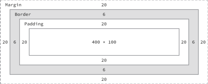
박스 전체 크기 계산
- 전체 너비 : width + left padding + right padding + left border + right border + left margin + right margin
- 전체 높이 : height + top padding + bottom padding + top border + bottom border + top margin + bottom margin
-
위 box 모델의 전체 크기 계산
- 전체 너비 : 492px = 400 + 20 + 20 + 6 + 6 + 20 + 20
- 전체 높이 : 192px = 100 + 20 + 20 + 6 + 6 + 20 + 20
- width와 height의 초기값은 auto이고, 브라우저가 상황에 따라 적당한 width와 height을 계산함
- 예) block 요소
width 초기값 : 부모 요소의 100%
height 초기값 : content의 높이(+약간의 여분)
<!DOCTYPE html>
<html>
  <head>
    <meta charset="UTF-8">
    <style>
      div {
        background-color: beige;
      }
    </style>
  </head>
  <body>
    <div>This is div</div>
  </body>
</html>- 명시적으로 width와 height를 지정하기 위해 px, % 등의 크기 단위를 사용
<!DOCTYPE html>
<html>
  <head>
    <meta charset="UTF-8">
    <style>
      div {
        background-color: beige;
        height: 100px;
        width: 50%;
      }
    </style>
  </head>
  <body>
    <div>This is div</div>
  </body>
</html>
2. margin / padding property
- margin과 padding은 content의 4개 방향(top, right, left, bottom)에 대해 지정 가능함
<!DOCTYPE html>
<html>
  <head>
    <style>
      div {
        border: 5px solid red;

        margin-top: 40px;
        margin-right: 30px;
        margin-bottom: 20px;
        margin-left: 10px;

        padding-top: 10px;
        padding-right: 20px;
        padding-bottom: 30px;
        padding-left: 40px;
      }
    </style>
  </head>
  <body>
    <div>In web development, the CSS box model refers to how HTML elements are modeled in browser engines and how the dimensions of those HTML elements are derived from CSS properties. It is a fundamental concept for the composition of HTML webpages.</div>
  </body>
</html>-
margin, padding 1개의 property만으로 4방향의 property를 한번에 정할 수 있음
- 4개의 값을 지정할 때:
margin: 25px 50px 75px 100px
margin-top: 25px
margin-right: 50px
margin-bottom: 75px
margin-left: 100px - 3개의 값을 지정할 때:
margin: 25px 50px 75px
margin-top: 25px
margin-right: 50px, margin-left: 50px
margin-bottom: 75px - 2개의 값을 지정할 때:
margin: 25px 50px
margin-top: 25px, margin-bottom: 25px
margin-right: 50px, margin-left: 50px - 1개의 값을 지정할 떄:
margin: 25px
margin-top: 25px, margin-right: 25px, margin-bottom: 25px, margin-left: 25px
- 4개의 값을 지정할 때:
<!DOCTYPE html>
<html>
  <head>
    <style>
      div {
        border: 5px solid red;

      	margin: 40px 30px 20px 10px;
      	padding: 10px 20px 30px 40px;
      }
    </style>
  </head>
  <body>
    <div>In web development, the CSS box model refers to how HTML elements are modeled in browser engines and how the dimensions of those HTML elements are derived from CSS properties. It is a fundamental concept for the composition of HTML webpages.</div>
  </body>
</html>- margin property에 auto 키워드를 설정 -> 해당 요소를 브라우저 중앙에 위치시킴
<!DOCTYPE html>
<html>
  <head>
    <style>
      div {
        border: 5px solid red;
      	width: 600px;
      	margin: 0 auto;
      }
    </style>
  </head>
  <body>
    <div>In web development, the CSS box model refers to how HTML elements are modeled in browser engines and how the dimensions of those HTML elements are derived from CSS properties. It is a fundamental concept for the composition of HTML webpages.</div>
  </body>
</html>- 요소 너비 > 브라우저 너비인 경우, 가로 스크롤바가 생성됨
- max-width를 사용하면 요소 너비 > 브라우저 너비일 때, 자동으로 요소의 너비가 줄어듬
<!DOCTYPE html>
<html>
  <head>
    <style>
      div {
        border: 5px solid red;
      	max-width: 600px;
      	margin: auto;
      }
    </style>
  </head>
  <body>
    <div>In web development, the CSS box model refers to how HTML elements are modeled in browser engines and how the dimensions of those HTML elements are derived from CSS properties. It is a fundamental concept for the composition of HTML webpages.</div>
  </body>
</html>- max-width : 요소 너비의 최대값 지정
- max-width: 300px일 때,
브라우저 너비가 300px보다 작다면 요소 너비가 브라우저 너비에 따라서 작아짐
- max-width: 300px일 때,
- min-width : 요소 너비의 최소값 지정
- min-width: 300px일 때,
브라우저 너비가 300px보다 작더라도 요소 너비는 지정 너비(300px)을 유지함
- min-width: 300px일 때,
3. border property
3.1 border-style
- border-style : 테두리 선의 스타일을 지정
<!DOCTYPE html>
<html>
  <head>
    <style>
      p {
      	background-color: palegreen;
      	padding: 10px;
      }

      p.dotted { border-style: dotted; }
      p.dashed { border-style: dashed; }
      p.solid { border-style: solid; }
      p.double { border-style: double; }
      p.groove { border-style: groove; }
      p.ridge { border-style: ridge; }
      p.inset { border-style: inset; }
      p.outset { border-style: outset; }
      p.none { border-style: none; }
      p.hidden { border-style: hidden; }
      p.mix { border-style: dotted dashed solid double; }
    </style>
  </head>
  <body>
    <h2>border-style Property</h2>

    <p class="dotted">dotted</p>
    <p class="dashed">dashed</p>
    <p class="solid">solid</p>
    <p class="double">double</p>
    <p class="groove">groove</p>
    <p class="ridge">ridge</p>
    <p class="inset">inset</p>
    <p class="outset">outset</p>
    <p class="none">none</p>
    <p class="hidden">hidden</p>
    <p class="mix">dotted dashed solid double</p>
  </body>
</html>- property 개수에 따라 4개의 방향 (top, right, bottom, left)에 대해 지정 가능
<!DOCTYPE html>
<html>
  <head>
    <style>
      p {
      	background-color: palegreen;
      	padding: 10px;
      }
      p.d1 {
      	/* four sides */
      	border-style: dashed;
      }
      p.d2 {
      	/* horizontal | vertical */
      	border-style: dotted solid;
      }
      p.d3 {
      	/* top | vertical | bottom */
      	border-style: hidden double dashed;
      }
      p.d4 {
      	/* top | right | bottom | left */
      	border-style: none solid dotted dashed;
      }
    </style>
  </head>
  <body>
    <p class="d1">border-style: dashed;</p>
    <p class="d2">border-style: dotted solid;</p>
    <p class="d3">border-style: hidden double dashed;</p>
    <p class="d4">border-style: none solid dotted dashed;</p>
  </body>
</html>
3.2 border-width
- border-width : 테두리의 두께를 지정
- property 개수에 따라 4개의 방향 (top, right, bottom, left)에 대하여 지정 가능
- border-width는 border-style과 함께 사용해야 적용됨
<!DOCTYPE html>
<html>
  <head>
    <style>
      p {
      	background-color: palegreen;
      	padding: 10px;
      	border-style: solid;
      }
      p.one {
      	border-width: thin; /* 1px */
      }
      p.two {
      	border-width: medium; /* 3px */
      }
      p.three {
      	border-width: thick; /* 5px */
      }
      p.four {
      	border-width: 15px;
      }
      p.five {
      	border-width: 2px 10px 4px 20px;
      }
    </style>
  </head>
  <body>
    <h2>border-width Property</h2>

    <p class="one">thin: 1px</p>
    <p class="two">medium: 3px</p>
    <p class="three">thick: 5px</p>
    <p class="four">15px</p>
    <p class="five">2px 10px 4px 20px</p>
  </body>
</html>
3.3 border-color
- border-color : 테두리의 색상을 지정
- property 개수에 따라 4개의 방향 (top, right, bottom, left)에 대하여 지정 가능
- border-color는 border-style과 함께 사용해야 적용됨
<!DOCTYPE html>
<html>
<head>
<style>
p {
background-color: palegreen;
padding: 10px;
border-style: solid;
}
p.one {
border-color: red;
}
p.two {
border-color: green;
}
p.three {
border-color: red green blue yellow;
}
</style>
</head>
<body>
<h2>border-color Property</h2>
<p class="one">border-color: red</p>
<p class="two">border-color: green</p>
<p class="three">border-color: red green blue yellow</p>
</body>
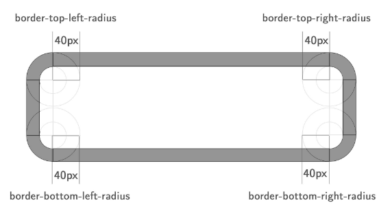
</html>3.4 border-radius
-
border-radius : 테두리 모서리를 둥글게 표현하도록 지정
-
property 값은 길이 단위 (px, em 등)와 %를 사용
-
property 개수에 따라 4개의 방향 (top, right, bottom, left) 각각의 모서리에 대하여 지정 가능
-
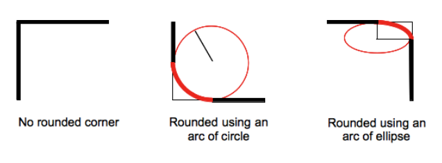
하나 혹은 두개의 반지름을 설정하여 각각의 모서리 굴곡을 설정 가능하므로, 원이나 타원 모양으로 정의 가능함
<!DOCTYPE html>
<html>
  <head>
    <style>
      div {
        background: #eaeaed;
        color: #666;
        display: inline-block;
        width: 90px;
        height: 90px;
        line-height: 90px;
        margin: 0 14px;
        text-align: center;
      }
      .border-rounded {
      	/* 꼭지점에 대해 radius 지정 */
      	border-radius: 5px;
      }
      .border-circle {
      	border-radius: 50%;
      }
      .border-football {
      	/* top-left & bottom-right | top-right & bottom-left */
      	border-radius: 15px 75px}
    </style>
  </head>
  <body>
    <div class="border-rounded">5px</div>
    <div class="border-circle">50%</div>
    <div class="border-football">15px 75px</div>
  </body>
</html>- 모든 모서리를 둥글게 설정하는 예시
.border-rounded {
	border-radius: 20px;

    /* border-top-left-radius: 20px;
	border-top-right-radius: 20px;
	border-bottom-right-radius: 20px;
	border-bottom-left-radius: 20px*/
}
<!DOCTYPE html>
<html>
<head>
<style>
div {
background: #eaeaed;
color: #666;
width: 150px;
height: 150px;
line-height: 150px;
text-align: center;
}
.border-rounded {
border-radius: 20px;
}
</style>
</head>
<body>
<div class="border-rounded">border-radius: 20px</div>
</body>
</html>- 각각의 모서리를 개별적으로 설정하는 예시
.border-rounded {
	border-radius: 10px 40px 40px 10px;

    /* border-top-left-radius: 10px;
	border-top-right-radius: 40px;
	border-bottom-right-radius: 40px;
	border-bottom-left-radius: 10px*/
}
<!DOCTYPE html>
<html>
<head>
<style>
div {
background: #eaeaed;
color: #666;
width: 200px;
height: 150px;
line-height: 150px;
text-align: center;
}
.border-rounded {
/* top-left | top-right | bottom-right | bottom=left */
border-radius: 10px 40px 40px 10px;
}
</style>
</head>
<body>
<div class="border-rounded">10px 40px 40px 10px</div>
</body>
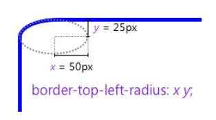
</html>- 두 개의 반지름을 지정하여 타원형 둥근 모서리를 설정하는 예시
.border-rounded {
	border-top-left-radius: 50px 25px;
}
<!DOCTYPE html>
<html>
  <head>
    <style>
      div {
        background: #eaeaed;
        color: #666;
        width: 300px;
        height: 150px;
        line-height: 150px;
        text-align: center;
      }
      .border-rounded {
      	border-top-left-radius: 50px 25px;
      }
    </style>
  </head>
  <body>
    <div class="border-rounded">border-top-left-radius: 50px 25px</div>
  </body>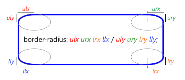
</html>- 각각의 모서리에 타원형 둥근 모서리 축약 설정하는 예시
.border-rounded {
	border-radius: 50px 50px 0 0 / 25px 25px 0 0;
}
<!DOCTYPE html>
<html>
  <head>
    <style>
      div {
        background: #eaeaed;
        color: #666;
        width: 450px;
        height: 150px;
        padding: 10px;
      }
      .border-rounded {
      	border-radius: 10px 20px 30px 40px / 5px 10px 15px 20px;
      }
    </style>
  </head>
  <body>
    <div class="border-rounded">
      border-radius: 10px 20px 30px 40px / 5px 10px 15px 20px;
      <ul>
        <li>border-top-left-radius: 10px 5px</li>
        <li>border-top-right-radius: 20px 10px</li>
        <li>border-bottom-right-radius: 30px 15px</li>
        <li>border-bottom-left-radius: 40px 20px</li>
      </ul>
    </div>
  </body>
</html>
3.5 border
- border : border-width, border-style, border-color를 한번에 설정 가능
p {
	/* border-width border-style border-color*/
	border: 5px solid red;
}
4. box-sizing
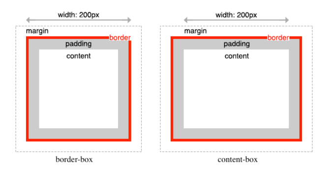
- box-sizing : width, height 대상 영역을 변경 가능
| box-sizing | description |
|---|---|
| content-box | width, height 값은 content 영역을 의미함 (기본값) |
| border-box | width, height 값은 content 영역, padding, border 포함된 값을 의미함 |
<!DOCTYPE html>
<html>
  <head>
    <style>
      .content-box {
      	width: 600px;
      	border: 10px solid;
      	padding: 50px;
      	margin: 50px;
      	background-color: red;
      }
      .border-box {
      	box-sizing:border-box;
      	width: 600px;
      	border: 10px solid;
      	padding: 50px;
      	margin: 50px;
      	background-color: red;
      }
    </style>
  </head>
  <body>
    <div class="content-box">content-box</div>
    <div class="border-box">border-box</div>
  </body>
</html>- box-sizing는 상속되지 않음
- box-sizing를 사용하도록 초기화하는 예시
html {
	box-sizing: border-box;
}
*,*:before, *:after {
	box-sizing: inherit;
}