모바일에서 카메라를 켜 사진을 찍고 바로 업로드 하거나 어떠한 파일을 선택하여 웹 또는 모바일에 업로드할 수 있는 기능.
입력
<input type="file">출력
자주 사용되는 기능 중 하나 이지만 그냥 쓰기엔 어딘가 맘에 안듭니다. 저와 같이 생각하는 분들을 위해서 Button을 커스터마이징 하는 법을 가져왔습니다.
<label>을 사용하는 방법
1. <label>을 사용하여 버튼 만들기
입력
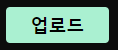
<label class="uploadFileBtn" for="uploadFile">업로드</label>
<input type="file" id="uploadFile">
출력
업로드
<label>의 for 속성을 이용하여 <input type="file">과 연결을 시켰습니다. label 폼인 업로드를 클릭하면 <input type="file">을 클릭한 것처럼 동작합니다.
그럼 이제 더이상 파일 선택 부분은 보여질 필요가 없으니 보이지 않게 해줍니다.
입력
<input type="file" id="uploadFile" style="display:none;">출력
업로드
여기에 <label>이 버튼 처럼 보이도록 CSS를 추가하면 됩니다.
입력
// CSS
.uploadFileBtn{
  padding: 6px 25px;
  background-color:#AAF0D1;
  border-radius: 4px;
  color: white;
  cursor: pointer;
  font-weight:bold;
}
출력
2. Bootstrap5 <label>을 사용하여 업로드 버튼 만들기
흔히 부트스트랩 "파일 업로드 기능"이라 하면 흔히들 정형화된 모양만을 생각할 수 있지만 부트스트랩을 활용하여 업로드 버튼을 커스터마이징 할 수 있습니다.
입력
<label class="btn btn-outline-pink btn-sm" for="camera" role="button">업로드</label>
<input type="file" id="camera" name="camera" accept="image/*"capture="camera"
onchange="takePicture(this)" style="display: none">

<script>
   function takePicture(input) {
       $('#camera').change(function (e) {
           $('#chooseFile').attr('src', URL.createObjectURL(e.target.files[0]));
       });
  };
</script>
출력
버튼을 누르면 파일선택하는 창이 뜹니다.

cf) .btn-pink는 기본으로 제공되지 않는 CSS 클래스입니다. 부트스트랩에선 다음과 같은 색을 기본으로 제공하고 있습니다.
.bg-primary  	// 파란색
.bg-secondary   // 회색
.bg-success     // 녹색
.bg-danger      // 붉은색
.bg-warning     // 노란색
.bg-info        // 하늘색
.bg-light       // 아주 밝은 회색
.bg-dark        // 검은색
.bg-body        // 현재 <body>와 같은색
.bg-white		// 흰색
.bg-transparent // 부모 태그 색
				// 예_부모인 <div> 가 background-color이 회색이라면 자식 클래스가 회색으로 출력됨.
Bootstrap5를 사용하는 방법
https://getbootstrap.kr/docs/5.1/forms/form-control/
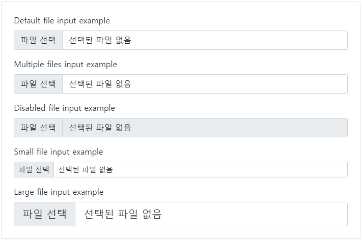
위 사이트에서 목차 파일 선택을 클릭하면 부트스트랩에서 제공하는 파일 업로드 기능이 제공됨을 확인할 수 있습니다.
입력
<div class="mb-3">
  <label for="formFile" class="form-label">Default file input example</label>
  <input class="form-control" type="file" id="formFile">
</div>
<div class="mb-3">
  <label for="formFileMultiple" class="form-label">Multiple files input example</label>
  <input class="form-control" type="file" id="formFileMultiple" multiple>
</div>
<div class="mb-3">
  <label for="formFileDisabled" class="form-label">Disabled file input example</label>
  <input class="form-control" type="file" id="formFileDisabled" disabled>
</div>
<div class="mb-3">
  <label for="formFileSm" class="form-label">Small file input example</label>
  <input class="form-control form-control-sm" id="formFileSm" type="file">
</div>
<div>
  <label for="formFileLg" class="form-label">Large file input example</label>
  <input class="form-control form-control-lg" id="formFileLg" type="file">
</div>
출력
입력된 순서와 동일하게 출력한 결과입니다. 필요한 곳에 소스를 가져가서 사용하면 됩니다.

기술 블로그