ThemeProvider로 다크모드 구현
Theme은 한 object 안에 모든 색이 다 들어가있어서 사용하기 편리하다.
-> 실행방법: index.js에 import {ThemeProvider} from styled-componenet 작성,
App을 ThemeProvider로 감싸주어 작성한 theme object를 props로 한다.
1) index.js
import React from "react";
import ReactDOM from "react-dom/client";
import App from "./App";
import { ThemeProvider } from "styled-components";

const root = ReactDOM.createRoot(document.getElementById("root"));

# 다크모드에서 사용할 배경색과 텍스트색 속성명 작성, 속성값 작성
const darkTheme = {
  backgroundColor: "black",
  textColor: "white",
};

# 라이트모드에서 사용할 배경색과 텍스트색 속성명 작성, 속성값 작성
const lightTheme = {
  backgroundColor: "smokewhite",
  textColor: "#111",
};


root.render(
  <React.StrictMode>
  #App을 ThemeProvider로 감싸주고 props로 theme object 작성
    <ThemeProvider theme={lightTheme}>
  #App 하위의 컴포넌트들은 props.theme.(속성명)으로 접근 가능
      <App />
    </ThemeProvider>
  </React.StrictMode>
);

// If you want to start measuring performance in your app, pass a function
// to log results (for example: reportWebVitals(console.log))
// or send to an analytics endpoint. Learn more: https://bit.ly/CRA-vitals
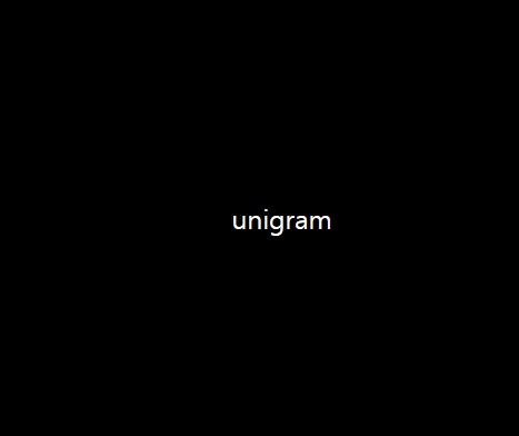
2)App.js
import styled from "styled-components";
const Container = styled.div`
  display: flex;
  justify-content: center;
  align-items: center;
  height: 100vh;
  width: 100vw;
 #theme props 'backgroundColor'를 받아와 사용=직접 속성명을 건드리지 않아도 된다는 장점
  background-color: ${(props) => props.theme.backgroundColor};
`;
const Text = styled.div`
 #theme props 'textColor'를 받아와 사용=직접 속성명을 건드리지 않아도 된다는 장점
  color: ${(props) => props.theme.textColor};
`;
function App() {
  return (
    <Container>
      <Text>unigram</Text>
    </Container>
  );
}

export default App;