Display
{display: block;}
{display: flex;}
{display: inline-flex;}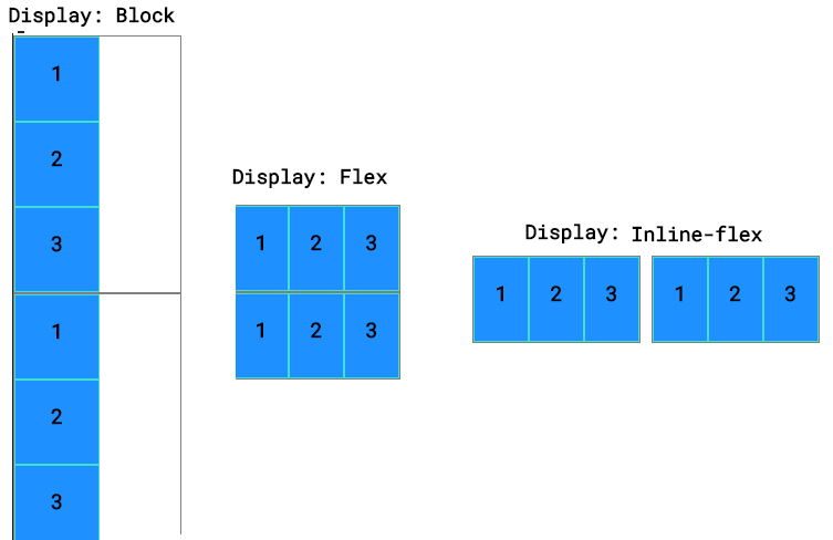
Main axis
1. Justify-content
{justify-content: flex-start;}
{justify-content: flex-end;}
{justify-content: center;}
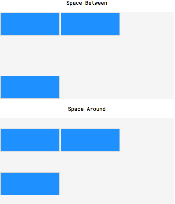
{justify-content: space-around;}
{justify-content: space-between;}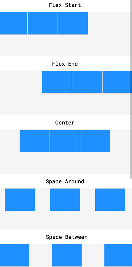
2. Flex-grow 확대 Flex-shrink 축소
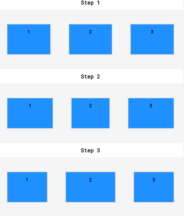
- Step 1
.top.side {flex-grow: 1;}
.top.center {flex-grow: 1;}- Step 2
.middle.side {flex-grow: 2;}
.middle.center {flex-grow: 1;}- Step 3
.bottom.side {flex-grow: 1;}
.bottom.center {flex-grow: 2;}
3. Flex-basis
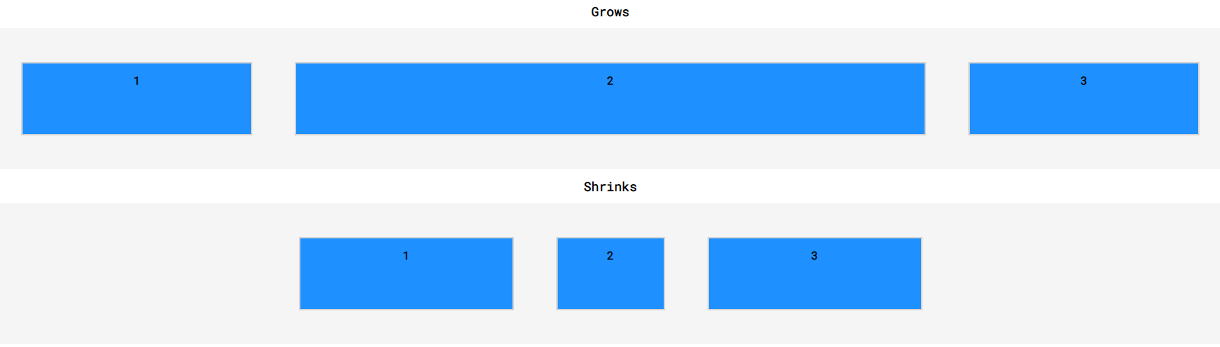
- Grow
.grow.side {
flex-basis: 60px;
flex-grow: 1;
}
.grow.center {
flex-grow: 3;
}- Shrink
.shrink.side {
flex-basis: 300px;
flex-shrink: 3;
}
.shrink.center {
flex-shrink: 2;
flex-basis: 150px;
}
- Flex: grow shrink basis 한줄에 작성하기
ex){flex: 2 2 100px ;}
4. Flex-wrap
- wrap 줄에 맞지 않는 영역은 다음 줄로 이동한다.
- wrap-reverse
- nowrap
Cross axis
1. Align-items
- Align-items
{align-items: flex-start;}
{align-items: flex-end;}
{align-items: center;}
{align-items: baseline;}- Stretch
{min-height: 75px ;}
max-height:'}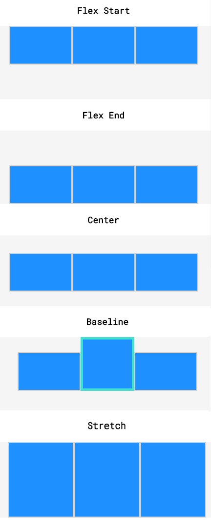
2. Align-content
(+)
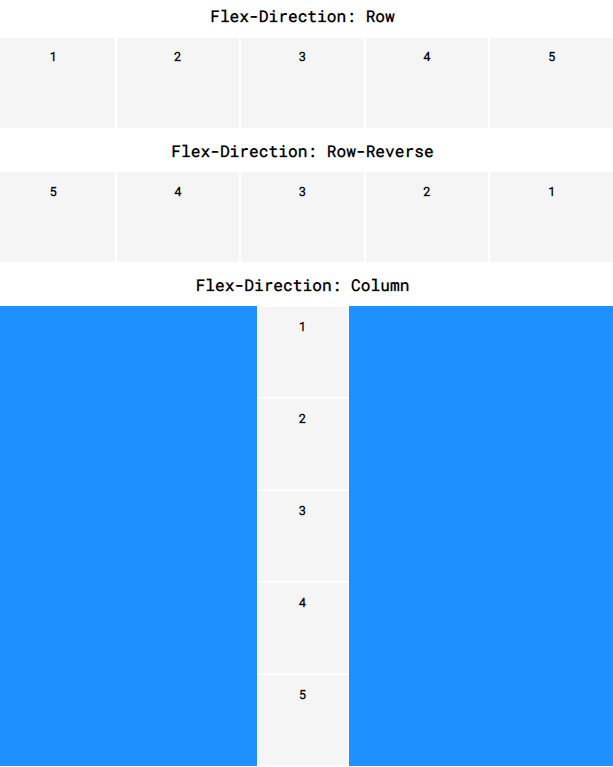
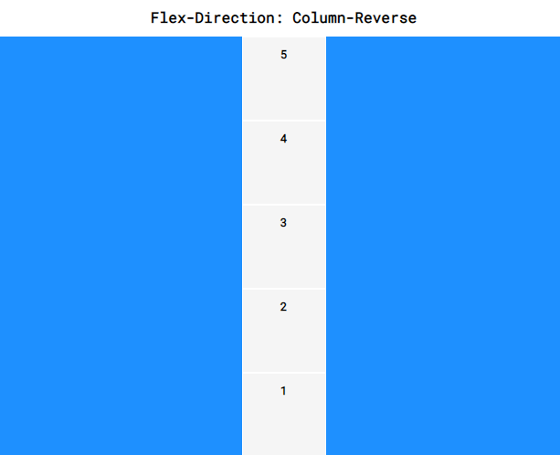
1. Flex-direction
Flex 방향속성 추가하기
2. Flex-flow
Flex-wrap과 flex-direction 속성을 한 줄에 작성하는 방법
- 반드시 direction -> wrap 순서로 작성!
{flex-flow: column wrap;}

그때그때 공부한 내용과 생각을 기록하는 블로그입니다.