사연
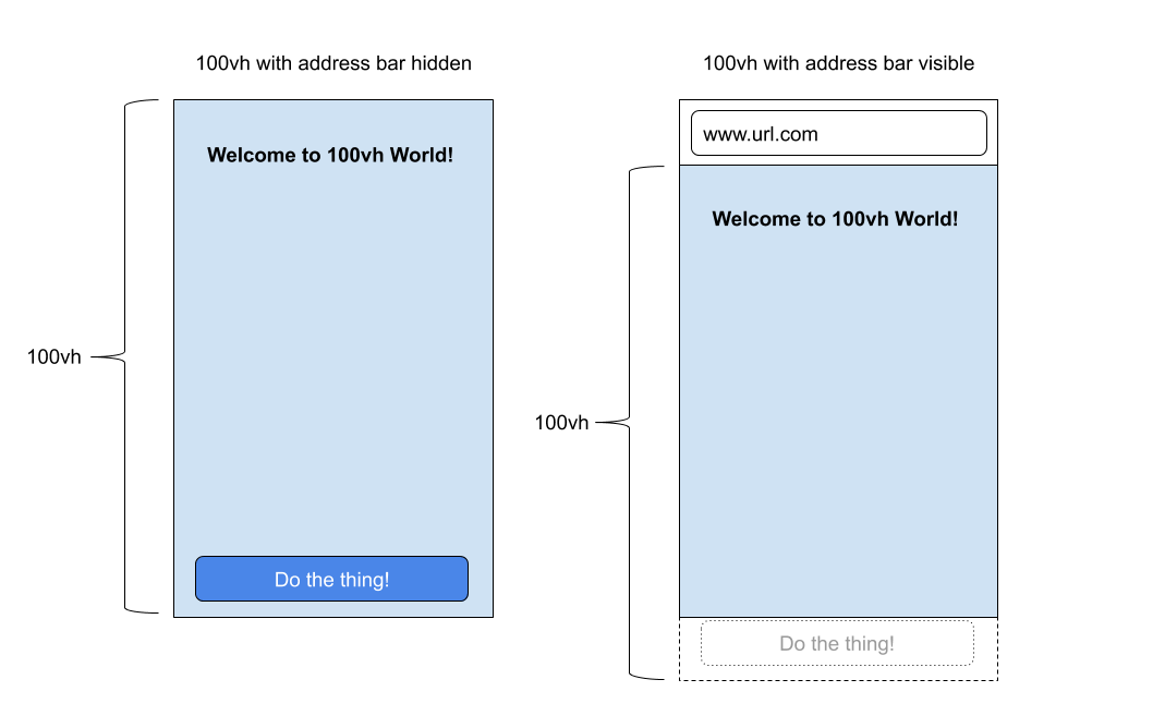
사내 프로젝트를 개발도중에 모바일에서 height를 100vh로 설정해서 화면을 구성하는 작업이 있었는데, ios safari에서는 100vh로 잡았을때 하단의 주소표시줄까지 포함이 되어서 최하단에 존재하는 요소는 가려지는 현상이 발생했다.
해결
화면이 렌더링 되는 시점에 window.innerHeight를 setProperty로 변수에 할당해서 css에서 사용하는 방식으로 해결할 수 있었다.
<!DOCTYPE html>
<html lang="en">
  <head>
    <meta http-equiv="X-UA-Compatible" content="IE=edge" />
    <meta name="viewport" content="width=device-width, initial-scale=1.0" />
    <title>Document</title>
  </head>
  <body>
    <style>
      body {
        margin: 0;
        height: var(--app-height);
      }
    </style>
    <script>
      window.addEventListener("DOMContentLoaded", function (ev) {
        const { innerHeight } = window;
        document.documentElement.style.setProperty("--app-height",`${innerHeight}px`);
      });
    </script>
  </body>
</html>
height 667px 디바이스일때
--app-height 변수에 window.innerHeight값을 설정하면 style attribute에 --app-height라는 변수가 667px로 할당 된 것을 볼 수 있다.
const { innerHeight } = window;
document.documentElement.style.setProperty("--app-height",`${innerHeight}px`);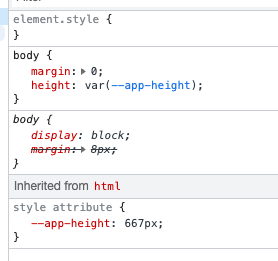
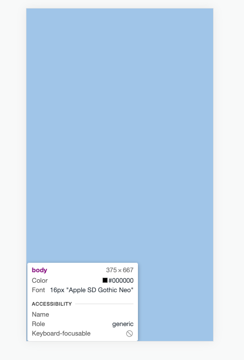
그리고 body에 height가 --app-height값이 적용되어서 667px로 올바르게 설정된 것을 볼수있다.
ios가 없어서 스크린샷을 생성하지는 못했는데 실제 아이폰에서 해당 방법으로 height를 설정하면 하단의 주소영역을 포함하지 않은 부분의 영역만 잡히는 것을 확인할 수 있었다

전 위메프, 이직준비중