Portal이란
ReactDom의 Portal은 부모 컴포넌트가 속해있는 DOM 바깥의 다른 DOM 노드로 렌더링을 가능하게 해준다.
createPortal을 사용하는 이유
Modal을 만들기 위해 Modal의 z-index를 아무리 높이더라도 부모의 z-index가 낮다면 Modal을 만들 때 의도했던 대로 렌더링이 안 될 수도 있다. 이런 현상을 해결하기 위해 앞에서 설명한 Portal은 좋은 해결책이 된다.
모달 만들기
- 트리 구조
|-- components
|   `-- Modal
|       |-- Modal.styles.ts
|       |-- Modal.tsx
|       `-- Modal.types.ts
|-- styles
|   |-- GlobalStyle.tsx
|   |-- colors.ts
|   `-- shared
|       |-- fixed.ts
|       `-- flex.ts
|-- App.tsx
|-- main.tsx
`-- vite-env.d.ts
index.html
<div id="root"></div>
<div id="modal"></div> <!-- Portal을 통해 modal이 렌더링 될 div태그 -->
Modal.types.ts
import { ReactNode, DetailedHTMLProps, HTMLAttributes } from "react";

export interface ModalProps
  extends DetailedHTMLProps<HTMLAttributes<HTMLDivElement>, HTMLDivElement> {
  open?: boolean;
  setOpen: (boolean: boolean) => void;
  children: ReactNode;
}
Modal.tsx
ReactDOM.createPortal은 첫 번째 인자로 렌더링할 ReactNode, 두 번째 인자로 렌더링 될 장소인Element를 받는다.
useEffect안의 로직으로 Modal이 열렸을 때 스크롤을 막아 준다.
import * as S from "./Modal.styles";
import ReactDOM from "react-dom";
import { useEffect } from "react";
import { ModalProps } from "./Modal.types";

/**
 *
 * @param {boolean} open - true일 때 모달이 열리고 false이면 모달이 닫힌다.
 * @param {Pick<ModalProps,"setOpen">} setOpen - open의 상태를 변경하는 setState 배경을 클릭하면 모달창이 꺼진다.
 * @param {ReactNode} children - 모달창 안에 나타나는 요소
 *
 */

const Modal = ({ open = false, setOpen, children, ...rest }: ModalProps) => {
  const modalRoot = document.querySelector("#modal") as HTMLElement;

  useEffect(() => {
    document.body.style.overflow = "hidden";
    return () => {
      document.body.style.overflow = "unset";
    };
  }, []);

  const onCancel = () => {
    setOpen(false);
  };

  return ReactDOM.createPortal(
    <>
      {open ? (
        <S.Container>
          <S.Background onClick={onCancel} />
          <S.Modal {...rest}>{children}</S.Modal>
        </S.Container>
      ) : null}
    </>,
    modalRoot
  );
};

export default Modal;
Modal.styles.ts
import colors from "@/styles/colors";
import { fixedCenter } from "@/styles/shared/fixed";
import { flexCenter } from "@/styles/shared/flex";
import styled from "@emotion/styled";

export const Container = styled.div``;

export const Background = styled.div`
  ${flexCenter}
  height: 100%;
  width: 100%;
  left: 0;
  top: 0;
  position: fixed;
  background-color: rgba(1, 1, 1, 0.2);
`;

export const Modal = styled.div`
  width: 30%;
  height: 30%;
  background: ${colors.black};
  color: ${colors.white};
  border-radius: 0.2rem;
  padding: 2rem 2rem;
  ${fixedCenter};
  top: 20%;
`;
App.tsx
import Button from "@/components/Button/Button";
import Modal from "@/components/Modal/Modal";
import { useState } from "react";

function App() {
  const [open, setOpen] = useState(false);
  return (
    <>
      <div style={{ padding: "1rem 2rem", height: "200vh" }}>
        ...
        {/** 모달 */}
        {open && <Modal open={open} setOpen={setOpen} children="hello" />}
        <Button onClick={() => setOpen(true)}>open modal</Button>
      </div>
    </>
  );
}

export default App;
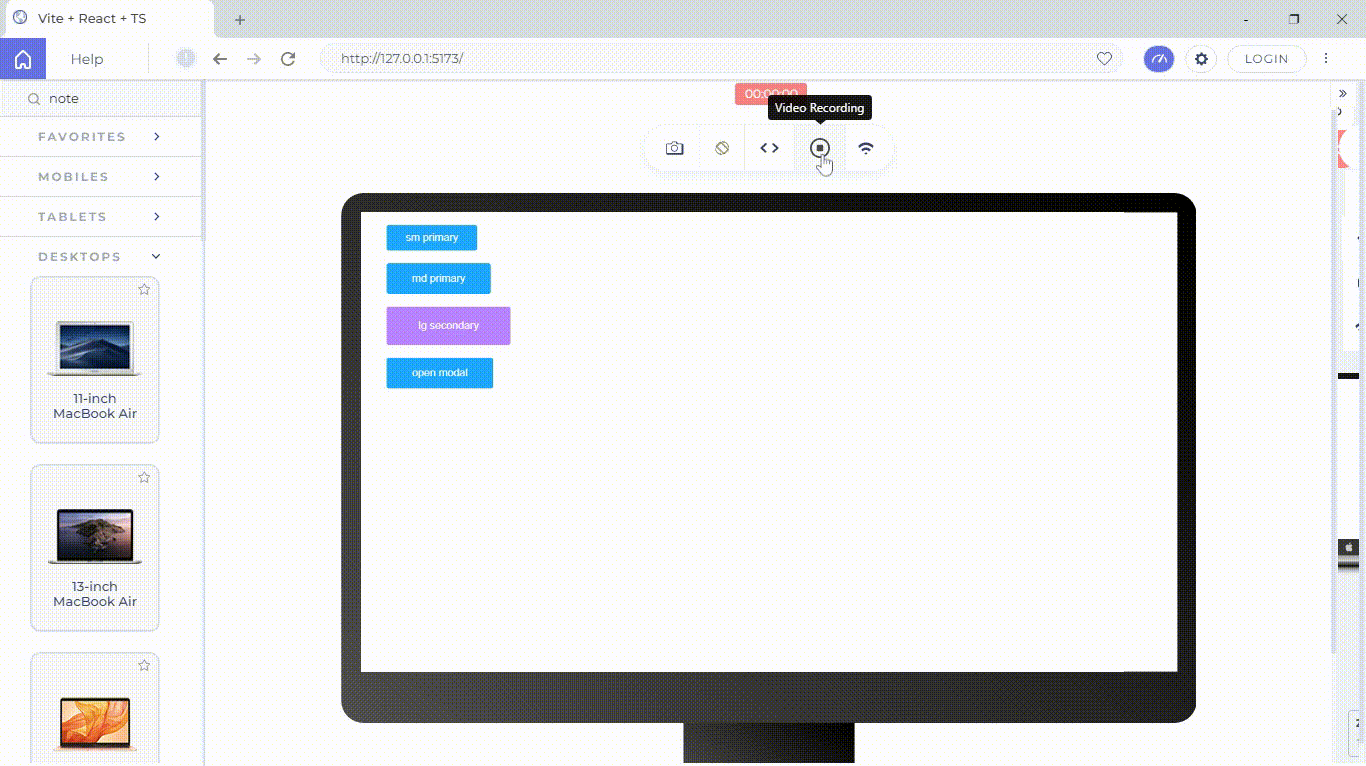
실행 화면

코드

기록해버리기