CSS(Cascading Style Sheet)란?
html에 design을 입히는 것으로, 유지보수 차원에서 html과 분리해서 관리합니다.
css는 선택자(selector), 선언부(property), 값(value)으로 나뉩니다.
selector {
   property: value;
}
1. box-sizing
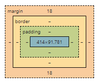
- margin : border 바깥 부분
- border : content 테두리
- padding : border와 content사이의 간격
- content : box의 내용
2. box type
1. display: block
.box {
   disply: block;
}- keyword : 길막, 자신의 옆에 어떤 요소도 오지 못하게 길막
- width : 나를 감싸는 부모의 content-box의 width 100%를 따른다. 따로 설정하면, 나머지 width값은 margin으로 채워진다.
- height : 따로 설정하지 않으면, 내가 감싸는 자식의 height들의 합
- margin :
margin-left: auto;   // 우측 배치
margin: 0 auto;      // 가운데 배치
margin-right: auto;  // 왼쪽 배치
2. flex
.box {
   display: flex;
   flex-direction: row;
   flex-wrap: nowrap;
}- flex-direction : 가로/세로 정렬
1-1. row : 가로 정렬, 왼쪽에서 오른쪽 순으로 배치
1-2. row-reverse: 가로 정렬, 오른쪽에서 왼쪽 순으로 배치
1-3. column : 세로 정렬, 위에서 아래 순으로 배치
1-4. column-reverse : 세로 정렬, 아래에서 위 순으로 배치 - justify-content : main축을 기준으로 위치 설정
2-1. flex-start : 축의 시작점에 위치함
2-2. flex-end
2-3. space-between: box간 사이 간격이 동일
2-4. space-around: box간 양 옆 사이 간격을 동일 - align-items : 내가 선언한 main축이 아닌 cross-axis기준으로 정렬
- align-content: align-items와 동일. 하지만 flex-wrap: wrap이어야 한다.
4-1. wrap으로 인해 n줄 이상이 된다면, flex의 축이 n줄 이상이 생김. 따라서, height를 기준으로 n개로 나눠진다. 이 때, box간 간격을 없애기 위해서 사용되는 것이 align-content이다. - flex-wrap : 한 줄 안에서 쇼부?
5-1. nowrap: 자식의 width를 줄여서라도 한 줄에 넣겠다
5-2. wrap: 두 줄을 만들어서라도 자식의 width를 보존하겠다
3. Responsive web
viewport
디바이스의 해상도에 따라서 적절하게 대응하는 반응형 웹을 만들기 위하여 사용
html (viewport meta)
- head tag에 넣어야 한다.
- viewport를 잡을 것인데 width를 사용자의 device width로 잡아라
<meta name="viewport" content="width=device-width"/>css (media query)
@media screen and (min-width: 768px)
/* 내가 보고있는 화면의 최소 width size가 768이면 아래의 css적용해줘 */- Mobile : max-width: 576px;
- Landscape Phone: min-width: 576px
- Tablet: min-width: 768px
- Desktop: min-width: 992px
- Large desktop: min-width: 1200px;
- Super large: min-width: 1360px;
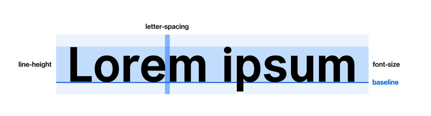
4. Typography(text design)
-
font-size : 글자 크기
1-1. px: 절대 단위
1-2. em(equal to capital M): 상대 단위, 현재 적용된 크기가 기준(부모 요소의 font-size가 기준이 될 수도 있음)
1-3. rem(root em): 상대 단위, html에 적용된 크기 -
line-height : 줄 간격
2-2. 글자는 줄 간격의 가운데에 위치함
2-3. px, em, rem의 단위를 따름. em만 생략 가능하다 -
font-family : 폰트 서체
3-1. 왼쪽의 서체부터 적용하고, 없으면 그 다음 서체를 적용해라
font-family: "Poppins";
font-family: "Poppins", sans-serif;
font-family: "Poppins", "Roboto", sans-serif;-
font-weight : 폰트 굵기
4-1. 300: light
4-2. 400: regular
4-3. 700: bold
4-4. 900: max bold -
text-align : 폰트 정렬
5-1.left,right,center -
text-indent : 들여쓰기
-
text-transform : 알파벳 텍스트 대/소문자 변형
7-1. capitalize: 단어의 첫 글자를 대문자
7-2. uppsercase: 모든 글자를 대문자
7-3. lowercase: 모든 글자를 소문자 -
text-decoration : 줄 관련 속성
8-1. none: default
8-2. underline: 밑줄
8-3. line-thorough: 취소선
8-4. overline: 윗줄 -
font-style
9-1. normal: default,
9-2. italic: 기울임 문자
5. Web font
Font 적용해보기
- fonts.google.com 접속
- font 다운로드 및 프로젝트에 업로드
- 아래의 css파일 작성
/* font.css */
@font-fact {
   font-family: 'kimbug';
   font-style: normal;
   font-weight: 400;
   src: url('./assets/font/webfont.eot');
   src: url('./assets/font/webfont.eot?#iefix') format('embedded-opentype');
}

@font-fact {
   font-family: 'kimbug';
   font-style: normal;
   font-weight: 700;
   src: url('webfont.woff2') format('woff2'), /* Super Modern Browsers */
        url('webfont.woff') format('woff'), /* Pretty Modern Browsers */
}
font import
html
<link rel="stylesheet" href="./fonts.css"/>css
@import url('./fonts.css');6. background
- background-color : 배경 색상
1-1. hex: #000000
1-2. rgb: 255, 255, 255
1-3. rgba: rgb + alpah(투명도)
.box {
   background-color: #ffffff;
   background-color: rgb(255, 255, 255);
   background-color: rgba(255, 255, 255, 0.5);
}- background-image : 배경에 이미지 넣기
2-1. url( ) 속성 사용하기. 확장자까지 입력해야 한다. 인터넷의 image path copy후 넣어도 된다.
2-2. unsplash.com : 무료 이미지 site.
.box {
   background-image: url('./assets/heart.png');
}-
background-repeat
3-1. repeat: default. 이미지 반복
3-2. no-repeat: 노 반복 -
background-size : 이미지의 크기에 대한 속성
4-1. contain: 직사각형의 이미지를 정사각형에 넣을 때, 이미지 모든 부분을 포함시키는 것
4-2. cover: 직사각형의 이미지를 정사각형에 넣을 때, width/height를 기준으로 포함시키는 것
4-3. custom: 아래의 코드는 세로의 100%꽉 맞추고, 가로는 auto로 해줘
background-size: 50% auto;
background-size: 100% auto;- background-position : 배경 이미지의 위치 조정
5-1. 아래는 가로 세로 모두 가운데로!
background-position: center center;7. Transition
CSS 속성을 변경할 때 애니메이션 속도를 조절하는 방법
property dudration [timing-function] [delay]- property: 속성
- duration: 지속 시간 (ms, s)
- 예제 : font-size가 2500ms동안 animation으로 변했으면 좋겠다.
.box {
   transition: font-size 2500ms;
   transition: all 2500ms;
}- timing-function
4-1. ease-in: 느리다가 빠르게
4-2. ease-out: 쁘라다가 느리게
4-3. cubic-bezier: cubic-bezier.com(변화 속도를 다이나믹하게 설정 가능)
.box {
   transition: all 2500ms ease-out
}-
delay
5-1. n초 후에 변화 시작 -
여러 요소를 각각에 맞춰 변화시키기
6-1. font-size는 1초 동안 변화
6-2. background-color는 1초후에 2초동안 cubic-bezier에 맞춰 변화
.box {
   transition: font-size 1000ms ease-out,
               background-color 2000ms cubic-bezier(.08, .57, .83, .67) 1000ms
8. Animation
animation-name duration timing-function - animation: property상관없이 적용할 수 있음
- transition: 요소에 적용한 property를 전환 시키는 것
keyframes: animation을 정의해 놓은 것
- animation-iteration-count: infinite
- animation-direction:
2-1. default: from -> to
2-2. reverse: to -> from
2-3. alternate: 진행 완료된 곳에서 번갈아가면서 진행하라
.box {
   animation-name: move-box;
   animation-duration: 2000ms;
   animation-timing-function: ease-in-out;
   animation-delay: 1000ms;
   animation-iteration-count: 3;
}

@keyframes move-box {
   from {
      // 변화해야하는 속성 작성
      top: 0;
      background-color: #0066ff;
   }

   to {
      top: 200px;
      background-color: #ff4949;
   }
}

@keyframes name {
   0% {
   }

   50% {
   }

   100% {
   }
}
10. Overflow
자식이 부모의 width/height를 넘었을 때 처리하는 법
- visible: 기본값. 넘어가도 넘어간대로 보여줄 것
- auto, scroll: 넘쳐 흐르면 알아서 표시할 것. 넘어간 요소들은 스크롤로 표현됨
- hidden: 넘쳐 흐르면 표시X. 스크롤도 X
11. transform
요소를 2/3차원 공간에서 변형하는 것.
transform으로 위치나 크기를 변경해도 기존의 위치와 크기는 기억된다.
- translate(x, y): 요소의 위치를 옮길 때. x, y값이 %라면, 현재 자신의 width, height가 기준
- scale(N): 자신의 크기를 변경할 때. N은 배율이다. 1이면 1배. 2면 2배
- rotate(Ndeg): 각도를 변경할 때. deg단위까지 입력해야한다.
Reference
- css
1-1. 김버그의 css는 재밌다 - viewport
2-1. 번데기개발자_뷰포트란 무엇일까?
2-2. JOKER's ROOM_[HTML] 반응형 웹 viewport 뷰포트