CSS(Cascading Style Sheet)란?
html에 design을 입히는 것으로, 유지보수 차원에서 html과 분리해서 관리합니다.
css는 선택자(selector), 선언부(property), 값(value)으로 나뉩니다.
selector {
   property: value;
}
box-sizing
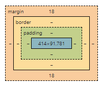
1. margin : border 바깥 부분
2. border : content 테두리
3. padding : border와 content사이의 간격
4. content : box의 내용
box type
1. display: block
.box {
   disply: block;
}
1. keyword : 길막, 자신의 옆에 어떤 요소도 오지 못하게 길막
2. width : 나를 감싸는 부모의 content-box의 width 100%를 따른다. 따로 설정하면, 나머지 width값은 margin으로 채워진다.
3. height : 따로 설정하지 않으면, 내가 감싸는 자식의 height들의 합
4. margin
margin: 0 auto; 자동으로 생기는 margin값을 왼쪽/오른쪽에 두겠다. 결론적으로 가운데 배치parent/child div두고 margin-left하여 오른쪽 배치되고, 왼쪽은 자동으로 채워진 margin보이는 이미지
- margin-left: 자동으로 생기는 margin값을 왼쪽에 두겠다. 결론적으로 우측에 배치
inline
- keyword : 컨텐츠의 흐름, 자신의 옆으로 줄서는 느낌
- 부모의 width를 넘어가면 자동으로 줄바꿈이 이뤄진다.
- width, height, padding-top/bottom, margin-top/bottom, border-top/bottom 사용불가. 왜? 자동으로 설정되어있는 inline의 줄간격의 흐름을 박살내는 요소이기 때문이라고 함 --> 속성자체도 먹히지 않는다.
inline-block
- keyword: 짬짜면. block + inline
- inline처럼 흐르다가 block처럼 영역을 잡을 수 있다. 따라서, padding-top/bottom, margin-top/bottom, border-top/bttom도 사용가능하다.
flex
- keyword: 4가지 step
- flexbox 선언
- 가로 정렬? 세로 정렬? flex-direction
- row: 가로, 왼쪽에서 오른쪽
- row-reverse: 가로, 오른쪽에서 왼쪽
- column
- column-reverse
- justify-content: 내가 선언한 main축을 기준으로 정렬
- flex-start
- flex-end
- space-between: box간 간격을 동일하게
- space-around: box간 양옆 간격을 동일하게
- align-items: 내가 선언한 main축이 아닌 cross-axis기준으로 정렬
- align-content: align-items와 동일. 하지만 flex-wrap: wrap이어야 한다.
- wrap으로 인해 n줄 이상이 된다면, flex의 축이 n줄 이상이 생김. 따라서, height를 기준으로 n개로 나눠진다.
- 이 때, box간 간격을 없애기 위해서 사용되는 것이 align-content이다.
- 한 줄 안에 다 정렬? flex-wrap:
- nowrap: 자식의 width를 줄여서라도 한 줄에 넣겠다
- wrap: 두 줄을 만들어서라도 자식의 width를 보존하겠다
.flexbox {
   display: flex;
   flex-direction: row;
   flex-wrap: nowrap;
}
Float
-
block box를 가로배치 하기 위함. inline의 경우 top/bottom 영역을 차지할 수 없기 때문에 영역 차지를 위해 float 사용
-
float으로 설정되면, 부모는 나를 자식으로 여기지 않고, 빈공간이 여긴다. 형제들은 이 빈 box를 밀어서 채워준다. 결과적으로 width/height가 줄어들 수 있다.
-
float를 적용하면, 해당 요소는 block box로 변경된다.
-
하지만, 자신의 content의 영역만 차지하는 block box이다.
-
자식의 요소들이 float속성을 계속 가지고 있다면, 부모의 width안에서 inline처럼 동작. 하지만, 부모는 float속성을 가지는 요소를 자식으로 여기지 않기때문에 height가 0으로 된다.
-
float: left; 자신이 갈 수 있는 공간에서 최대한 왼쪽에 배치
-
float: right; 자신이 갈 수 있는 공간에서 최대한 오른쪽에 배치
-
text/image와 같이 inline의 속성을 가지는 요소들은 float의 영역을 인지한다.
-
float로 인해 망가진 layout 해결하기
- overflow: hidden
- 부모의 요소가 집 나간 자식 요소를 찾을 수 있는 방법이다.
- clearfix
- clear: left|right|both; 형제 요소 중 float: left;가 있는지 인식할 수 있는 요소이다.
- psuedo
- clear fix먹이기
- box type block에만 적용이 된다
- ::befor: 부모의 첫 번째 자식으로 가상 요소가 생성
- ::after: 부모의 가장 마지막 자식으로 가상 요소가 생성
.psuedo::before {
   content: '';
   display: block;
   clear: left;
}
- overflow: hidden
Responsive web
html: viewport meta
- head tag에 넣어야 한다.
- viewport를 잡을 것인데 width를 사용자의 device width로 잡아라
<meta name="viewport" content="width=device-width"/>css: media query
- 내가 보고있는 화면의 최소 width size가 768이면 아래의 css적용해줘
@media screen and (min-width: 768px)- Mobile : max-width: 576px;
- Landscape Phone: min-width: 576px
- Tablet: min-width: 768px
- Desktop: min-width: 992px
- Large desktop: min-width: 1200px;
- Super large: min-width: 1360px;
Typography
text design을 뜻한다.
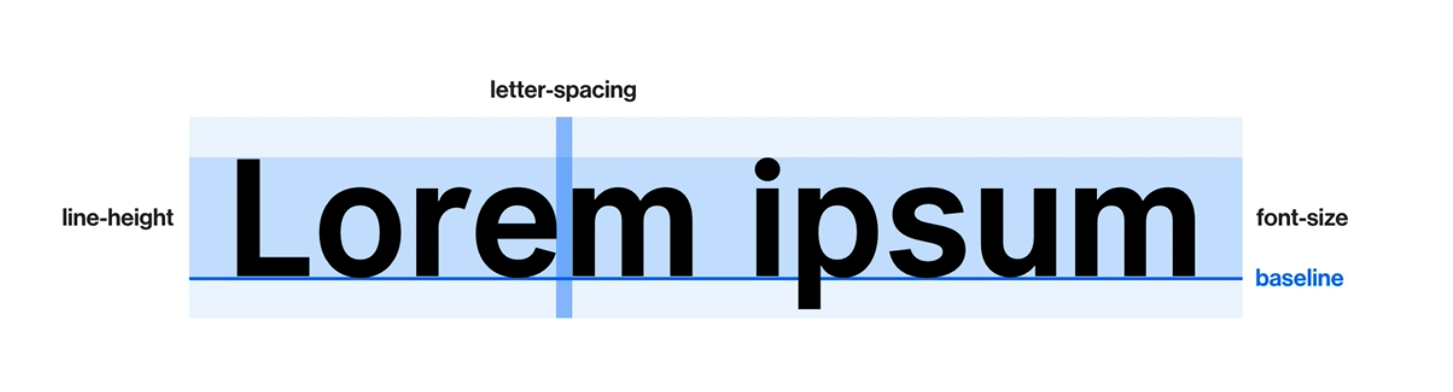
font-size
- px: 절대 단위
- em(equal to capital M): 상대 단위, 현재 적용된 크기가 기준(부모 요소의 font-size가 기준이 될 수도 있음)
- rem(root em): 상대 단위, html에 적용된 크기
line-height
- 줄 간격을 뜻함
- 글자는 줄 간격의 가운데에 위치함
- px, em, rem의 단위를 따름. em만 생략 가능하다
font-family
- 폰트 서체
- 왼쪽의 서체부터 적용하고, 없으면 그 다음 서체를 적용해라
font-family: "Poppins";
font-family: "Poppins", sans-serif;
font-family: "Poppins", "Roboto", sans-serif;
font-weight
- 폰트의 굵기
- 300: light
- 400: regular
- 700: bold
- 900: max bold
text-align
- 폰트 정렬
- left, right, center
text-indent
- 들여쓰기
text-transform
- 알파벳 텍스트 대/소문자 변형
- capitalize: 단어의 첫 글자를 대문자
- uppsercase: 모든 글자를 대문자
- lowercase: 모든 글자를 소문자
text-decoration
- 줄 관련 속성
- none: default
- underline: 밑줄
- line-thorough: 취소선
- overline: 윗줄
font-style
- normal: default,
- italic: 기울임 문자
Web font
- fonts.google.com
- font 적용하기
- 브라우저별로 지원하는 확장자가 다르다
// font.css
@font-fact {
   font-family: 'kimbug';
   font-style: normal;
   font-weight: 400;
   src: url('./assets/font/webfont.eot');
   src: url('./assets/font/webfont.eot?#iefix') format('embedded-opentype');
}

@font-fact {
   font-family: 'kimbug';
   font-style: normal;
   font-weight: 700;
   src: url('webfont.woff2') format('woff2'), /* Super Modern Browsers */
        url('webfont.woff') format('woff'), /* Pretty Modern Browsers */
}
font import하기
- .html
<link rel="stylesheet" href="./fonts.css"/>- .css
@import url('./fonts.css');background
background-color
- 배경의 색상
- hex: #000000
- rgb: 255, 255, 255
- rgba: rgb + alpah
background-image
- 배경에 이미지 넣기
- url( ) 속성 사용하기. 확장자까지 입력해야 한다.
- unsplash.com : 무료 이미지 site.
- 인터넷의 image path copy후 넣어도 된다.
.box {
   background-image: url('./assets/heart.png');
}
background-repeat
- repeat: default. 이미지 반복
- no-repeat: 노 반복
background-size
- 이미지의 크기에 대한 속성
- contain: 직사각형의 이미지를 정사각형에 넣을 때, 이미지 모든 부분을 포함시키는 것
- cover: 직사각형의 이미지를 정사각형에 넣을 때, width/height를 기준으로 포함시키는 것
- custom: 아래의 코드는 세로의 100%꽉 맞추고, 가로는 auto로 해줘
background-size: 50% auto;
background-size: 100% auto;
background-position
- 배경 이미지의 위치 조정
- 아래는 가로 세로 모두 가운데로!
background-position: center center;Transition
property dudration [timing-function][delay]
property: 속성
duration: 지속 시간 (ms, s)
font-size가 2500ms동안 animation으로 변했으면 좋겠다.
.box {
   transition: font-size 2500ms;
   transition: all 2500ms;
}
timing-function
ease-in: 느리다가 빠르게
ease-out: 쁘라다가 느리게
cubic-bezier:
- cubic-bezier.com
- 변화 속도를 다이나믹하게 설정 가능
.box {
   transition: all 2500ms ease-out
}
delay
- n초 후에 변화 시작
여러 요소를 각각에 맞춰 변화시키기
- font-size는 1초 동안 변화
- background-color는 1초후에 2초동안 cubic-bezier에 맞춰 변화
.box {
   transition: font-size 1000ms ease-out,
               background-color 2000ms cubic-bezier(.08, .57, .83, .67) 1000ms
Animation
animation-name duration timing-function
animation: property상관없이 적용할 수 있음
transition: 요소에 적용한 property를 전환 시키는 것
keyframes: animation을 정의해 놓은 것
animation-iteration-count: infinite
animation-direction:
- default: from -> to
- reverse: to -> from
- alternate: 진행 완료된 곳에서 번갈아가면서 진행하라
.box {
   animation-name: move-box;
   animation-duration: 2000ms;
   animation-timing-function: ease-in-out;
   animation-delay: 1000ms;
   animation-iteration-count: 3;
}

@keyframes move-box {
   from {
      // 변화해야하는 속성 작성
      top: 0;
      background-color: #0066ff;
   }

   to {
      top: 200px;
      background-color: #ff4949;
   }
}

@keyframes name {
   0% {
   }

   50% {
   }

   100% {
   }
}
Box shadow
neomorphism
h-offset v-offset blur spread color
x y 흐린정도 그림자사이즈 색상
Overflow
자식이 부모의 width/height를 넘었을 때 처리하는 법
visible | auto | scroll | hidden
visible: 기본값. 넘어가도 넘어간대로 보여줄 것
auto, scroll: 넘쳐 흐르면 알아서 표시할 것. 넘어간 요소들은 스크롤로 표현됨
hidden: 넘쳐 흐르면 표시X. 스크롤도 X
transform
요소를 2/3차원 공간에서 변형하는 것. transform으로 위치나 크기를 변경해도 기존의 위치와 크기는 기억된다.
translate(x, y): 요소의 위치를 옮길 때. x, y값이 %라면, 현재 자신의 width, height가 기준
scale(N): 자신의 크기를 변경할 때. N은 배율이다. 1이면 1배. 2면 2배
rotate(Ndeg): 각도를 변경할 때. deg단위까지 입력해야한다.
Visibility
*visible | hidden
visible: 기본값. 보이는 것
hidden: 있는데 안보이는 것( vs display: none; --> 요소 자체를 삭제)
selector
자식 선택자 parent > child
자손 선택자 parent descendants
형제 선택자 parent + sibling | parent ~ sibling
// active 바로 뒤 li
.active + li {
   ...
}
// active 이후 모든 li
.active ~ li {
   ...
}
가상 클래스: 상태나 조건에 맞을 때 사용하는 것
구조적 가상 클래스
// li 중 첫 번째
li:first-child {
   ...
}

// li 중 마지막
li:last-child {
   ...
}

// li 중 n번쨰
li:nth-child(n|2n|2n-1) {
   ...
}
유저의 활동에 따른 가상 클래스
// 마우스를 요소 위에 두었을 때
a:hover {
   ...
}

// 마우스를 눌렀을 때
a:active {
   ...
}

// 요소가 클릭되었을 때
// input은 active + focus 2개의 css를 set로 사용함
input:focus {

}
우선순위
나중에 선언될수록 우선순위가 높다
왼쪽에서 오른쪽으로
id > class(+pseudo) > type
우선순위 breaker
!important > inline style
grid
12분할한 화면
왜 12? 12/2 12/3 12/4 12/6 12/12 분할할 수 있는 경우가 많음
bootstrap
grid에 맞춰 제작되어있는 라이브러리
container
row
col
57x: col-sm | mobile
720: col-md | tablet
960: col-lg | desktop
1140: col-xl| large desktop
Tips
ul/li 에서 .selected, hover등의 padding적용할 때는 li의 자식요소에서 입히는 것이 좋다.
button의 경우, width를 설정하지않고 padding을 설정하여 content와 border의 간격을 주는 것이 좋다. 왜? 안에 내용이 길어지거나 짧아져도 width는 고정되어있고, 간격은 짧아지거나 길어지기 때문에
modal의 경우 position: fixed가 좋다. 왜? display block의 경우 width 100%로 차지하기 때문에 원하는 컨텐츠보다 넓을 가능성이 높음.
하지만 fixed로 하면 display inline으로 box-sizing만큼 width가 할당됨.
그렇다면 위치는? viewport에 맞춰서 진행하면 된다.
font-family를 body에 작성하면 모든 요소에 적용된다.
input outline 제거
input {
   outline: none;
   box-shadow: none;
}