BRAND : LE LABO
#LE LABO #반응형 #5일 #swiper #jquery #javascript #gsap #리뉴얼
📌 PROJECT KET POINTS
- gsap 라이브러리를 활용한 애니메이션.
1-1)position: sticky;활용.
1-2)z-index활용.
1-3) scrub 활용. - java script 메뉴 호버 이벤트.
- 반응형 레이아웃.
3-1) @mixin / @include
3-2) 모바일 스와이퍼.
1. gsap
✔️ 1-1) position: sticky;
✏️ preview
position: sticky;란?**
설정된 위치에 도달하기 전까지는 sticky로 설정된 영역이 static 속성처럼 행동하다가 설정된 위치에 다다르면 fixed 속성처럼 행동하는 속성이다.✅ TIP
- 필수적으로 위치를 설정해주어야 한다. (top, bottom, left, right)
- 원하는 스크롤에 따라 고정하고자 하는 대상의 높이를 적절히 지정해둔다.
- scss
.sc-visual{
position: relative;
padding: 0 4vw;
height: 200vh;
.group-grid{
  display: grid;
  grid-template-columns: 1fr 1.2fr;
  position: sticky;
  top: 0;
  height: 300vh;
  }
 }
🖋 CODE REVIEW
1. 부모인sc-visual에 높이 200vh를 주고 기준점 (relative)을 준다.
2. 자식인group-grid에 높이 300vh를 주고position: sticky;를 설정한다.
3. 결과적으로 자식의 높이값이 부모의 높이값보다 커지므로 스크롤이 위로 올라오게 된다.
✔️ 1-2) z-index
- 하단으로 스크롤링을 하면
position: absolute;로 겹쳐 둔 이미지의z-index가 순서대로 바뀌면서 이미지가 바뀌는 듯한 효과를 준다.
- js
// 3-1) 메인 비주얼 이미지 z-index 변경 애니메이션

  gsap.timeline({
    scrollTrigger: {
      trigger: '.sc-visual',
      start:"0% 0%",
      end:"100% 0%",
      scrub:1,
      // markers:true,
    },
  })
  .to('.thumb-box.box1',{"z-index":1})
  .to('.thumb-box.box2',{"z-index":2})
  .to('.thumb-box.box3',{"z-index":3})
  .to('.thumb-box.box4',{"z-index":4})
✔️ 1-3) 스크럽 모션
- js
  const mainScrub = document.querySelectorAll('.sc-visual .scrub')
  mainScrub.forEach(element => {
    dataY = element.dataset.y;
    gsap.to(element,{
      scrollTrigger: {
        trigger: '.sc-visual',
        start:"0% 100%",
        end:"100% 0%",
        scrub:1,
        // duration:3,
        // markers: true,
      },
      yPercent:dataY
    })
  });
🖋 code review
1. html파일의 해당 요소에 data- 값을 설정.
2.dataY = element.dataset.y;: 데이터 값을 가져와 선언.
3. scrub을 사용하여 해당 섹션 내에서 메인 비주얼 이미지와 텍스트가 각각 스크롤링에 맞추어 움직이도록 했다.
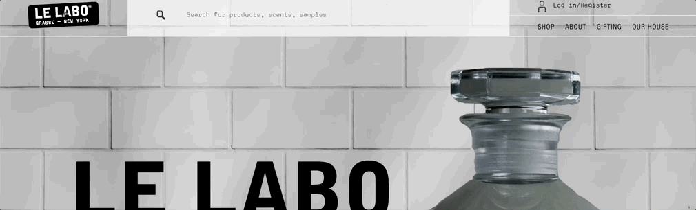
🖥 출력 화면
2. java script 메뉴 호버 이벤트.
✅ 목표
1. 메뉴에 mousehover 시 메뉴 나타남.
2. 애니메이션 실행.
3. mouseleave 됐을 시 1초 뒤 메뉴 사라짐.
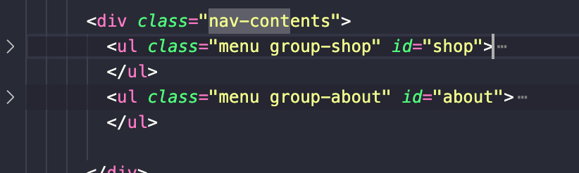
- html
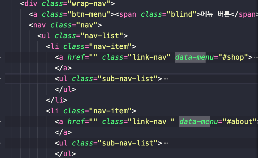
🖋 code review
data-속성으로 데이터 값 지정해두기.id = ""를 사용하여 nav-contents의 해당하는 콘텐츠와 연결.
- js
  // 1. 메뉴 호버 이벤트
  menuMotion1=gsap.timeline({
    paused:true,
  })
  menuMotion1
  .from('.header .nav-contents .wrap-img > *',{delay:0.5,opacity:0,stagger:.1, yPercent:100});


  $('[data-menu]').mouseover(function(){

    menuData = $(this).data('menu');
    maxHeight = $(menuData).outerHeight();
    $('.nav-contents .menu').removeClass('show');
    $('.nav-contents').css({'max-height':maxHeight}).find(menuData).addClass('show');

    if(menuData == '#shop'){
      menuMotion1.restart();
    }

  })

  $('.header').mouseleave(function(){
    setTimeout(function(){
      $('.nav-contents .menu').removeClass('show');
      $('.nav-contents').css({'max-height':0});
    }, 1000);
    menuMotion1.reverse();
  })
🖋 code review
1.$('[data-menu]'): html에서 데이터 값 선택.
2.menuData = $(this).data('menu');: html에서data-menu값을 받아와 선언.
3.maxHeight = $(menuData).outerHeight();: menuData에 해당하는 높이값을 받아와 선언.
4.$('[data-menu]').mouseover(function(){('.nav-contents').css({'max-height':maxHeight}).find(menuData).addClass('show');}:
해당 data-menu 값에 마우스 오버를 하면 해당 nav-contents값이 나타남.
5.menuMotion1 .from('.header .nav-contents .wrap-img > *',{delay:0.5,opacity:0,stagger:.1, yPercent:100});: .nav-contents의 .wrap-img가yPercent: 100으로부터yPercent: 0으로 차례대로 나타남.
6.if(menuData == '#shop'){ menuMotion1.restart(); }: #shop을 가진 menu-data값에 호버하면 menuMotion1이 재시작되도록 함.
7.setTimeout(function(){ $('.nav-contents .menu').removeClass('show'); $('.nav-contents').css({'max-height':0}); }, 1000); menuMotion1.reverse();: setTimeout()을 사용하여 mouseleave 되었을 때 1초 동안 menuMotion1이 reverse() 될 수 있게끔 함.
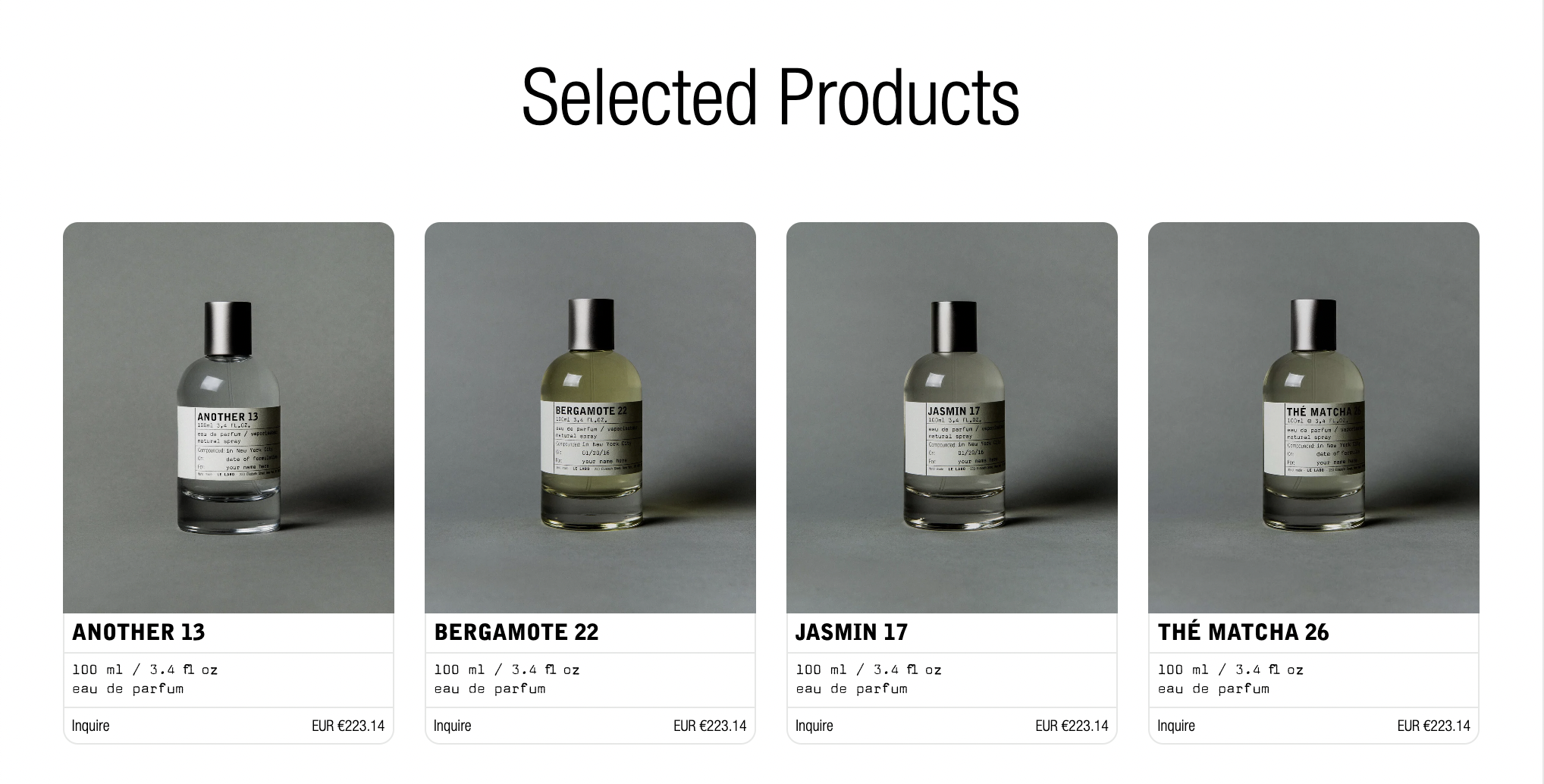
🖥 출력 화면
3. 반응형 레이아웃.
3-1) @mixin / @include
✏️ preview
- scss mixin 사용법
https://velog.io/@shiningwon97/SCSS-%EA%B5%AC%EC%A1%B0
1. 반응형 작업을 위한 미디어쿼리 mixin 만들기.
$mobile: 767px; //320 최소
$tablet: 1023px; // 768 최소
$desktop: 1200px; //1024 최소
//1200


/*반응형, 브라우저 크기가 767px 이하일때*/
@mixin mobile{
  @media (max-width: $mobile){
    @content;
  }
}

/*반응형, 브라우저 크기가 768이상, 1023px 이하일때*/
@mixin tablet{
  @media (max-width: $tablet){
    @content;
  }
}

/*반응형, 브라우저 크기가 1024px 이상일때*/
@mixin desktop{
  @media (max-width: $desktop){
    @content;
  }
}
2. @include를 사용하여 @mixin 사용하기.
    @include mobile{
        top: 40%;
        .strong-txt{
          font-size: 10vw;
          mix-blend-mode: overlay;
        }
        .accent-txt{
          display: none;
        }
        .txt{
          font-size: 4vw;
          letter-spacing: .3vw;
          mix-blend-mode: difference;
        }
      }
3-2) 반응형 스와이퍼
✏️ preview
- 디자인 삼성과 동일한 방법, 목차 4-2) 참조.
https://velog.io/@shiningwon97/DESIGN-SAMSUNG
🖥 출력 화면
- pc & tablet
- mobile