들어가기 앞서 🌱
3주간 개발해서 만든 웹 어플리케이션을 베포한 후, 드디어 올 것이 왔다. 예상하지 못한 에러들의 연속이었다. 너무 감사하다!
마지막 베포 전, 동료 개발자와 자체 QA를 진행하면서 유저의 액션에 반응하는 Toast UI가 있으면 좋겠다는 의견이 나왔다. 현재까진 context API만으로 어찌 어찌 구현할 수 있었고 상태 관리 라이브러리의 필요성을 느끼지 못했다. 하지만 Toast Ui를 구현하려고 하니... 필요함을 느꼈다. 여러 컴포넌트에서 장차 불려질 Toast 컴포넌트는 전역 상태 관리 라이브러리를 사용해야했다.
그래서 결국 클라이언트 상태 관리 라이브러리를 사용하여 기준점을 두고 몇가의 상태들은 전역에서 관리하려고 한다.
📕어떤 라이브러리가 좋을까? (이 블로그에서는 간단하게)
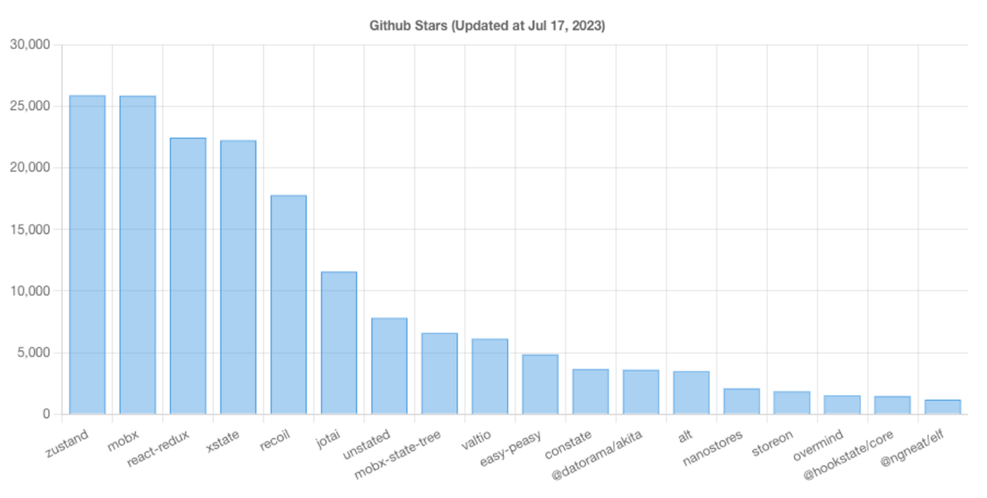
이미지 출처 : https://fe-tool.com/awesome-react-state-managemen
react-redux
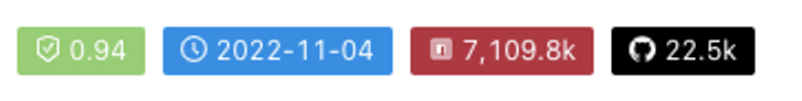
안정적이고 많은 유저가 있으며 최신 업데이트는 작년 11월로 나름 안쓸 이유가 없다. 하지만 리덕스 뒷단의 배경을 알아야한다. flux 패턴이 왜 등장했고 그로 인해 리액트 안에서 어떻게 효용이 있는지를 정리해야한다. 무엇보다 react-redux를 통해 확장가능하고 유지보수가 높은 웹 앱을 만들 수 있기에 많은 사람들이 사용한다.
2023년 가장 많이 쓰인 라이브러리이다.
zustand
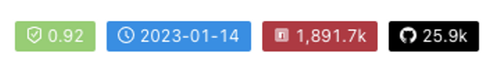
간단한 flux패턴을 기반으로 만들어진 가볍고 쉬운 라이브러리인다. 가볍고 효율적으로 상태를 관리해줘서 인기가 많다. zustand는 API를 제공해주는데 개발자에게 store를 만들도록 하고 그 안에서 데이터를 관리하고 업데이트하도록 한다.
zustand는 결국 리액트 Context API로 만들어졌는데 훅을 일으킨다는 특징이 있다. 이말인 즉슨, 전체 context Providers로 감싸지 않아도 된다는 것. 현재 우리 프로젝트의 문제는 수 많은 Context가 존재하는 것인데 가장 적합할 지 모르겠다.
mobx
mobx는 함수형 반응형 프로그래밍을 기반으로 만들어진 라이브러리이다. 복잡하고 데이터 기반 인터페이스 데이터를 쉽게 관리할 수 있는 도구를 제공해준다. 추가적으로 Mobx는 관찰 가능하고 계산된 값 그리고 상태가 변했을때 변화를 감지할 수 있는 상태관리 도구를 제공해준다.
jotai

리액트의 새로운 동시성 모드 그리고 성능 최적화에 동작하도록 설계되었고 크고 복잡한 어플리케이션에 적합하다. redux, mobx와 비슷하지만 작은 버전이라고 생각하면 된다.
그럼 우리 프로젝트에선 무엇을 써야할까?
zustand을 활용하려고 한다. 왜냐하면 다른 상태관리 툴은 크고 복잡한 구조의 어플리케이션에 적합하다고 나와있지만 zustand은 가볍고 효율적으로 상태를 관리해준다고 하며, 무엇보다 업데이트 시기가 가장 이르고 빠르게 익혀 프로젝트에 적용할 수 있다고 판단했다. redux보다는 약 60배 recoil 보다는 약 20배 가량 번들 사이즈가 작다고 한다.
📕본격적으로 코드를 살펴보면
구현 화면
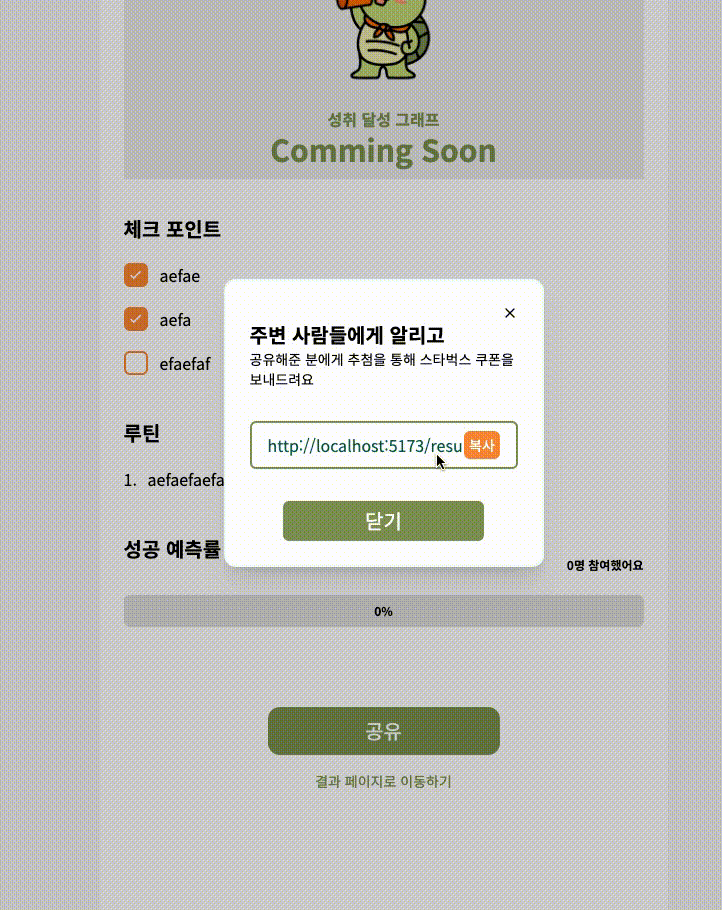
구현 화면을 보면 복사 버튼을 누르면 아래에서 위로 “클립보드에 복사되었습니다.” 문구의 UI를 제공하고 있는 것을 볼 수 있다. 그럼 어떻게 구현했는지 이제 하나씩 살펴보면
토스트 메세지 구현 블로그를 참고하여 구현하였다.
1. zustand store 생성
store/toastStore.ts
import { create } from "zustand";

export const TOAST_TYPE = {
	exampleA: "exampleA",
	exampleB: "exampleB",
	exampleC: "exampleC",
} as const;

// TOAST_TYPE의 키값통해 객체에 접근할 수 있도록 하는 타입
export type ToastType = keyof typeof TOAST_TYPE;

// toastTitle은 위의 키값이 담긴 배열로 타입을 지정
interface ToastStore {
	toastTitle: ToastType[];
}

export const toastStore = create<ToastStore>((set) => ({
	toastTitle: [],
}));
위와 같이 기본 타입들을 설정한다. zustand 라이브러리를 학습하는데 큰 어려움은 없었지만 깊이 들어가면 분명 모르는게 있을 것 같다. 우선 사용해보면서 문제를 만나면 한번 깊이 정리해보아야겠다.
우선 state를 만들고
import { create } from "zustand";

export const TOAST_TYPE = {
	toastA: "toastA",
	toastB: "toastB",
	toastC: "toastC",
} as const;

export type ToastType = keyof typeof TOAST_TYPE;

interface ToastStore {
	toastTitle: ToastType[];
	updateToastTitle: (val: ToastType) => void;
	removeToastTitle: (val: ToastType) => void;
}

export const toastStore = create<ToastStore>((set) => ({
	toastTitle: [],
	updateToastTitle: (toastType: ToastType) =>
		set((store) => ({ toastTitle: [...store.toastTitle, toastType] })),
	removeToastTitle: (toastType: ToastType) =>
		set((store) => ({
			toastTitle: store.toastTitle.filter((t) => t !== toastType),
		})),
}));
해당 toastTitle이라는 상태를 여러 컴포넌트에서 업데이트하여 Toast UI를 보여줄 것이고 일정 시간이 지나면 없어져야하니 위의 코드를 추가해주었다. 이런 측면에서 zustand 라이브러리를 통해 어렵지 않게 상태를 수정하고 삭제하는 기능을 구현할 수 있었다.
2. useToasts.ts 커스텀 훅 생성
이렇게 만들어진 store를 활용하여 custom hook을 만든다.
// useToasts.ts
import { useCallback } from "react";
import { ToastType, toastStore } from "../store/toastStore";

const useToasts = () => {
	const toastList = toastStore<ToastType[]>((state) => state.toastTitle);
	const updateToastTitle = toastStore((state) => state.updateToastTitle);
	const removeToastTitle = toastStore((state) => state.removeToastTitle);

	const show = useCallback(
		(toastType: ToastType) => {
			updateToastTitle(toastType);
		},
		[updateToastTitle]
	);

	const close = useCallback(
		(toastType: ToastType) => {
			removeToastTitle(toastType);
		},
		[removeToastTitle]
	);

	return {
		toastList,
		show,
		close,
	};
};

export default useToasts;
store/toastStore.ts 를 통해 만든 전역 상태를 useToasts 훅으로 가지고 온다. 이후 실제적인 유저 행동에 관련한 함수를 정의한다. 함수의 정의부에 store의 상태를 수정하고 삭제하는 함수를 호출한다. 그리고 return 객체안에 살포시 넣어주면 useToasts 훅도 마무리
3. Portal 설정
<html lang="ko">
	<head>
		<meta charset="UTF-8" />
		<link rel="icon" type="image/svg+xml" href="./src/assets/logo/oli.png" />
		<meta name="viewport" content="width=device-width, initial-scale=1.0" />

		<title>알리고 올리고</title>
	</head>
	<body>
		<div id="root"></div>
		<div id="toast-root"></div> // here i am
		<script type="module" src="/src/main.tsx"></script>
	</body>
</html>
Index.html 파일 안에
<div id="toast-root"></div>를 추가하여 id가 toast-root인 div에 createPortal 매소드를 활용해서 추가해주려고 한다. 현재 다른 여러 페이지에서 root div에 포탈을 사용하고 있어서 부득이하게 추가해준 것이다.
4. ToastContainer 컴포넌트 생성
여러 컴포넌트에서 사용할 수 있도록 장차 만들어질 Toast 컴포넌트들의 컨테이너를 생성한다.
import { ReactNode, useEffect } from "react";
import { ToastType } from "../../store/toastStore";
import useToasts from "../../hooks/useToasts";
import { createPortal } from "react-dom";
import { AnimatePresence, motion } from "framer-motion";

interface Props {
	children: ReactNode;
	toastType: ToastType;
	config?: {
		duration: number;
	};
}

const ToastContainer = ({
	children,
	toastType,
	config = { duration: 1000 },
}: Props) => {
	const ref = document.querySelector("#toast-root");
	const { duration } = config;
	const { toastList, close } = useToasts();

	const isShown = toastList.includes(toastType);

	return (
	...
)

export default ToastContainer;
useToasts 커스텀 훅을 import하여 해당 컨테이너에서 전역 상태인 toastList와 닫는 기능을 구조 분해 할당으로 가지고 온다. 그리고 Props인 toastType이 상태 배열에 있다면 isShown은 True의 값을 가지게 한다.
const ToastContainer = ({
	children,
	toastType,
	config = { duration: 1000 },
}: Props) => {
	const ref = document.querySelector("#toast-root");
	const { duration } = config;
	const { toastList, close } = useToasts();

	const isShown = toastList.includes(toastType);

	useEffect(() => {
		if (!isShown) {
			return undefined;
		}

		const timer = setTimeout(() => {
			close(toastType);
		}, duration);

		return () => {
			clearTimeout(timer);
		};
	}, [close, duration, isShown, toastType]);

	if (!ref) {
		return null;
	}

	return createPortal(
		<AnimatePresence>
			{isShown && (
				<motion.div
					key={toastType}
					layout
					initial={{ opacity: 0.5, y: 24 }}
					animate={{ opacity: 1, y: 0 }}
					exit={{ opacity: 0.5, y: 12 }}
					transition={{ ease: "easeOut" }}
				>
					{children}
				</motion.div>
			)}
		</AnimatePresence>,
		ref
	);
};

export default ToastContainer;
useEffect 훅을 살펴보면 만약 인자로 들어온 값이 상태값에 없다면 아무것도 보이지 않는다. setTimeout() 비동기 API를 활용하여 이팩트가 일어난 이후 지정된 duration동안 보이다 사라지도록 구현하였다. 그 이후 컴포넌트가 unMount가 되면 해당 API를 제거하는 로직이다. ref는 자바스크립트를 활용하여 dom에 접근하였다.
5. Toast 컴포넌트 생성
// Toast.tsx
import { TOAST_TYPE } from "../../store/toastStore";
import ToastContainer from "../layout/ToastContainer";

const Toast = () => {
	return (
		<ToastContainer toastType={TOAST_TYPE.exampleA}>
			<div className="flex items-center justify-center w-80 h-16 px-3 py-5 rounded-3xl shadow-orange-500 bg-orange-300 text-white">
				클립보드에 추가되었습니다
			</div>
		</ToastContainer>
	);
};

export default Toast;
ToastContainer에 타입과 동일한 string을 props로 내려준다.
6. 필요한 컴포넌트에 로직 추가
import { FiX } from "react-icons/fi";
import StyledButton from "../common/StyledButton";
import Toast from "../common/Toast";
import useToasts from "../../hooks/useToasts";

type Props = {
	closeModal: () => void;
	shareUrl: string | undefined;
};

const SharingModal = ({ shareUrl, closeModal }: Props) => {
	const { show } = useToasts();

	return (
		<div className="bg-white rounded-md">
			<div className="flex justify-end cursor-pointer">
				<FiX onClick={closeModal} onKeyDown={closeModal} />
			</div>
			<h1 className="font-semibold text-xl">주변 사람들에게 알리고</h1>
			<p className="font-light text-sm">
				공유해준 분에게 추첨을 통해 스타벅스 쿠폰을 보내드려요
			</p>
			<div className="flex items-center my-8 border-main border-2 border-solid rounded-md py-2 px-4 relative">
				<input
					defaultValue={shareUrl}
					type="text"
					className="placeholder:text-xs w-full outline-none text-emerald-800"
				/>
				<StyledButton
					styleName="copy"
					type="button"
					onClick={() => show("toastA")}
				>
					복사
				</StyledButton>
			</div>
			<div className="flex justify-center">
				<StyledButton
					styleName="sharingExit"
					type="button"
					onClick={closeModal}
				>
					닫기
				</StyledButton>
			</div>

			// 추가
			<Toast />
		</div>
	);
};

export default SharingModal;
위에서 만든 훅을 import하여 show 함수를 가지고 오고 원하는 이벤트 함수 내부에 추가하면 된다. Toast 컴포넌트 같은 경우는 하단에 추가하였다.
해당 기능을 확장성있게 사용해보려고 한다.
📕여러 컴포넌트에서 다른 내용의 Toast UI 컴포넌트 사용하기
7월 19일 예정
마치며 🌱
아직 웹 서비스를 정식 release한 것은 아니지만 임시 배포를 한 후, 부족한 점이 너무 많이 보인다. 우선 너무 딱딱하고 심미적으로 문제가 많다. 그 외에도 소셜 로그인, 베포 환경 테스트 문제, env 문제등 만나고 싶은 에러들을 다 마주하고 있다. 하나씩 리팩토링할 일만 남았다.
-끝-

글 잘 봤습니다, 많은 도움이 되었습니다.