UI 라이브러리와 코어 라이브러리의 분리
코어 라이브러리
- 날짜 및 시간 관련 로직, 이벤트 관리 와 같은 비즈니스로직을 코어 라이브러리로 분리
- UI와 관련이 없어 Headless UI로 독립적인 모듈로 관리할 수 있음.
- UI를 유연하게 구축하고 관리하기 위한 코어 라이브러리!
코어 라이브러리로 개발하기 위해 최소한의 캘린더 뷰를 위한 css 만을 포함하고 있다.
또한, 처음 스타일드 컴포넌트로 구현되어있었으나, 최소한의 css만을 보여주기 위해 굳이 스타일드컴포넌트로 구현할 필요가 없다고 느껴졌다.
왜냐 ? 스타일드 컴포넌트를 사용하는 이유는 props에 따라 렌더링을 쉽게 다르게 보여줄 수 있는데, UI를 제거한 비즈니스로직만 있는 코어라이브러리에서까지 굳이 쓸 필요는 없다 생각하였고,
스타일드 컴포넌트가 CSS를 JavaScript 객체로 관리하고, 라이브러리 코드 자체도 빌드에 포함되기 때문에 빌드 용량이 클 수 밖에 없다.
따라서 최적화를 위해서도 css로 마이그레이션 하는것은 필수적이였다.
- 기존
function App(props: CalendarProps) {
  const { mainColor, subMainColor, onCheckInOutChange } = props;

  return (
    <ThemeProvider theme={{ mainColor, subMainColor }}>
      <GlobalStyle />
      <CalendarProvider
        calendarProps={props}
        onCheckInOutChange={onCheckInOutChange}
      >
        <Calendar />
      </CalendarProvider>
    </ThemeProvider>
  );
}

export default App;
- 변경 후
function App(props: CalendarProps) {
  const { onCheckInOutChange } = props;

  return (
    <>
      <CalendarProvider
        calendarProps={props}
        onCheckInOutChange={onCheckInOutChange}
      >
        <Calendar   />
      </CalendarProvider>
    </>
  );
}

export default App;
그럼에 따라 context의 props도 변경이 되었다.
스타일과 관련된 defaultProps 제거
- 기존
const defaultProps: CalendarProps = {
  startDay: 0,
  numMonths: 2,
  language: "en",
  maximumMonths: 12,
  showBookingDatesView: true,
  isRectangular: false,
  resetStyle: false,
  defaultCheckIn: dayjs().add(7, "day"),
  defaultCheckOut: dayjs().add(8, "day"),
};
- 변경 후
const defaultProps: CalendarProps = {
  startDay: 0,
  numMonths: 1,
  language: "ko",
  defaultCheckIn: dayjs().add(7, "day"),
  defaultCheckOut: dayjs().add(8, "day"),
};
DateCell Component
- 변경 전
type DateCellProps = {
  date: number;
  month: number;
  year: number;
  isOtherDay: boolean;
  lastDayOfMonth: number;
};

const DateCell = ({
  date,
  month,
  year,
  isOtherDay,
  lastDayOfMonth,
}: DateCellProps) => {
  const { bookingDates, today, calendarSettings } = useContext(CalendarContext);
  const { isRectangular, resetStyle } = calendarSettings;
  const currentDate = dayjs(new Date(year, month - 1, date));
  const { handleClickDate } = useHandleClickDate(today);
  const currentDateString = currentDate.format(DATE_FORMAT);
  const todayDateString = today.format(DATE_FORMAT);
  const isAfterLastDay = date > lastDayOfMonth;
  const checkInDateString = bookingDates.checkIn?.format(DATE_FORMAT);
  const checkOutDateString = bookingDates.checkOut?.format(DATE_FORMAT);
  const isSelectedDate =
    !isOtherDay &&
    (checkInDateString === currentDateString ||
      checkOutDateString === currentDateString);
  const isWithinRange =
    !isOtherDay &&
    checkInDateString &&
    checkOutDateString &&
    checkInDateString < currentDateString &&
    currentDateString < checkOutDateString;

  return (
    <DatesContainer
      onClick={
        !isAfterLastDay && !isOtherDay
          ? () => handleClickDate(currentDate)
          : undefined
      }
    >
      {isSelectedDate && (
        <Highlighting isRectangular={isRectangular} resetStyle={resetStyle} />
      )}
      {isWithinRange && (
        <MiddleHighlighting
          isRectangular={isRectangular}
          resetStyle={resetStyle}
        />
      )}
      {currentDateString === todayDateString && (
        <TodayDot isHighlighting={isSelectedDate} resetStyle={resetStyle} />
      )}
      <DateNum
        isBeforeToday={currentDateString < todayDateString}
        isOtherDay={isOtherDay}
        isHighlighting={isSelectedDate}
        isRectangular={isRectangular}
        resetStyle={resetStyle}
      >
        {date}
      </DateNum>
    </DatesContainer>
  );
};

export default DateCell;
const centered = css`
  position: absolute;
  top: 50%;
  left: 50%;
  transform: translate(-50%, -50%);
`;

const DatesContainer = styled.li`
  display: flex;
  position: relative;
  width: calc(100% / 7);
  padding: 1rem 0;
  text-align: center;
  list-style: none;
  box-sizing: border-box;
  justify-content: center;
  align-items: center;
`;

const DateNum = styled.div<{
  isHighlighting?: boolean;
  isOtherDay: boolean;
  isBeforeToday: boolean;
  isRectangular?: boolean;
  resetStyle?: boolean;
}>`
  display: ${(props) => (props.isOtherDay ? "none" : "block")};

  color: ${(props) =>
    props.resetStyle
      ? "var(--color-black)"
      : props.isBeforeToday
      ? "var(--color-light-gray)"
      : props.isHighlighting
      ? "var(--color-white)"
      : "var(--color-black)"};

  &:hover {
    ::after {
      content: "";
      display: block;
      border: ${(props) =>
        props.resetStyle
          ? "var(--color-white)"
          : props.isBeforeToday
          ? "var(--color-white)"
          : "3px solid var(--color-main)"};
      border-radius: ${(props) => (props.isRectangular ? "4px" : "50%")};

      width: 40px;
      height: 40px;
      ${centered}
    }
  }
  cursor: pointer;
  z-index: 10;
`;

const Highlighting = styled.div<{
  isRectangular?: boolean;
  resetStyle?: boolean;
}>`
  border: ${(props) =>
    props.resetStyle ? "var(--color-white)" : "3px solid var(--color-main)"};
  background-color: ${(props) =>
    props.resetStyle ? "var(--color-white)" : "var(--color-main)"};
  border-radius: ${(props) => (props.isRectangular ? "4px" : "50%")};
  width: 40px;
  height: 40px;
  ${centered}
`;
const MiddleHighlighting = styled.div<{
  isRectangular?: boolean;
  resetStyle?: boolean;
}>`
  width: 40px;
  height: 40px;
  ${centered}
  border-radius: ${(props) => (props.isRectangular ? "4px" : "50%")};
  background-color: ${(props) =>
    props.resetStyle ? "var(--color-white)" : "var(--color-sub-main)"};
`;

const TodayDot = styled.div<{ isHighlighting: boolean; resetStyle?: boolean }>`
  background-color: ${(props) =>
    props.resetStyle
      ? "var(--color-white)"
      : props.isHighlighting
      ? "var(--color-white)"
      : "var(--color-main)"};

  border-radius: 50%;
  width: 5px;
  height: 5px;
  position: absolute;
  bottom: 10%;
  left: 50%;
  transform: translate(-50%, -50%);
`;
- 변경 후
type DateCellProps = {
  date: number;
  month: number;
  year: number;
  isOtherDay: boolean;
  lastDayOfMonth: number;
};

const DateCell = ({
  date,
  month,
  year,
  isOtherDay,
  lastDayOfMonth,
}: DateCellProps) => {
  const { bookingDates, today } = useContext(CalendarContext);
  const currentDate = dayjs(new Date(year, month - 1, date));
  const isAfterLastDay = date > lastDayOfMonth;
  const { handleClickDate } = useHandleClickDate(today);
  const currentDateString = currentDate.format(DATE_FORMAT);
  const todayDateString = today.format(DATE_FORMAT);
  const checkInDateString = bookingDates.checkIn?.format(DATE_FORMAT);
  const checkOutDateString = bookingDates.checkOut?.format(DATE_FORMAT);
  const isSelectedDate =
    !isOtherDay &&
    (checkInDateString === currentDateString ||
      checkOutDateString === currentDateString);
  const isWithinRange =
    !isOtherDay &&
    checkInDateString &&
    checkOutDateString &&
    checkInDateString < currentDateString &&
    currentDateString < checkOutDateString;

  let classNames = "";
  if (currentDateString === todayDateString) {
    classNames += "today";
  }
  if (isSelectedDate) {
    classNames += "selected";
  }
  if (isWithinRange) {
    classNames += "within-range";
  }
  if (isOtherDay) {
    classNames += "other-day";
  }

  return (
    <li
      className={`datecell-container ${classNames}`}
      onClick={
        !isAfterLastDay && !isOtherDay
          ? () => handleClickDate(currentDate)
          : undefined
      }
    >
      <div className="date-cell">{date}</div>
    </li>
  );
};

export default DateCell;
기존 스타일드 컴포넌트에 해당하는 부분들을 조건에따라 className을 주입해주는 방식으로 변경
UI 라이브러리
- 아직 완벽하게 UI 라이브러리는 배포업데이트가 되기 전이지만 계속해서 업데이트하는중
- UI 라이브러리를 개발하게 된 이유는 처음에는 props로 자유도를 높여가고자 고민했지만, 가장 좋은 자유도는 직접 스타일 하는 것 만큼의 높은 자유도를 줄 수 있는 일은 없을 것이라 생각했다.
- 때문에, 코어 라이브러리에서 기본 기능만 제공하고 UI라이브러리에서 코어 라이브러리를 Import 해서 사용 하는 방식으로 진행하려한다.
npm i react-check-in-out-calendar-core
import { Calendar } from "react-check-in-out-calendar-core";
import "./styles/calendar.css";
import "./styles/index.css";
function App() {
  return <Calendar />;
}

export default App;
css 적용
.datecell-container.today::after {
  content: "";
  background-color: var(--color-main);
  border-radius: 50%;
  width: 5px;
  height: 5px;
  position: absolute;
  bottom: 10%;
  left: 50%;
  transform: translate(-50%, -50%);
}

.datecell-container .date-cell:hover::after {
  content: "";
  display: block;
  border: 3px solid var(--color-main);
  border-radius: 50%;
  width: 40px;
  height: 40px;
  position: absolute;
  top: 50%;
  left: 50%;
  transform: translate(-50%, -50%);
}

.datecell-container.selected .date-cell::after {
  content: "";
  display: block;
  border: 3px solid var(--color-main);
  border-radius: 50%;
  width: 40px;
  height: 40px;
  position: absolute;
  top: 50%;
  left: 50%;
  transform: translate(-50%, -50%);
}

.datecell-container.within-range .date-cell::after {
  /* within-range에 해당하는 스타일 */
  content: "";
  display: block;
  border: 3px solid var(--color-sub-main);
  border-radius: 50%;
  width: 40px;
  height: 40px;
  position: absolute;
  top: 50%;
  left: 50%;
  transform: translate(-50%, -50%);
}

.datecell-container.other-day {
  visibility: hidden;
}
빌드 용량차이
- 기존 통합 라이브러리
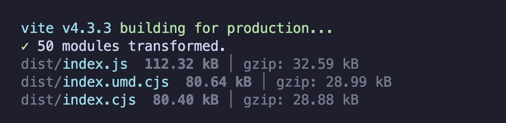
-
코어 라이브러리
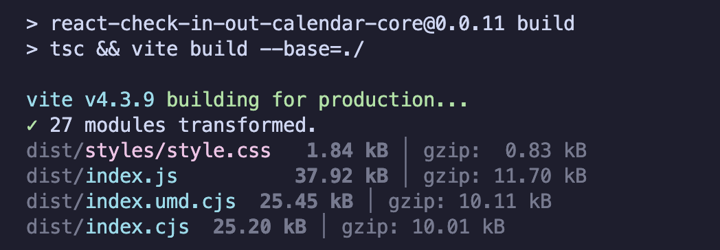
-
UI 라이브러리
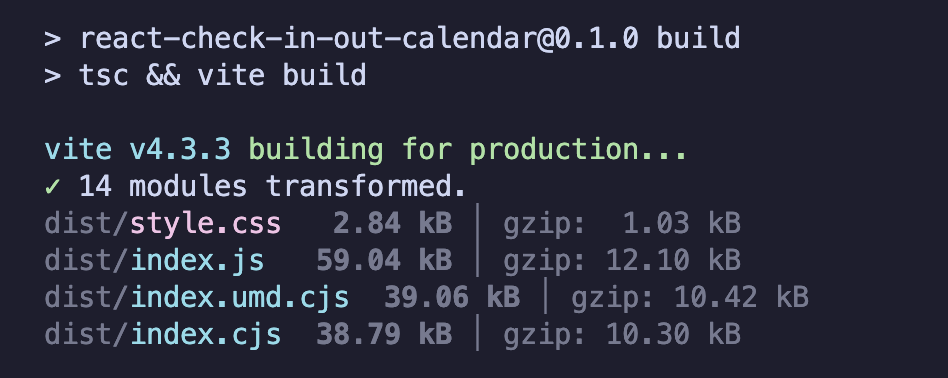
272kb ->129kb로 대략 50% 의 용량을 줄일 수 있었다!

프론트엔드 개발자 항상 뭘 하고있는 슬킹(seulki + ing)