유노코딩 인프런 강의 정리 [입문자를 위한 반응형 웹 기초 강의
]
https://www.inflearn.com/course/%EB%B0%98%EC%9D%91%ED%98%95-%EC%9B%B9-%EC%9E%85%EB%AC%B8/dashboard
반응형 웹
반응형 웹 : 기기나 브라우저의 크기에 맞게 구성이나 크기를 변경해가며 반흥하는 웹문서 또는 이를 위해 사용하는 기법을 뜻하는 말
가변성 : 반응형 웹 사이트에서 가장 핵심이 되는 키워드
뷰포트(viewport) : 현재 화면에 보여지고 있는 영역
기기에 따라 다른 화면 크기에 대응하기 위해, 웹문서에 viewport속성에 대한 마크업을 추가해야 한다.
상대단위 em rem
px : 절대 길이 단위 가변성 X
em : 부모요소 글꼴 크기
rem : 루트 요소 글꼴 크기
html 기본 글꼴 크기는 16px 1rem → 16px 2rem → 32px
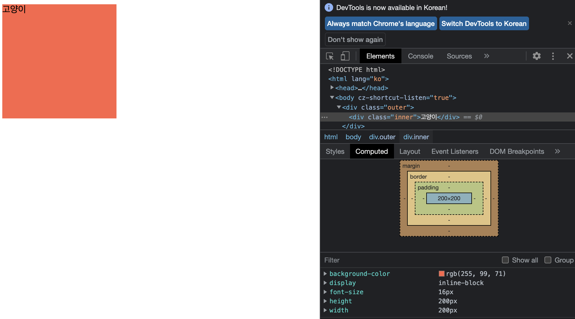
<!DOCTYPE html>
<html lang="ko">
<head>
    <meta charset="UTF-8">
    <meta http-equiv="X-UA-Compatible" content="IE=edge">
    <meta name="viewport" content="width=device-width, initial-scale=1.0">
    <title>em과 rem</title>
    <style>
        .outer{
            font-size: 18px;
        }
        .inner{
            font-size: 1rem; //html 기본 16px
            display: inline-block;
            width: 200px;
            height: 200px;
            background-color: tomato;
        }
    </style>
</head>
<body>
    <div class="outer">
        <div class="inner">고양이</div>
    </div>
</body>
</html>
em으로 내,외부 여백 크기를 정할 때는 자기 자신의 글자 크기를 기준으로 한다!
<!DOCTYPE html>
<html lang="ko">
<head>
    <meta charset="UTF-8">
    <meta http-equiv="X-UA-Compatible" content="IE=edge">
    <meta name="viewport" content="width=device-width, initial-scale=1.0">
    <title>em과 rem</title>
    <style>
        .outer{
            font-size: 32px;
        }
        .inner{
            font-size: 1em;
            display: inline-block;
            width: 200px;
            height: 200px;
            background-color: tomato;
            padding: 1em;
            margin: 1em;
        }
    </style>
</head>
<body>
    <div class="outer">
        <div class="inner">고양이</div>
    </div>
</body>
</html>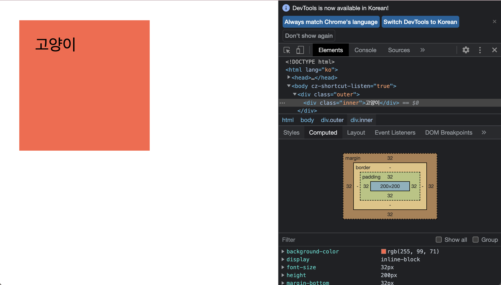
<!DOCTYPE html>
<html lang="ko">
<head>
    <meta charset="UTF-8">
    <meta http-equiv="X-UA-Compatible" content="IE=edge">
    <meta name="viewport" content="width=device-width, initial-scale=1.0">
    <title>em과 rem</title>
    <style>
        .outer{
            font-size: 32px;
        }
        .inner{
            font-size: 18px;
            display: inline-block;
            width: 200px;
            height: 200px;
            background-color: tomato;
            padding: 1em;
            margin: 1em;
        }
    </style>
</head>
<body>
    <div class="outer">
        <div class="inner">고양이</div>
    </div>
</body>
</html>
em과 rem은 주변상황에 따라 그 크기를 달리할 수 있는 가변성을 지니고 있지만, 브라우저나 기기화면에 크기에 따라 크기가 달라지는 단위는 아니다.
따라서, 진정한 반응형 단위라고 할 수는 없다.
가변단위
뷰포트 크기를 기반으로 값을 계산하여 크기를 결정하는 가변 단위
font-size : 1vw /* 뷰포트 너비의 100분의 1 */
font-size : 1vh /* 뷰포트 높이의 100분의 1 */

font-size : 1vmin /* 뷰포트 높이와 너비 중 작은 쪽의 100분의 1 */
font-size : 1vmin /* 뷰포트 높이와 너비 중 큰 쪽의 100분의 1 */
가변 레이아웃
%
- 비율 계산 기반으로 변화하는 가변 레이아웃에는 %단위가 주로 사용됨
- %e단위는 백분율 값으로 부모 요소와의 상대적 크기를 지정함
- 너비와 여백은 부모 요소의 너비에 비례해 계산됨
- 높이는 부모 요소의 높이에 비례해 계산됨
- 글자 크기는 부모 요소의 글자 크기에 비례해 계산됨
<!DOCTYPE html>
<html lang="ko">
<head>
    <meta charset="UTF-8">
    <meta http-equiv="X-UA-Compatible" content="IE=edge">
    <meta name="viewport" content="width=device-width, initial-scale=1.0">
    <title>가변 레이아웃</title>
    <style>
        .container{
            width: 90%;
            margin: 0 auto;
            text-align: center;
        }
        .header{
            width: 100%;
            height: 100px;
            background-color: tomato;
        }
        .main{
            float: left;
            width: 67%;
            height: 300px;
            background-color: orange;
        }
        .aside{
            float: right;
            width: 33%;
            height: 300px;
            background-color: purple;
        }
        .footer{
            clear: both;
            width: 100%;
            height: 100px;
            background-color: violet;
        }
    </style>
</head>
<body>
    <div class="container">
        <div class="header">HEADER</div>
        <div class="main">MAIN</div>
        <div class="aside">ASIDE</div>
        <div class="footer">FOOTER</div>
    </div>
</body>
</html>
CSS 대표 함수 calc()
계산식의 결과를 속성값으로 지정할 수 있음
width: calc(30px-20px)
미디어 쿼리
미디어 타입을 인식하고, 콘텐츠를 읽어들이는 기기나 브라우저의 물리적 속성을 감지할 수 있는 유용한 장치이다.
- 미디어 타입
- 조건에 대한 물음(쿼리)
## 미디어 쿼리

미디어 타입을 인식하고, 콘텐츠를 읽어들이는 기기나 브라우저의 물리적 속성을 감지할 수 있는 유용한 장치이다.

- 미디어 타입
- 조건에 대한 물음(쿼리)
가변이미지
max-width : 요소의 최대 너비 제한을 정할 수 있는 속성
picture 와 source 요소 : 이미지를 미디어 조건에 맞게 선택적으로 불러올 수 있는 요소
가변 동영상
- iframe은 고정된 픽셀값이 주어져도 그 컨테이너 안에서 콘텐츠 크기를 유동적으로 조절할 수 있기 때문에.. 단순히 width & height 만 가지고 크기를 조절 힘들다.
- 동영상 서비스의 소스를 사용할 경우 height가 width와 비율을 정확하게 맞추지 않는 경우 있음.
- 따라서 정확한 비율을 유지하는 여백을 만들어 그 안에서만 동영상이 보여지게 만드는 기법을 사용함. 티에리 코블렌츠 라는 웹개발자가 처음 제안한 방법 (종횡비 이용!)