1. 📊 React Apex Chart
- ApexCharts is a modern charting library that helps developers to create beautiful and interactive visualizations for web pages.
- ApexCharts는 차트 라이브러리중 하나로, 시각적이고 인터렉티브한 차트를 구성할 수 있도록 도와줌. 현재 수 많은 차트 라이브러리들이 있지만, 상세하게 정리된 문서, 깔끔한 UI 등의 장점이 있다.
👇notion으로 정리된 문서 보길 원하면👇
2. Chart Types
1) Line Chart
(1) Series(Data Format)
- Single Value
1) Single Values

series:[{
  data: [23, 34, 12, 54, 32, ... , 43]
}]

// data에 들어가는 array는 y값

xaxis:{
  categories: ["Jan", "Feb", "Mar", ... , "Dec"]
}

// xaxis.categories 속성에서 x값 데이터가 제공되어야 함- Paired values
2-1) Paired Values

series: [{
  data: [[1, 34], [3, 54], [5, 23] , ... , [15, 43]]
}],
xaxis: {
  type: 'numeric'
}

// data에 paired value로 이루어진 two-dimensional array를 넣어줄 수도 있음 [x의 값, y의 값] 2-2) Numeric paired values in XY properties
series: [{
data: [{
x: 20,
y: 54
}, {
x: 30,
y: 66
}],
}],
xaxis: {
type: 'numeric'
}
// data에 paired value로 이루어진 object형태로 넣어줄 수 있음 {x: x의 값, y: y의 값}2-3) Category paired values
series: [{
data: [{
x: 'Apple',
y: 54
}, {
x: 'Orange',
y: 66
}],
}],
xaxis: {
type: 'category'
}
// 숫자쌍의 형태가 아니더라도 y값에 따르는 string value인 x의 값을 지정해 줄 수 있음.- Timeline Series
3-1) TimeStamps

series: [{
  data: [[1324508400000, 34], [1324594800000, 54] , ... , [1326236400000, 43]]
}]

// 시계열 series를 plot하기 위해서는 timestamp가 필요함.3-2) Date strings
series: [{
data: [{ x: '05/06/2014', y: 54 }, { x: '05/08/2014', y: 17 } , ... , { x: '05/28/2014', y: 26 }]
}]
// JavaScript의 Date.parse()함수를 통과하는 date string을 넣어 줄 수도 있음(2) Line Charts Types & Options
- Basic Line Chart
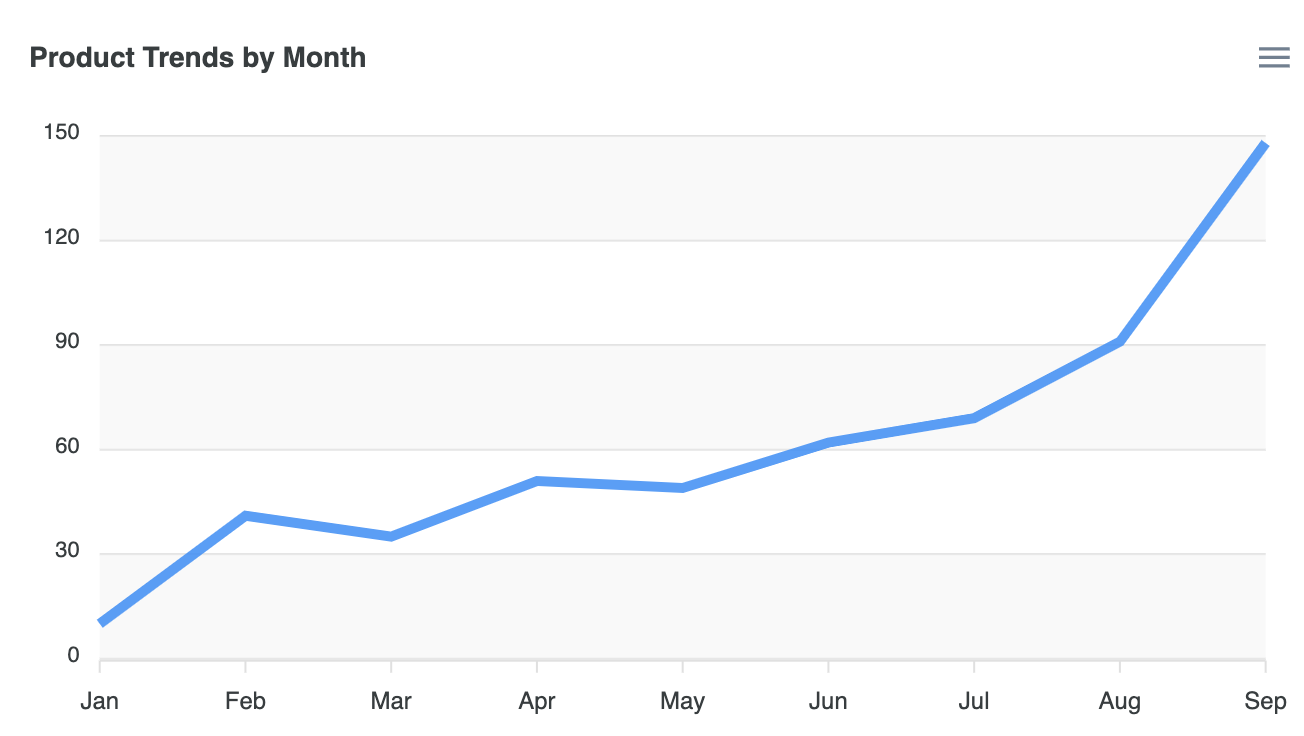
var options = {
          series: [{
            name: "Desktops",
            data: [10, 41, 35, 51, 49, 62, 69, 91, 148]
        }],
          chart: {
          height: 350,
          type: 'line',
          zoom: {
            enabled: false
          }
        },
        dataLabels: {
          enabled: false
        },
        stroke: {
          curve: 'straight'
        },
        title: {
          text: 'Product Trends by Month',
          align: 'left'
        },
        grid: {
          row: {
            colors: ['#f3f3f3', 'transparent'], // takes an array which will be repeated on columns
            opacity: 0.5
          },
        },
        xaxis: {
          categories: ['Jan', 'Feb', 'Mar', 'Apr', 'May', 'Jun', 'Jul', 'Aug', 'Sep'],
        }
        };

        var chart = new ApexCharts(document.querySelector("#chart"), options);
chart.render();- Line chart with Data Labels
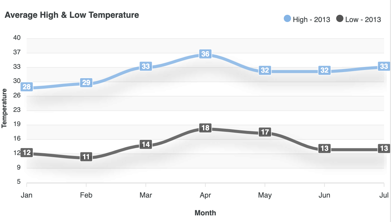
var options = {
          series: [
          {
            name: "High - 2013",
            data: [28, 29, 33, 36, 32, 32, 33]
          },
          {
            name: "Low - 2013",
            data: [12, 11, 14, 18, 17, 13, 13]
          }
        ],
          chart: {
          height: 350,
          type: 'line',
          dropShadow: {
            enabled: true,
            color: '#000',
            top: 18,
            left: 7,
            blur: 10,
            opacity: 0.2
          },
          toolbar: {
            show: false
          }
        },
        colors: ['#77B6EA', '#545454'],
        dataLabels: {
          enabled: true,
        },
        stroke: {
          curve: 'smooth'
        },
        title: {
          text: 'Average High & Low Temperature',
          align: 'left'
        },
        grid: {
          borderColor: '#e7e7e7',
          row: {
            colors: ['#f3f3f3', 'transparent'], // takes an array which will be repeated on columns
            opacity: 0.5
          },
        },
        markers: {
          size: 1
        },
        xaxis: {
          categories: ['Jan', 'Feb', 'Mar', 'Apr', 'May', 'Jun', 'Jul'],
          title: {
            text: 'Month'
          }
        },
        yaxis: {
          title: {
            text: 'Temperature'
          },
          min: 5,
          max: 40
        },
        legend: {
          position: 'top',
          horizontalAlign: 'right',
          floating: true,
          offsetY: -25,
          offsetX: -5
        }
        };

        var chart = new ApexCharts(document.querySelector("#chart"), options);
chart.render();- Zoomable Timeseries
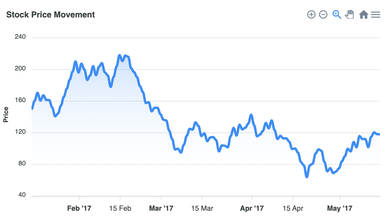
var options = {
          series: [{
          name: 'XYZ MOTORS',
          data: dates
        }],
          chart: {
          type: 'area',
          stacked: false,
          height: 350,
          zoom: {
            type: 'x',
            enabled: true,
            autoScaleYaxis: true
          },
          toolbar: {
            autoSelected: 'zoom'
          }
        },
        dataLabels: {
          enabled: false
        },
        markers: {
          size: 0,
        },
        title: {
          text: 'Stock Price Movement',
          align: 'left'
        },
        fill: {
          type: 'gradient',
          gradient: {
            shadeIntensity: 1,
            inverseColors: false,
            opacityFrom: 0.5,
            opacityTo: 0,
            stops: [0, 90, 100]
          },
        },
        yaxis: {
          labels: {
            formatter: function (val) {
              return (val / 1000000).toFixed(0);
            },
          },
          title: {
            text: 'Price'
          },
        },
        xaxis: {
          type: 'datetime',
        },
        tooltip: {
          shared: false,
          y: {
            formatter: function (val) {
              return (val / 1000000).toFixed(0)
            }
          }
        }
        };

        var chart = new ApexCharts(document.querySelector("#chart"), options);
chart.render();- Line Chart with Annotations
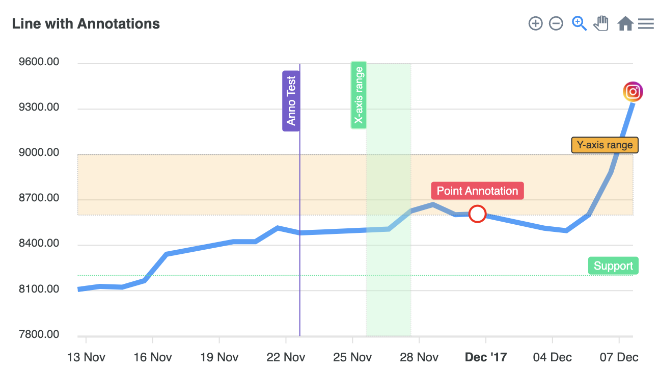
var options = {
          series: [{
          data: series.monthDataSeries1.prices
        }],
          chart: {
          height: 350,
          type: 'line',
          id: 'areachart-2'
        },
        annotations: {
          yaxis: [{
            y: 8200,
            borderColor: '#00E396',
            label: {
              borderColor: '#00E396',
              style: {
                color: '#fff',
                background: '#00E396',
              },
              text: 'Support',
            }
          }, {
            y: 8600,
            y2: 9000,
            borderColor: '#000',
            fillColor: '#FEB019',
            opacity: 0.2,
            label: {
              borderColor: '#333',
              style: {
                fontSize: '10px',
                color: '#333',
                background: '#FEB019',
              },
              text: 'Y-axis range',
            }
          }],
          xaxis: [{
            x: new Date('23 Nov 2017').getTime(),
            strokeDashArray: 0,
            borderColor: '#775DD0',
            label: {
              borderColor: '#775DD0',
              style: {
                color: '#fff',
                background: '#775DD0',
              },
              text: 'Anno Test',
            }
          }, {
            x: new Date('26 Nov 2017').getTime(),
            x2: new Date('28 Nov 2017').getTime(),
            fillColor: '#B3F7CA',
            opacity: 0.4,
            label: {
              borderColor: '#B3F7CA',
              style: {
                fontSize: '10px',
                color: '#fff',
                background: '#00E396',
              },
              offsetY: -10,
              text: 'X-axis range',
            }
          }],
          points: [{
            x: new Date('01 Dec 2017').getTime(),
            y: 8607.55,
            marker: {
              size: 8,
              fillColor: '#fff',
              strokeColor: 'red',
              radius: 2,
              cssClass: 'apexcharts-custom-class'
            },
            label: {
              borderColor: '#FF4560',
              offsetY: 0,
              style: {
                color: '#fff',
                background: '#FF4560',
              },

              text: 'Point Annotation',
            }
          }, {
            x: new Date('08 Dec 2017').getTime(),
            y: 9340.85,
            marker: {
              size: 0
            },
            image: {
              path: '../../assets/images/ico-instagram.png'
            }
          }]
        },
        dataLabels: {
          enabled: false
        },
        stroke: {
          curve: 'straight'
        },
        grid: {
          padding: {
            right: 30,
            left: 20
          }
        },
        title: {
          text: 'Line with Annotations',
          align: 'left'
        },
        labels: series.monthDataSeries1.dates,
        xaxis: {
          type: 'datetime',
        },
        };

        var chart = new ApexCharts(document.querySelector("#chart"), options);
chart.render();- Syncing chart
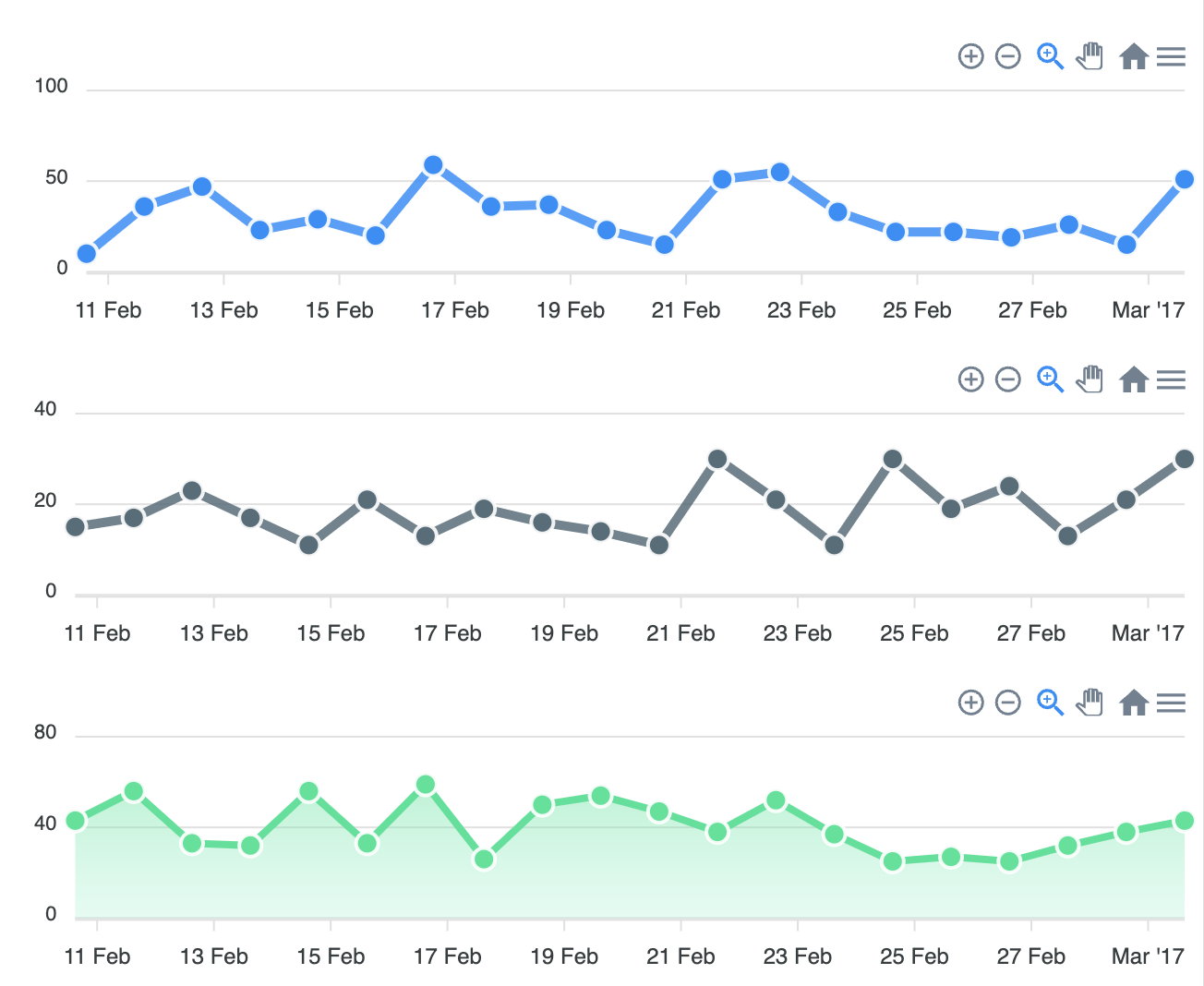
var options = {
          series: [{
          data: generateDayWiseTimeSeries(new Date('11 Feb 2017').getTime(), 20, {
            min: 10,
            max: 60
          })
        }],
          chart: {
          id: 'fb',
          group: 'social',
          type: 'line',
          height: 160
        },
        colors: ['#008FFB']
        };

        var chart = new ApexCharts(document.querySelector("#chart-line"), options);
        chart.render();

        var optionsLine2 = {
          series: [{
          data: generateDayWiseTimeSeries(new Date('11 Feb 2017').getTime(), 20, {
            min: 10,
            max: 30
          })
        }],
          chart: {
          id: 'tw',
          group: 'social',
          type: 'line',
          height: 160
        },
        colors: ['#546E7A']
        };

        var chartLine2 = new ApexCharts(document.querySelector("#chart-line2"), optionsLine2);
        chartLine2.render();

        var optionsArea = {
          series: [{
          data: generateDayWiseTimeSeries(new Date('11 Feb 2017').getTime(), 20, {
            min: 10,
            max: 60
          })
        }],
          chart: {
          id: 'yt',
          group: 'social',
          type: 'area',
          height: 160
        },
        colors: ['#00E396']
        };

        var chartArea = new ApexCharts(document.querySelector("#chart-area"), optionsArea);
        chartArea.render();

        var optionsSmall = {
          series: [{
          data: generateDayWiseTimeSeries(new Date('11 Feb 2017').getTime(), 20, {
            min: 10,
            max: 60
          })
        }],
          chart: {
          id: 'ig',
          group: 'social',
          type: 'area',
          height: 160,
          width: 300
        },
        colors: ['#008FFB']
        };

        var chartSmall = new ApexCharts(document.querySelector("#chart-small"), optionsSmall);
        chartSmall.render();

        var optionsSmall2 = {
          series: [{
          data: generateDayWiseTimeSeries(new Date('11 Feb 2017').getTime(), 20, {
            min: 10,
            max: 60
          })
        }],
          chart: {
          id: 'li',
          group: 'social',
          type: 'area',
          height: 160,
          width: 300
        },
        colors: ['#546E7A']
        };

        var chartSmall2 = new ApexCharts(document.querySelector("#chart-small2"), optionsSmall2);
chartSmall2.render();- Brush chart
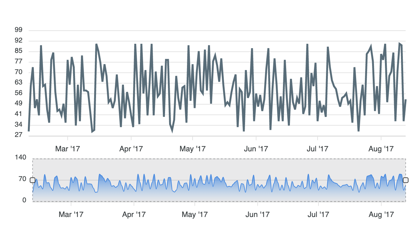
var options = {
          series: [{
          data: data
        }],
          chart: {
          id: 'chart2',
          type: 'line',
          height: 230,
          toolbar: {
            autoSelected: 'pan',
            show: false
          }
        },
        colors: ['#546E7A'],
        stroke: {
          width: 3
        },
        dataLabels: {
          enabled: false
        },
        fill: {
          opacity: 1,
        },
        markers: {
          size: 0
        },
        xaxis: {
          type: 'datetime'
        }
        };

        var chart = new ApexCharts(document.querySelector("#chart-line2"), options);
        chart.render();

        var optionsLine = {
          series: [{
          data: data
        }],
          chart: {
          id: 'chart1',
          height: 130,
          type: 'area',
          brush:{
            target: 'chart2',
            enabled: true
          },
          selection: {
            enabled: true,
            xaxis: {
              min: new Date('19 Jun 2017').getTime(),
              max: new Date('14 Aug 2017').getTime()
            }
          },
        },
        colors: ['#008FFB'],
        fill: {
          type: 'gradient',
          gradient: {
            opacityFrom: 0.91,
            opacityTo: 0.1,
          }
        },
        xaxis: {
          type: 'datetime',
          tooltip: {
            enabled: false
          }
        },
        yaxis: {
          tickAmount: 2
        }
        };

        var chartLine = new ApexCharts(document.querySelector("#chart-line"), optionsLine);
chartLine.render();- Stepline Chart
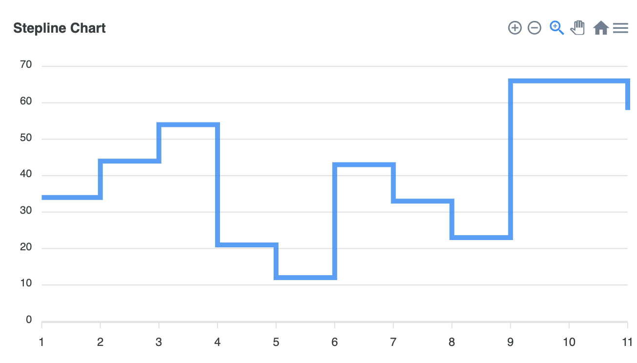
var options = {
          series: [{
          data: [34, 44, 54, 21, 12, 43, 33, 23, 66, 66, 58]
        }],
          chart: {
          type: 'line',
          height: 350
        },
        stroke: {
          curve: 'stepline',
        },
        dataLabels: {
          enabled: false
        },
        title: {
          text: 'Stepline Chart',
          align: 'left'
        },
        markers: {
          hover: {
            sizeOffset: 4
          }
        }
        };

        var chart = new ApexCharts(document.querySelector("#chart"), options);
chart.render();- Gradient Chart
var options = {
          series: [{
          name: 'Sales',
          data: [4, 3, 10, 9, 29, 19, 22, 9, 12, 7, 19, 5, 13, 9, 17, 2, 7, 5]
        }],
          chart: {
          height: 350,
          type: 'line',
        },
        forecastDataPoints: {
          count: 7
        },
        stroke: {
          width: 5,
          curve: 'smooth'
        },
        xaxis: {
          type: 'datetime',
          categories: ['1/11/2000', '2/11/2000', '3/11/2000', '4/11/2000', '5/11/2000', '6/11/2000', '7/11/2000', '8/11/2000', '9/11/2000', '10/11/2000', '11/11/2000', '12/11/2000', '1/11/2001', '2/11/2001', '3/11/2001','4/11/2001' ,'5/11/2001' ,'6/11/2001'],
          tickAmount: 10,
          labels: {
            formatter: function(value, timestamp, opts) {
              return opts.dateFormatter(new Date(timestamp), 'dd MMM')
            }
          }
        },
        title: {
          text: 'Forecast',
          align: 'left',
          style: {
            fontSize: "16px",
            color: '#666'
          }
        },
        fill: {
          type: 'gradient',
          gradient: {
            shade: 'dark',
            gradientToColors: [ '#FDD835'],
            shadeIntensity: 1,
            type: 'horizontal',
            opacityFrom: 1,
            opacityTo: 1,
            stops: [0, 100, 100, 100]
          },
        },
        yaxis: {
          min: -10,
          max: 40
        }
        };

        var chart = new ApexCharts(document.querySelector("#chart"), options);
chart.render();- Null Value Chart
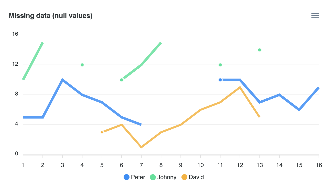
var options = {
          series: [{
          name: 'Peter',
          data: [5, 5, 10, 8, 7, 5, 4, null, null, null, 10, 10, 7, 8, 6, 9]
        }, {
          name: 'Johnny',
          data: [10, 15, null, 12, null, 10, 12, 15, null, null, 12, null, 14, null, null, null]
        }, {
          name: 'David',
          data: [null, null, null, null, 3, 4, 1, 3, 4,  6,  7,  9, 5, null, null, null]
        }],
          chart: {
          height: 350,
          type: 'line',
          zoom: {
            enabled: false
          },
          animations: {
            enabled: false
          }
        },
        stroke: {
          width: [5,5,4],
          curve: 'straight'
        },
        labels: [1, 2, 3, 4, 5, 6, 7, 8, 9, 10, 11, 12, 13, 14, 15, 16],
        title: {
          text: 'Missing data (null values)'
        },
        xaxis: {
        },
        };

        var chart = new ApexCharts(document.querySelector("#chart"), options);
chart.render();- Realtime Chart
var options = {
          series: [{
          data: data.slice()
        }],
          chart: {
          id: 'realtime',
          height: 350,
          type: 'line',
          animations: {
            enabled: true,
            easing: 'linear',
            dynamicAnimation: {
              speed: 1000
            }
          },
          toolbar: {
            show: false
          },
          zoom: {
            enabled: false
          }
        },
        dataLabels: {
          enabled: false
        },
        stroke: {
          curve: 'smooth'
        },
        title: {
          text: 'Dynamic Updating Chart',
          align: 'left'
        },
        markers: {
          size: 0
        },
        xaxis: {
          type: 'datetime',
          range: XAXISRANGE,
        },
        yaxis: {
          max: 100
        },
        legend: {
          show: false
        },
        };

        var chart = new ApexCharts(document.querySelector("#chart"), options);
        chart.render();


        window.setInterval(function () {
        getNewSeries(lastDate, {
          min: 10,
          max: 90
        })

        chart.updateSeries([{
          data: data
        }])
}, 1000)- Dashed Chart
var options = {
          series: [{
            name: "Session Duration",
            data: [45, 52, 38, 24, 33, 26, 21, 20, 6, 8, 15, 10]
          },
          {
            name: "Page Views",
            data: [35, 41, 62, 42, 13, 18, 29, 37, 36, 51, 32, 35]
          },
          {
            name: 'Total Visits',
            data: [87, 57, 74, 99, 75, 38, 62, 47, 82, 56, 45, 47]
          }
        ],
          chart: {
          height: 350,
          type: 'line',
          zoom: {
            enabled: false
          },
        },
        dataLabels: {
          enabled: false
        },
        stroke: {
          width: [5, 7, 5],
          curve: 'straight',
          dashArray: [0, 8, 5]
        },
        title: {
          text: 'Page Statistics',
          align: 'left'
        },
        legend: {
          tooltipHoverFormatter: function(val, opts) {
            return val + ' - ' + opts.w.globals.series[opts.seriesIndex][opts.dataPointIndex] + ''
          }
        },
        markers: {
          size: 0,
          hover: {
            sizeOffset: 6
          }
        },
        xaxis: {
          categories: ['01 Jan', '02 Jan', '03 Jan', '04 Jan', '05 Jan', '06 Jan', '07 Jan', '08 Jan', '09 Jan',
            '10 Jan', '11 Jan', '12 Jan'
          ],
        },
        tooltip: {
          y: [
            {
              title: {
                formatter: function (val) {
                  return val + " (mins)"
                }
              }
            },
            {
              title: {
                formatter: function (val) {
                  return val + " per session"
                }
              }
            },
            {
              title: {
                formatter: function (val) {
                  return val;
                }
              }
            }
          ]
        },
        grid: {
          borderColor: '#f1f1f1',
        }
        };

        var chart = new ApexCharts(document.querySelector("#chart"), options);
        chart.render();
1) Area Chart
(1) Series(Data Format)
- Single Value
1) Single Values

series:[{
  data: [23, 34, 12, 54, 32, ... , 43]
}]

// data에 들어가는 array는 y값

xaxis:{
  categories: ["Jan", "Feb", "Mar", ... , "Dec"]
}

// xaxis.categories 속성에서 x값 데이터가 제공되어야 함- Paired values
2-1) Paired Values

series: [{
  data: [[1, 34], [3, 54], [5, 23] , ... , [15, 43]]
}],
xaxis: {
  type: 'numeric'
}

// data에 paired value로 이루어진 two-dimensional array를 넣어줄 수도 있음 [x의 값, y의 값] 2-2) Numeric paired values in XY properties
series: [{
data: [{
x: 20,
y: 54
}, {
x: 30,
y: 66
}],
}],
xaxis: {
type: 'numeric'
}
// data에 paired value로 이루어진 object형태로 넣어줄 수 있음 {x: x의 값, y: y의 값}2-3) Category paired values
series: [{
data: [{
x: 'Apple',
y: 54
}, {
x: 'Orange',
y: 66
}],
}],
xaxis: {
type: 'category'
}
// 숫자쌍의 형태가 아니더라도 y값에 따르는 string value인 x의 값을 지정해 줄 수 있음.- Timeline Series
3-1) TimeStamps

series: [{
  data: [[1324508400000, 34], [1324594800000, 54] , ... , [1326236400000, 43]]
}]

// 시계열 series를 plot하기 위해서는 timestamp가 필요함.3-2) Date strings
series: [{
data: [{ x: '05/06/2014', y: 54 }, { x: '05/08/2014', y: 17 } , ... , { x: '05/28/2014', y: 26 }]
}]
// JavaScript의 Date.parse()함수를 통과하는 date string을 넣어 줄 수도 있음(2) Area Charts Types & Options
- Basic Area Chart
var options = {
          series: [{
          name: "STOCK ABC",
          data: series.monthDataSeries1.prices
        }],
          chart: {
          type: 'area',
          height: 350,
          zoom: {
            enabled: false
          }
        },
        dataLabels: {
          enabled: false
        },
        stroke: {
          curve: 'straight'
        },

        title: {
          text: 'Fundamental Analysis of Stocks',
          align: 'left'
        },
        subtitle: {
          text: 'Price Movements',
          align: 'left'
        },
        labels: series.monthDataSeries1.dates,
        xaxis: {
          type: 'datetime',
        },
        yaxis: {
          opposite: true
        },
        legend: {
          horizontalAlign: 'left'
        }
        };

        var chart = new ApexCharts(document.querySelector("#chart"), options);
chart.render();- Spline Area Chart
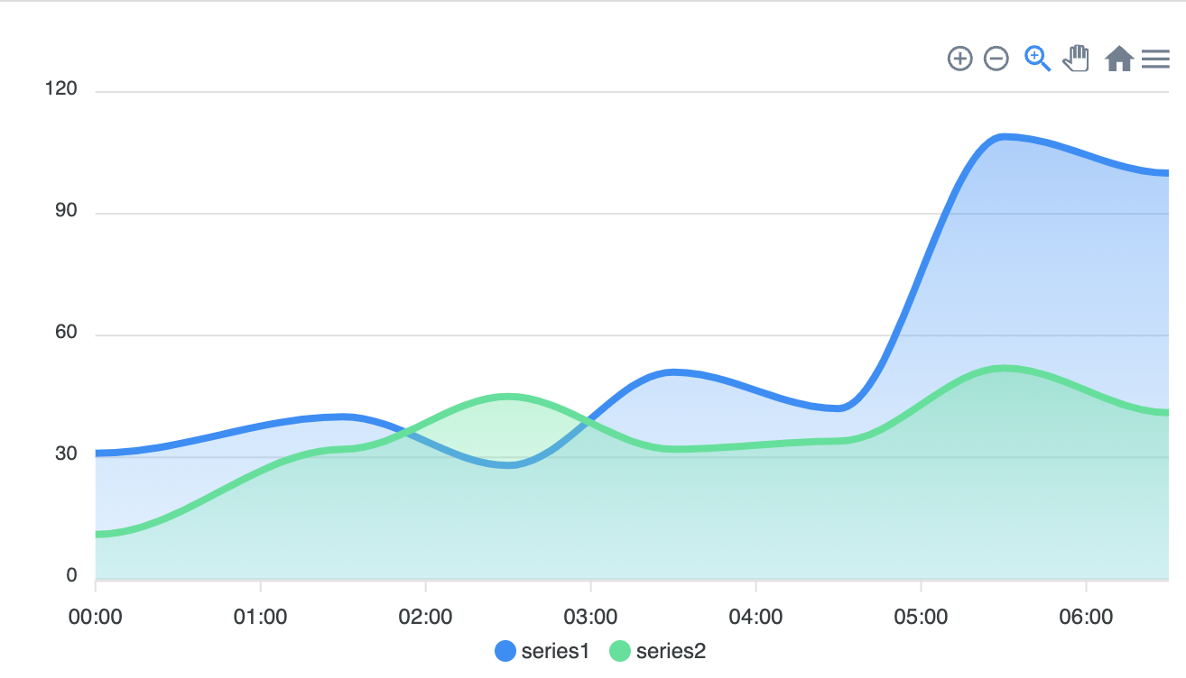
var options = {
          series: [{
          name: 'series1',
          data: [31, 40, 28, 51, 42, 109, 100]
        }, {
          name: 'series2',
          data: [11, 32, 45, 32, 34, 52, 41]
        }],
          chart: {
          height: 350,
          type: 'area'
        },
        dataLabels: {
          enabled: false
        },
        stroke: {
          curve: 'smooth'
        },
        xaxis: {
          type: 'datetime',
          categories: ["2018-09-19T00:00:00.000Z", "2018-09-19T01:30:00.000Z", "2018-09-19T02:30:00.000Z", "2018-09-19T03:30:00.000Z", "2018-09-19T04:30:00.000Z", "2018-09-19T05:30:00.000Z", "2018-09-19T06:30:00.000Z"]
        },
        tooltip: {
          x: {
            format: 'dd/MM/yy HH:mm'
          },
        },
        };

        var chart = new ApexCharts(document.querySelector("#chart"), options);
chart.render();- Datetime X-Axis Area Chart
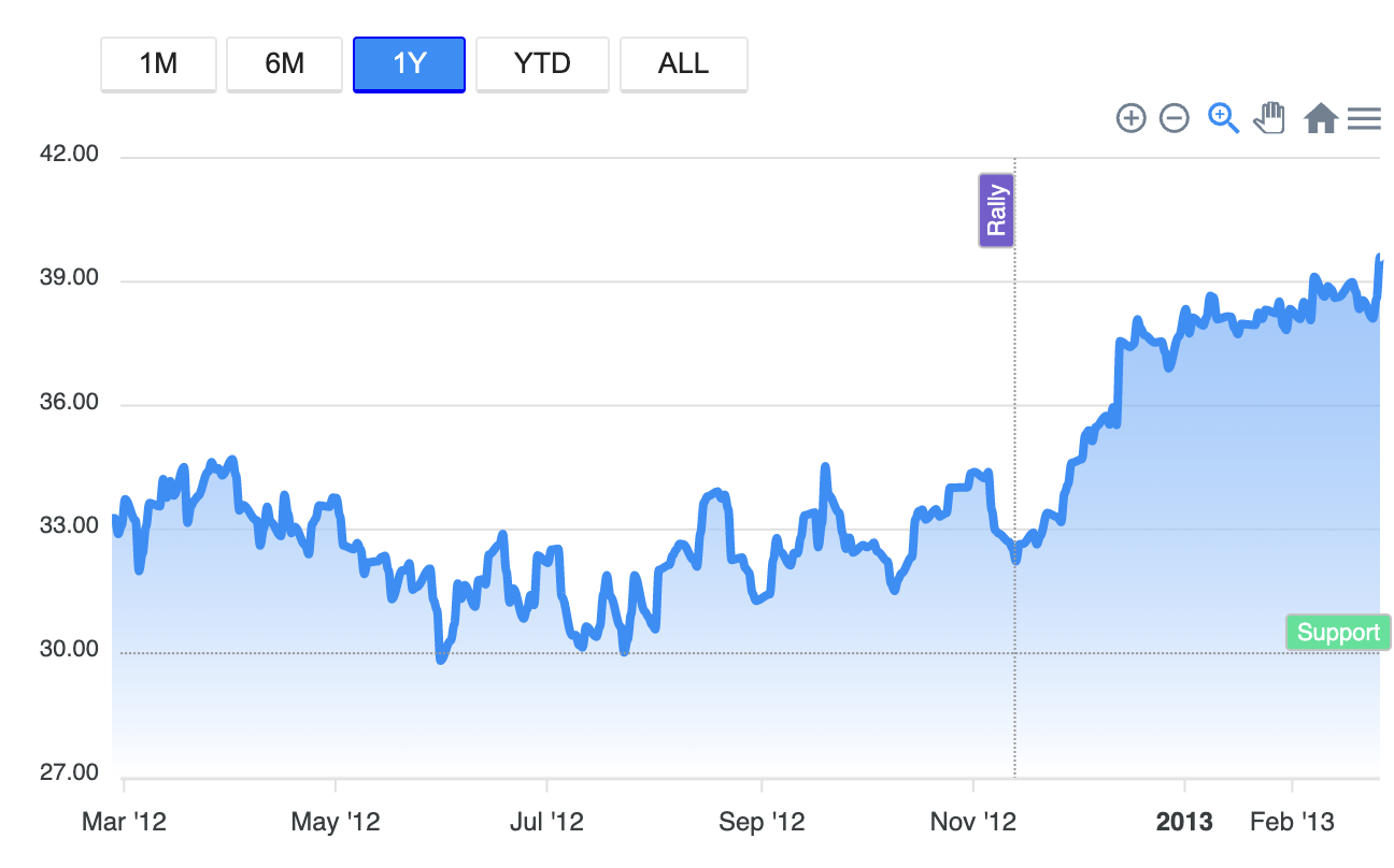
var options = {
          series: [{
          data: [
            [1327359600000,30.95],
            [1327446000000,31.34],
            [1327532400000,31.18],
                    ...
            [1361746800000,38.11],
            [1361833200000,38.59],
            [1361919600000,39.60],
          ]
        }],
          chart: {
          id: 'area-datetime',
          type: 'area',
          height: 350,
          zoom: {
            autoScaleYaxis: true
          }
        },
        annotations: {
          yaxis: [{
            y: 30,
            borderColor: '#999',
            label: {
              show: true,
              text: 'Support',
              style: {
                color: "#fff",
                background: '#00E396'
              }
            }
          }],
          xaxis: [{
            x: new Date('14 Nov 2012').getTime(),
            borderColor: '#999',
            yAxisIndex: 0,
            label: {
              show: true,
              text: 'Rally',
              style: {
                color: "#fff",
                background: '#775DD0'
              }
            }
          }]
        },
        dataLabels: {
          enabled: false
        },
        markers: {
          size: 0,
          style: 'hollow',
        },
        xaxis: {
          type: 'datetime',
          min: new Date('01 Mar 2012').getTime(),
          tickAmount: 6,
        },
        tooltip: {
          x: {
            format: 'dd MMM yyyy'
          }
        },
        fill: {
          type: 'gradient',
          gradient: {
            shadeIntensity: 1,
            opacityFrom: 0.7,
            opacityTo: 0.9,
            stops: [0, 100]
          }
        },
        };

        var chart = new ApexCharts(document.querySelector("#chart-timeline"), options);
        chart.render();


        var resetCssClasses = function(activeEl) {
        var els = document.querySelectorAll('button')
        Array.prototype.forEach.call(els, function(el) {
          el.classList.remove('active')
        })

        activeEl.target.classList.add('active')
      }

      document
        .querySelector('#one_month')
        .addEventListener('click', function(e) {
          resetCssClasses(e)

          chart.zoomX(
            new Date('28 Jan 2013').getTime(),
            new Date('27 Feb 2013').getTime()
          )
        })

      document
        .querySelector('#six_months')
        .addEventListener('click', function(e) {
          resetCssClasses(e)

          chart.zoomX(
            new Date('27 Sep 2012').getTime(),
            new Date('27 Feb 2013').getTime()
          )
        })

      document
        .querySelector('#one_year')
        .addEventListener('click', function(e) {
          resetCssClasses(e)
          chart.zoomX(
            new Date('27 Feb 2012').getTime(),
            new Date('27 Feb 2013').getTime()
          )
        })

      document.querySelector('#ytd').addEventListener('click', function(e) {
        resetCssClasses(e)

        chart.zoomX(
          new Date('01 Jan 2013').getTime(),
          new Date('27 Feb 2013').getTime()
        )
      })

      document.querySelector('#all').addEventListener('click', function(e) {
        resetCssClasses(e)

        chart.zoomX(
          new Date('23 Jan 2012').getTime(),
          new Date('27 Feb 2013').getTime()
        )
})- Negative Area Chart
var options = {
          series: [{
          name: 'north',
          data: [{
              x: 1996,
              y: 322
            },
		           ...
            {
              x: 2015,
              y: 334
            }
          ]
        }, {
          name: 'south',
          data: [
            {
              x: 1996,
              y: 162
            },
            {
              x: 1997,
              y: 90
            },
			         ...
            {
              x: 2014,
              y: -169
            },
            {
              x: 2015,
              y: -184
            }
          ]
        }],
          chart: {
          type: 'area',
          height: 350
        },
        dataLabels: {
          enabled: false
        },
        stroke: {
          curve: 'straight'
        },

        title: {
          text: 'Area with Negative Values',
          align: 'left',
          style: {
            fontSize: '14px'
          }
        },
        xaxis: {
          type: 'datetime',
          axisBorder: {
            show: false
          },
          axisTicks: {
            show: false
          }
        },
        yaxis: {
          tickAmount: 4,
          floating: false,

          labels: {
            style: {
              colors: '#8e8da4',
            },
            offsetY: -7,
            offsetX: 0,
          },
          axisBorder: {
            show: false,
          },
          axisTicks: {
            show: false
          }
        },
        fill: {
          opacity: 0.5
        },
        tooltip: {
          x: {
            format: "yyyy",
          },
          fixed: {
            enabled: false,
            position: 'topRight'
          }
        },
        grid: {
          yaxis: {
            lines: {
              offsetX: -30
            }
          },
          padding: {
            left: 20
          }
        }
        };

        var chart = new ApexCharts(document.querySelector("#chart"), options);
chart.render();- Stacked Area Chart
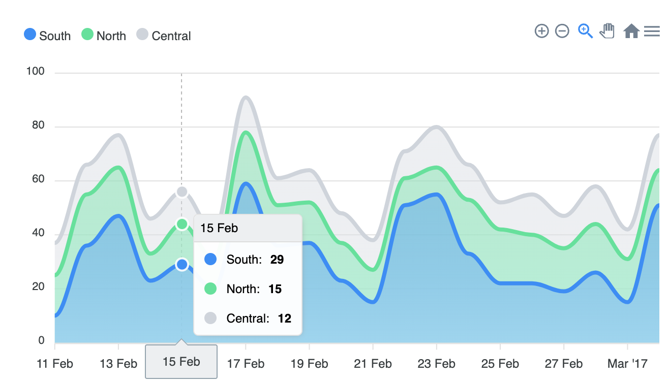
var options = {
          series: [
          {
            name: 'South',
            data: generateDayWiseTimeSeries(new Date('11 Feb 2017 GMT').getTime(), 20, {
              min: 10,
              max: 60
            })
          },
          {
            name: 'North',
            data: generateDayWiseTimeSeries(new Date('11 Feb 2017 GMT').getTime(), 20, {
              min: 10,
              max: 20
            })
          },
          {
            name: 'Central',
            data: generateDayWiseTimeSeries(new Date('11 Feb 2017 GMT').getTime(), 20, {
              min: 10,
              max: 15
            })
          }
        ],
          chart: {
          type: 'area',
          height: 350,
          stacked: true,
          events: {
            selection: function (chart, e) {
              console.log(new Date(e.xaxis.min))
            }
          },
        },
        colors: ['#008FFB', '#00E396', '#CED4DC'],
        dataLabels: {
          enabled: false
        },
        stroke: {
          curve: 'smooth'
        },
        fill: {
          type: 'gradient',
          gradient: {
            opacityFrom: 0.6,
            opacityTo: 0.8,
          }
        },
        legend: {
          position: 'top',
          horizontalAlign: 'left'
        },
        xaxis: {
          type: 'datetime'
        },
        };

        var chart = new ApexCharts(document.querySelector("#chart"), options);
chart.render();- Irregular Timeseries Area Chart
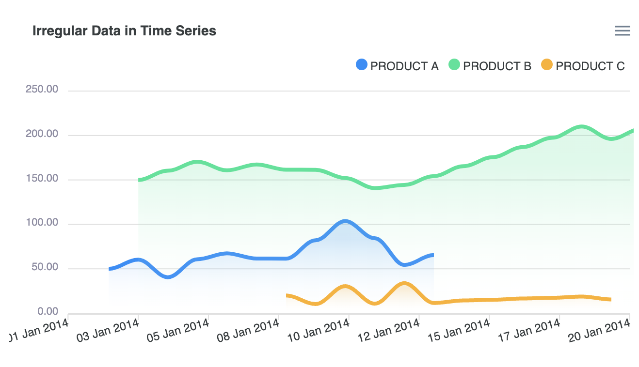
var options = {
          series: [{
          name: 'PRODUCT A',
          data: dataSet[0]
        }, {
          name: 'PRODUCT B',
          data: dataSet[1]
        }, {
          name: 'PRODUCT C',
          data: dataSet[2]
        }],
          chart: {
          type: 'area',
          stacked: false,
          height: 350,
          zoom: {
            enabled: false
          },
        },
        dataLabels: {
          enabled: false
        },
        markers: {
          size: 0,
        },
        fill: {
          type: 'gradient',
          gradient: {
              shadeIntensity: 1,
              inverseColors: false,
              opacityFrom: 0.45,
              opacityTo: 0.05,
              stops: [20, 100, 100, 100]
            },
        },
        yaxis: {
          labels: {
              style: {
                  colors: '#8e8da4',
              },
              offsetX: 0,
              formatter: function(val) {
                return (val / 1000000).toFixed(2);
              },
          },
          axisBorder: {
              show: false,
          },
          axisTicks: {
              show: false
          }
        },
        xaxis: {
          type: 'datetime',
          tickAmount: 8,
          min: new Date("01/01/2014").getTime(),
          max: new Date("01/20/2014").getTime(),
          labels: {
              rotate: -15,
              rotateAlways: true,
              formatter: function(val, timestamp) {
                return moment(new Date(timestamp)).format("DD MMM YYYY")
            }
          }
        },
        title: {
          text: 'Irregular Data in Time Series',
          align: 'left',
          offsetX: 14
        },
        tooltip: {
          shared: true
        },
        legend: {
          position: 'top',
          horizontalAlign: 'right',
          offsetX: -10
        }
        };

        var chart = new ApexCharts(document.querySelector("#chart"), options);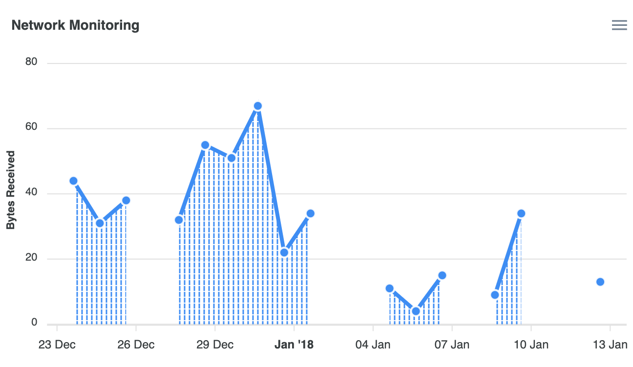
chart.render();- Null Vlaue Area Chart
var options = {
          series: [{
          name: 'Network',
          data: [{
              x: 'Dec 23 2017',
              y: null
            },
            {
              x: 'Dec 24 2017',
              y: 44
            },
            {
              x: 'Dec 25 2017',
              y: 31
            },
            {
              x: 'Dec 26 2017',
              y: 38
            },
            {
              x: 'Dec 27 2017',
              y: null
            },
            {
              x: 'Dec 28 2017',
              y: 32
            },
            {
              x: 'Dec 29 2017',
              y: 55
            },
            {
              x: 'Dec 30 2017',
              y: 51
            },
            {
              x: 'Dec 31 2017',
              y: 67
            },
            {
              x: 'Jan 01 2018',
              y: 22
            },
            {
              x: 'Jan 02 2018',
              y: 34
            },
            {
              x: 'Jan 03 2018',
              y: null
            },
            {
              x: 'Jan 04 2018',
              y: null
            },
            {
              x: 'Jan 05 2018',
              y: 11
            },
            {
              x: 'Jan 06 2018',
              y: 4
            },
            {
              x: 'Jan 07 2018',
              y: 15,
            },
            {
              x: 'Jan 08 2018',
              y: null
            },
            {
              x: 'Jan 09 2018',
              y: 9
            },
            {
              x: 'Jan 10 2018',
              y: 34
            },
            {
              x: 'Jan 11 2018',
              y: null
            },
            {
              x: 'Jan 12 2018',
              y: null
            },
            {
              x: 'Jan 13 2018',
              y: 13
            },
            {
              x: 'Jan 14 2018',
              y: null
            }
          ],
        }],
          chart: {
          type: 'area',
          height: 350,
          animations: {
            enabled: false
          },
          zoom: {
            enabled: false
          },
        },
        dataLabels: {
          enabled: false
        },
        stroke: {
          curve: 'straight'
        },
        fill: {
          opacity: 0.8,
          type: 'pattern',
          pattern: {
            style: ['verticalLines', 'horizontalLines'],
            width: 5,
            height: 6
          },
        },
        markers: {
          size: 5,
          hover: {
            size: 9
          }
        },
        title: {
          text: 'Network Monitoring',
        },
        tooltip: {
          intersect: true,
          shared: false
        },
        theme: {
          palette: 'palette1'
        },
        xaxis: {
          type: 'datetime',
        },
        yaxis: {
          title: {
            text: 'Bytes Received'
          }
        }
        };

        var chart = new ApexCharts(document.querySelector("#chart"), options);
        chart.render();
3) Bar Chart
(1) Series(Data Format)
- Single Value
1) Single Values

series:[{
  data: [23, 34, 12, 54, 32, ... , 43]
}]

// data에 들어가는 array는 y값

xaxis:{
  categories: ["Jan", "Feb", "Mar", ... , "Dec"]
}

// xaxis.categories 속성에서 x값 데이터가 제공되어야 함- Paired values
2-1) Paired Values

series: [{
  data: [[1, 34], [3, 54], [5, 23] , ... , [15, 43]]
}],
xaxis: {
  type: 'numeric'
}

// data에 paired value로 이루어진 two-dimensional array를 넣어줄 수도 있음 [x의 값, y의 값] 2-2) Numeric paired values in XY properties
series: [{
data: [{
x: 20,
y: 54
}, {
x: 30,
y: 66
}],
}],
xaxis: {
type: 'numeric'
}
// data에 paired value로 이루어진 object형태로 넣어줄 수 있음 {x: x의 값, y: y의 값}2-3) Category paired values
series: [{
data: [{
x: 'Apple',
y: 54
}, {
x: 'Orange',
y: 66
}],
}],
xaxis: {
type: 'category'
}
// 숫자쌍의 형태가 아니더라도 y값에 따르는 string value인 x의 값을 지정해 줄 수 있음.- Timeline Series
3-1) TimeStamps

series: [{
  data: [[1324508400000, 34], [1324594800000, 54] , ... , [1326236400000, 43]]
}]

// 시계열 series를 plot하기 위해서는 timestamp가 필요함.3-2) Date strings
series: [{
data: [{ x: '05/06/2014', y: 54 }, { x: '05/08/2014', y: 17 } , ... , { x: '05/28/2014', y: 26 }]
}]
// JavaScript의 Date.parse()함수를 통과하는 date string을 넣어 줄 수도 있음(2) Bar Charts Types & Options
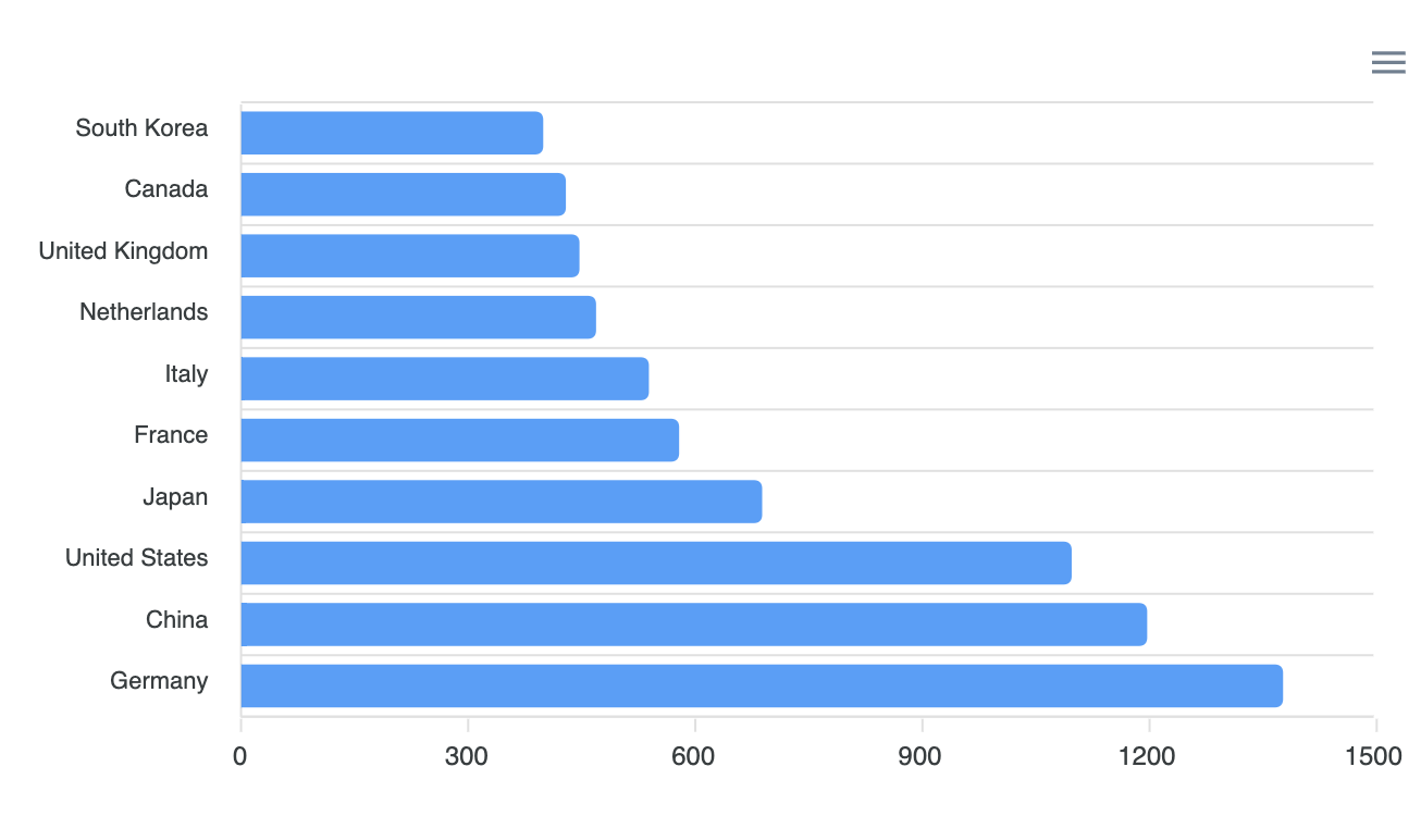
- Basic Bar Chart
var options = {
          series: [{
          data: [400, 430, 448, 470, 540, 580, 690, 1100, 1200, 1380]
        }],
          chart: {
          type: 'bar',
          height: 350
        },
        plotOptions: {
          bar: {
            borderRadius: 4,
            horizontal: true,
          }
        },
        dataLabels: {
          enabled: false
        },
        xaxis: {
          categories: ['South Korea', 'Canada', 'United Kingdom', 'Netherlands', 'Italy', 'France', 'Japan',
            'United States', 'China', 'Germany'
          ],
        }
        };

        var chart = new ApexCharts(document.querySelector("#chart"), options);
chart.render();- Grouped Bar Chart
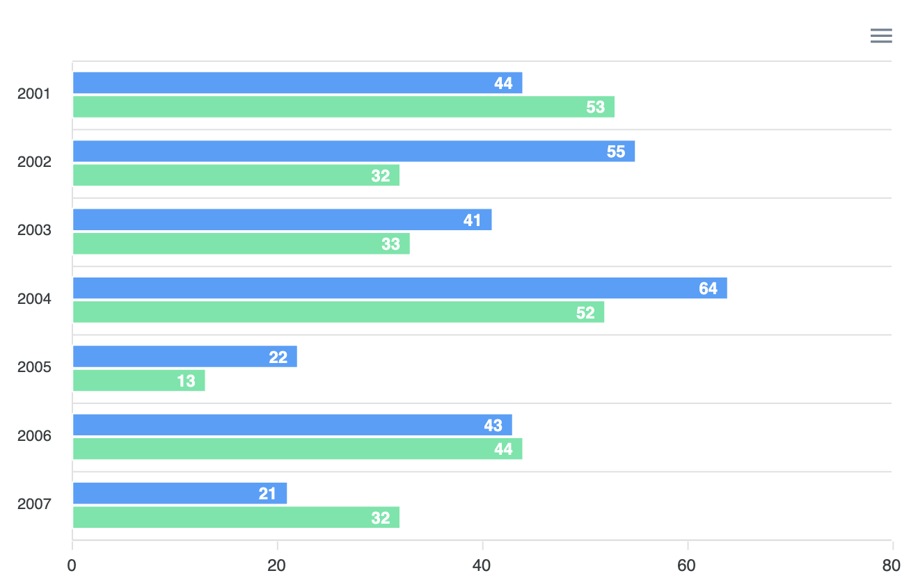
var options = {
          series: [{
          data: [44, 55, 41, 64, 22, 43, 21]
        }, {
          data: [53, 32, 33, 52, 13, 44, 32]
        }],
          chart: {
          type: 'bar',
          height: 430
        },
        plotOptions: {
          bar: {
            horizontal: true,
            dataLabels: {
              position: 'top',
            },
          }
        },
        dataLabels: {
          enabled: true,
          offsetX: -6,
          style: {
            fontSize: '12px',
            colors: ['#fff']
          }
        },
        stroke: {
          show: true,
          width: 1,
          colors: ['#fff']
        },
        tooltip: {
          shared: true,
          intersect: false
        },
        xaxis: {
          categories: [2001, 2002, 2003, 2004, 2005, 2006, 2007],
        },
        };

        var chart = new ApexCharts(document.querySelector("#chart"), options);
chart.render();- Stacked Bar Chart
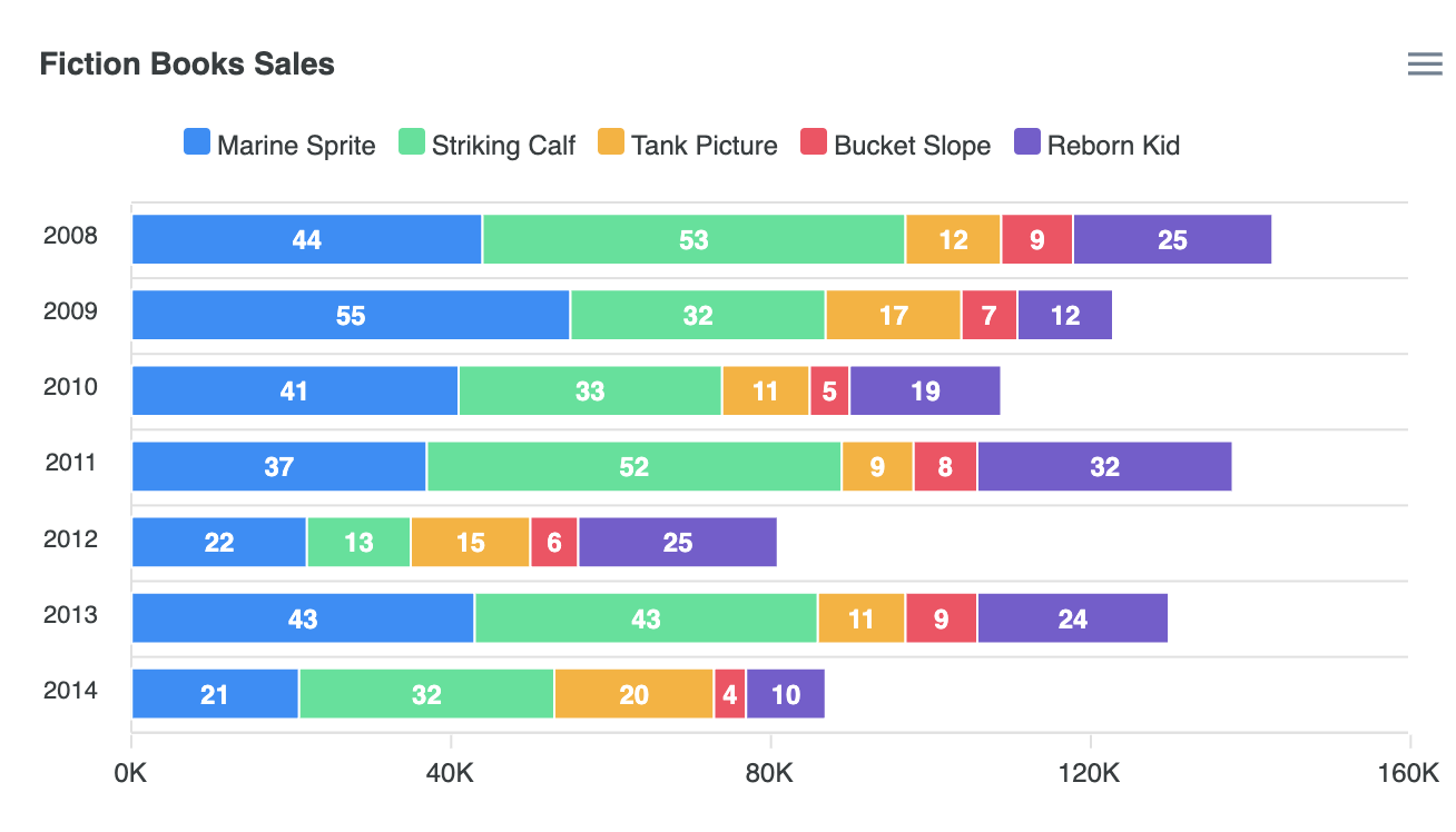
var options = {
          series: [{
          name: 'Marine Sprite',
          data: [44, 55, 41, 37, 22, 43, 21]
        }, {
          name: 'Striking Calf',
          data: [53, 32, 33, 52, 13, 43, 32]
        }, {
          name: 'Tank Picture',
          data: [12, 17, 11, 9, 15, 11, 20]
        }, {
          name: 'Bucket Slope',
          data: [9, 7, 5, 8, 6, 9, 4]
        }, {
          name: 'Reborn Kid',
          data: [25, 12, 19, 32, 25, 24, 10]
        }],
          chart: {
          type: 'bar',
          height: 350,
          stacked: true,
        },
        plotOptions: {
          bar: {
            horizontal: true,
          },
        },
        stroke: {
          width: 1,
          colors: ['#fff']
        },
        title: {
          text: 'Fiction Books Sales'
        },
        xaxis: {
          categories: [2008, 2009, 2010, 2011, 2012, 2013, 2014],
          labels: {
            formatter: function (val) {
              return val + "K"
            }
          }
        },
        yaxis: {
          title: {
            text: undefined
          },
        },
        tooltip: {
          y: {
            formatter: function (val) {
              return val + "K"
            }
          }
        },
        fill: {
          opacity: 1
        },
        legend: {
          position: 'top',
          horizontalAlign: 'left',
          offsetX: 40
        }
        };

        var chart = new ApexCharts(document.querySelector("#chart"), options);
chart.render();- Negative Values Bar Chart
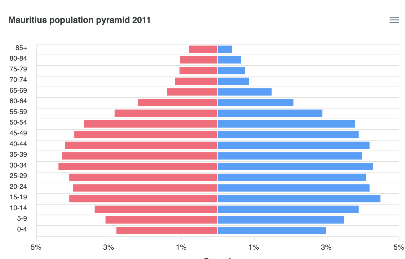
var options = {
          series: [{
          name: 'Males',
          data: [0.4, 0.65, 0.76, 0.88, 1.5, 2.1, 2.9, 3.8, 3.9, 4.2, 4, 4.3, 4.1, 4.2, 4.5,
            3.9, 3.5, 3
          ]
        },
        {
          name: 'Females',
          data: [-0.8, -1.05, -1.06, -1.18, -1.4, -2.2, -2.85, -3.7, -3.96, -4.22, -4.3, -4.4,
            -4.1, -4, -4.1, -3.4, -3.1, -2.8
          ]
        }
        ],
          chart: {
          type: 'bar',
          height: 440,
          stacked: true
        },
        colors: ['#008FFB', '#FF4560'],
        plotOptions: {
          bar: {
            horizontal: true,
            barHeight: '80%',
          },
        },
        dataLabels: {
          enabled: false
        },
        stroke: {
          width: 1,
          colors: ["#fff"]
        },

        grid: {
          xaxis: {
            lines: {
              show: false
            }
          }
        },
        yaxis: {
          min: -5,
          max: 5,
          title: {
            // text: 'Age',
          },
        },
        tooltip: {
          shared: false,
          x: {
            formatter: function (val) {
              return val
            }
          },
          y: {
            formatter: function (val) {
              return Math.abs(val) + "%"
            }
          }
        },
        title: {
          text: 'Mauritius population pyramid 2011'
        },
        xaxis: {
          categories: ['85+', '80-84', '75-79', '70-74', '65-69', '60-64', '55-59', '50-54',
            '45-49', '40-44', '35-39', '30-34', '25-29', '20-24', '15-19', '10-14', '5-9',
            '0-4'
          ],
          title: {
            text: 'Percent'
          },
          labels: {
            formatter: function (val) {
              return Math.abs(Math.round(val)) + "%"
            }
          }
        },
        };

        var chart = new ApexCharts(document.querySelector("#chart"), options);
chart.render();- Markers Bar chart
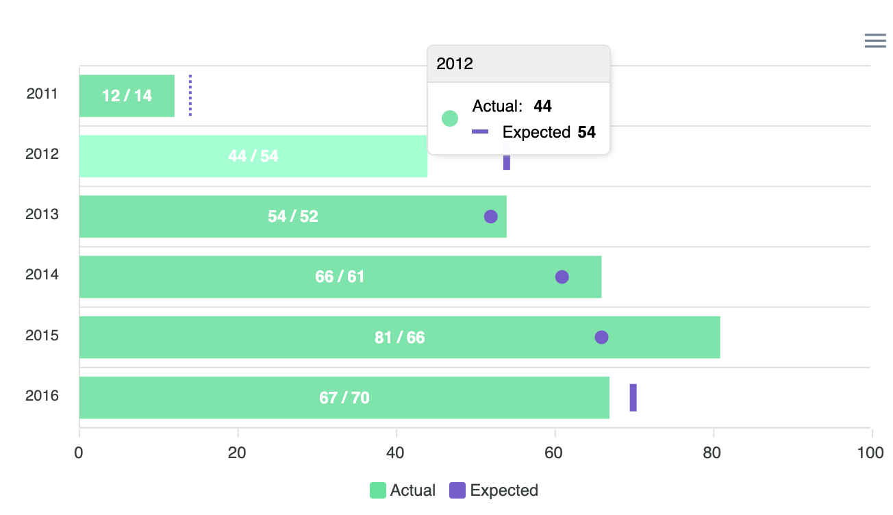
var options = {
          series: [
          {
            name: 'Actual',
            data: [
              {
                x: '2011',
                y: 12,
                goals: [
                  {
                    name: 'Expected',
                    value: 14,
                    strokeWidth: 2,
                    strokeDashArray: 2,
                    strokeColor: '#775DD0'
                  }
                ]
              },
              {
                x: '2012',
                y: 44,
                goals: [
                  {
                    name: 'Expected',
                    value: 54,
                    strokeWidth: 5,
                    strokeHeight: 10,
                    strokeColor: '#775DD0'
                  }
                ]
              },
              {
                x: '2013',
                y: 54,
                goals: [
                  {
                    name: 'Expected',
                    value: 52,
                    strokeWidth: 10,
                    strokeHeight: 0,
                    strokeLineCap: 'round',
                    strokeColor: '#775DD0'
                  }
                ]
              },
              {
                x: '2014',
                y: 66,
                goals: [
                  {
                    name: 'Expected',
                    value: 61,
                    strokeWidth: 10,
                    strokeHeight: 0,
                    strokeLineCap: 'round',
                    strokeColor: '#775DD0'
                  }
                ]
              },
              {
                x: '2015',
                y: 81,
                goals: [
                  {
                    name: 'Expected',
                    value: 66,
                    strokeWidth: 10,
                    strokeHeight: 0,
                    strokeLineCap: 'round',
                    strokeColor: '#775DD0'
                  }
                ]
              },
              {
                x: '2016',
                y: 67,
                goals: [
                  {
                    name: 'Expected',
                    value: 70,
                    strokeWidth: 5,
                    strokeHeight: 10,
                    strokeColor: '#775DD0'
                  }
                ]
              }
            ]
          }
        ],
          chart: {
          height: 350,
          type: 'bar'
        },
        plotOptions: {
          bar: {
            horizontal: true,
          }
        },
        colors: ['#00E396'],
        dataLabels: {
          formatter: function(val, opt) {
            const goals =
              opt.w.config.series[opt.seriesIndex].data[opt.dataPointIndex]
                .goals

            if (goals && goals.length) {
              return `${val} / ${goals[0].value}`
            }
            return val
          }
        },
        legend: {
          show: true,
          showForSingleSeries: true,
          customLegendItems: ['Actual', 'Expected'],
          markers: {
            fillColors: ['#00E396', '#775DD0']
          }
        }
        };

        var chart = new ApexCharts(document.querySelector("#chart"), options);
chart.render();- Custom Data Labels Bar Chart
var options = {
          series: [{
          data: [400, 430, 448, 470, 540, 580, 690, 1100, 1200, 1380]
        }],
          chart: {
          type: 'bar',
          height: 380
        },
        plotOptions: {
          bar: {
            barHeight: '100%',
            distributed: true,
            horizontal: true,
            dataLabels: {
              position: 'bottom'
            },
          }
        },
        colors: ['#33b2df', '#546E7A', '#d4526e', '#13d8aa', '#A5978B', '#2b908f', '#f9a3a4', '#90ee7e',
          '#f48024', '#69d2e7'
        ],
        dataLabels: {
          enabled: true,
          textAnchor: 'start',
          style: {
            colors: ['#fff']
          },
          formatter: function (val, opt) {
            return opt.w.globals.labels[opt.dataPointIndex] + ":  " + val
          },
          offsetX: 0,
          dropShadow: {
            enabled: true
          }
        },
        stroke: {
          width: 1,
          colors: ['#fff']
        },
        xaxis: {
          categories: ['South Korea', 'Canada', 'United Kingdom', 'Netherlands', 'Italy', 'France', 'Japan',
            'United States', 'China', 'India'
          ],
        },
        yaxis: {
          labels: {
            show: false
          }
        },
        title: {
            text: 'Custom DataLabels',
            align: 'center',
            floating: true
        },
        subtitle: {
            text: 'Category Names as DataLabels inside bars',
            align: 'center',
        },
        tooltip: {
          theme: 'dark',
          x: {
            show: false
          },
          y: {
            title: {
              formatter: function () {
                return ''
              }
            }
          }
        }
        };

        var chart = new ApexCharts(document.querySelector("#chart"), options);
        chart.render();
4) Column Chart
(1) Series(Data Format)
- Single Value
1) Single Values

series:[{
  data: [23, 34, 12, 54, 32, ... , 43]
}]

// data에 들어가는 array는 y값

xaxis:{
  categories: ["Jan", "Feb", "Mar", ... , "Dec"]
}

// xaxis.categories 속성에서 x값 데이터가 제공되어야 함- Paired values
2-1) Paired Values

series: [{
  data: [[1, 34], [3, 54], [5, 23] , ... , [15, 43]]
}],
xaxis: {
  type: 'numeric'
}

// data에 paired value로 이루어진 two-dimensional array를 넣어줄 수도 있음 [x의 값, y의 값] 2-2) Numeric paired values in XY properties
series: [{
data: [{
x: 20,
y: 54
}, {
x: 30,
y: 66
}],
}],
xaxis: {
type: 'numeric'
}
// data에 paired value로 이루어진 object형태로 넣어줄 수 있음 {x: x의 값, y: y의 값}2-3) Category paired values
series: [{
data: [{
x: 'Apple',
y: 54
}, {
x: 'Orange',
y: 66
}],
}],
xaxis: {
type: 'category'
}
// 숫자쌍의 형태가 아니더라도 y값에 따르는 string value인 x의 값을 지정해 줄 수 있음.- Timeline Series
3-1) TimeStamps

series: [{
  data: [[1324508400000, 34], [1324594800000, 54] , ... , [1326236400000, 43]]
}]

// 시계열 series를 plot하기 위해서는 timestamp가 필요함.3-2) Date strings
series: [{
data: [{ x: '05/06/2014', y: 54 }, { x: '05/08/2014', y: 17 } , ... , { x: '05/28/2014', y: 26 }]
}]
// JavaScript의 Date.parse()함수를 통과하는 date string을 넣어 줄 수도 있음(2) Column Charts Types & Options
- Basic Column Chart
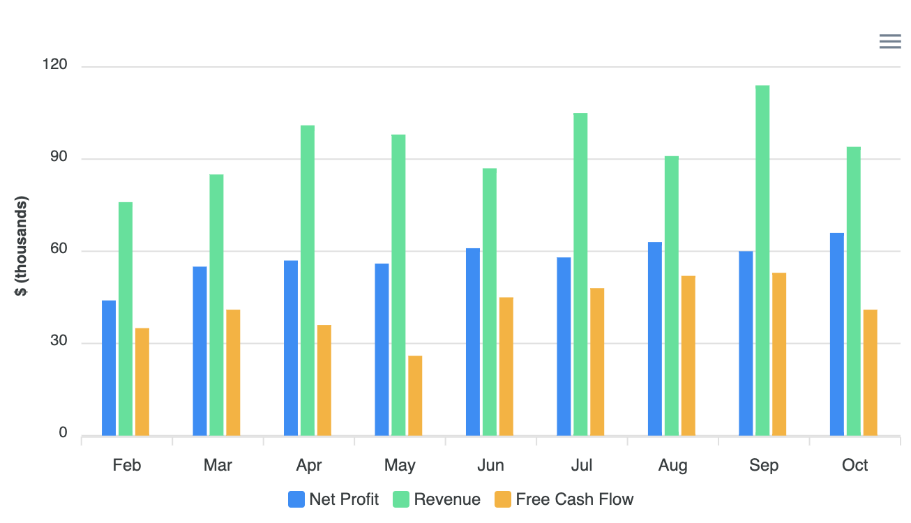
var options = {
          series: [{
          name: 'Net Profit',
          data: [44, 55, 57, 56, 61, 58, 63, 60, 66]
        }, {
          name: 'Revenue',
          data: [76, 85, 101, 98, 87, 105, 91, 114, 94]
        }, {
          name: 'Free Cash Flow',
          data: [35, 41, 36, 26, 45, 48, 52, 53, 41]
        }],
          chart: {
          type: 'bar',
          height: 350
        },
        plotOptions: {
          bar: {
            horizontal: false,
            columnWidth: '55%',
            endingShape: 'rounded'
          },
        },
        dataLabels: {
          enabled: false
        },
        stroke: {
          show: true,
          width: 2,
          colors: ['transparent']
        },
        xaxis: {
          categories: ['Feb', 'Mar', 'Apr', 'May', 'Jun', 'Jul', 'Aug', 'Sep', 'Oct'],
        },
        yaxis: {
          title: {
            text: '$ (thousands)'
          }
        },
        fill: {
          opacity: 1
        },
        tooltip: {
          y: {
            formatter: function (val) {
              return "$ " + val + " thousands"
            }
          }
        }
        };

        var chart = new ApexCharts(document.querySelector("#chart"), options);
chart.render();- Data Label Column Chart
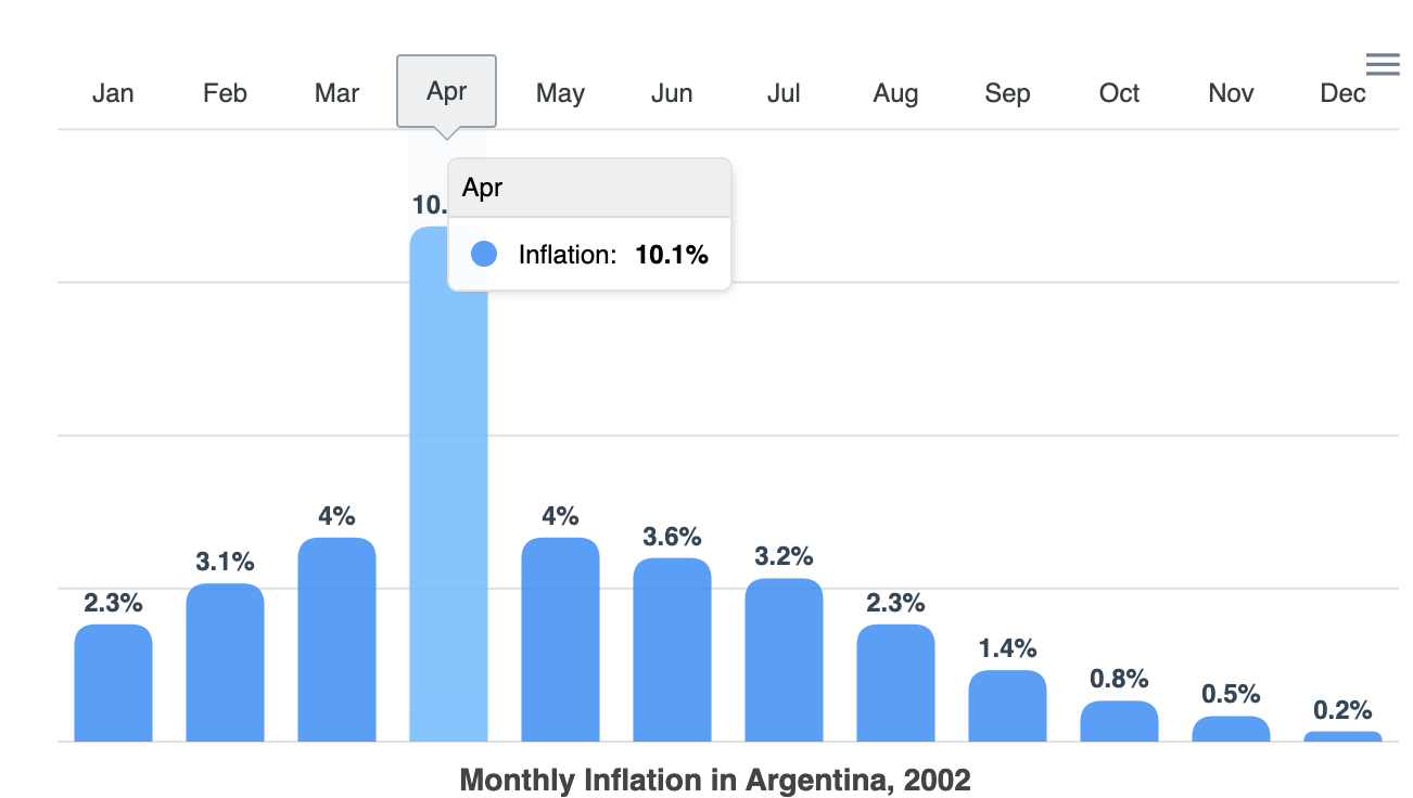
var options = {
          series: [{
          name: 'Inflation',
          data: [2.3, 3.1, 4.0, 10.1, 4.0, 3.6, 3.2, 2.3, 1.4, 0.8, 0.5, 0.2]
        }],
          chart: {
          height: 350,
          type: 'bar',
        },
        plotOptions: {
          bar: {
            borderRadius: 10,
            dataLabels: {
              position: 'top', // top, center, bottom
            },
          }
        },
        dataLabels: {
          enabled: true,
          formatter: function (val) {
            return val + "%";
          },
          offsetY: -20,
          style: {
            fontSize: '12px',
            colors: ["#304758"]
          }
        },

        xaxis: {
          categories: ["Jan", "Feb", "Mar", "Apr", "May", "Jun", "Jul", "Aug", "Sep", "Oct", "Nov", "Dec"],
          position: 'top',
          axisBorder: {
            show: false
          },
          axisTicks: {
            show: false
          },
          crosshairs: {
            fill: {
              type: 'gradient',
              gradient: {
                colorFrom: '#D8E3F0',
                colorTo: '#BED1E6',
                stops: [0, 100],
                opacityFrom: 0.4,
                opacityTo: 0.5,
              }
            }
          },
          tooltip: {
            enabled: true,
          }
        },
        yaxis: {
          axisBorder: {
            show: false
          },
          axisTicks: {
            show: false,
          },
          labels: {
            show: false,
            formatter: function (val) {
              return val + "%";
            }
          }

        },
        title: {
          text: 'Monthly Inflation in Argentina, 2002',
          floating: true,
          offsetY: 330,
          align: 'center',
          style: {
            color: '#444'
          }
        }
        };

        var chart = new ApexCharts(document.querySelector("#chart"), options);
chart.render();- Stacked Column Chart
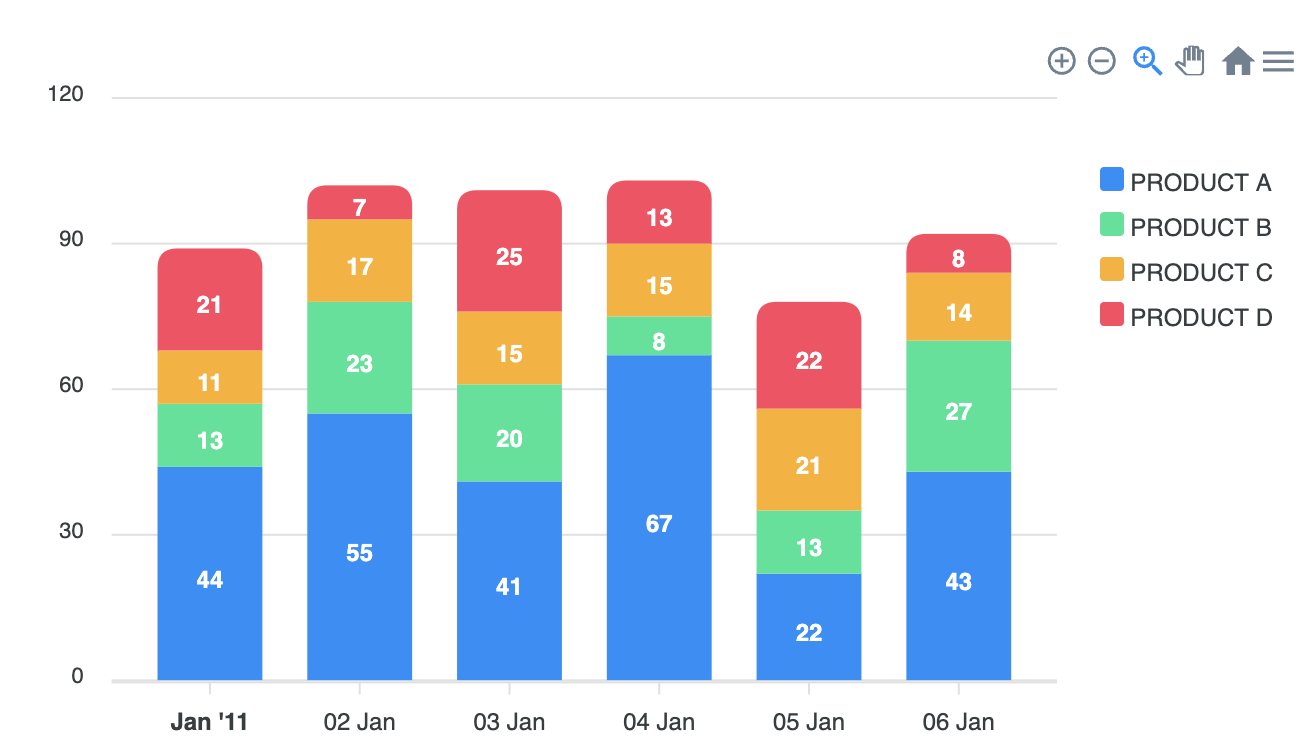
var options = {
          series: [{
          name: 'PRODUCT A',
          data: [44, 55, 41, 67, 22, 43]
        }, {
          name: 'PRODUCT B',
          data: [13, 23, 20, 8, 13, 27]
        }, {
          name: 'PRODUCT C',
          data: [11, 17, 15, 15, 21, 14]
        }, {
          name: 'PRODUCT D',
          data: [21, 7, 25, 13, 22, 8]
        }],
          chart: {
          type: 'bar',
          height: 350,
          stacked: true,
          toolbar: {
            show: true
          },
          zoom: {
            enabled: true
          }
        },
        responsive: [{
          breakpoint: 480,
          options: {
            legend: {
              position: 'bottom',
              offsetX: -10,
              offsetY: 0
            }
          }
        }],
        plotOptions: {
          bar: {
            horizontal: false,
            borderRadius: 10
          },
        },
        xaxis: {
          type: 'datetime',
          categories: ['01/01/2011 GMT', '01/02/2011 GMT', '01/03/2011 GMT', '01/04/2011 GMT',
            '01/05/2011 GMT', '01/06/2011 GMT'
          ],
        },
        legend: {
          position: 'right',
          offsetY: 40
        },
        fill: {
          opacity: 1
        }
        };

        var chart = new ApexCharts(document.querySelector("#chart"), options);
chart.render();- Negative Column Chart
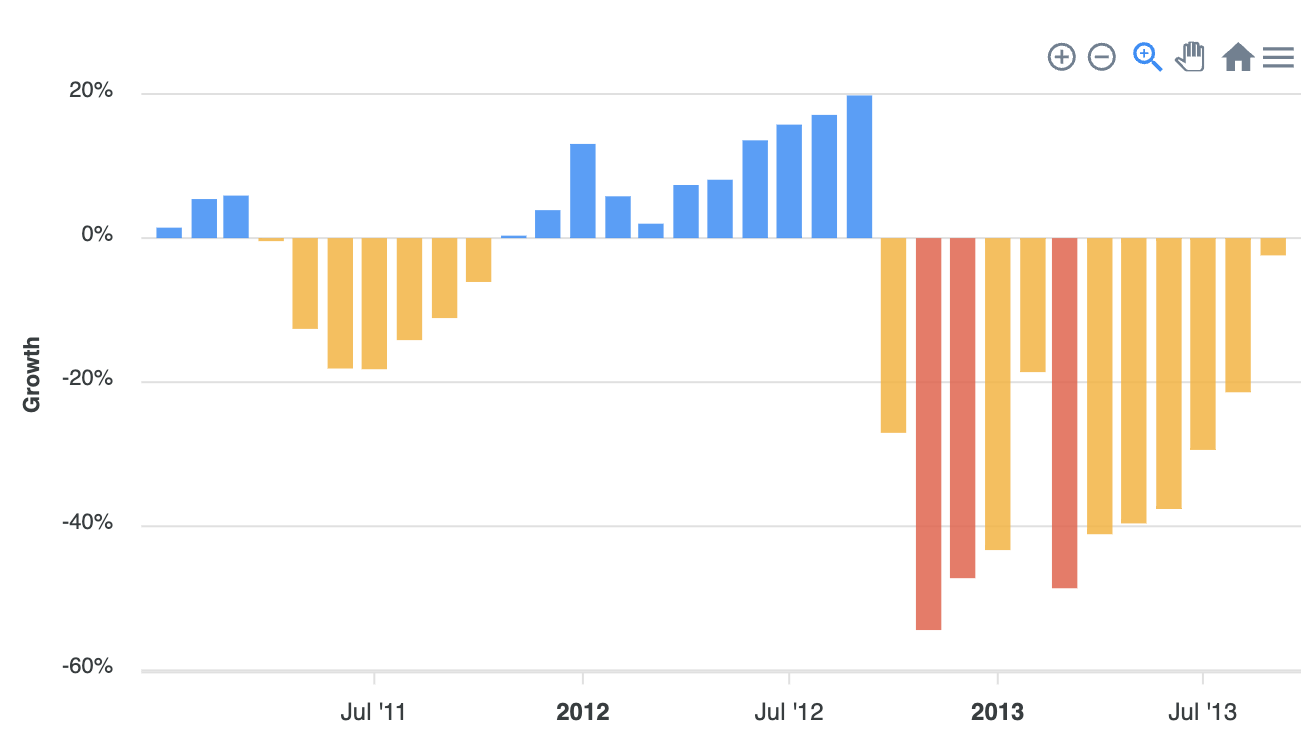
class ApexChart extends React.Component {
        constructor(props) {
          super(props);

          this.state = {

            series: [{
              name: 'Cash Flow',
              data: [1.45, 5.42, 5.9, -0.42, -12.6, -18.1, -18.2, -14.16, -11.1, -6.09, 0.34, 3.88, 13.07,
                5.8, 2, 7.37, 8.1, 13.57, 15.75, 17.1, 19.8, -27.03, -54.4, -47.2, -43.3, -18.6, -
                48.6, -41.1, -39.6, -37.6, -29.4, -21.4, -2.4
              ]
            }],
            options: {
              chart: {
                type: 'bar',
                height: 350
              },
              plotOptions: {
                bar: {
                  colors: {
                    ranges: [{
                      from: -100,
                      to: -46,
                      color: '#F15B46'
                    }, {
                      from: -45,
                      to: 0,
                      color: '#FEB019'
                    }]
                  },
                  columnWidth: '80%',
                }
              },
              dataLabels: {
                enabled: false,
              },
              yaxis: {
                title: {
                  text: 'Growth',
                },
                labels: {
                  formatter: function (y) {
                    return y.toFixed(0) + "%";
                  }
                }
              },
              xaxis: {
                type: 'datetime',
                categories: [
                  '2011-01-01', '2011-02-01', '2011-03-01', '2011-04-01', '2011-05-01', '2011-06-01',
                  '2011-07-01', '2011-08-01', '2011-09-01', '2011-10-01', '2011-11-01', '2011-12-01',
                  '2012-01-01', '2012-02-01', '2012-03-01', '2012-04-01', '2012-05-01', '2012-06-01',
                  '2012-07-01', '2012-08-01', '2012-09-01', '2012-10-01', '2012-11-01', '2012-12-01',
                  '2013-01-01', '2013-02-01', '2013-03-01', '2013-04-01', '2013-05-01', '2013-06-01',
                  '2013-07-01', '2013-08-01', '2013-09-01'
                ],
                labels: {
                  rotate: -90
                }
              }
            },


          };
}- Dynamic Loaded Column Chart
class ApexChart extends React.Component {
constructor(props) {
super(props);
this.state = {
series: [{
data: makeData()
}],
options: {
chart: {
id: 'barYear',
height: 400,
width: '100%',
type: 'bar',
events: {
dataPointSelection: function (e, chart, opts) {
var quarterChartEl = document.querySelector("#chart-quarter");
var yearChartEl = document.querySelector("#chart-year");
if (opts.selectedDataPoints[0].length === 1) {
if (quarterChartEl.classList.contains("active")) {
updateQuarterChart(chart, 'barQuarter')
} else {
yearChartEl.classList.add("chart-quarter-activated")
quarterChartEl.classList.add("active");
updateQuarterChart(chart, 'barQuarter')
}
} else {
updateQuarterChart(chart, 'barQuarter')
}
if (opts.selectedDataPoints[0].length === 0) {
yearChartEl.classList.remove("chart-quarter-activated")
quarterChartEl.classList.remove("active");
}
},
updated: function (chart) {
updateQuarterChart(chart, 'barQuarter')
}
}
},
plotOptions: {
bar: {
distributed: true,
horizontal: true,
barHeight: '75%',
dataLabels: {
position: 'bottom'
}
}
},
dataLabels: {
enabled: true,
textAnchor: 'start',
style: {
colors: ['#fff']
},
formatter: function (val, opt) {
return opt.w.globals.labels[opt.dataPointIndex]
},
offsetX: 0,
dropShadow: {
enabled: true
}
},
colors: colors,
states: {
normal: {
filter: {
type: 'desaturate'
}
},
active: {
allowMultipleDataPointsSelection: true,
filter: {
type: 'darken',
value: 1
}
}
},
tooltip: {
x: {
show: false
},
y: {
title: {
formatter: function (val, opts) {
return opts.w.globals.labels[opts.dataPointIndex]
}
}
}
},
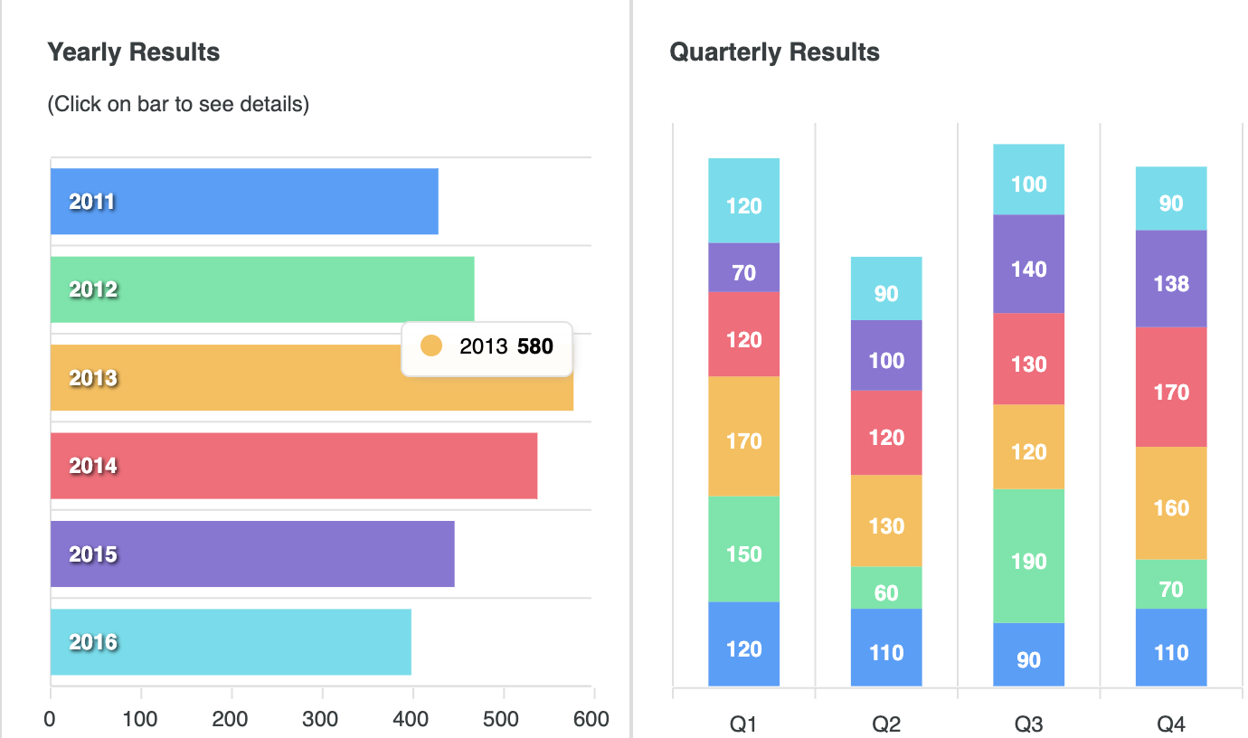
title: {
text: 'Yearly Results',
offsetX: 15
},
subtitle: {
text: '(Click on bar to see details)',
offsetX: 15
},
yaxis: {
labels: {
show: false
}
}
},
seriesQuarter: [{
data: []
}],
optionsQuarter: {
chart: {
id: 'barQuarter',
height: 400,
width: '100%',
type: 'bar',
stacked: true
},
plotOptions: {
bar: {
columnWidth: '50%',
horizontal: false
}
},
legend: {
show: false
},
grid: {
yaxis: {
lines: {
show: false,
}
},
xaxis: {
lines: {
show: true,
}
}
},
yaxis: {
labels: {
show: false
}
},
title: {
text: 'Quarterly Results',
offsetX: 10
},
tooltip: {
x: {
formatter: function (val, opts) {
return opts.w.globals.seriesNames[opts.seriesIndex]
}
},
y: {
title: {
formatter: function (val, opts) {
return opts.w.globals.labels[opts.dataPointIndex]
}
}
}
}
},
};
}
changeData() {
Apex.exec('barYear', 'updateSeries', [{
data: makeData()
}])
}5) BoxPlot Chart
(1) Series(Data Format)
chart: {
    type: "boxPlot"
  },
  series: [{
    data: [{
      x: "category 1",
      y: [40, 51.98, 56.29, 59.59, 63.85]
    },
    {
      x: "category 2",
      y: [43.66, 44.99, 51.35, 52.95, 59.42]
    },
    .
    .
    .
    {
      x: "category n",
      y: [52.76, 57.35, 59.15, 63.03, 67.98]
    }]
  }]

// [{ x: category/date, y: [min, q1, median, q3, max] }]
// 배열안에 x, y를 key값으로 하는 객체가 필요하며
// x의 value로는 카테고리 혹은 날짜, y의 value로는 [최소값, q1, 중간값, q3, 최대값]이 필요하다.
(2) BoxPlot Charts Types & Options
- Basic BoxPlot Chart
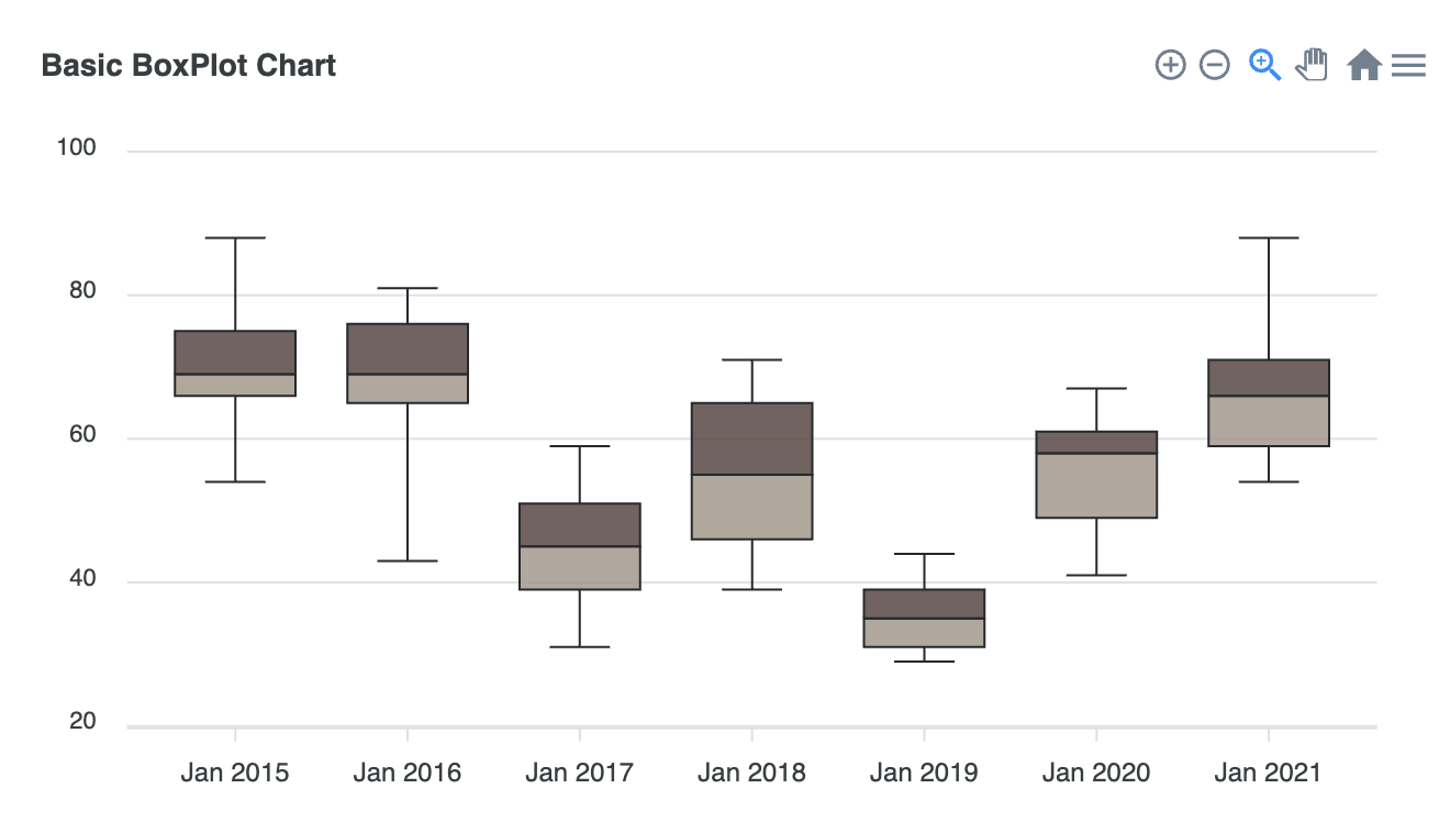
class ApexChart extends React.Component {
        constructor(props) {
          super(props);

          this.state = {

            series: [
              {
                type: 'boxPlot',
                data: [
                  {
                    x: 'Jan 2015',
                    y: [54, 66, 69, 75, 88]
                  },
                  {
                    x: 'Jan 2016',
                    y: [43, 65, 69, 76, 81]
                  },
                  {
                    x: 'Jan 2017',
                    y: [31, 39, 45, 51, 59]
                  },
                  {
                    x: 'Jan 2018',
                    y: [39, 46, 55, 65, 71]
                  },
                  {
                    x: 'Jan 2019',
                    y: [29, 31, 35, 39, 44]
                  },
                  {
                    x: 'Jan 2020',
                    y: [41, 49, 58, 61, 67]
                  },
                  {
                    x: 'Jan 2021',
                    y: [54, 59, 66, 71, 88]
                  }
                ]
              }
            ],
            options: {
              chart: {
                type: 'boxPlot',
                height: 350
              },
              title: {
                text: 'Basic BoxPlot Chart',
                align: 'left'
              },
              plotOptions: {
                boxPlot: {
                  colors: {
                    upper: '#5C4742',
                    lower: '#A5978B'
                  }
                }
              }
            },


          };
}- Scatter BoxPlot Chart
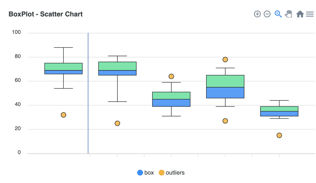
class ApexChart extends React.Component {
        constructor(props) {
          super(props);

          this.state = {

            series: [
              {
                name: 'box',
                type: 'boxPlot',
                data: [
                  {
                    x: new Date('2017-01-01').getTime(),
                    y: [54, 66, 69, 75, 88]
                  },
                  {
                    x: new Date('2018-01-01').getTime(),
                    y: [43, 65, 69, 76, 81]
                  },
                  {
                    x: new Date('2019-01-01').getTime(),
                    y: [31, 39, 45, 51, 59]
                  },
                  {
                    x: new Date('2020-01-01').getTime(),
                    y: [39, 46, 55, 65, 71]
                  },
                  {
                    x: new Date('2021-01-01').getTime(),
                    y: [29, 31, 35, 39, 44]
                  }
                ]
              },
              {
                name: 'outliers',
                type: 'scatter',
                data: [
                  {
                    x: new Date('2017-01-01').getTime(),
                    y: 32
                  },
                  {
                    x: new Date('2018-01-01').getTime(),
                    y: 25
                  },
                  {
                    x: new Date('2019-01-01').getTime(),
                    y: 64
                  },
                  {
                    x: new Date('2020-01-01').getTime(),
                    y: 27
                  },
                  {
                    x: new Date('2020-01-01').getTime(),
                    y: 78
                  },
                  {
                    x: new Date('2021-01-01').getTime(),
                    y: 15
                  }
                ]
              }
            ],
            options: {
              chart: {
                type: 'boxPlot',
                height: 350
              },
              colors: ['#008FFB', '#FEB019'],
              title: {
                text: 'BoxPlot - Scatter Chart',
                align: 'left'
              },
              xaxis: {
                type: 'datetime',
                tooltip: {
                  formatter: function(val) {
                    return new Date(val).getFullYear()
                  }
                }
              },
              tooltip: {
                shared: false,
                intersect: true
              }
            },


          };
}- Horizontal BoxPlot Chart
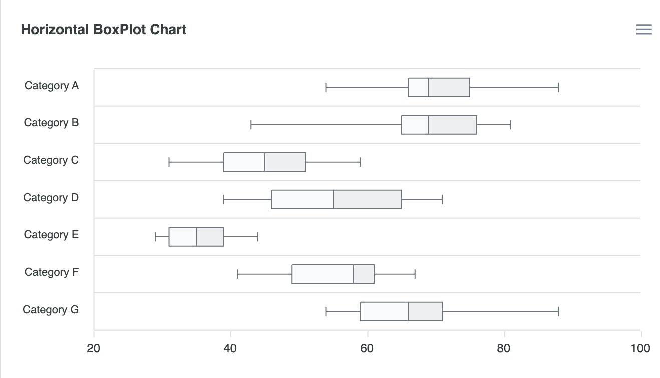
class ApexChart extends React.Component {
        constructor(props) {
          super(props);

          this.state = {

            series: [
              {
                data: [
                  {
                    x: 'Category A',
                    y: [54, 66, 69, 75, 88]
                  },
                  {
                    x: 'Category B',
                    y: [43, 65, 69, 76, 81]
                  },
                  {
                    x: 'Category C',
                    y: [31, 39, 45, 51, 59]
                  },
                  {
                    x: 'Category D',
                    y: [39, 46, 55, 65, 71]
                  },
                  {
                    x: 'Category E',
                    y: [29, 31, 35, 39, 44]
                  },
                  {
                    x: 'Category F',
                    y: [41, 49, 58, 61, 67]
                  },
                  {
                    x: 'Category G',
                    y: [54, 59, 66, 71, 88]
                  }
                ]
              }
            ],
            options: {
              chart: {
                type: 'boxPlot',
                height: 350
              },
              title: {
                text: 'Horizontal BoxPlot Chart',
                align: 'left'
              },
              plotOptions: {
                bar: {
                  horizontal: true,
                  barHeight: '50%'
                },
                boxPlot: {
                  colors: {
                    upper: '#e9ecef',
                    lower: '#f8f9fa'
                  }
                }
              },
              stroke: {
                colors: ['#6c757d']
              }
            },


          };
        }
6) Candlestick Chart
(1) Series(Data Format)
The data format for candlestick is slightly different than other charts. ApexCharts assumes that your data is in the OHLC format as given in the below example.
Candlestick 차트는 기본적으로 Data Format으로 OHLC(Open-High-Low-Close)
즉, 시가-고가-저가-종가 형태의 Data가 제공 되어야 함.
- Two dimensional Array (Paired)
series: [{
    data: [
      [1538856000000, [6593.34, 6600, 6582.63, 6600]],
      [1538856900000, [6595.16, 6604.76, 6590.73, 6593.86]]
    ]
  }]
// 이차원 배열은 [[Timestamp], [O, H, L, C]] 형식의 Data Format
- Single Array
```js
series: [{
  data: [
    [1538856000000, 6593.34, 6600, 6582.63, 6600],
    [1538856900000, 6595.16, 6604.76, 6590.73, 6593.86]
  ]
  }]

// 단일 배열은 [Timestamp, O, H, L, C] 형식의 Data Format- XY Format
series: [{
    data: [{
      x: new Date(2016, 01, 01),
      y: [51.98, 56.29, 51.59, 53.85]
    },
    {
      x: new Date(2016, 02, 01),
      y: [53.66, 54.99, 51.35, 52.95]
    },
    .
    .
    .
    {
      x: new Date(2016, 08, 01),
      y: [52.76, 57.35, 52.15, 57.03]
    }]
  }]

// OHLC 형식의 배열뿐만 아니라, [{ x: date, y: [O,H,L,C] }]형식의 XY Data도 가능.
(2) Candlestick Charts Types & Options
- Basic CandleStick Chart
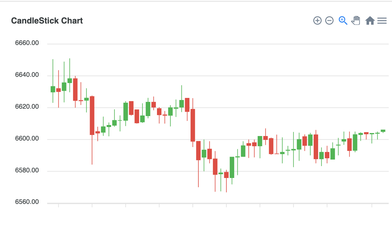
class ApexChart extends React.Component {
        constructor(props) {
          super(props);

          this.state = {

            series: [{
              data: [{
                  x: new Date(1538778600000),
                  y: [6629.81, 6650.5, 6623.04, 6633.33]
                },
                {
                  x: new Date(1538780400000),
                  y: [6632.01, 6643.59, 6620, 6630.11]
                },
						                .....
                {
                  x: new Date(1538883000000),
                  y: [6603.85, 6605, 6600, 6604.07]
                },
                {
                  x: new Date(1538884800000),
                  y: [6604.98, 6606, 6604.07, 6606]
                },
              ]
            }],
            options: {
              chart: {
                type: 'candlestick',
                height: 350
              },
              title: {
                text: 'CandleStick Chart',
                align: 'left'
              },
              xaxis: {
                type: 'datetime'
              },
              yaxis: {
                tooltip: {
                  enabled: true
                }
              }
            },


          };
}- Combo CandleStick Chart
class ApexChart extends React.Component {
        constructor(props) {
          super(props);

          this.state = {

            series: [{
              data: seriesData
            }],
            options: {
              chart: {
                type: 'candlestick',
                height: 290,
                id: 'candles',
                toolbar: {
                  autoSelected: 'pan',
                  show: false
                },
                zoom: {
                  enabled: false
                },
              },
              plotOptions: {
                candlestick: {
                  colors: {
                    upward: '#3C90EB',
                    downward: '#DF7D46'
                  }
                }
              },
              xaxis: {
                type: 'datetime'
              }
            },

            seriesBar: [{
              name: 'volume',
              data: seriesDataLinear
            }],
            optionsBar: {
              chart: {
                height: 160,
                type: 'bar',
                brush: {
                  enabled: true,
                  target: 'candles'
                },
                selection: {
                  enabled: true,
                  xaxis: {
                    min: new Date('20 Jan 2017').getTime(),
                    max: new Date('10 Dec 2017').getTime()
                  },
                  fill: {
                    color: '#ccc',
                    opacity: 0.4
                  },
                  stroke: {
                    color: '#0D47A1',
                  }
                },
              },
              dataLabels: {
                enabled: false
              },
              plotOptions: {
                bar: {
                  columnWidth: '80%',
                  colors: {
                    ranges: [{
                      from: -1000,
                      to: 0,
                      color: '#F15B46'
                    }, {
                      from: 1,
                      to: 10000,
                      color: '#FEB019'
                    }],

                  },
                }
              },
              stroke: {
                width: 0
              },
              xaxis: {
                type: 'datetime',
                axisBorder: {
                  offsetX: 13
                }
              },
              yaxis: {
                labels: {
                  show: false
                }
              }
            },


          };
}- Category x-axis CandleStick Chart
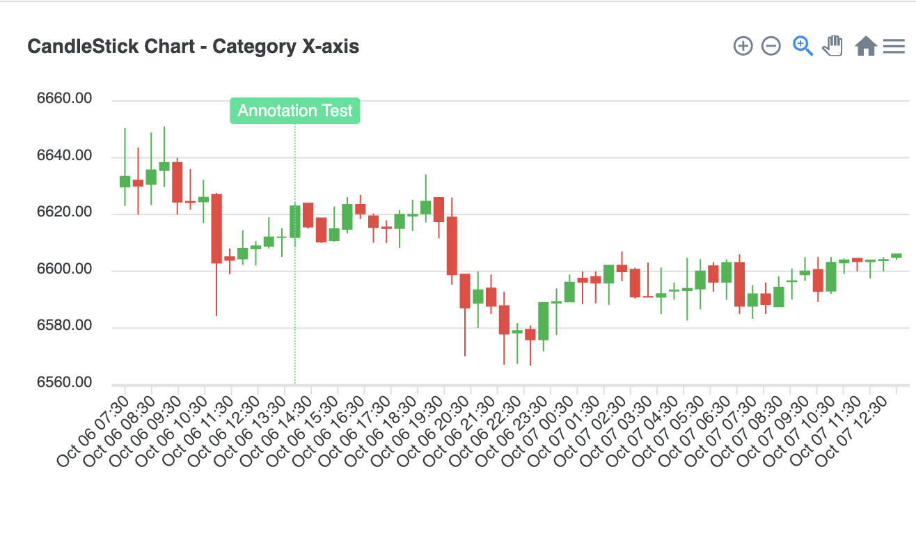
class ApexChart extends React.Component {
        constructor(props) {
          super(props);

          this.state = {

            series: [{
              name: 'candle',
              data: [
                {
                  x: new Date(1538778600000),
                  y: [6629.81, 6650.5, 6623.04, 6633.33]
                },
                {
                  x: new Date(1538780400000),
                  y: [6632.01, 6643.59, 6620, 6630.11]
                },
					                .....
                {
                  x: new Date(1538883000000),
                  y: [6603.85, 6605, 6600, 6604.07]
                },
                {
                  x: new Date(1538884800000),
                  y: [6604.98, 6606, 6604.07, 6606]
                },
              ]
            }],
            options: {
              chart: {
                height: 350,
                type: 'candlestick',
              },
              title: {
                text: 'CandleStick Chart - Category X-axis',
                align: 'left'
              },
              annotations: {
                xaxis: [
                  {
                    x: 'Oct 06 14:00',
                    borderColor: '#00E396',
                    label: {
                      borderColor: '#00E396',
                      style: {
                        fontSize: '12px',
                        color: '#fff',
                        background: '#00E396'
                      },
                      orientation: 'horizontal',
                      offsetY: 7,
                      text: 'Annotation Test'
                    }
                  }
                ]
              },
              tooltip: {
                enabled: true,
              },
              xaxis: {
                type: 'category',
                labels: {
                  formatter: function(val) {
                    return dayjs(val).format('MMM DD HH:mm')
                  }
                }
              },
              yaxis: {
                tooltip: {
                  enabled: true
                }
              }
            },


          };
        }
7) RangeBar Chart
(1) Series(Data Format)
series: [{
    data: [{
      x: 'TEAM A',
      y: [65, 96]
    },
    {
      x: 'TEAM B',
      y: [55, 78]
    },
    .
    .
    .
    {
      x: 'TEAM C',
      y: [95, 186]
    }]
  }]

// [{ x: category, y: [Start, End] }] 형태의 XY Data Format
(2) RangeBar Charts Types & Options
- Basic RangeBar Chart
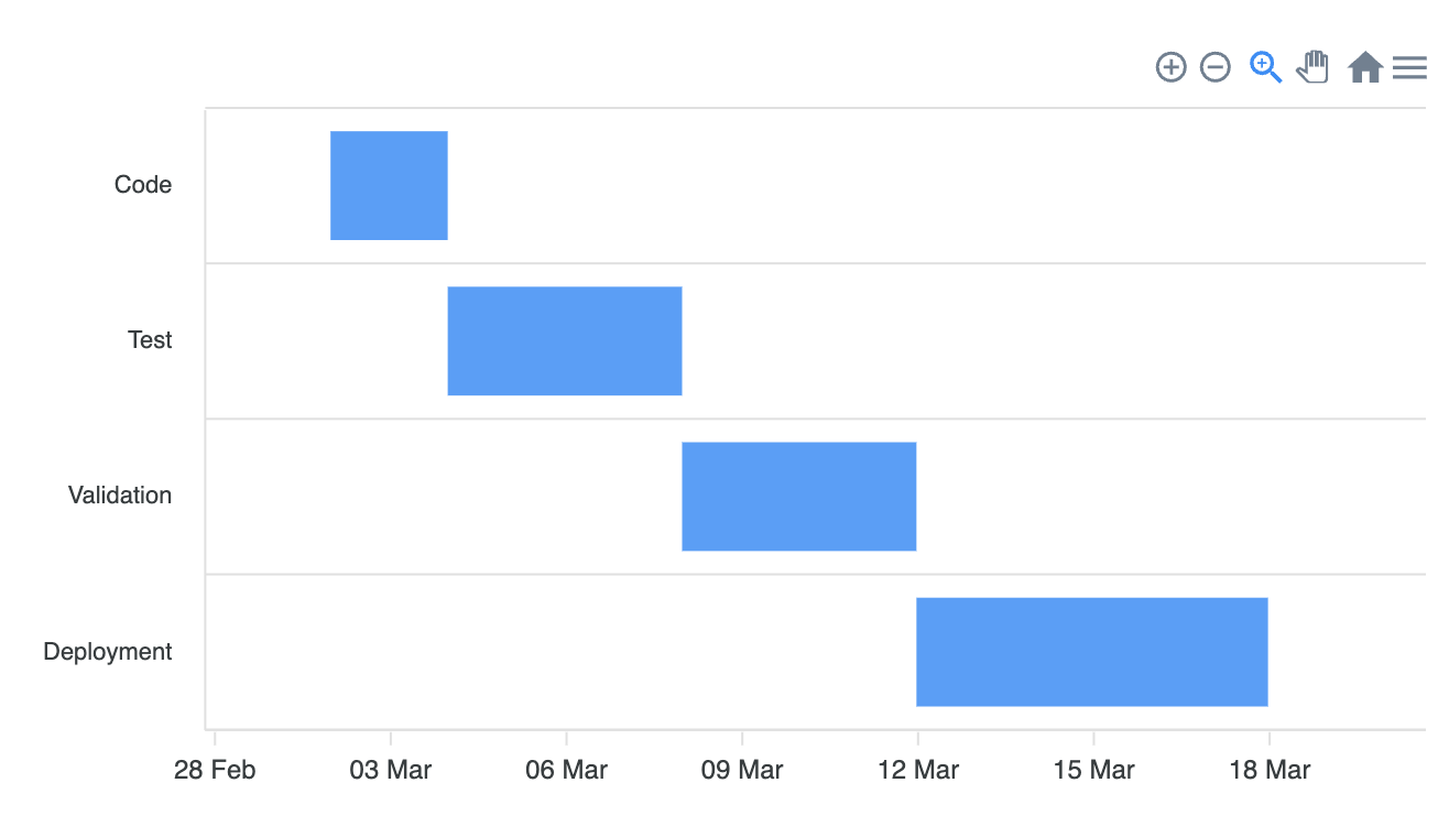
class ApexChart extends React.Component {
        constructor(props) {
          super(props);

          this.state = {

            series: [
              {
                data: [
                  {
                    x: 'Code',
                    y: [
                      new Date('2019-03-02').getTime(),
                      new Date('2019-03-04').getTime()
                    ]
                  },
                  {
                    x: 'Test',
                    y: [
                      new Date('2019-03-04').getTime(),
                      new Date('2019-03-08').getTime()
                    ]
                  },
                  {
                    x: 'Validation',
                    y: [
                      new Date('2019-03-08').getTime(),
                      new Date('2019-03-12').getTime()
                    ]
                  },
                  {
                    x: 'Deployment',
                    y: [
                      new Date('2019-03-12').getTime(),
                      new Date('2019-03-18').getTime()
                    ]
                  }
                ]
              }
            ],
            options: {
              chart: {
                height: 350,
                type: 'rangeBar'
              },
              plotOptions: {
                bar: {
                  horizontal: true
                }
              },
              xaxis: {
                type: 'datetime'
              }
            },


          };
}- Multi Series RangeBar Chart
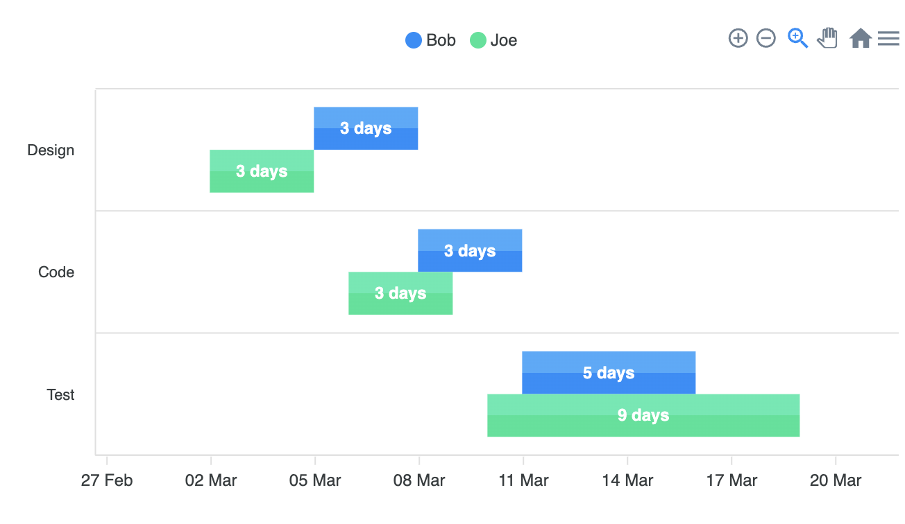
class ApexChart extends React.Component {
        constructor(props) {
          super(props);

          this.state = {

            series: [
              {
                name: 'Bob',
                data: [
                  {
                    x: 'Design',
                    y: [
                      new Date('2019-03-05').getTime(),
                      new Date('2019-03-08').getTime()
                    ]
                  },
                  {
                    x: 'Code',
                    y: [
                      new Date('2019-03-08').getTime(),
                      new Date('2019-03-11').getTime()
                    ]
                  },
                  {
                    x: 'Test',
                    y: [
                      new Date('2019-03-11').getTime(),
                      new Date('2019-03-16').getTime()
                    ]
                  }
                ]
              },
              {
                name: 'Joe',
                data: [
                  {
                    x: 'Design',
                    y: [
                      new Date('2019-03-02').getTime(),
                      new Date('2019-03-05').getTime()
                    ]
                  },
                  {
                    x: 'Code',
                    y: [
                      new Date('2019-03-06').getTime(),
                      new Date('2019-03-09').getTime()
                    ]
                  },
                  {
                    x: 'Test',
                    y: [
                      new Date('2019-03-10').getTime(),
                      new Date('2019-03-19').getTime()
                    ]
                  }
                ]
              }
            ],
            options: {
              chart: {
                height: 350,
                type: 'rangeBar'
              },
              plotOptions: {
                bar: {
                  horizontal: true
                }
              },
              dataLabels: {
                enabled: true,
                formatter: function(val) {
                  var a = moment(val[0])
                  var b = moment(val[1])
                  var diff = b.diff(a, 'days')
                  return diff + (diff > 1 ? ' days' : ' day')
                }
              },
              fill: {
                type: 'gradient',
                gradient: {
                  shade: 'light',
                  type: 'vertical',
                  shadeIntensity: 0.25,
                  gradientToColors: undefined,
                  inverseColors: true,
                  opacityFrom: 1,
                  opacityTo: 1,
                  stops: [50, 0, 100, 100]
                }
              },
              xaxis: {
                type: 'datetime'
              },
              legend: {
                position: 'top'
              }
            },


          };
        }
8) HeatMap Chart
(1) Series(Data Format)
options = {
  series: [
    {
      name: "Series 1",
      data: [{
        x: 'W1',
        y: 22
      }, {
        x: 'W2',
        y: 29
      }, {
        x: 'W3',
        y: 13
      }, {
        x: 'W4',
        y: 32
      }]
    },
    {
      name: "Series 2",
      data: [{
        x: 'W1',
        y: 43
      }, {
        x: 'W2',
        y: 43
      }, {
        x: 'W3',
        y: 43
      }, {
        x: 'W4',
        y: 43
      }]
    }
  ]
}

// data는 배열 형태이며, x는 x축의 lbael, y는 value가 들어가야 함.
(2) HeatMap Charts Types & Options
- Basic HeatMap Chart
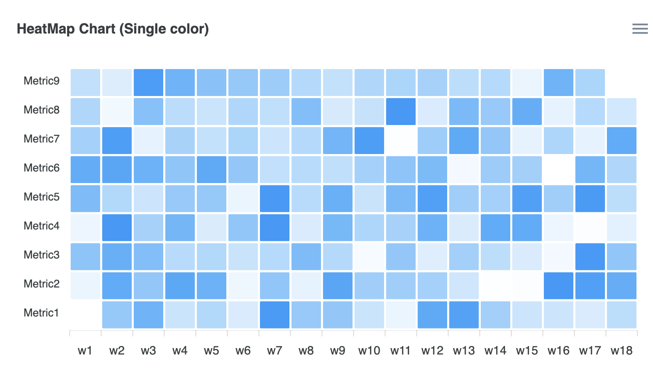
      class ApexChart extends React.Component {
        constructor(props) {
          super(props);

          this.state = {

            series: [{
              name: 'Metric1',
              data: generateData(18, {
                min: 0,
                max: 90
              })
            },
            {
              name: 'Metric2',
              data: generateData(18, {
                min: 0,
                max: 90
              })
            },
            {
              name: 'Metric3',
              data: generateData(18, {
                min: 0,
                max: 90
              })
            },
            {
              name: 'Metric4',
              data: generateData(18, {
                min: 0,
                max: 90
              })
            },
            {
              name: 'Metric5',
              data: generateData(18, {
                min: 0,
                max: 90
              })
            },
            {
              name: 'Metric6',
              data: generateData(18, {
                min: 0,
                max: 90
              })
            },
            {
              name: 'Metric7',
              data: generateData(18, {
                min: 0,
                max: 90
              })
            },
            {
              name: 'Metric8',
              data: generateData(18, {
                min: 0,
                max: 90
              })
            },
            {
              name: 'Metric9',
              data: generateData(18, {
                min: 0,
                max: 90
              })
            }
            ],
            options: {
              chart: {
                height: 350,
                type: 'heatmap',
              },
              dataLabels: {
                enabled: false
              },
              colors: ["#008FFB"],
              title: {
                text: 'HeatMap Chart (Single color)'
              },
            },


          };
}- Multiple Series HeatMap Chart
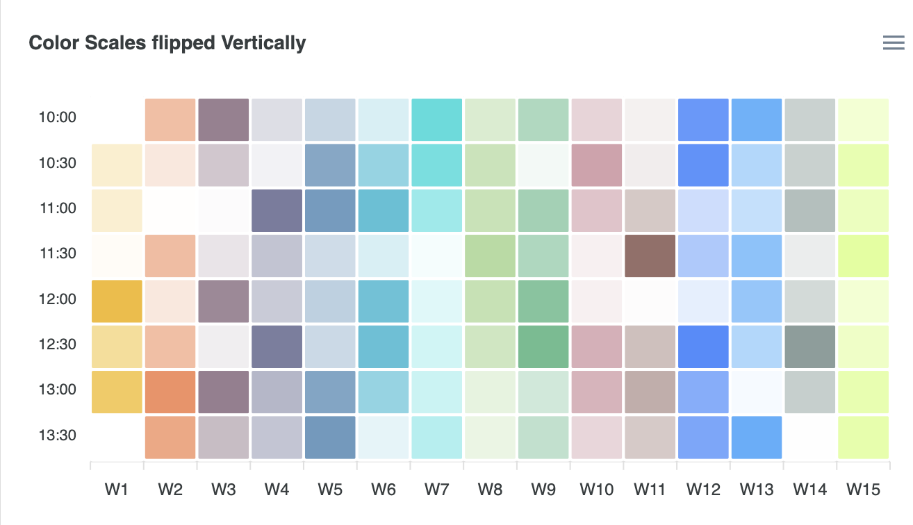
class ApexChart extends React.Component {
        constructor(props) {
          super(props);

          this.state = {

            series: data,
            options: {
              chart: {
                height: 350,
                type: 'heatmap'
              },
              dataLabels: {
                enabled: false
              },
              plotOptions: {
                heatmap: {
                  colorScale: {
                    inverse: true
                  }
                }
              },
              colors: ["#F3B415", "#F27036", "#663F59", "#6A6E94", "#4E88B4", "#00A7C6", "#18D8D8", '#A9D794',
                '#46AF78', '#A93F55', '#8C5E58', '#2176FF', '#33A1FD', '#7A918D', '#BAFF29'
              ],
              xaxis: {
                type: 'category',
                categories: ['W1', 'W2', 'W3', 'W4', 'W5', 'W6', 'W7', 'W8', 'W9', 'W10', 'W11', 'W12', 'W13', 'W14', 'W15']
              },
              title: {
                text: 'Color Scales flipped Vertically'
              },
            },


          };
        }
9) TreeMap Chart
(1) Series(Data Format)
options = {
    chart: {
      height: 350,
      type: "treemap",
    },
    series: [
      {
        data: [
          {
            x: "New Delhi",
            y: 218,
          },
          {
            x: "Kolkata",
            y: 149,
          },
          {
            x: "Pune",
            y: 31,
          },
          {
            x: "Chennai",
            y: 70,
          }
        ],
      },
    ]
  }

// XY Data Format으로 {x: 카테고리, y: value}
(2) TreeMap Charts Types & Options
- Basic TreeMap Chart
class ApexChart extends React.Component {
        constructor(props) {
          super(props);

          this.state = {

            series: [
              {
                data: [
                  {
                    x: 'New Delhi',
                    y: 218
                  },
                  {
                    x: 'Kolkata',
                    y: 149
                  },
		                  .....
                  {
                    x: 'Indore',
                    y: 19
                  },
                  {
                    x: 'Kanpur',
                    y: 29
                  }
                ]
              }
            ],
            options: {
              legend: {
                show: false
              },
              chart: {
                height: 350,
                type: 'treemap'
              },
              title: {
                text: 'Basic Treemap'
              }
            },


          };
}- Multiple Series TreeMap Chart
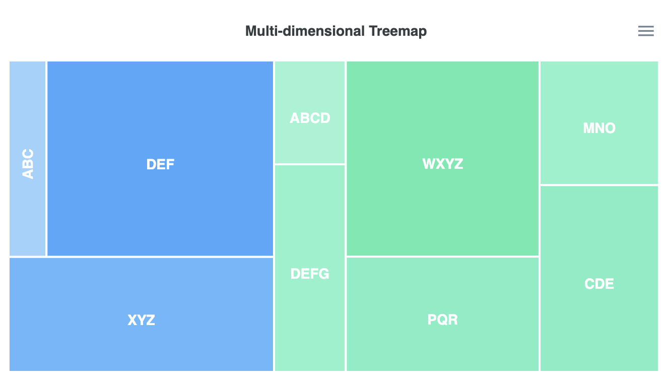
class ApexChart extends React.Component {
        constructor(props) {
          super(props);

          this.state = {

            series: [
              {
                name: 'Desktops',
                data: [
                  {
                    x: 'ABC',
                    y: 10
                  },
                  {
                    x: 'DEF',
                    y: 60
                  },
                  {
                    x: 'XYZ',
                    y: 41
                  }
                ]
              },
              {
                name: 'Mobile',
                data: [
                  {
                    x: 'ABCD',
                    y: 10
                  },
                  {
                    x: 'DEFG',
                    y: 20
                  },
                  {
                    x: 'WXYZ',
                    y: 51
                  },
                  {
                    x: 'PQR',
                    y: 30
                  },
                  {
                    x: 'MNO',
                    y: 20
                  },
                  {
                    x: 'CDE',
                    y: 30
                  }
                ]
              }
            ],
            options: {
              legend: {
                show: false
              },
              chart: {
                height: 350,
                type: 'treemap'
              },
              title: {
                text: 'Multi-dimensional Treemap',
                align: 'center'
              }
            },


          };
        }
10) Pie/Donut Chart
(1) Series(Data Format)
options = {
    series: [44, 55, 13, 33],
    labels: ['Apple', 'Mango', 'Orange', 'Watermelon']
  }

// series에는 single-dimensional array가 필수적이고, 각각에 대응되는 label이 필요로 함.
(2) Pie/Donut Charts Types & Options
- Basic Pie Chart
class ApexChart extends React.Component {
        constructor(props) {
          super(props);

          this.state = {

            series: [44, 55, 13, 43, 22],
            options: {
              chart: {
                width: 380,
                type: 'pie',
              },
              labels: ['Team A', 'Team B', 'Team C', 'Team D', 'Team E'],
              responsive: [{
                breakpoint: 480,
                options: {
                  chart: {
                    width: 200
                  },
                  legend: {
                    position: 'bottom'
                  }
                }
              }]
            },


          };
}- Monochrome Pie Chart
class ApexChart extends React.Component {
        constructor(props) {
          super(props);

          this.state = {

            series: [25, 15, 44, 55, 41, 17],
            options: {
              chart: {
                width: '100%',
                type: 'pie',
              },
              labels: ["Monday", "Tuesday", "Wednesday", "Thursday", "Friday", "Saturday"],
              theme: {
                monochrome: {
                  enabled: true
                }
              },
              plotOptions: {
                pie: {
                  dataLabels: {
                    offset: -5
                  }
                }
              },
              title: {
                text: "Monochrome Pie"
              },
              dataLabels: {
                formatter(val, opts) {
                  const name = opts.w.globals.labels[opts.seriesIndex]
                  return [name, val.toFixed(1) + '%']
                }
              },
              legend: {
                show: false
              }
            },


          };
}- Basic Donut chart
class ApexChart extends React.Component {
        constructor(props) {
          super(props);

          this.state = {

            series: [44, 55, 41, 17, 15],
            options: {
              chart: {
                type: 'donut',
              },
              responsive: [{
                breakpoint: 480,
                options: {
                  chart: {
                    width: 200
                  },
                  legend: {
                    position: 'bottom'
                  }
                }
              }]
            },


          };
}- Semi Donut chart
class ApexChart extends React.Component {
        constructor(props) {
          super(props);

          this.state = {

            series: [44, 55, 41, 17, 15],
            options: {
              chart: {
                type: 'donut',
              },
              plotOptions: {
                pie: {
                  startAngle: -90,
                  endAngle: 90,
                  offsetY: 10
                }
              },
              grid: {
                padding: {
                  bottom: -80
                }
              },
              responsive: [{
                breakpoint: 480,
                options: {
                  chart: {
                    width: 200
                  },
                  legend: {
                    position: 'bottom'
                  }
                }
              }]
            },


          };
        }
11) Radar Chart
(1) Series(Data Format)
options = {
  series: [
    {
      name: "Radar Series 1",
      data: [45, 52, 38, 24, 33, 10]
    },
    {
      name: "Radar Series 2",
      data: [26, 21, 20, 6, 8, 15]
    }
  ],
  labels: ['April', 'May', 'June', 'July', 'August', 'September']
}

// numberic array의 형식인 data와 각각에 대응하는 label을 필요로 함.
(2) Radar Charts Types & Options
- Basic Radar Chart
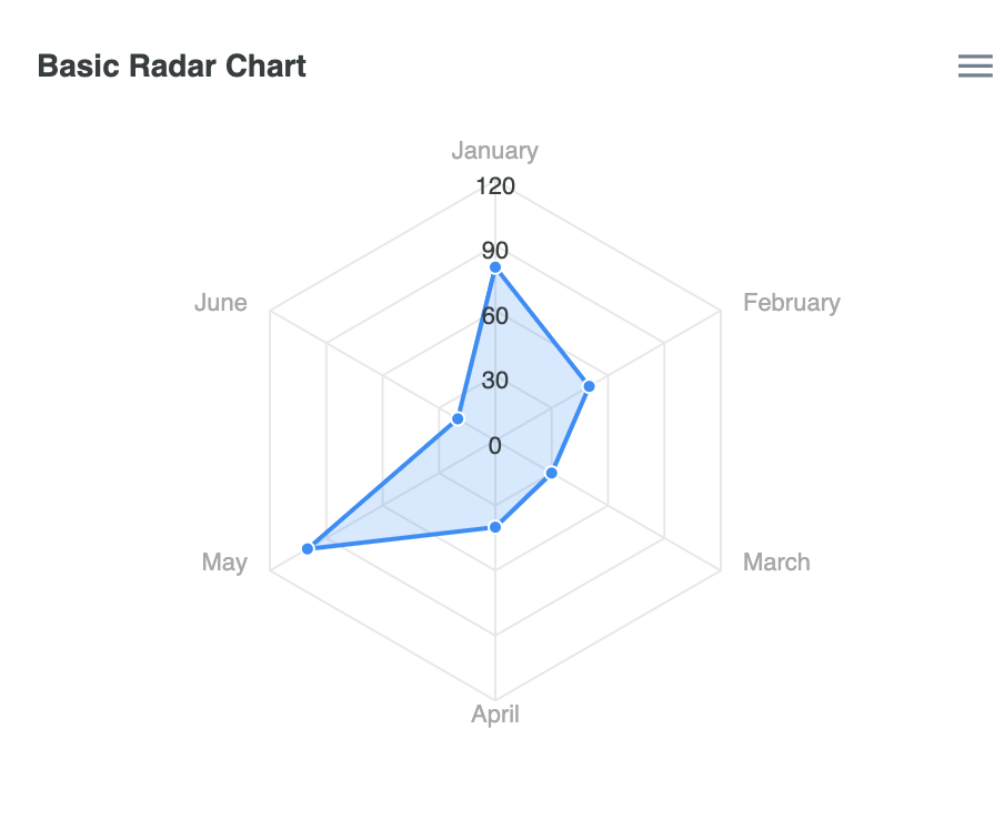
class ApexChart extends React.Component {
        constructor(props) {
          super(props);

          this.state = {

            series: [{
              name: 'Series 1',
              data: [80, 50, 30, 40, 100, 20],
            }],
            options: {
              chart: {
                height: 350,
                type: 'radar',
              },
              title: {
                text: 'Basic Radar Chart'
              },
              xaxis: {
                categories: ['January', 'February', 'March', 'April', 'May', 'June']
              }
            },


          };
}- Multiple Series Radar Chart
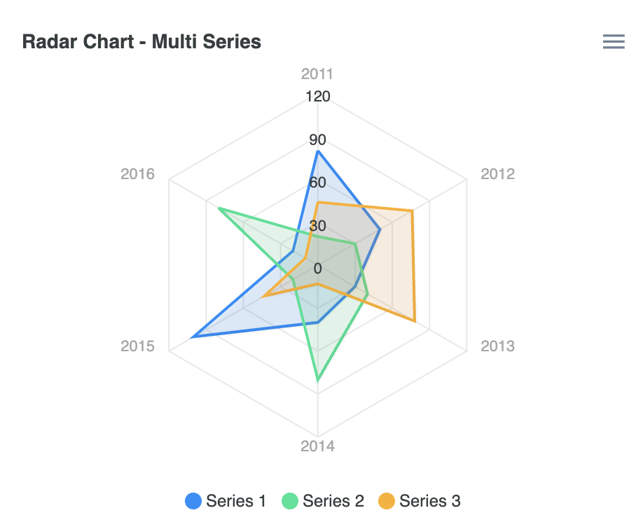
class ApexChart extends React.Component {
        constructor(props) {
          super(props);

          this.state = {

            series: [{
              name: 'Series 1',
              data: [80, 50, 30, 40, 100, 20],
            }, {
              name: 'Series 2',
              data: [20, 30, 40, 80, 20, 80],
            }, {
              name: 'Series 3',
              data: [44, 76, 78, 13, 43, 10],
            }],
            options: {
              chart: {
                height: 350,
                type: 'radar',
                dropShadow: {
                  enabled: true,
                  blur: 1,
                  left: 1,
                  top: 1
                }
              },
              title: {
                text: 'Radar Chart - Multi Series'
              },
              stroke: {
                width: 2
              },
              fill: {
                opacity: 0.1
              },
              markers: {
                size: 0
              },
              xaxis: {
                categories: ['2011', '2012', '2013', '2014', '2015', '2016']
              }
            },


          };
}- Polygon filled Radar Chart
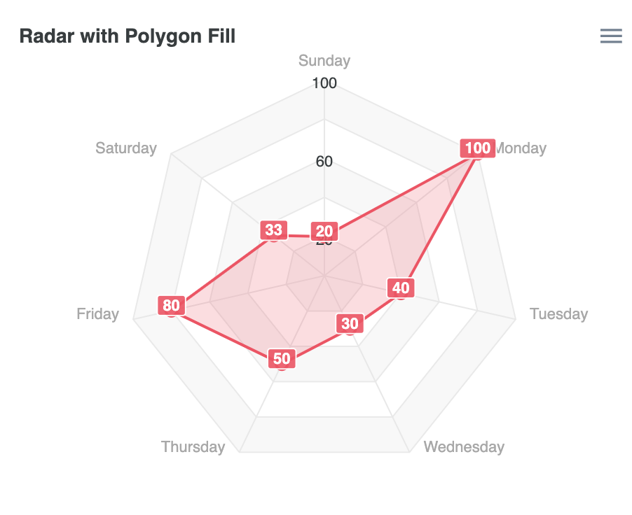
class ApexChart extends React.Component {
        constructor(props) {
          super(props);

          this.state = {

            series: [{
              name: 'Series 1',
              data: [20, 100, 40, 30, 50, 80, 33],
            }],
            options: {
              chart: {
                height: 350,
                type: 'radar',
              },
              dataLabels: {
                enabled: true
              },
              plotOptions: {
                radar: {
                  size: 140,
                  polygons: {
                    strokeColors: '#e9e9e9',
                    fill: {
                      colors: ['#f8f8f8', '#fff']
                    }
                  }
                }
              },
              title: {
                text: 'Radar with Polygon Fill'
              },
              colors: ['#FF4560'],
              markers: {
                size: 4,
                colors: ['#fff'],
                strokeColor: '#FF4560',
                strokeWidth: 2,
              },
              tooltip: {
                y: {
                  formatter: function(val) {
                    return val
                  }
                }
              },
              xaxis: {
                categories: ['Sunday', 'Monday', 'Tuesday', 'Wednesday', 'Thursday', 'Friday', 'Saturday']
              },
              yaxis: {
                tickAmount: 7,
                labels: {
                  formatter: function(val, i) {
                    if (i % 2 === 0) {
                      return val
                    } else {
                      return ''
                    }
                  }
                }
              }
            },


          };
        }
12) RadialBar Chart
(1) Series(Data Format)
var options = {
  chart: {
      height: 350,
      type: 'radialBar',
  },
  series: [70],
  labels: ['Progress'],
}

// series는 percentage로 제공되어야 함.(0~100 사이)
(2) RadialBar Charts Types & Options
- Basic RadialBar Chart
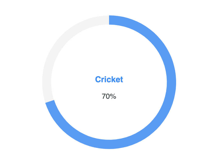
class ApexChart extends React.Component {
        constructor(props) {
          super(props);

          this.state = {

            series: [70],
            options: {
              chart: {
                height: 350,
                type: 'radialBar',
              },
              plotOptions: {
                radialBar: {
                  hollow: {
                    size: '70%',
                  }
                },
              },
              labels: ['Cricket'],
            },


          };
}- Multiple RadialBar Chart
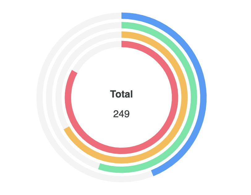
class ApexChart extends React.Component {
        constructor(props) {
          super(props);

          this.state = {

            series: [44, 55, 67, 83],
            options: {
              chart: {
                height: 350,
                type: 'radialBar',
              },
              plotOptions: {
                radialBar: {
                  dataLabels: {
                    name: {
                      fontSize: '22px',
                    },
                    value: {
                      fontSize: '16px',
                    },
                    total: {
                      show: true,
                      label: 'Total',
                      formatter: function (w) {
                        // By default this function returns the average of all series. The below is just an example to show the use of custom formatter function
                        return 249
                      }
                    }
                  }
                }
              },
              labels: ['Apples', 'Oranges', 'Bananas', 'Berries'],
            },


          };
}- Semi Circle Gauge
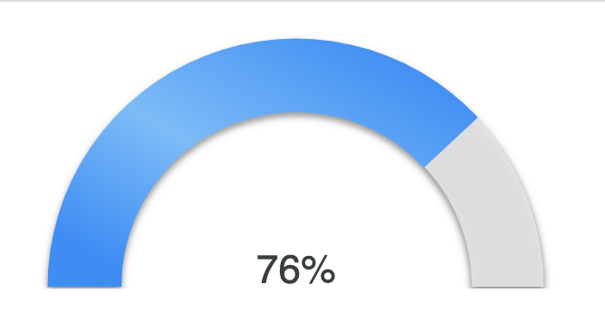
class ApexChart extends React.Component {
        constructor(props) {
          super(props);

          this.state = {

            series: [76],
            options: {
              chart: {
                type: 'radialBar',
                offsetY: -20,
                sparkline: {
                  enabled: true
                }
              },
              plotOptions: {
                radialBar: {
                  startAngle: -90,
                  endAngle: 90,
                  track: {
                    background: "#e7e7e7",
                    strokeWidth: '97%',
                    margin: 5, // margin is in pixels
                    dropShadow: {
                      enabled: true,
                      top: 2,
                      left: 0,
                      color: '#999',
                      opacity: 1,
                      blur: 2
                    }
                  },
                  dataLabels: {
                    name: {
                      show: false
                    },
                    value: {
                      offsetY: -2,
                      fontSize: '22px'
                    }
                  }
                }
              },
              grid: {
                padding: {
                  top: -10
                }
              },
              fill: {
                type: 'gradient',
                gradient: {
                  shade: 'light',
                  shadeIntensity: 0.4,
                  inverseColors: false,
                  opacityFrom: 1,
                  opacityTo: 1,
                  stops: [0, 50, 53, 91]
                },
              },
              labels: ['Average Results'],
            },


          };
        }
Always Awake