모바일 코딩
https://jinhongstar.tistory.com/25
모바일 코딩에 대해서
- 모바일 코딩에서는 배수를 생각해줘야 된다.
- bitmap 이미지는 2배수, 3배수 크게 importing을 해줘야 된다.
<a>태그는 block 처리를 해줘야 된다.text-size-adjust: auto;일 경우 화면 크기에 따라서 자동으로 조절될 수 있으니none값을 지정해줘야 된다. ## 모바일 코딩- 모바일 코딩에서는 배수를 생각해줘야 된다.
- bitmap 이미지는 2배수, 3배수 크게 importing을 해줘야 된다.
<a>태그는 block 처리를 해줘야 된다.text-size-adjust: auto;일 경우 화면 크기에 따라서 자동으로 조절될 수 있으니none값을 지정해줘야 된다.
오답노트
금요일날 예제를 만들어보았지만, 그 시간에 다 만들 수 없어 토요일날도 예제를 만들어봤다. 예제를 만들어보면서 구현이 되지 않았던 부분과 수정한 부분을 같이 기록해두려고 한다.
position을 잘못 생각한 부분
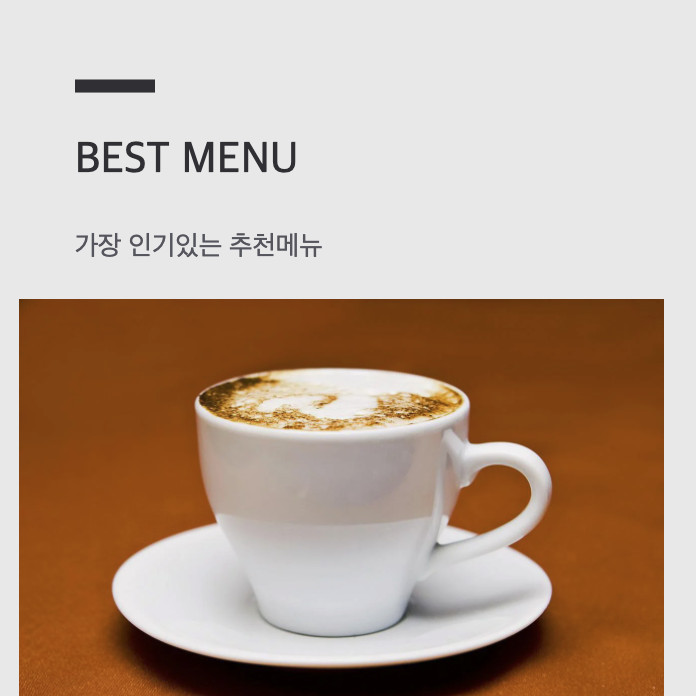
<div class="best-menu">
                <h3 class="title" >BEST MENU</h3>
                <p class="sub-title">가장 인기있는 추천메뉴</p>
                <img src="./img/bestmenu1.png" alt="뉴올리언스" />
                <div class="menu-des">
                    <p class="des-title">뉴 올리언스</p>
                    <p class="des">볶은 치커리 뿌리와 굵게 갈아낸 원두를 찬물에 넣어 12시간 동안 우려낸 콜드브루에 우유와 유기농 사탕수수로 만든 설탕을 섞어 만든 커피 음료</p>
                </div>
                <div class="swipe-btn cf">
                    <button type="button" class="first-btn">첫번째</button>
                    <button type="button" class="second-btn">두번째</button>
                    <button type="button" class="third-btn" >세번째</button>
                </div>

            </div>
이런식으로 BEST MENU 글씨 위에 선을 주려고 했다. 처음에는 아래와 같이 CSS 값을 줬다.
.best-menu .title {
  font-size: 5.6944vw;
  font-weight: 500;
  color: #36373b;
  font-family: 'Noto Sans KR', sans-serif;
  position: relative;
}
.best-menu .title::before {
  content: "";
  display: block;
  position: absolute;
  width: 10.2777vw;
  height: 1.6666vw;
  background-color: #36373b;
  left: 0;
  top: 50%;
  transform: translateY(-50%);

}
- 여기서 잘못한 부분은 처음에 나는 zeplin을 보고 만들면서 padding 값을
<div class="best-menu">부분에 주고,<h3 class="title" >BEST MENU</h3>이 부분에 padding 값을 주지 않은 상태로 계속 위치를 지정하고 있었던 것이었다.position: relative를 title에 주고, 가상 요소 before에 absolute를 해놓고, 나는 큰 영역 상단에서부터 위치를 맞추려고 생각했기 때문에 문제가 됐던 것이다. position: absolute값을 가진 것은position: relative를 기준으로 위치가 지정된다는 것을 다시 생각하게 되었다.- 그렇게 해서 title 스타일 부분에
padding-top값을 주거나,top값을(-50%)마이너스 값으로 위치를 바깥으로 조정하면 문제가 해결된다.
선택자(Selector)
<div class="find-store">
<h3 class="title">FIND YOUR<br /> CAFE</h3>
<p class="sub-title">당신의 까페를 찾아보세요</p>
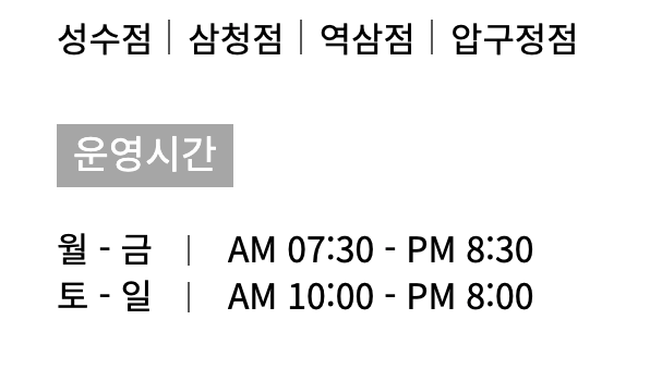
<ul class="store-list cf"><span>매장</span>
<li>성수점</li>
<li>삼청점</li>
<li>역삼점</li>
<li>압구정점</li>
</ul>
<ul class="time-list"><span>운영시간</span>
<li>
<span>월 - 금</span>
<span>AM 07:30 - PM 8:30</span>
</li>
<li>
<span>토 - 일</span>
<span>AM 10:00 - PM 8:00</span>
</li>
</ul>
<a href="javascript:void(0)" class="find-store-btn" >매장찾기</a>
<img src="./img/shop4.png" alt="매장사진">
<!-- <div class="store-photo">삼청동 매장</div> -->
</div>.find-store {
font-family: 'Noto Sans KR', sans-serif;
background-color: #fff;
height: 236.11111vw;
padding: 8.61111vw 7.7777vw 15.2777vw 8.33333vw;
}
.find-store .title {
color: #00a1df;
font-size: 8.88888vw;
font-weight: 500;
text-align: center;
margin: 8.61111vw 0;
}
.find-store .sub-title {
color: #666;
font-size: 5vw;
font-weight: 500;
text-align: center;
line-height: 0.2472vw;
}
.find-store .store-list {
width: 71.6666vw;
margin: auto;
margin-top: 16.3888vw;
}
.find-store .store-list>span {
display: block;
background-color: #afafaf;
color: #fff;
width: 34.4444vw;
height: 8.05555vw;
font-size: 5vw;
line-height: 7vw;
text-align: center;
margin-bottom: 4.1666vw;
}
.find-store .store-list>li {
float: left;
padding-right: 4.4444vw;
position: relative;
}
.find-store .store-list>li::before {
content: "";
display: block;
width: 0.5555vw;
height : 4.44444vw;
font-size: 4.44444vw;
background-color: #666;
position: absolute;
left: 85%;
}
.find-store .time-list {
width: 71.6666vw;
margin: auto;
}
.find-store .time-list>span {
display: block;
background-color: #afafaf;
color: #fff;
width: 22.5vw;
height: 8.05555vw;
font-size: 5vw;
line-height: 7vw;
text-align: center;
margin-top: 8.8888vw;
margin-bottom: 4.7222vw;
}
.find-store .time-list li{
line-height: 5.97222vw;
position: relative;
font-size: 4.4444vw;
}
.find-store .time-list li span:nth-of-type(1) {
margin-right: 8.3333vw;
}
- 처음에는 store-list에 ::before를 이용해서 버티컬바를 만들고 가장 마지막에 있는 li::before를 없애주려고 했고, span 태그에는 ::after를 이용해서 버티컬바를 만든 다음에 각 li에 있는 2번째 span에 있는 버티컬바를 없애주려고 했다.
/* 실패작
.find-store .store-list li:last-child {
  display: none;
}
.find-store .store-list>li:last-child>::before {
  display: none;

}
.find-store .store-list>li::before:last-child {
  display: none;
}
*/- 없애주기 위해서 해봤으나 잘 되지 않았다. 아직 선택자에 대한 부분이 많이 부족하기 때문에 공부가 더 필요하다는 생각이 든다.
- 그러다가 not 선택자를 사용해보라는 조언을 구할 수 있었다. 그렇게 할 경우에는 따로 지울 필요가 없다고 하여 not 선택자 문법을 찾아서 적용해보았다.
not Selector
- 부정 CSS 가상 클래스 :not(selector)
- selector를 제외한 부분에만 스타일이 적용된다. selector 부분에는 다른 부정 선택자를 포함하면 안된다.
.find-store .store-list li:not(li:last-child)::before {
  content: "";
  display: block;
  width: 0.27777vw;
  height : 4.44444vw;
  font-size: 4.44444vw;
  background-color: #666;
  position: absolute;
  left: 85%;
}- 이 위 css에서는 .store-list 하위 li 중에 last-child만 제외하고 선택한 것이다.
형제 선택자
위에 예시 span 태그 사이에 버티컬바를 만들기 위해서 각각 class를 주거나 :nth-child를 주기에는 비효율적이지만, 나의 두뇌로는 그 생각밖에 들지 않았다. 조언을 구한 결과 형제 선택자를 사용하라는 조언을 받을 수 있었다.
- 형제 선택자 : 형제선택자는
~를 이용한다.A ~ BA 선택자와 B 선택자는 부모 요소가 같아야 되고, B가 A 선택자보다 뒤에 위치했을 때 선택할 수 있다. (두 요소가 서로 붙어 있을 필요는 없음)- A 선택자는 선택되지 않는다!!
- 문법 :
former_element ~ target_element { style properties }
.find-store .time-list li span ~ span::before {
  content: "";
  display: block;
  width: 0.27777vw;
  height: 3.8888vw;
  background-color: #666;
  position: absolute;
  top: 1.3888vw;
  left: 16.6666vw;
}
확실히 항상 이론적인 부분에 대해서 공부할 때는 공부를 하고 난 후에 기억에 잘 남지 않아서 힘들었었다.
하지만 이렇게 Input과 Output을 하다 보니까 이해하는데도 쉽고, 잘 보지 못 했던 것들에 대해서도 공부하게 되어서 도움이 많이 된다.
position 기준점에 대해서는 다시는 실수하지 말아야지. 그리고 Selector에 대해서도 많이 사용하지 않는 선택자라고 해서 공부하지 않을 게 아니라, 그래도 대략적으로 이런 선택자들이 있고, 이렇게 사용하는구나 정도는 알아야 된다고 생각이 든다.

경험한 것을 기록