
기본 Bar Plot
- 직사각형 막대를 사용하여 데이터의 값을 표현하는 차트/그래프
- 범주에 따른 수치 값을 비교하기에 적합한 방법
- 개별 비교, 그룹 비교 모두 적합
- 범주가 많아질 시에는 Horizontal 사용을 추천
다양한 Bar Plot
Multiple Bar Plot
- Plot을 여러개 그리기
- 한 개의 plot에 동시에 나타내기
- 쌓아서 표현
- 겹쳐서 표현
- 이웃에 배치하여 표현
Stacked Bar Chart
- 쌓아서 표현하기
- 비율 등을 주석으로 달아놓는 것이 좋음
- 전체에서 비율을 나타내는 percentage stacked bar chart가 있음
Overlapped Bar Chart
- 2개 그룹만 비교한다면 겹쳐서 만드는 것도 하나의 선택지
- 같은 축을 사용하니 비교가 쉬움
- Bar plot보다는 area plot에서 더 효과적
- 투명도 등 이상적인 색상을 잘 쓰는 것이 중요
Grouped Bar Plot

- Matplotlib로 구현이 조금 까다로움
- 앞서 소개한 내용 모두 그룹이 5개 ~ 7개 이하일 때 효과적
더 정확한 Bar Plot
Bar plot의 오용을 막기
Principle of Proportion Ink
- 실제 값과 그에 표현되는 그래픽 잉크 양은 비례해야 함
- 반드시 x 축의 시작은 zero여야 함
- 막대 그래프에만 한정되는 원칙은 아님
데이터 정렬
- 더 정확한 정보를 전달하기 위해서는 정렬이 필수
- sort_values 등
- 데이터의 종류에 따라 다음 기준으로
- 시계열 | 시간 순
- 수치형 | 크기 순
- 순서형 | 범주 순서대로
- 명목형 | 범주의 값에 따라 정렬
- 대시보드에서는 Interactive를 제공하는 것이 좋음
적절한 공간 활용
- 여백과 공간만 조정해도 가독성이 높아짐
- matplotlib에서 bar plot은 ax에 꽉 차서 살짝 답답
복잡함과 단순함
- 필요없는 복잡함은 X
- 인사이트 전달을 위해서는 직사각형이 최고
ETC
- 오차 막대를 추가하여 Uncertainty 정보를 추가 가능
- Bar사이 Gap이 0이라면 Histogram
- 다양한 text 정보 활용하기
실습
student.sample(5)group = student.groupby('gender')['race/ethnicity'].value_counts().sort_index()
display(group)
print(student['gender'].value_counts())- sample을 통해 데이터프레임 확인
Multiple Bar Plot
fig, axes = plt.subplots(1, 2, figsize=(15, 7))
axes[0].bar(group['male'].index, group['male'], color='royalblue')
axes[1].bar(group['female'].index, group['female'], color='tomato')
plt.show()- 이러면 두 그룹의 y축이 다름
fig, axes = plt.subplots(1, 2, figsize=(15, 7), sharey=True)
axes[0].bar(group['male'].index, group['male'], color='royalblue')
axes[1].bar(group['female'].index, group['female'], color='tomato')
plt.show()- sharey 를 사용해 y 축을 고정
- 이외에도 ylim을 미리 정해주어도 좋음
Stacked Bar Plot
fig, axes = plt.subplots(1, 2, figsize=(15, 7))

group_cnt = student['race/ethnicity'].value_counts().sort_index()
axes[0].bar(group_cnt.index, group_cnt, color='darkgray')
axes[1].bar(group['male'].index, group['male'], color='royalblue')
axes[1].bar(group['female'].index, group['female'], bottom=group['male'], color='tomato')

for ax in axes:
    ax.set_ylim(0, 350)

plt.show()- bottom이라는 파라미터를 통해 밑에 추가해줌
- 가독성이 엄청 좋지는 않으니, 많이 사용하지는 않음
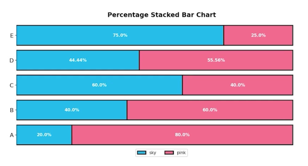
Percentage Stacked Bar Plot
fig, ax = plt.subplots(1, 1, figsize=(12, 7))

group = group.sort_index(ascending=False) # 역순 정렬
total=group['male']+group['female'] # 각 그룹별 합


ax.barh(group['male'].index, group['male']/total,
        color='royalblue')

ax.barh(group['female'].index, group['female']/total,
        left=group['male']/total,
        color='tomato')

ax.set_xlim(0, 1)
for s in ['top', 'bottom', 'left', 'right']:
    ax.spines[s].set_visible(False)

plt.show()- spine은 테두리를 없애는 함수
Overlapped Bar Plot
group = group.sort_index() # 다시 정렬

fig, axes = plt.subplots(2, 2, figsize=(12, 12))
axes = axes.flatten()

for idx, alpha in enumerate([1, 0.7, 0.5, 0.3]):
    axes[idx].bar(group['male'].index, group['male'],
                  color='royalblue',
                  alpha=alpha)
    axes[idx].bar(group['female'].index, group['female'],
                  color='tomato',
                  alpha=alpha)
    axes[idx].set_title(f'Alpha = {alpha}')

for ax in axes:
    ax.set_ylim(0, 200)


plt.show()- alpha를 통해 투명도를 조절
Grouped Bar Plot
- 조금 복잡스
fig, ax = plt.subplots(1, 1, figsize=(12, 7))

idx = np.arange(len(group['male'].index))
width=0.35

ax.bar(idx-width/2, group['male'],
       color='royalblue',
       width=width, label='Male')

ax.bar(idx+width/2, group['female'],
       color='tomato',
       width=width, label='Female')

ax.set_xticks(idx)
ax.set_xticklabels(group['male'].index)
ax.legend()

plt.show()- seaborn 등 다른 plot 사용하는게 날듯?
- 더 자세한 내용은 주피터 노트북을 참고하자