SwiftUI 는 UIKit 과 다르게 View 와 Shape 를 구별하여 사용하지 않으면 내가 생각한대로 뷰가 나오지 않는 경우가 상당히 많다. 그렇기 때문에 UIKit 을 많이 사용하다보면 이런 부분에 대해 얼마나 빨리 이해하느냐가 SwiftUI 를 빨리 적용하느냐에 도움을 줄 수 있다고 생각하였다.
여기서 다룰 내용들은 이런 문제를 만났을 때 도움이 될 것이라고 생각한다.
- resizable(), sizeToFit() 은 언제 사용하는 것이 적절한가?
- fill(), background() 의 차이는 무엇일까?
- Text 위젯에 정렬을 적용했는데도 아무런 변화가 없다. 무엇이 문제일까?
- border(), strokeBorder() 의 차이는 무엇일까?
여기서 알아보는 것들은 보시다시피 view modififer 혹은 shape modifier 이다. 뭐든 알아보기 전에 공식문서의 설명부터 보고 시작할 것이다.
공식문서 설명 중 iOS 15 혹은 16 에 최적화된 메소드나 객체가 생길 경우 deprecated 되는 경우가 있다. 하지만 iOS 13 에서 사용 가능한 공식문서 만을 참조할 것이다. 이는 현업에서 iOS 15 / 16 으로 배포버전을 세팅하기 어렵기 때문이다.
View 와 Shape 의 차이
UIKit 에서는 별로 고려하지 않았던 요소이다. View 는 알겠는데 Shape 는 대체 뭐란 말인가?
View in documentation
https://developer.apple.com/documentation/swiftui/view
protocol ViewA type that represents part of your app’s user interface and provides modifiers that you use to configure views.
앱의 UI 를 담당하고 여러 modifier 를 제공하는 뷰의 타입.
You create custom views by declaring types that conform to the View protocol. Implement the required body computed property to provide the content for your custom view.
View 프로토콜을 구현한 어떤 타입이든 간에 커스터마이징하여 view 안에 선언할 수 있다. 계산 프로퍼티인 body 를 구현하여 커스터마이징 한 view 를 구현하면 된다.
struct MyView: View {
    var body: some View {
        Text("Hello, World!")
    }
}
Shape in documentation
https://developer.apple.com/documentation/swiftui/shape
protocol Shape: Animatable, View A 2D shape that you can use when drawing a view.
2D 형태의 View 를 그릴 때 사용하는 Shape (더욱 헷갈리게 하는 설명인 것 같다...)
Shapes without an explicit fill or stroke get a default fill based on the foreground color.
채우기 혹은 구분이 없는 모양에서 기본 채우기(in Foreground)만을 가진 형태(Shape)를 말한다.
You can define shapes in relation to an implicit frame of reference, such as the natural size of the view that contains it. Alternatively, you can define shapes in terms of absolute coordinates.
Shape 는 내제되어 있는 뷰의 크기에 따라 결정된다. 하지만 절대적인 크기를 설정하는 것도 가능하다.
description
간단히 말해 Shape 는 Path 의 모음이며, Path 는 View 가 될 예정인 View 이다. 아직 뷰가 아니다.
좌표평면계 안에서 Path 에 좌표값을 입력해 Shape 그리는 식인 것이다. 이런 작업이 굉장히 귀찮다는 것을 모를리 없는 Apple 은 아래의 Shape 를 미리 만들어 제공한다.
- Rectangle
- RoundedRectangle
- RotatedShape
- Ellipse
- Circle
- Capsule
resizable 과 scaledToFit 의 차이
resizable() in documentation
https://developer.apple.com/documentation/SwiftUI/Image/resizable(capInsets:resizingMode:)
func resizable(
    capInsets: EdgeInsets = EdgeInsets(),
    resizingMode: Image.ResizingMode = .stretch
) -> Image
Sets the mode by which SwiftUI resizes an image to fit its space.
SwiftUI 가 어떻게 이미지 크기를 재조정하여 이미지의 공간을 맞출지 모드를 정한다.
Parameters
- capInsets : Image 가 resize 하지 않을 부분을 EdgeInset 객체로 나타낸다.
- EdgeInset 은 간단히 말해 상하좌우의 inset 크기를 표현하는 struct 이다.
- resizingModel : strect, tile 두 개로 나뉜다. stretch 는 이미지를 리사이즈 할 때 늘이겠다는 것이고 tile 은 타일 형태로 복사하겠다는 의미이다.
scaledToFit() in documentation
https://developer.apple.com/documentation/swiftui/view/scaledtofit()
func scaledToFit() -> some ViewScales this view to fit its parent.
뷰를 조절하여 부모 뷰와 크기를 맞춘다.
Use scaledToFit() to scale this view to fit its parent, while maintaining the view’s aspect ratio as the view scales.
scaledToFit() 으로 뷰 크기를 부모 뷰와 맞춘다. 이와 동시에 뷰의 가로세로비(aspect ratio) 를 함께 조절하여 크기를 맞춘다.
description
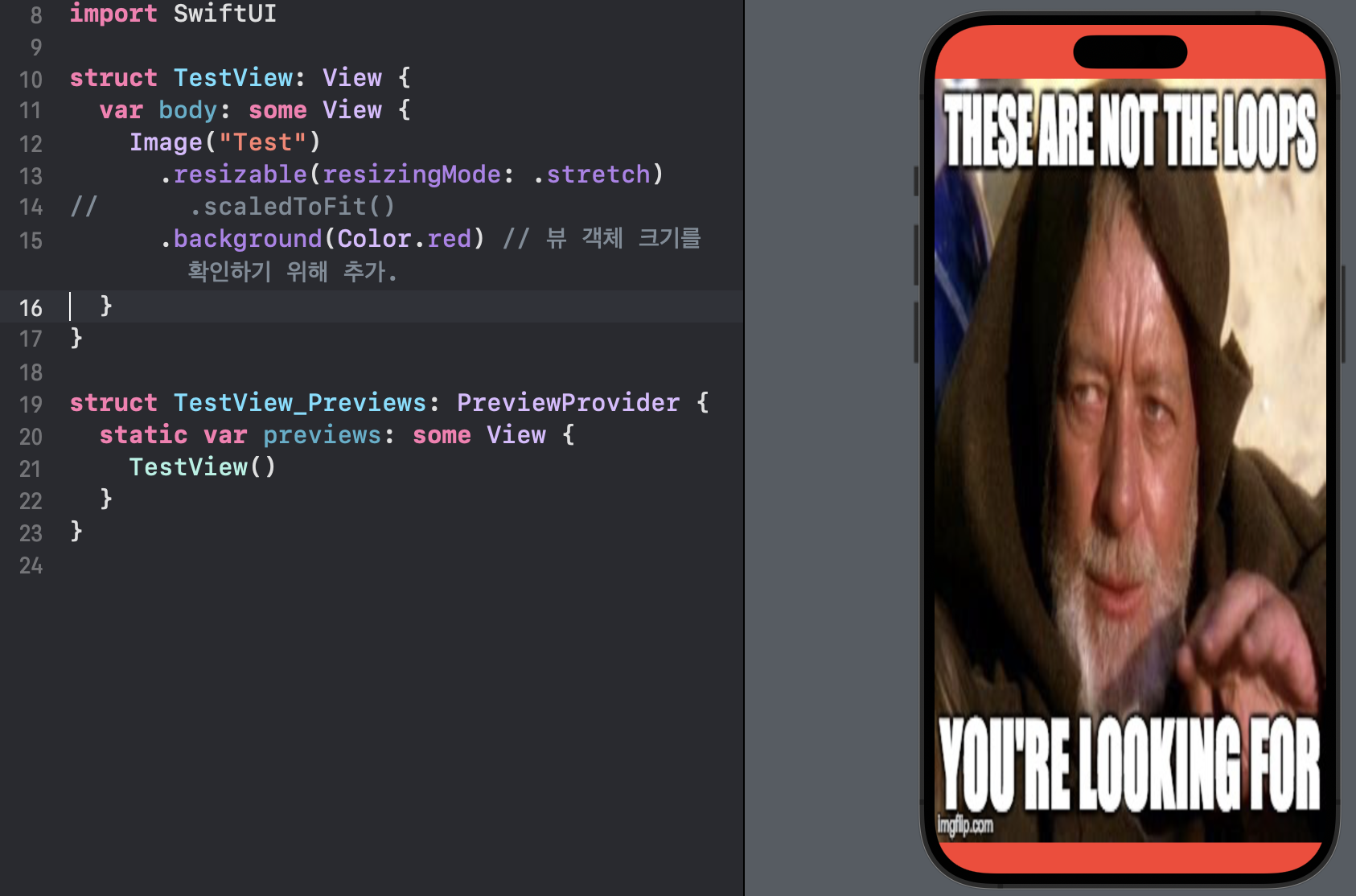
구현만 봐서도 알 수 있는 부분 중에 하나는 resizable() 은 Image 에서만 사용할 수 있다 는 점이다. 그리고 목적 자체도 다르다.
resizable() 은 Image 뷰의 크기와 이미지 자체의 해상도가 맞지 않을 경우 이미지 자체의 크기를 조절하는 modifier 이다.
다음은 Kodeco 의 "swiftui-by-tutorials" 라는 책에서 resizable 에 대해 설명하는 글이다.
Note: If you don’t apply the resizable modifier, the image will keep its native size. When you apply a modifier that either directly or indirectly changes the image’s size, that change is applied to the actual view the modifier is applied to, but not to the image itself, which will retain its original size.
만약 당신이 resizable modifier 를 사용하지 않는다면, 이미지(Image 뷰)는 그 본연의 크기(본래 표현하고자 하는 이미지)만을 갖게 될 것이다. modifier 직접 혹은 간접적으로 적용한다면 이미지(Image 뷰)의 크기가 바뀌고, 이런 변화는 modifier 가 반영된 실제 뷰(Image 뷰)에 적용된다. 하지만 이미지(본래 표현하고자 하는 이미지) 자체는 본연의 사이즈를 유지하게 된다.
많은 부분을 설명하지만 개인적으로는 코드로 확인하는게 더 나은 것 같다. 금방 이해할 수 있다.
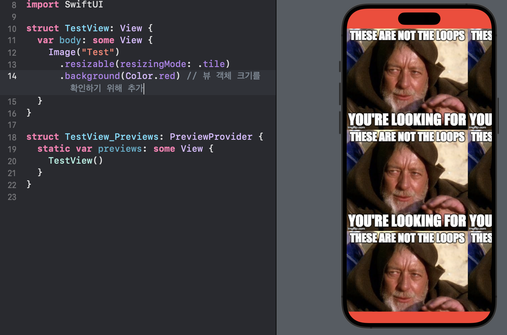 적용 전
적용 전
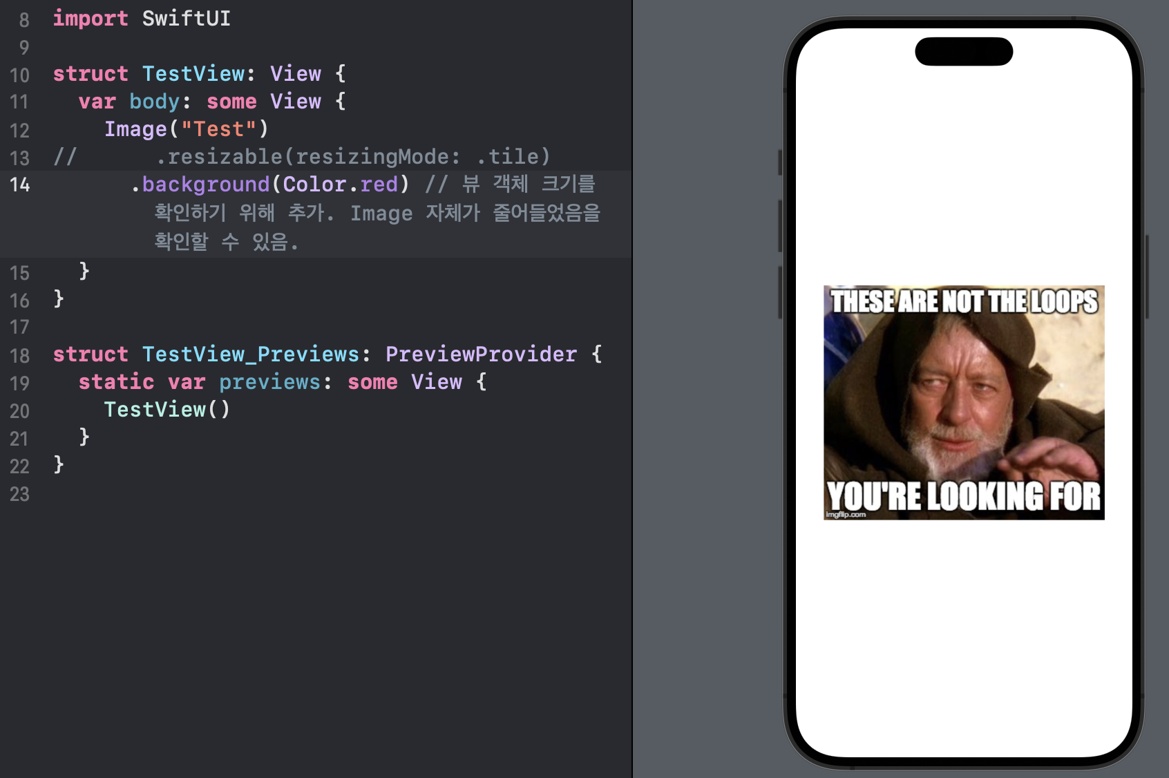 적용 후
적용 후
이에 비해 scaledToFit() 은 우리가 UIKit 에서 많이 했던 것처럼 부모 뷰의 나머지를 자식 뷰가 모두 채우길 바랄 때 사용한다.
Image 를 사용할 경우 두 개를 혼합해서 사용하는 경우가 많다.
 적용 전
적용 전
 적용 후
적용 후
fill 과 background 의 차이
fill() in documentation
https://developer.apple.com/documentation/swiftui/shape/fill(style:)
func fill(style: FillStyle = FillStyle()) -> some ViewFills this shape with the foreground color.
이 Shape 를 foregroundColor 로 채운다.
Parameter
- style : 렌더링을 어떻게 채울지 설정하는 style 옵션이다.
background() in documentation
https://developer.apple.com/documentation/swiftui/view/background(_:alignment:)
func background<Background>(
    _ background: Background,
    alignment: Alignment = .center
) -> some View where Background : View
Parameter
- background : 적용되는 뷰의 뒤에 그려질 뷰를 정의한다.
- alignment : 뒤에 그려질 뷰의 위치를 정의한다.
Use background(_:alignment:) when you need to place one view behind another, with the background view optionally aligned with a specified edge of the frontmost view.
background() 는 뷰 뒤에 다른 뷰를 위치시키고 싶을 때 사용한다. 옵션으로 뷰가 앞의 뷰를 기준으로 어디에 정렬될지도 결정할 수 있다.
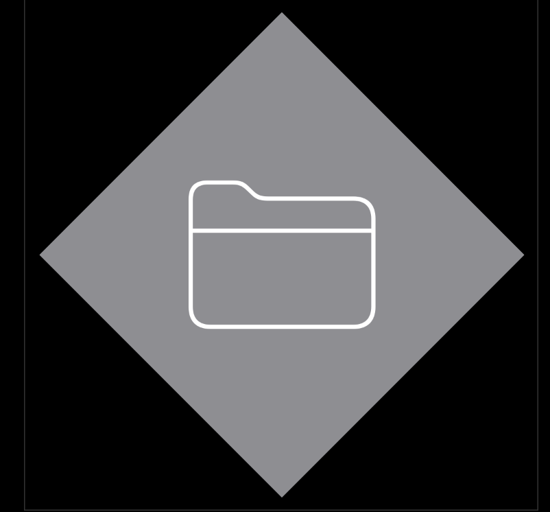
The example below creates two views: the Frontmost view, and the DiamondBackground view. The Frontmost view uses the DiamondBackground view for the background of the image element inside the Frontmost view’s VStack.
아래 예시는 두 개의 뷰를 생성하는데, 앞의 뷰와 다이아몬드 형태의 배경 뷰이다.
struct DiamondBackground: View {
    var body: some View {
        VStack {
            Rectangle()
                .fill(Color.gray)
                .frame(width: 250, height: 250, alignment: .center)
                .rotationEffect(.degrees(45.0))
        }
    }
}

struct Frontmost: View {
    var body: some View {
        VStack {
            Image(systemName: "folder")
                .font(.system(size: 128, weight: .ultraLight))
                .background(DiamondBackground())
        }
    }
}
description
공식문서 링크를 자세히보면 상위 카테고리가 다르다.
- shape -> fill(style:)
- view -> background(_:alignment)
만약 View 에 fill 을 사용하려고 하면 사용이 되지 않을 것이다. undefined 되었다는 오류를 만날 것이다.
어떠한 SwiftUI 객체에 사용하는지만 잘 알아두면 내부에 어떤 View 나 Shape 를 채운다 는 목적은 같다.
Text 위젯의 문자열을 정렬하는 법
Text in documentation
https://developer.apple.com/documentation/swiftui/text
@frozen struct Text읽기 전용의 여러 줄 텍스트를 표시한다. AttributedString 을 바로 적용하는 것도 가능하다.
A text view always uses exactly the amount of space it needs to display its rendered contents, but you can affect the view’s layout. For example, you can use the frame(width:height:alignment:) modifier to propose specific dimensions to the view. If the view accepts the proposal but the text doesn’t fit into the available space, the view uses a combination of wrapping, tightening, scaling, and truncation to make it fit.
Text 는 정확히 표현해야 할 컨텐츠만큼만 크기를 갖는다. 하지만 뷰의 레이아웃 조절은 가능하다. 예를 들어, frame(width:height:alignment:) modifier 를 사용하는 것이다. 하지만 뷰가 이러한 제의를 받아들이고도 텍스트가 가용되는 공간 안에 표현하는 것이 불가능 할 경우, 뷰는 여러 옵션을 통해 이를 맞추려 시도할 것이다.
description
내가 자주 사용하는 코드는 이것이다.
Text("Hello World")
	.frame(maxWidth: .infinity, alignment: .leading)
Text 자체를 최대한 늘린 뒤, 내부의 컨텐츠를 leading 으로 처리한다.
frame() 은 뷰 자체의 크기가 아닌 내부의 컨텐츠 크기를 조절하는 것이기 때문에 이 방법을 자주 사용한다.
border 와 strokeBorder 의 차이
border() in documentation
https://developer.apple.com/documentation/swiftui/view/border(_:width:)
func border<S>(
    _ content: S,
    width: CGFloat = 1
) -> some View where S : ShapeStyle
view 에 경계선을 특정 스타일과 굵기로 넣는다.
Parameter
- content: ShapeStyle 프로토콜을 구현하는 Color, HierarchicalShapeStyle 과 같은 값을 반영하여 SwiftUI 가 border 를 채울 값을 정의한다.
- width: border 의 굵기
Use this modifier to draw a border of a specified width around the view’s frame. By default, the border appears inside the bounds of this view. For example, you can add a four-point wide border covers the text:
이 modifier 를 사용해서 경계선을 뷰의 프레임에 특정 굵기로 넣을 수 있다. 기본적으로 경계선은 뷰의 경계 안쪽에 표시된다. 예를 들어, 4포인트 굵기의 경계선을 Text 에 넣으면 이렇게 된다.
Text("Purple border inside the view bounds.")
  .border(Color.purple, width: 4)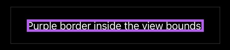
To place a border around the outside of this view, apply padding of the same width before adding the border:
경계선을 바깥으로 밀어내기 위해서는 padding 을 굵기와 똑같이 주면 된다.
Text("Purple border outside the view bounds.")
  .padding(4)
  .border(Color.purple, width: 4)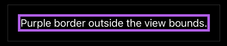
strokeBorder() in documentation
https://developer.apple.com/documentation/swiftui/insettableshape/strokeborder(_:style:antialiased:)
func strokeBorder<S>(
    _ content: S,
    style: StrokeStyle,
    antialiased: Bool = true
) -> some View where S : ShapeStyle
Returns a view that is the result of insetting self by style.lineWidth / 2, stroking the resulting shape with style, and then filling with content.
특정 Shape 에 lineWidth 의 반만큼 굵기를 가진 선을 세팅한 후 나머지 style 과 함께 View 로 만들어 반환한다. 그리고 컨텐츠를 채운다.
description
둘 다 똑같이 View 를 반환한다. 하지만, strokeBorder 는 Shape 에 적용하고, border() 는 뷰에 적용한다.