정의
자바스크립트 파일 안에서 css를 작성할 수 있는 방법(CSS-in-JS)중
대표적인 방법이 styled-components이다.
styeld-components 를 사용하면 하나의 컴포넌트 안에서 태그설정,
스타일 변경, attribute 설정을 함께 할 수 있다.
설치
npm install styled-components기본 사용법
// App.js
import React from 'react';
import styled from 'styled-components';

export default function App() {
  return (
    <Container>
      <Title>Hello!</Title>
    </Container>
  )
}

const Container = styled.div`
  width: 100%;
`

const Title = styled.strong`
  display: block;
  font-size: 32px;
  line-height: 1.5;
`
응용
styled-components 의 장점은 상황에 따라 특정 속성만 변하는 컴포넌트를
적은양의 코드로 만들어 줄 수 있다는 점이다.
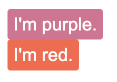
스타일된 컴포넌트의 재사용
<Button /> 을 스타일드 컴포넌트로 선언해준뒤 하위의 <TomatoButton /> 을
기존 컴포넌트의 스타일 값 + 변경된 스타일의 오버라이딩으로 만들어 줄 수 있다.
const Button = styled.button`
  background: palevioletred;
  border-radius: 3px;
  border: none;
  color: white;
`

const TomatoButton = styled(Button)`
  background: tomato;
`

return (
  <>
    <Button>I'm purple.</Button>
    <br />
    <TomatoButton>I'm red.</TomatoButton>
  </>
)
props 전달
아니면 컴포넌트에서 전달해준 props를 스타일의 변수처럼 받을 수 있다는 점을 활용하여 props 로 관련 속성정보를 넘겨받아 변경시켜 줄 수도 있다.
const Button = styled.button`
  background: ${props => props.bgColor || palevioletred};
  border-radius: 3px;
  border: none;
  color: white;
`

return (
  <>
    <Button>I'm purple.</Button>
    <br />
    <Button bgColor="tomato">I'm red.</Button>
  </>
)
ThemeProvier의 사용
// index.js
import { ThemeProvider } from 'styled-components'

const theme = {
  purple: 'palevioletred',
  red: 'tomato',
};

<ThemeProvider theme={theme}>
  <App />
</ThemeProvider>


// App.js
const Button = styled.button`
  background: ${props => props.theme.purple};
  border-radius: 3px;
  border: none;
  color: white;
`

const TomatoButton = styled(Button)`
  background: ${props => props.theme.red};
`


return (
  <>
    <Button>I'm purple.</Button>
    <br />
    <TomatoButton>I'm red.</TomatoButton>
  </>
)
index.js에 ThemeProvier 를 만들어준 뒤 theme 을 공급해주면
스타일 속성을 전역적으로 사용할 수 있는 상태가 된다.
이후 원하는 곳에서 props.theme.[변수명] 으로 접근해서 사용해주면 된다.
위의 세 가지 방법 모두 동일한 결과를 반영해주며 상황에 맞게 사용하면 된다.
props의 응용처리
props 로 받아주는 경우 컴포넌트 내부에서 자바스크립트의 어떠한 기능도 이용할 수 있게 되며 응용하면 아래와 같은 레이아웃의 변경 처리도 가능해진다.
const List = ({ column=3 }) => {
  const [products, setProducts] = useState([]);

  useEffect(() => {
    fetch('/data/productData.json')
      .then(res => res.json())
      .then(data => {
        setProducts(data);
      });
  }, []);

  return (
    <ListWrapper column={column}>
      {products.map(product => {
        return (
          <ProductCard
            key={product.productid}
            product={product}
            selectOpt={selectOpt}
          />
        );
      })}
    </ListWrapper>
  );
}

const ListWrapper = styled.div`
  display: grid;
  grid-template-columns: ${props => '1fr '.repeat(props.column)};
  grid-gap: 40px;
  place-items: center;
  margin: 35px auto 0;
`;

export default List;
데이터를 fetch하여 상품 리스트를 그려주는 컴포넌트인데 페이지마다 한 줄에
보여줄 상품의 갯수가 달라질 수 있다.
그런 경우 column 이라는 속성을 props 로 받아 스타일드 컴포넌트 안에서 javascript의
repeat 메서드를 실행해주면 페이지마다 다른 갯수를 가진 상품리스트 페이지를 얻을 수 있게 된다.