
개인적으로 module scss로 작업을 하다가
현업에서 styled component로 개발을 하였는데 런타임 속도가 체감이 되어서
추천으로 알게된 stitches css를 사이드 프로젝트에서 사용해보게 되었습니다.
본 글은 주관적인 한 달 사용 리뷰가 되겠습니다.
공식 문서
설치
# With npm
npm install @stitches/react

# With yarn
yarn add @stitches/react
사용하게 된 이유
여러가지 이유가 있을 수 있겠지만 개인적으로 사용한 이유이자 만족했던 점은 크게 3가지 였습니다.
- 빠른 런타임
- variants
- 러닝 커브
1. 런타임 관련 밴치마크
아래 사진은 stitches 홈페이지에 나와있는 런타임 비교 글입니다.
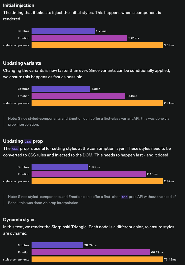
실제로 아래 링크에서 간단히 테스팅을 해 볼 수 있게 되어있는데 확실히 styled에 비해 빨랐습니다.
https://stitches-bench.modulz-deploys.com/
https://github.com/stitchesjs/stitches-bench
2. variants 기능
styled component를 사용하면서 가장 귀찮았던게 props로 넘기거나 theme을 불러오는 일이었는데 이 부분에 있어 stitches를 사용하면서 가장 만족했던 기능이었습니다.
variants라는 객체에 다양한 css 조건들을 설정할 수 있었습니다.
// styled-components
const Button = styled.button`
  ${(props) =>
    props.color === 'violet' &&
    `
    background-color: 'blueviolet'
  `}

  ${(props) =>
    props.color === 'gray' &&
    `
    background-color: 'gainsboro'
  `}
`;

// Stitches
const Button = styled('button', {
  variants: {
    color: {
      violet: { backgroundColor: 'blueviolet' },
      gray: { backgroundColor: 'gainsboro' },
    },
  },
});

() => <Button color="violet">Button</Button>;
실제 사용 모습
// BUTTON //

import { ButtonBase } from '@mui/material'
import { styled } from 'styles/globalStitches'

const Button = styled(ButtonBase, {
  fontWeight: 'bold',
  transition: 'all 0.3s ease',
  '&:disabled': {
    opacity: '0.64',
  },
  variants: {
    color: {
      primary: {
        backgroundColor: '$primary_btn',
        color: '$white',
        '&:active': {
          backgroundColor: '$BLUE6',
        },
        '&:hover': {
          backgroundColor: '$BLUE6',
        },
      },
      secondary: {
        backgroundColor: '$GRAY6',
        color: '$white',
        '&:active': {
          backgroundColor: '$GRAY7',
        },
        '&:hover': {
          backgroundColor: '$GRAY7',
        },
      },
      tertiary: {
        backgroundColor: '$GRAY2',
        color: '$GRAY6',
        '&:active': {
          backgroundColor: '$GRAY3',
        },
        '&:hover': {
          backgroundColor: '$GRAY3',
        },
      },
    },
    sizes: {
      sm: { padding: '12px 20px', fontSize: '$BODY1' },
      md: { padding: '16px 24px', fontSize: '$BODY2' },
      lg: { padding: '18px 24px', fontSize: '$BODY2' },
    },

    radii: {
      rect: { borderRadius: '4px' },
      round: { borderRadius: '30px' },
    },
    outlined: {
      primary: {
        border: 'solid 1px $primary',
        color: '$primary_text',
        backgroundColor: 'transparent',
        '&:active': {
          backgroundColor: 'rgba(217, 244, 254, 0.32)',
        },
        '&:hover': {
          backgroundColor: 'rgba(217, 244, 254, 0.32)',
        },
      },
      secondary: {
        border: 'solid 1px $secondary',
        color: '$secondary_text',
        backgroundColor: 'transparent',
        '&:active': {
          backgroundColor: '$GRAY1',
        },
        '&:hover': {
          backgroundColor: '$GRAY1',
        },
      },
      tertiary: {
        border: 'solid 1px $tertiary',
        color: '$tertiary_text',
        backgroundColor: 'transparent',
        '&:active': {
          backgroundColor: '$GTRANS1',
        },
        '&:hover': {
          backgroundColor: '$GTRANS1',
        },
      },
    },
    badge: {
      true: {
        color: '$primary_text',
        backgroundColor: '$GRAY2',
        padding: '10px 16px',
        borderRadius: '17px',
        fontWeight: '600',
        '&:active': {
          backgroundColor: '$tertiary_pressed',
        },
        '&:hover': {
          backgroundColor: '$tertiary_pressed',
        },

        '& svg': {
          width: '14px',
          height: '14px',
        },
      },
    },
    default: {
      true: {
        backgroundColor: 'transparent',
        color: '$secondary_text',
        fontSize: '$BODY2',
        padding: '0px',
        border: 'none',
      },
    },
  },
  defaultVariants: {
    color: 'primary',
    radii: 'rect',
    sizes: 'md',
  },
})

export default Button
3. 러닝 커브
사용해보면서 styled component를 이용하는 것과 큰 괴리가 없어서 금방금방 받아들일 수 있었고 적용해 볼 수 있어서 스타일드 컴포넌트를 이용했던 분들이라면 러닝 커브가 사실상 거의 없다고 봐도 무방합니다.
사용 방법
next.js를 이용중이시라면 server-side-rendering 설정은 아래와 같은 방법을 이용합니다
import { createStitches } from '@stitches/react';

export const { getCssText } = createStitches();
//DOCUMENT
import React from 'react';
import NextDocument, { Html, Head, Main, NextScript } from 'next/document';
import { getCssText } from 'path-to/stitches.config';
export default class Document extends NextDocument {
render() {
return (
<Html lang="en">
<Head>
<style id="stitches" dangerouslySetInnerHTML={{ __html: getCssText() }} />
</Head>
<body>
<Main />
<NextScript />
</body>
</Html>
);
}
}기본적인 사용 방법입니다.
const Button = styled('button', {
  backgroundColor: 'gainsboro',
  borderRadius: '9999px',
  fontSize: '13px',
  border: '0',
});

() => <Button>Button</Button>;
선택자의 경우 아래 코드를 참고해주시면 한 번에 이해가 되실겁니다.
 '&:hover': {
    backgroundColor: 'lightgray',
  },

 '&::before': {
    display: 'block',
    backgroundImage: 'linear-gradient(to right, #1fa2ff, #12d8fa, #a6ffcb)',
  },

 '&.custom-class': {
    boxShadow: '0 0 0 3px blueviolet',
  },

  '&[data-custom-attribute]': {
    boxShadow: '0 0 0 3px royalblue',
  },

'& svg': {
    height: '13px',
    marginLeft: '5px',
  },

  '& + button': {
    marginLeft: '10px',
},- 컴포넌트 선택자
const Icon = styled('svg', {
  display: 'inline-block',
  marginLeft: '5px',
  width: '16px',
});

const Button = styled('button', {
  // base styles

  [`& ${Icon}`]: {
    marginLeft: '5px',
  },
});- KEY FRAME
const scaleUp = keyframes({
  '0%': { transform: 'scale(1)' },
  '100%': { transform: 'scale(1.5)' },
});

const Button = styled('button', {
  // base styles

  '&:hover': {
    animation: `${scaleUp} 200ms`,
},- 로컬 스코프
const Button = styled('button', {
  $$shadow: 'blueviolet',
  boxShadow: '0 0 0 3px $$shadow',

  '&:hover': {
    $$shadow: 'royalblue',
  },
반응형
반응형 지정은 아래와 같은 방법을 이용합니다.
export const { styled, css } = createStitches({
  media: {
    bp1: '(min-width: 640px)',
    bp2: '(min-width: 768px)',
    bp3: '(min-width: 1024px)',
  },
});
사용할 때:
const Button = styled('button', {
  // base styles

  variants: {
    color: {
      violet: {},
      gray: {},
    },
  },
});
() => (
  <Button
    color={{
     '@initial': 'gray', //기본 value
      '@bp2': 'violet'  //아까 지정해 놓은 break point를 불러옵니다
    }}
  >
    Button
  </Button>
);
컴포징 컴포넌트
const BaseButton = styled('button', {});

const CheckoutButton = styled(BaseButton, {
  borderRadius: 0,
  backgroundColor: 'hotpink',
  color: 'white',
  '&:hover': {
    backgroundColor: 'deeppink',
  },
});

() => (
    <CheckoutButton>Checkout button</CheckoutButton>
);
커스텀 유틸 함수
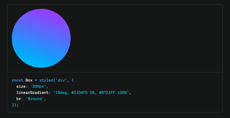
커스텀 유틸 함수 기능을 제공합니다.
export const { styled, css } = createStitches({
  utils: {
    size: (value) => ({
      width: value,
      height: value,
    }),
    linearGradient: (value) => ({
      backgroundImage: `linear-gradient(${value})`,
    }),
    br: (value) => ({
      borderRadius: value,
    }),
  },
});
사실 비슷비슷한 느낌도 많고 공식 문서에 예제와 함께 잘 정리되어 있으므로 공식문서를 참조하시면 좀 더 빠르게 배우실 수 있습니다. 새로운 프로젝트에 css in js툴을 고민중이시라면 한 번쯤 사용해보시는 것을 추천드립니다