🚩 React
useContext 사용해서 다크모드 구현
📝 설명
- useContext를 사용해서 다크모드 toggle버튼 구현해보기
✒️ 코드 작성
입력
App.js
import './App.css';
import Footer from './components/Footer';
import Header from './components/Header';
import Main from './components/Main';
import { DarkmodeProvider } from './context/DarkmodeContext';

function App() {

  return (
    <div className='app'>
      <DarkmodeProvider>
        <Header />
        <Main/>
        <Footer />
      </DarkmodeProvider>
    </div>
  );
}

export default App;
App.css
:root { --main-color: rgb(164, 184, 221); --dark-color: darkslategray}
body { margin: 0; padding: 0; height: 100vh; }
/* 다크모드 상태 */
body.on { background: #000; color: #fff; }
body.onheader,body.onfooter { background: var(--dark-color); color: var(--main-color); }
.app { display: flex; flex-direction: column; justify-content: space-between; height: 100%; border: 5px solid red; }
.header,.footer { display: flex; justify-content: center; background: var(--main-color); color: white; }
.main { padding: 20px; max-width: 700px; margin: auto; }
.section { border: 2px solid lightgray; }
components
// Header.jsx
import React from 'react'
export default function Header() {
return (
<div className="header">
<h1>Header</h1>
</div>
)
}
// Main.jsx
import React from 'react'
import Section from './Section'
export default function Main() {
return (
<div className='main'>
<Section />
<br />
<Section />
</div>
)
}
//Article.jsx
import React, { useContext } from 'react'
import { DarkmodeContext } from '../context/DarkmodeContext'
export default function Article() {
const { darkmode, toggleDarkMode } = useContext(DarkmodeContext);
const all = document.querySelector("body");
return (
<div className='article'>
<p>
{/* <b>Article- </b>{darkmode.toString()} */}
<b>Article- </b>{darkmode ? all.classList.add("on") : all.classList.remove("on")} <br />
<button onClick={toggleDarkMode}>Toggle BUTTON</button>
</p>
</div>
)
}
// Footer.jsx
import React from 'react'
export default function Footer() {
return (
<div className='footer'>
<h3>Footer</h3>
</div>
)
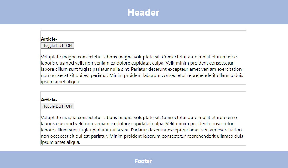
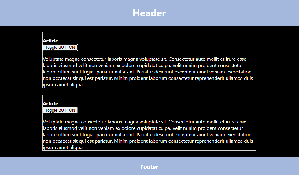
}출력
- 이미지로 대체
🔗 참고 링크 & 도움이 되는 링크
classNames 라이브러리
📝 설명
- 리액트에서 조건부 스타일을 줄 때 사용하는 라이브러리
- 클래스를 여러 개 변수처럼 사용할 때 편리함
- 설치 방법
- $ yarn add classnames
✒️ 코드 작성
입력
App.js
import "./App.scss";
import Button from "./components/Button";
function App() {
return (
<div className="App">
<div className="btnWrap">
{/* Button.jsx에서 children으로 보낼 값 */}
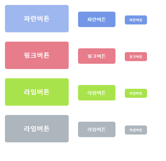
<Button size="large" color="blue">파란버튼</Button>
<Button color="blue">파란버튼</Button>
<Button size="small" color="blue">파란버튼</Button>
</div>
<div className="btnWrap">
<Button size="large" color="pink">핑크버튼</Button>
<Button color="pink">핑크버튼</Button>
<Button size="small" color="pink">핑크버튼</Button>
</div>
<div className="btnWrap">
<Button size="large" color="lime">라임버튼</Button>
<Button color="lime">라임버튼</Button>
<Button size="small" color="lime">라임버튼</Button>
</div>
<div className="btnWrap">
<Button size="large" color="gray">라임버튼</Button>
<Button color="gray">라임버튼</Button>
<Button size="small" color="gray">라임버튼</Button>
</div>
</div>
);
}
export default App;Button.jsx
import React from 'react';
import './Button.scss';
import classNames from "classnames";

const Button = ({children,size,color}) => {
  return (
    <button className={classNames("Button", size, color)} >{children}</button>
  )
}

Button.defaultProps = { size:'medium'}
export default Button
Button.scss
$blue: #7397e6;
$pink: #e77c8a;
$lime: #a9e34b;
$gray: #adb5bd;

// mixin 추가
@mixin btnColor($color) {
  background: $color;
  &:hover {
    background: lighten($color, 10%); // lighten 함수 사용 (sass/scss 내장 함수) - 해당 색상에서 10% 더 밝게
  }
  &:active {
    background: darken($color, 10%); // darken 함수 (sass/scss 내장 함수) - 해당 색상에서 10% 더 어둡게
  }
}

.Button {
  color: #fff;
  font-weight: bold;
  cursor: pointer;
  margin: 1rem;
  border: none;
  border-radius: 0.4rem;
  outline: none;

  // 사이즈 관리
  &.large {
    padding: 2rem 4rem;
    font-size: 1.4rem;
  }
  &.medium {
    padding: 1rem 2rem;
    font-size: 1rem;
  }
  &.small {
    padding: 0.5rem 1rem;
    font-size: 0.7rem;
  }

  // 색상 지정
  &.blue { @include btnColor($blue); }
  &.pink { @include btnColor($pink); }
  &.lime { @include btnColor($lime); }
  &.gray { @include btnColor($gray); }
}
출력
- 이미지로 대체
🔗 참고 링크 & 도움이 되는 링크

공부하는 벨로그