발표
오늘은 프로젝트를 발표하는날이라 공부를 할수있는 시간은 아침시간과 발표가 끝난 후 오후 시간이였다.
아침공부
아침에는 공부라면 공부지만 프로젝트의 버그를 잡아내는것에 집중하여 프로젝트 발표를 1시간남기고 완성 할수있었다.
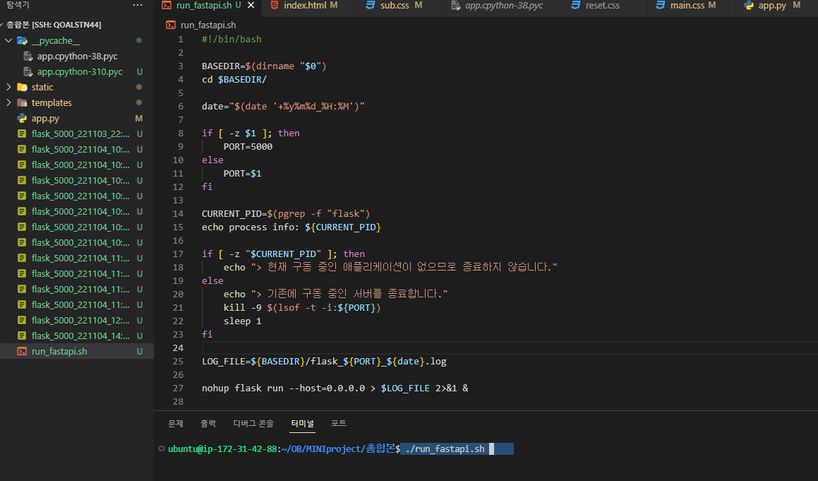
서버에서 구동했을때는
이런식으로 몽고DB에 있는 데이터들이 뭉개지면서 실행이되었다.
"아니! 에러가나면 잡기라도 할텐데 그냥 실행이되잖아!"
그래서 더 수정하기 힘들었던걸까. 결국에는 버그를 잡는데 성공했다. 역시 코드 문제였다.
결국은 수정을하여 깔끔하게 완성을 하였다.
오후공부
발표가 끝나고 다른사람들의 프로젝트를 보고 불이 붙어버렸다. 반응형 웹사이트! 애니메이션 효과! 이런것들이 나의 눈을 사로잡았다. 그리고 파워 구글링을하여 예제코드를 다운받은 뒤 컴퓨터에 저장하여 하나식 만저보고 지워보고 하였다.
이런식으로 크기가 줄어들면 줄어드는 방식으로 만들수있었다.
애니메이션 효과는 백그라운드에 애니메이션 즉 동영상을 넣어서 만들수 있는 방식이 있었다.
<
<div class="bubbles-container">
	<svg class="bubbles" xmlns="http://www.w3.org/2000/svg" viewBox="0 0 701 1024" style="overflow: visible;">

    <g class="bubbles-large" stroke-width="7">
        <g>
            <g transform="translate(10 940)">
                <circle cx="35" cy="35" r="35"/>
            </g>
        </g>
        <g>
            <g transform="translate(373 940)">
                <circle cx="35" cy="35" r="35"/>
            </g>
        </g>
        <g>
            <g transform="translate(408 940)">
                <circle cx="35" cy="35" r="35"/>
            </g>
        </g>
        <g>
            <g transform="translate(621 940)">
                <circle cx="35" cy="35" r="35"/>
            </g>
        </g>
        <g>
            <g transform="translate(179 940)">
                <circle cx="35" cy="35" r="35"/>
            </g>
        </g>
    </g>

    <g class="bubbles-small" stroke-width="4">
        <g>
            <g transform="translate(147 984)">
                <circle cx="15" cy="15" r="15"/>
            </g>
        </g>
        <g>
            <g transform="translate(255 984)">
                <circle cx="15" cy="15" r="15"/>
            </g>
        </g>
        <g>
            <g transform="translate(573 984)">
                <circle cx="15" cy="15" r="15"/>
            </g>
        </g>
        <g>
            <g transform="translate(429 984)">
                <circle cx="15" cy="15" r="15"/>
            </g>
        </g>
        <g>
            <g transform="translate(91 984)">
                <circle cx="15" cy="15" r="15"/>
            </g>
        </g>
        <g>
            <g transform="translate(640 984)">
                <circle cx="15" cy="15" r="15"/>
            </g>
        </g>
        <g>
            <g transform="translate(321 984)">
                <circle cx="15" cy="15" r="15"/>
            </g>
        </g>
        <g>
            <g transform="translate(376 984)">
                <circle cx="15" cy="15" r="15"/>
            </g>
        </g>
        <g>
            <g transform="translate(376 984)">
                <circle cx="15" cy="15" r="15"/>
            </g>
        </g>
        <g>
            <g transform="translate(497 984)">
                <circle cx="15" cy="15" r="15"/>
            </g>
        </g>
    </g>

</svg>
</div>

<h1>Bubbles</h1>
@import url('https://fonts.googleapis.com/css?family=Exo+2:900');
h1 {
font-family: 'Exo 2', sans-serif;
font-size: 8.5vw;
color: white;
padding: 5rem 0;
text-shadow: 0px 4px 48px rgba(255,255,255,0.2);
}
.container {
position: relative;
display: flex;
align-content: center;
justify-content: center;
background: {
image: linear-gradient(to bottom, #00c9ff 0%, #92fe9d 100%), url(https://images.unsplash.com/photo-1502726299822-6f583f972e02);
blend-mode: multiply;
size: cover;
}
overflow: hidden;
}
.bubbles-container {
position: absolute;
top: 0;
left: 50%;
width: 100%;
max-width: 15rem;
transform: translateX(-50%);
opacity: 0.75;
overflow: visible;
}
.bubbles {
width: 100%;
height: auto;
circle {
stroke: white;
fill: none;
}
> g > g:nth-of-type(3n) circle {
stroke: #87f5fb;
}
> g > g:nth-of-type(4n) circle {
stroke: #8be8cb;
}
}
.bubbles-large {
overflow: visible;
> g {
transform: translateY(2048px);
opacity: 0;
will-change: transform, opacity;
}
g:nth-of-type(1) {
animation: up 6.5s infinite;
g {
transform: translateX(350px);
}
circle {
animation: wobble 3s infinite ease-in-out;
}
}
g:nth-of-type(2) {
animation: up 5.25s 250ms infinite;
g {
transform: translateX(450px);
}
circle {
animation: wobble 3s infinite ease-in-out;
}
}
g:nth-of-type(3) {
animation: up 6s 750ms infinite;
g {
transform: translateX(700px);
}
circle {
animation: wobble 3s infinite ease-in-out;
}
}
g:nth-of-type(4) {
animation: up 5.5s 1.5s infinite;
g {
transform: translateX(500px);
}
circle {
animation: wobble 3s infinite ease-in-out;
}
}
g:nth-of-type(5) {
animation: up 6.5s 4s infinite;
g {
transform: translateX(675px);
}
circle {
animation: wobble 3s infinite ease-in-out;
}
}
}
.bubbles-small {
overflow: visible;
> g {
transform: translateY(2048px);
opacity: 0;
will-change: transform, opacity;
}
g circle {
transform: scale(0);
}
g:nth-of-type(1) {
animation: up 5.25s infinite;
g {
transform: translateX(350px);
}
circle {
animation: wobble 3s infinite ease-in-out;
}
}
g:nth-of-type(2) {
animation: up 5.75s infinite;
g {
transform: translateX(750px);
}
circle {
animation: wobble 3s infinite ease-in-out;
}
}
g:nth-of-type(3) {
animation: up 5.25s 250ms infinite;
g {
transform: translateX(350px);
}
circle {
animation: wobble 3s 250ms infinite ease-in-out;
}
}
g:nth-of-type(4) {
animation: up 5.75s 325ms infinite;
g {
transform: translateX(180px);
}
circle {
animation: wobble 3s 325ms infinite ease-in-out;
}
}
g:nth-of-type(5) {
animation: up 6s 125ms infinite;
g {
transform: translateX(350px);
}
circle {
animation: wobble 3s 250ms infinite ease-in-out;
}
}
g:nth-of-type(6) {
animation: up 5.13s 250ms infinite;
g {
transform: translateX(650px);
}
circle {
animation: wobble 3s 125ms infinite ease-in-out;
}
}
g:nth-of-type(7) {
animation: up 6.25s 350ms infinite;
g {
transform: translateX(480px);
}
circle {
animation: wobble 3s 325ms infinite ease-in-out;
}
}
g:nth-of-type(8) {
animation: up 7s 200ms infinite;
g {
transform: translateX(330px);
}
circle {
animation: wobble 3s 325ms infinite ease-in-out;
}
}
g:nth-of-type(9) {
animation: up 6.25s 233ms infinite;
g {
transform: translateX(230px);
}
circle {
animation: wobble 3s 275ms infinite ease-in-out;
}
}
g:nth-of-type(10) {
animation: up 6s 900ms infinite;
g {
transform: translateX(730px);
}
circle {
animation: wobble 2s 905ms infinite ease-in-out;
}
}
}
@keyframes wobble {
33% {
transform: translateX(-50px);
}
66% {
transform: translateX(50px);
}
}
@keyframes up {
0% {
opacity: 0;
}
10%, 90% {
opacity: 1;
}
100% {
opacity: 0;
transform: translateY(-1024px);
}
}결과는!?
https://thumbs.gfycat.com/PerfumedObedientEkaltadeta-mobile.mp4 여기서 확인할수 있다.
다음에는 꼭 멋있게 만들어 보고 싶다.

처음부터 끝까지 책임지는 직업