📝 velog UI 클론해보기
클릭시 움직이는 막대
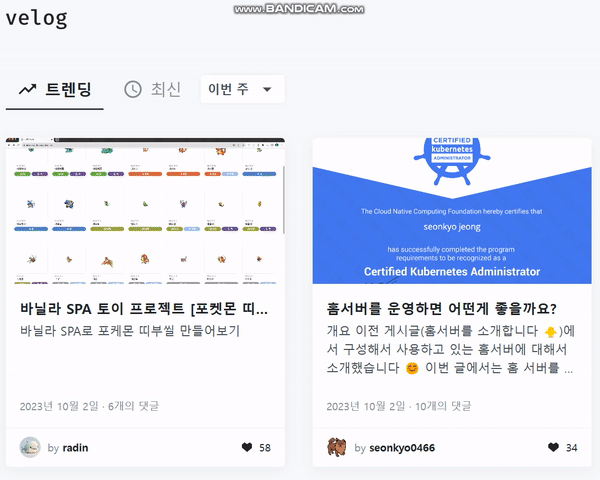
위 velog에서 트렌딩일 때 막대의 margin-Left가 0인 상태이고 최신일 때 margin-Left가 트렌딩 width만큼 주면 된다. 그리고 트랜지션을 주면 된다.
  const tabBarhandle = (tab) => {

    tabData.forEach((item, idx)=>{
      if (item === tab){
        tabbarref.current.style.marginLeft = `${idx*130}px`;
      }
      if (tab === 'myboard' || tab === 'home') setcurdropbox('제목');
      else setcurdropbox('아이디');
    })

    const searchinput = document.querySelector(".search-input")
    if (tab !== "write" && searchinput != null ) document.querySelector(".search-input").value = '';
    setinput('');
    setcurtab(tab)
  }
위에 코드는 탭바를 클릭했을 때 실행하는 함수이다.
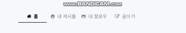
tabData 변수는 props로 배열을 받아오는데 위에 예제로는 [홈, 내 게시물, 내 팔로우, 글쓰기]를 props로 받는다. 그리고 tab마다 width는 130px로 고정되어 있기 때문에 인덱스에 맞게 margin-Left를 부여한다.
CSS를 보자
.tab-bar{
  width: 120px;
  height: 2px;
  background-color: #000;
  transition: 0.3s;
}
tab-bar css인데 margin-Left를 0.3s에 걸쳐서 부여한다는 소리이므로 애니메이션 효과가 난다.
그러면 클릭했을 때 tab active는 어떻게 부여하지?
if (props.type == 'clock'){
    return (
      <div onClick = {() => {props.tabBarhandle('clock')}}
      className={"tab" + (props.curtab == 'clock' ? " active" : "")}>
        <i className="fa fa-clock-o"></i>
        <span>최신</span>
      </div>
    )
  }
탭 컴포넌트함수이다. 탭을 클릭하면 위에서 설명한 tabarhandler를 호출한다. 그리고 현재 tab정보를 저장하는 setcurtab(tab)실행시켜서 다시한번 렌더링을 하는데 이 때 전달받은 curtab과 같으면 클래스 네임을 active를 추가한다.
그러면 active css만 구현해주면 되는 것이다.
.user-tabs > .tabs > .tab.active{
  color:#000;
  font-weight: bold;
}
클릭할 떄 color와 bold를 바꿔주면 된다.
select box 카피하기

selectbox는 위치를 absolute를 사용하여 바로 밑에 오도록 설정해주어야 한다.
물론 부모 div에는 relative를 설정하여 부모 div에 맞게 위치 설정을 해주어야 한다.
이것도 마찬가지로 눌렀을 때 acitve 클래스를 추가하여 보이도록 하였다.
처음 display:none을 했다가 active클래스에서 display:block을 했는데 transition이 작동하지 않았다. 하지만 visibility 속성을 사용하니 transition이 작동하였다.🤔_
transform: scale을 사용하면 기본적으로 중앙을 기준으로 scale이 작동한다. 여기서는 오른쪽을 기준으로 scale이 작동해야 한다. 이때 사용한 것이 transform-orgin: 100% 0이다.🤔_
transform-origin이란?
(HTML)
<div className= {'tab-dropbox-drop' + (active == true ? " active" : "")}>
          {dropboxcontent_bbs.map((data, idx)=>{
            return <div onClick={() => {props.condselectSubmit('',data); inputref.current.value=''}} className={data==curdropbox ? " target" : ""} key={idx}>{data}</div>
          })}
</div>

(CSS)
.tab-dropbox-drop{
  position: absolute;
  right: 0;
  width: 150px;

  background-color: #fff;
  margin-top: 50px;
  transform: scale(0.5, 0.5);
  transform-origin: 100% 0;
  transition: 0.3s;
  opacity: 0;
  border-radius: 5px;
  box-shadow: 0px 0px 8px 0px rgba(0, 0, 0, 0.1);
  z-index: 100;
  visibility: hidden;
}
.tab-dropbox-drop.active{
  transform: scale(1, 1);
  opacity: 1;
  visibility: visible;
}
이런식으로 className에 active를 동적으로 추가하여 active CSS를 추가할 수 있었다.
