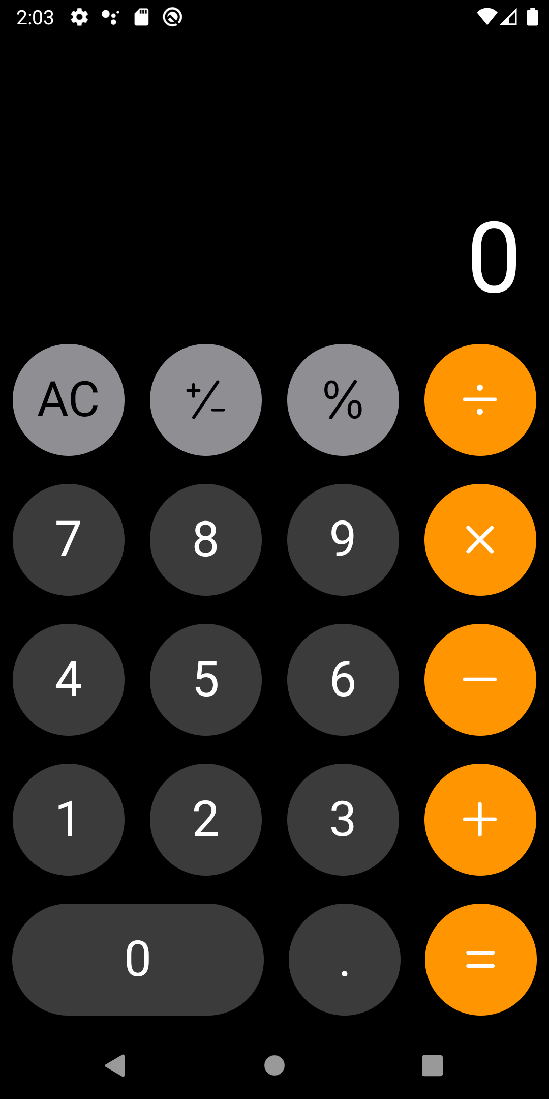
클론을 제작하는 것은 앱 개발공부 과정에 있어서, 가장 빠르고 단시간에 많은 공부를 할 수 있는 공부법이라고 개인적으로 생각합니다. 그리고 제일 먼저 무엇을 만들어보겠는가라고 한다면 저는 계산기를 만들어볼겁니다. 왜냐하면 처음에 계산기 앱을 만들면서 UI와 기능적 요소를 배우기에 좋은것 같거든요. 그래서 flutter클론 시리즈 첫 작품은 아이폰 계산기입니다!
만들기 전에 생각을 해보자
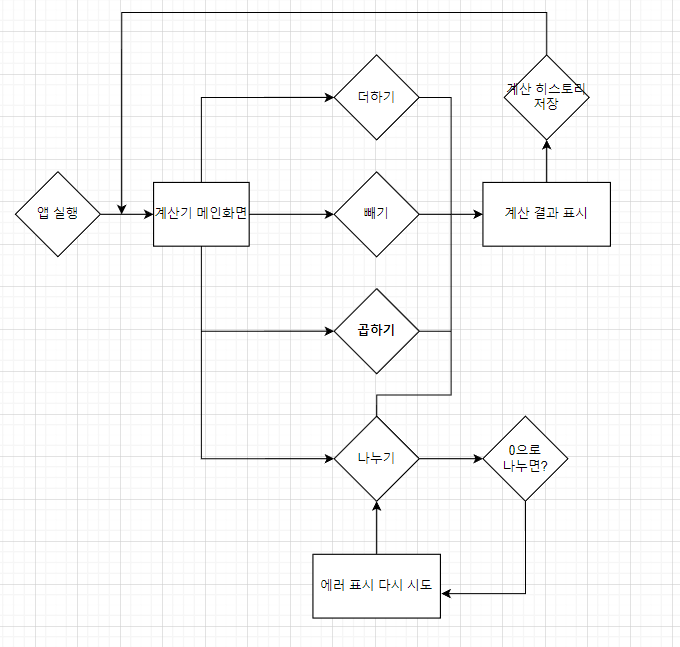
클론이든, 실제 프로젝트든 앱을 만든다면 구상을 먼저 하는게 좋습니다. 그렇지 않고 그냥 무작정 만들면, 후에 수정이라던지 복잡한 일이 생기고 싹 뜯어고치고 보통일이 아닙니다. 그래서 저는 대략적인 유저 플로우 다이어그램을 먼저 만들고, 앱을 제작합니다.
User Flow Diagram
계산기 앱은 보통 이런 형식인것 같습니다.
프로젝트 구상
저는 GetX를 사용해서 비즈니스 로직과 UI를 분리하겠습니다. 아무래도 하나의 파일안에 두가지가 동시에 존재하면 굉장히 어지러울것 같습니다. GetX는 초보자도 쉽게 상태관리를 할 수 있게 해주는 라이브러리입니다. 외부 라이브러리는 딱, GetX만 사용할것 같습니다.
UI 구상
기본적인 버튼 구상
보니까, 버튼의 색상은 다르지만, 비슷한 모양일거 같네요. 그래서 component로 가장 기본적인 버튼을 하나 만들겠습니다.
import 'package:flutter/cupertino.dart';
import 'package:flutter_ios_calculator/src/constants/btn_size.dart';
enum BtnShape { CIRCLE, FLAT } // 버튼의 모양을 결정하는 Enum 클래스
class BasicBtn extends StatelessWidget {
final BtnShape? shape;
final Color color;
final Widget child;
final Function() onPressed;
const BasicBtn(
{super.key,
required this.child,
required this.color,
this.shape = BtnShape.CIRCLE,
required this.onPressed});
Widget build(BuildContext context) {
switch (shape) {
case BtnShape.CIRCLE:
return _btn(BtnSize.btnRound, BtnSize.btnRound);
case BtnShape.FLAT:
return _btn(BtnSize.btnRound, BtnSize.btnFlatWidth);
default:
return Container();
}
}
// 기존의 body는 높이와 너비를 요구하는 위젯 클래스로 재생성
Widget _btn(double height, double width) {
return SizedBox(
width: width,
height: height,
child: CupertinoButton(
color: color,
padding: const EdgeInsets.all(8.0),
borderRadius: BorderRadius.circular(100),
child: child,
onPressed: onPressed,
),
);
}
}Cupertino 위젯을 이용해서 계산기의 버튼을 만들어봤습니다. 눌럿을 때, 하얗게 효과가 나타나진 않아요. 왜냐하면 배경색이 검정색이라서, 더욱 어둡게 변합니다. 이 버튼을 통해서 모든 버튼을 만들게요.
버튼을 만들기 위해서 너비와 높이, 색상이 필요한데요. 이러한 것들은 대부분 기기마다 다르게 처리해야 랜더 오류가 발생하지 않으므로, 따로 클래스를 만들어서 관리할게요.
class BtnColor {
  static Color get orange => CupertinoColors.systemOrange;
  static Color get silver => CupertinoColors.systemGrey;
  static Color get black => Color.fromARGB(255, 56, 56, 56);
  static Color get white => CupertinoColors.white;
}

class BtnSize {
  static double get btnRound => Get.size.width / 4 - 15;
  static double get btnFlatWidth => 2 * Get.size.width / 4 - 15;
}

class BtnIconType {
  static double _iconSize = 35.0;
  static Color _greyBtnColor = CupertinoColors.black;
  static Color _orangeBtnColor = CupertinoColors.white;
  static Color _orangeBtnColorReverse = CupertinoColors.activeOrange;

  static Icon get plusAndMinus => Icon(
        CupertinoIcons.plus_slash_minus,
        size: _iconSize,
        color: _greyBtnColor,
      );

  static Icon get percent => Icon(
        CupertinoIcons.percent,
        size: _iconSize,
        color: _greyBtnColor,
      );
  static Icon get plus => Icon(
        CupertinoIcons.plus,
        size: _iconSize,
        color: _orangeBtnColor,
      );
  static Icon get plusReverse => Icon(
        CupertinoIcons.plus,
        size: _iconSize,
        color: _orangeBtnColorReverse,
      );
  static Icon get minus => Icon(
        CupertinoIcons.minus,
        size: _iconSize,
        color: _orangeBtnColor,
      );
  static Icon get minusReverse => Icon(
        CupertinoIcons.minus,
        size: _iconSize,
        color: _orangeBtnColorReverse,
      );
  static Icon get multiply => Icon(
        CupertinoIcons.multiply,
        size: _iconSize,
        color: _orangeBtnColor,
      );
  static Icon get multplyReverse => Icon(
        CupertinoIcons.multiply,
        size: _iconSize,
        color: _orangeBtnColorReverse,
      );
  static Icon get divide => Icon(
        CupertinoIcons.divide,
        size: _iconSize,
        color: _orangeBtnColor,
      );
  static Icon get divideReverse => Icon(
        CupertinoIcons.divide,
        size: _iconSize,
        color: _orangeBtnColorReverse,
      );
  static Icon get equal => Icon(
        CupertinoIcons.equal,
        size: _iconSize,
        color: _orangeBtnColor,
      );

  static Text get allClear => Text(
        'AC',
        style: TextStyle(fontSize: 30, color: CupertinoColors.black),
      );

  static Text get clear => Text(
        'C',
        style: TextStyle(fontSize: 30, color: CupertinoColors.black),
      );
}
검정색 숫자 버튼
검정색 버튼은 숫자와 . 으로 구성되어 있죠. 아무래도 숫자와 버튼의 onPressed 함수만 받으면 될 것 같아요. 숫자는 직접 숫자로 받는 것 보단 enum을 이용해서 직관적으로 볼 수 있게 해보았습니다.
enum BlackBtnType {
ONE,
TWO,
THREE,
FOUR,
FIVE,
SIX,
SEVEN,
EIGHT,
NINE,
ZERO,
DOT
}
class BlackBtn extends StatelessWidget {
final BlackBtnType type;
final Function() onPressed;
const BlackBtn({super.key, required this.type, required this.onPressed});
Widget build(BuildContext context) {
switch (type) {
case BlackBtnType.ONE:
return _numberBtn('1');
case BlackBtnType.TWO:
return _numberBtn('2');
case BlackBtnType.THREE:
return _numberBtn('3');
case BlackBtnType.FOUR:
return _numberBtn('4');
case BlackBtnType.FIVE:
return _numberBtn('5');
case BlackBtnType.SIX:
return _numberBtn('6');
case BlackBtnType.SEVEN:
return _numberBtn('7');
case BlackBtnType.EIGHT:
return _numberBtn('8');
case BlackBtnType.NINE:
return _numberBtn('9');
case BlackBtnType.ZERO:
return _zeroBtn('0');
case BlackBtnType.DOT:
return _numberBtn('.');
}
}
Widget _numberBtn(String number) {
return BasicBtn(
child: _numberText(number),
color: BtnColor.black,
onPressed: onPressed,
);
}
Widget _zeroBtn(String number) {
return BasicBtn(
color: BtnColor.black,
child: _numberText(number),
shape: BtnShape.FLAT,
onPressed: onPressed,
);
}
Widget _numberText(String number) {
return Text(
number,
style: TextStyle(
fontSize: 35,
color: CupertinoColors.white,
),
);
}
}회색 기능 버튼
회색 버튼은 AC 버튼, 부호 전환 버튼, 백분위 표시 버튼 이렇게 3가지가 있습니다. AC라는 글자는 Text지만, Cupertino 아이콘을 받아서 아이폰 계산기와 동일하게 만들 수 있을 것 같아요.
enum GreyBtnType { ALLCLEAR, PLUSNMINUS, PERCENT }
class GreyBtn extends GetView<CalculatorController> {
final GreyBtnType type;
final Function() onPressed;
const GreyBtn({
Key? key,
required this.type,
required this.onPressed,
}) : super(key: key);
Widget build(BuildContext context) {
switch (type) {
case GreyBtnType.PLUSNMINUS:
return _buttonETC(BtnIconType.plusAndMinus);
case GreyBtnType.PERCENT:
return _buttonETC(BtnIconType.percent);
case GreyBtnType.ALLCLEAR:
return _buttonAllClear();
}
}
Widget _buttonAllClear() {
return SizedBox(
width: BtnSize.btnRound,
height: BtnSize.btnRound,
child: Obx(
() => CupertinoButton(
color: BtnColor.silver,
padding: const EdgeInsets.all(8.0),
borderRadius: BorderRadius.circular(100),
child: (controller.result == '0')
? BtnIconType.allClear
: BtnIconType.clear,
onPressed: onPressed,
),
),
);
}
Widget _buttonETC(Icon icon) {
return BasicBtn(color: BtnColor.silver, onPressed: onPressed, child: icon);
}
}역시 마찬가지로 enum을 이용해서 외부에서 직접 타입을 지정할 수 있게 해주었습니다.
주황색 기호 버튼
= 버튼을 제외하고 나머지 사측연산 버튼들은 활성화 비활성화 효과를 갖습니다. 이를 고려해서 버튼을 만들어야 해요.
class OrangeBtn extends StatelessWidget {
final Icon iconFront;
final Icon iconBack;
final bool isClicked;
final void Function() onPressed;
const OrangeBtn({
super.key,
required this.iconFront,
required this.iconBack,
required this.isClicked,
required this.onPressed,
});
Widget build(BuildContext context) {
return Stack(
children: [
_backBtn(),
_frontBtn(),
],
);
}
Widget _backBtn() {
return SizedBox(
width: BtnSize.btnRound,
height: BtnSize.btnRound,
child: CupertinoButton(
color: BtnColor.white,
padding: const EdgeInsets.all(8.0),
borderRadius: BorderRadius.circular(100),
onPressed: onPressed,
child: iconBack,
),
);
}
Widget _frontBtn() {
return AnimatedOpacity(
opacity: (isClicked) ? 0.0 : 1.0,
duration: const Duration(milliseconds: 300),
child: SizedBox(
width: BtnSize.btnRound,
height: BtnSize.btnRound,
child: CupertinoButton(
pressedOpacity: null,
color: BtnColor.orange,
padding: const EdgeInsets.all(8.0),
borderRadius: BorderRadius.circular(100),
child: iconFront,
onPressed: onPressed,
),
),
);
}
}이 버튼은 사측연산 버튼에 대한 코드입니다. 아무래도 두가지 버튼을 Stack을 이용해서 겹치고, bool 변수를 이용해서 AnimatedOpacity를 사용해서 만들려고 하니까, 외부에서 enum을 통해서 받으면 코드가 너무 길어지겠더라구요. 그래서 이번엔 직접 아이콘을 받으려고 enum을 사용하지 않았습니다.
자, component들은 준비가 다 되었네요. 이제 UI를 만들겠습니다.
UI
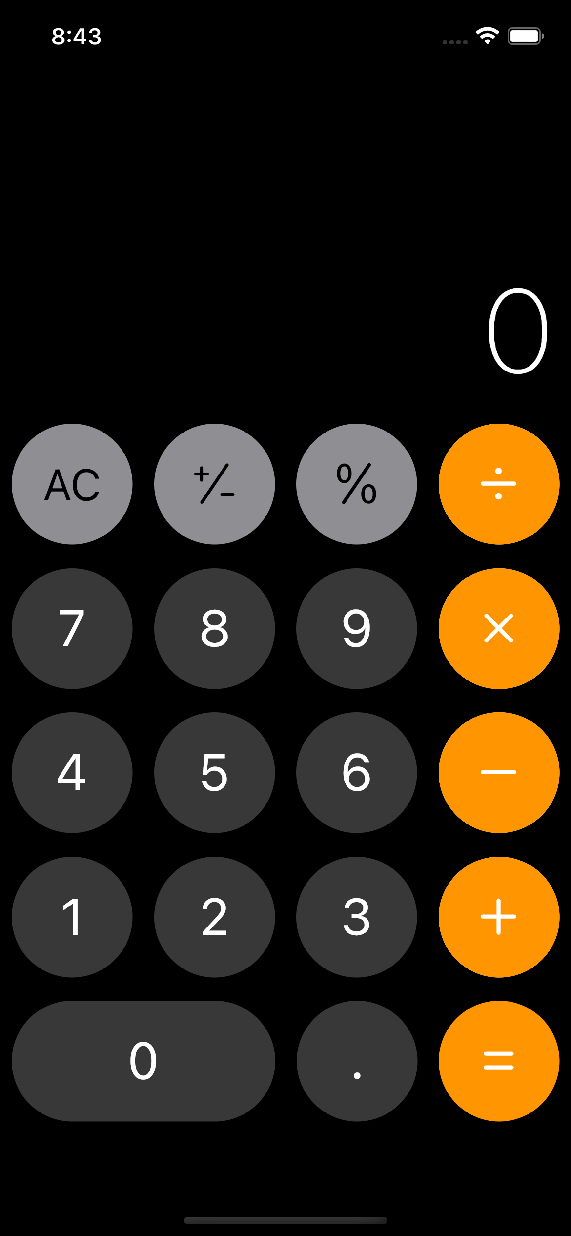
화면을 기준으로 위는 결과창, 아래는 버튼들입니다. 결과창의 텍스트는 유일하게 변화하는 값이므로, Obx를 이용해서 나타낼겁니다. 그리고, 선택해서 복사할 수 도 있으므로, 일반적인 Text가 아닌 SelectableText를 이용할거에요. 하단의 버튼 영역도 역시, 총 5개의 줄로 이루어져 있습니다. 그래서 UI는 결과영역, 버튼 1열, 버튼 2열, 버튼 3열, 버튼 4열, 버튼 5열로 구성할게요.
class App extends GetView<CalculatorController> {
const App({super.key});
Widget build(BuildContext context) {
return Scaffold(
backgroundColor: Colors.black,
body: Column(
children: [
Flexible(flex: ViewRatio.ratio['top']!, child: _result()),
Flexible(flex: ViewRatio.ratio['bottom']!, child: _buttons()),
],
),
);
}
//버튼 영역
Widget _buttons() {
return SizedBox(
child: Column(
children: [
_buttonsRow1(),
_buttonsRow2(),
_buttonsRow3(),
_buttonsRow4(),
_buttonsRow5(),
],
),
);
}
// 계산기 화면을 나타내는 영역
Widget _result() {
return Padding(
padding: const EdgeInsets.all(8.0),
child: Container(
alignment: Alignment.bottomRight,
child: Align(
alignment: Alignment.bottomRight,
child: Obx(
() => SelectableText(
'0',
style: TextStyle(
color: Colors.white,
fontSize: 80,
fontWeight: FontWeight.w200),
),
),
),
),
);
}
// 버튼 첫번째 줄
Widget _buttonsRow1() {
return Padding(
padding: const EdgeInsets.all(8.0),
child: Row(
mainAxisAlignment: MainAxisAlignment.spaceBetween,
crossAxisAlignment: CrossAxisAlignment.center,
children: [
GreyBtn(
type: GreyBtnType.ALLCLEAR,
onPressed: () {},
),
GreyBtn(
type: GreyBtnType.PLUSNMINUS,
onPressed: () {},
),
GreyBtn(
type: GreyBtnType.PERCENT,
onPressed: () {},
),
Obx(
() => OrangeBtn(
iconFront: BtnIconType.divide,
iconBack: BtnIconType.divideReverse,
isClicked: false,
onPressed: () {},
),
),
],
),
);
}
// 버튼 두번째 줄
Widget _buttonsRow2() {
return Padding(
padding: const EdgeInsets.all(8.0),
child: Row(
mainAxisAlignment: MainAxisAlignment.spaceBetween,
crossAxisAlignment: CrossAxisAlignment.center,
children: [
BlackBtn(
type: BlackBtnType.SEVEN,
onPressed: () {},
),
BlackBtn(
type: BlackBtnType.EIGHT,
onPressed: () {},
),
BlackBtn(
type: BlackBtnType.NINE,
onPressed: () {},
),
Obx(
() => OrangeBtn(
iconFront: BtnIconType.multiply,
iconBack: BtnIconType.multplyReverse,
isClicked: false,
onPressed: () {},
),
),
],
),
);
}
// 버튼 세번째 줄
Widget _buttonsRow3() {
return Padding(
padding: const EdgeInsets.all(8.0),
child: Row(
mainAxisAlignment: MainAxisAlignment.spaceBetween,
crossAxisAlignment: CrossAxisAlignment.center,
children: [
BlackBtn(
type: BlackBtnType.FOUR,
onPressed: () {},
),
BlackBtn(
type: BlackBtnType.FIVE,
onPressed: () {},
),
BlackBtn(
type: BlackBtnType.SIX,
onPressed: () {},
),
Obx(
() => OrangeBtn(
iconFront: BtnIconType.minus,
iconBack: BtnIconType.minusReverse,
isClicked: false,
onPressed: () {},
),
),
],
),
);
}
// 버튼 네번째 줄
Widget _buttonsRow4() {
return Padding(
padding: const EdgeInsets.all(8.0),
child: Row(
mainAxisAlignment: MainAxisAlignment.spaceBetween,
crossAxisAlignment: CrossAxisAlignment.center,
children: [
BlackBtn(
type: BlackBtnType.ONE,
onPressed: () {},
),
BlackBtn(
type: BlackBtnType.TWO,
onPressed: () {},
),
BlackBtn(
type: BlackBtnType.THREE,
onPressed: () {},
),
Obx(
() => OrangeBtn(
iconFront: BtnIconType.plus,
iconBack: BtnIconType.plusReverse,
isClicked: false,
onPressed: () {},
),
),
],
),
);
}
// 버튼 다섯번째 줄
Widget _buttonsRow5() {
return Padding(
padding: const EdgeInsets.all(8.0),
child: Row(
mainAxisAlignment: MainAxisAlignment.spaceBetween,
crossAxisAlignment: CrossAxisAlignment.center,
children: [
BlackBtn(
type: BlackBtnType.ZERO,
onPressed: () {},
),
BlackBtn(
type: BlackBtnType.DOT,
onPressed: () {},
),
EqualBtn(
onPressed: () {},
),
],
),
);
}
}GetX를 사용하기 위해서 GetView를 사용했습니다. 이렇게 UI를 완성하고, 로직 작성하기 전단계까지 완성하였습니다 !!

0개의 댓글