💣 issue
-
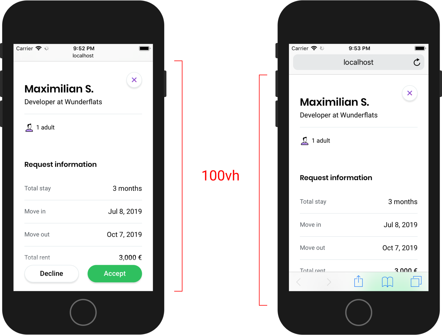
iOS Mobile Safari 또는 Chroime 사용 시,
100vh로 높이를 맞추면 하단의 내용이 잘리는 현상.
특히, 하단에 배치해둔button,alert등의 내용이 잘리는 상황
👨🏻💻 Solve
🚀 public > index.html
현재
window의innerHeight를 구해서--customVH변수에 담아styleProperty에 세팅함
  <head>
    ...

    <style>
      body {
        height: calc(var(--vh, 1vh) * 100);
      }
    </style>
  </head>

  <body>
    ...

    <script>
      let customVH = window.innerHeight * 0.01
      document.documentElement.style.setProperty('--vh', customVH + 'px')
      window.addEventListener('resize', () => {
        let customVH = window.innerHeight * 0.01
        document.documentElement.style.setProperty(
          '--vh',
          customVH + 'px',
        )
      })
    </script>
  </body>
🚀 사용
container와content에서customVH를 이용하여 계산함
// app.vue
  <v-app id="app-container">
    ...
  </v-app>
...
<style>
.app-container {
  height: calc(var(--vh, 1vh) * 100);
  overflow: scroll;
}
</style>
// CourtList.vue
<style>
.court-list-container {
width: 100%;
height: calc(var(--vh, 1vh) * 100 - 48px);
display: flex;
flex-direction: column;
.court-list-content {
width: 100%;
height: calc(var(--vh, 1vh) * 100 - 134px);
overflow: scroll;
}
}
</style>🚀 Vuetify 환경
v-application--wrap의min-height기본값이100vh로 설정되어있기 때문에
App.vue의style태그에서scoped를 떼고!important로 덮어씌워야함.
// App.vue
<template>
  <v-app id="app">
    ...
  </v-app>
</template>
...
<style lang="scss"> // `scoped` 제거
#app {
  height: calc(var(--vh, 1vh) * 100);
  overflow: scroll;
  .v-application--wrap {
    min-height: calc(var(--vh, 1vh) * 100) !important; // 덮어씌우기
  }
}
📚 REF
모바일(iOS) Safari, Chrome 에서 100vh 스크롤 생기는 문제 종결
script와 css의 선언 위치는 어디가 좋을까
[Vue.js] Vue.js 에서 css variable 사용하기
추가 : The trick to viewport units on mobile

protect me from what i want