본 내용은 인프런 강의 <데이터 분석을 위한 판다스>를 수강하며 중요한 점을 정리한 글입니다.
timestamp에서 원하는 데이터 추출
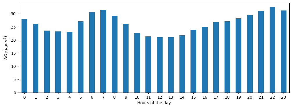
import matplotlib.pyplot as plt

fig, axs = plt.subplots(figsize=(12, 4))
air_quality.groupby('hour')['value'].mean().plot(kind='bar', ax=axs, rot=0)
axs.set_xlabel('Hours of the day')
axs.set_ylabel('$NO_2 (µg/m^3)$')
코드해석
fig, axs = plt.subplots(figsize=(12, 4)): Matplotlib에서 subplots 함수를 사용하여 새로운 그림(figure)과 축(axes)을 생성합니다. fig은 전체 그림을 나타내는 객체이고, axs는 하나 이상의 축을 나타내는 객체입니다. figsize 매개변수는 그림의 크기를 지정합니다.
air_quality.groupby('hour')['value'].mean(): 데이터프레임인 air_quality를 'hour' 열을 기준으로 그룹화하고, 각 그룹에 대해 'value' 열의 평균을 계산합니다. 즉, 시간대별로 대기질 값의 평균을 구합니다.
.plot(kind='bar', ax=axs): 위에서 계산한 시간대별 대기질 값의 평균을 바 형태의 그래프로 그립니다. ax=axs는 그래프를 생성할 축을 지정합니다.
axs.set_xlabel('Hours of the day'): x축에 레이블을 설정합니다. 이 경우, x축은 하루의 시간대를 나타냅니다.
Resample
daily_mean = no2.resample('D').mean()
daily_mean.plot(figsize=(10, 5), style='-o')

데이터분석 공부로그