서론
이번 프로젝트에서 나는 서포터 포지션을 맡았다.
주도적으로 이끌기보다 팀원들의 의견을 최대한 존중하고 조율하는 역할이라고 해야할까.
결원인원의 보충역으로 프로젝트에 참여하는 만큼, 이들이 주인공이 됐으면 했고
그걸 도와주는게 내가 맡은 역할이라고 생각했다.
팀원들이 어떻게 하면 주인공이 될 수 있을까, 어떻게 하면 편하게 개발할 수 있을까를 고민했다.
그래서 '가장 티가 나지는 않지만 가장 도움이 되는' 기능 위주로 맡으려고 했다.
그 첫번째가 디자인 시스템.
왜 ?
좋은 UI/UX를 고려하는 것은 아무리 강조해도 지나치지 않지만,
짧은 개발경험으로 미루어 보았을 때 DX, 개발자 경험도 중요하다.
개발자 경험은 개발자가 제품을 사용하거나 개발하는 동안의 경험이라고 한다.
그런 측면에서 우리의 프로젝트를 바라봤을 때,
- 언제나 쉽게 꺼내쓸 수 있으면서
- 유지보수가 쉽고
- 획일화 된 디자인을 갖는
디자인 관련 상수 객체를 만들어 놓고
필요할 때 꺼내쓰고 수정이 용이하게 설계하면 분명 도움이 될 것 같았다.
이전과 다른 점
이전의 개인, 혹은 협업 프로젝트에서는 단순히 styled-components의
theme-provider 를 이용하는 것으로 color나 font-size 관련
디자인 상수들을 관리하는 것에서 그쳤다.
theme로 상수를 관리하는 것 만으로도 분명히 큰 도움이 됐지만
조금 더 욕심을 내서 아예 프로젝트 전체의 공통된 속성을
Variants 객체로 묶어서 관리해보고자 했다.
코드
스타일링 라이브러리는 styled-components 를 사용하고 있었기 때문에
theme-provider 를 적극 활용하기로 했다.
const grayScale = {
  800: "#2c2c2c",
  700: "#383838",
  600: "#424242",
  500: "#757575",
  400: "#9e9e9e",
  300: "#bdbdbd",
  200: "#dadada",
  100: "#e9e9e9",
  50: "#f8f8f8",
  25: "#fdfdfd",
};

const color = {
  black: "#212121",
  white: "#ffffff",
  primary: "#3cc678",
  blue: "#567bff",
  blue_lighter: "#eef2ff",
  red: "#f35451",
  red_lighter: "#feeeee",
  orange: "#ff852d",
  orange_lighter: "#fff3ea",
  yellow: "#ffd600",
  green: "#86e49b",
  green_darker: "#F1F7F1",
  perple: "#9747ff",
  perple_lighter: "#f5edff",
  grayScale: grayScale,
};

const fontSize = {
  h1: "30px",
  h2: "24px",
  h3: "20px",
  body1: "16px",
  body2: "14px",
  body3: "12px",
  caption: "10px",
};

const fontWeight = {
  bold: 700,
  semi_bold: 600,
  medium: 500,
  regular: 400,
};

const defaultTheme = {
  color,
  fontSize,
  fontWeight,
};

export default defaultTheme;
프로젝트의 골격이 되는 defaultTheme.
색 관련 상수가 매우 많다.
import { css } from "styled-components";
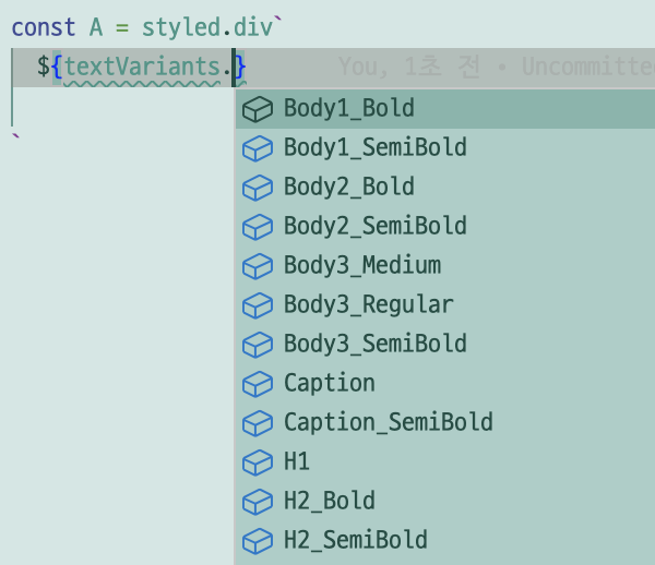
const textVariants = {
H1: css`
font-size: ${({ theme }) => theme.fontSize.h1};
font-weight: ${({ theme }) => theme.fontWeight.bold};
`,
H2_Bold: css`
font-size: ${({ theme }) => theme.fontSize.h2};
font-weight: ${({ theme }) => theme.fontWeight.bold};
`,
H2_SemiBold: css`
font-size: ${({ theme }) => theme.fontSize.h2};
font-weight: ${({ theme }) => theme.fontWeight.semi_bold};
`,
H3_Bold: css`
font-size: ${({ theme }) => theme.fontSize.h3};
font-weight: ${({ theme }) => theme.fontWeight.bold};
`,
H3_SemiBold: css`
font-size: ${({ theme }) => theme.fontSize.h3};
font-weight: ${({ theme }) => theme.fontWeight.semi_bold};
`,
Body1_Bold: css`
font-size: ${({ theme }) => theme.fontSize.body1};
font-weight: ${({ theme }) => theme.fontWeight.bold};
`,
Body1_SemiBold: css`
font-size: ${({ theme }) => theme.fontSize.body1};
font-weight: ${({ theme }) => theme.fontWeight.semi_bold};
`,
Body2_Bold: css`
font-size: ${({ theme }) => theme.fontSize.body2};
font-weight: ${({ theme }) => theme.fontWeight.bold};
`,
Body2_SemiBold: css`
font-size: ${({ theme }) => theme.fontSize.body2};
font-weight: ${({ theme }) => theme.fontWeight.semi_bold};
`,
Body3_SemiBold: css`
font-size: ${({ theme }) => theme.fontSize.body3};
font-weight: ${({ theme }) => theme.fontWeight.semi_bold};
`,
Body3_Medium: css`
font-size: ${({ theme }) => theme.fontSize.body3};
font-weight: ${({ theme }) => theme.fontWeight.medium};
`,
Body3_Regular: css`
font-size: ${({ theme }) => theme.fontSize.body3};
font-weight: ${({ theme }) => theme.fontWeight.regular};
`,
Caption: css`
font-size: ${({ theme }) => theme.fontSize.caption};
font-weight: ${({ theme }) => theme.fontWeight.bold};
`,
Caption_SemiBold: css`
font-size: ${({ theme }) => theme.fontSize.caption};
font-weight: ${({ theme }) => theme.fontWeight.semi_bold};
`,
};
export default textVariants;
프로젝트의 text 관련 Variants.
import { css } from "styled-components";
import textVariants from "./textVariants";

const buttonVariants = {
  Attendance: css`
    ${textVariants.Body1_SemiBold}
    width: 137.6px;
    height: 36.8px;
    padding: 6.4px 8px;
    border-radius: 8px;
  `,

  State: css`
    ${textVariants.Body2_SemiBold}
    width: 48px;
    height: 24px;
    padding: 4px;
    border-radius: 20px;
  `,

  NB_Button: css`
    ${textVariants.H3_SemiBold}
    width: 160px;
    height: 46px;
    padding: 8px 20px;
    border-radius: 4px;
  `,

  Filter_All: css`
    ${textVariants.Body1_SemiBold}
    height: 32px;
    padding: 10px 12px;
    border-radius: 4px;
  `,

  Time_Button: css`
    ${textVariants.Body1_SemiBold}
    width: 120px;
    height: 32px;
    padding: 4px 8px;
    border-radius: 24px;
    border: 1px solid #dadada;
  `,

  AB_Button: css`
    ${textVariants.Body1_SemiBold}
    width: 83px;
    height: 40px;
    padding: 12px 20px;
  `,
};

export default buttonVariants;
프로젝트의 button 스타일 관련 Variants.
보충설명
이 세개의 객체는 독립적인 객체로 이루어져 있고, 각자가 모듈화된 특정한 기능을 수행한다.
textVariants 객체는 프로젝트의 text 관련 속성들을,
buttonVariants 객체는 프로젝트의 button 관련 속성들을 담당하게 된다.
프로젝트 전체 스타일이 달라질 경우 default-theme 파일을 수정하면 되고
버튼의 세부적인 스타일이 달리지는 경우에는 buttonVariants 파일을 수정하면 된다.
유지보수성에 초점을 두면서 vscode 의 자동완성 기능을 이용하여 사용하기 쉽도록
객체로 관리한다. 이러면 휴먼에러를 방지할 수 있다.
예를들면,
파생된 공통 버튼 컴포넌트
import { StyledButton } from "./styled";

export const CustomButton = ({
  width,
  height,
  bgColor,
  opacity,
  disabled,
  outlined,
  colorTypes,
  buttonsTypes,
  children,
  ...props
}) => {


  return (
    <StyledButton
      width={width}
      height={height}
      opacity={opacity}
      bgColor={bgColor}
      disabled={disabled}
      outlined={outlined}
      colorTypes={colorTypes}
      buttonsTypes={buttonsTypes}
      {...props}
    >
      {children}
    </StyledButton>
  );
};


const Buttons = {
  Attendance: (props) => <StyledButton buttonsTypes="Attendance" {...props} />,
  State: (props) => <StyledButton buttonsTypes="State" {...props} />,
  NB: (props) => <StyledButton buttonsTypes="NB_Button" {...props} />,
  Filter: (props) => <StyledButton buttonsTypes="Filter_All" {...props} />,
  Time: (props) => (
    <StyledButton
      whileHover={{ scale: 1.1 }}
      transition={{ duration: 0.2 }}
      buttonsTypes="Time_Button" {...props} />
  ),
  AB: (props) => <StyledButton buttonsTypes="AB_Button" {...props} />,
};

export default Buttons;
import styled, { css } from "styled-components";
import { lighten } from "polished";
import buttonVariants from "../../styles/variants/buttonVariants";
import { motion } from "framer-motion";

const getBackgroundColor = ({ colorTypes, bgColor, theme, outlined }) => {
  if (outlined) return bgColor || theme.color.white;
  return colorTypes
    ? theme.color[colorTypes]
    : bgColor || theme.color.grayScale[50];
};

const getBorderColor = ({ outlined, bgColor, theme, colorTypes }) => {
  if (!outlined) return null;
  return colorTypes
    ? theme.color[colorTypes]
    : bgColor || theme.color.grayScale[400];
};

const getTextColor = ({ outlined, theme, colorTypes, color }) => {
  if (color) return color;
  if (outlined)
    return colorTypes ? theme.color[colorTypes] : theme.color.grayScale[400];
  return colorTypes ? theme.color.white : theme.color.grayScale[200];
};

const getHoverBackgroundColor = ({ colorTypes, bgColor, theme, outlined }) => {
  if (outlined) return bgColor ? lighten(0.1, bgColor) : theme.color.white;
  return colorTypes
    ? lighten(0.1, theme.color[colorTypes])
    : bgColor
    ? lighten(0.1, bgColor)
    : lighten(0.2, theme.color.grayScale[50]);
};

export const StyledButton = styled(motion.button)`
  display: inline-flex;
  width: max-content;
  height: max-content;
  justify-content: center;
  align-items: center;

  background-color: ${getBackgroundColor};
  border: ${({ outlined }) => (outlined ? "1px solid" : "none")};
  border-color: ${getBorderColor};
  color: ${getTextColor};

  &:hover {
    background-color: ${getHoverBackgroundColor};
  }

  ${({ disabled }) =>
    disabled &&
    css`
      background-color: ${({ theme }) => theme.color.grayScale[50]};
      color: ${({ theme }) => theme.color.grayScale[200]};
      opacity: 70%;
      pointer-events: none;
    `}

  ${({ buttonsTypes }) =>
    buttonsTypes === "State" &&
    css`
      color: ${({ theme, colorTypes }) => theme.color[colorTypes]};
      background-color: ${({ theme, colorTypes }) =>
        theme.color[`${colorTypes}_lighter`]};

      &:hover {
        color: ${({ theme, colorTypes }) => theme.color[colorTypes]};
        background-color: ${({ theme, colorTypes }) =>
          lighten(0.3, theme.color[colorTypes])};
      }
    `}

  ${({ buttonsTypes }) => buttonVariants[buttonsTypes] ?? ""}

  ${({ width }) =>
    width &&
    css`
      width: ${width};
    `}

  ${({ height }) =>
    height &&
    css`
      height: ${height};
    `}

  opacity: ${({ opacity }) => opacity};
  transition: background-color 0.3s ease-in-out;
  white-space: nowrap;
  cursor: pointer;
`;
버튼 컴포넌트와 버튼 컴포넌트 스타일 컴포넌트.
buttonVariants 객체에 의해 크기와 스펙, 폰트 스타일이 결정되고,
defaultTheme의 color 속성에 의해 colorType 이 결정된다.
추가적으로 outlined 같은 옵션으로 조금 더 세부적인 속성을 적용할 수 있다.
위의 함수들은..
추가적인 요구사항이 점점 많아져서 조건문을 함수로 분리했다.
스타일드 컴포넌트 내부에 과도하게 조건문과 삼항연산자가 사용되고 있어
가독성 측면에서 너무 좋지 않았고, 유지보수가 너무 힘들었기 때문.
얻을 수 있었던 장점
일단 첫번째로는 쉬운 재사용성.
공통 스타일 요소를 상수로 관리하고 객체로 묶어서 관리함으로써 쉽게 재사용할 수 있었으며,
코드의 중복또한 줄일 수 있었다.
두번째로는 유지보수의 용이성.
예를들어 color 값이나 font-size 같은 것이 수정된다면 defaultTheme 객체를,
buttons 의 size나 font 관련 속성이 수정된다면 buttonVariants 객체를 수정하면 된다.
공통된 디자인으로 관리하고 있다면 한 곳에서만 수정해도 프로젝트 전체의 스타일을 한번에 수정할 수 있으므로
유지보수에 굉장히 유리하다.
한계
프로젝트를 진행하면서 느꼈던 내가 구현한 디자인 시스템의 한계점은,
"어느 부분까지 획일화를 진행하고 어느 부분까지 획일화 하지 않을 것인지"
에 대한 명확한 기준이 제대로 설정되지 않은 상태에서의 디자인 시스템은
효율성이 조금 떨어질 수 있다는 점이다.
요약하자면 컨벤션의 부재라고 할 수 있겠다.
나도, 디자이너님도 이런 시스템에 대한 이해도가 높지 않았고
컨벤션을 정해야 한다는 자각도 하지 못했다.
그래서 보완할 점이 굉장히 많았고 팀원들이 초기 페이지 스타일링 작업을 할 때
사용할 수 없어 차후에 리팩토링을 하는 등의 비효율이 발생했다.
유명한 회사들에서 적용한 디자인 시스템 컨벤션이 많은데
이런 레퍼런스들을 많이 참고하지 못했던 게 원인이 아닐까 싶다.
다음에 이런 시스템을 만들 때는 참고해서 조금 더 빠르게 컨벤션을 정하고
명확한 기준을 설정해서 보다 효율적인 프로젝트를 진행할 수 있으리라.