React ApexCharts
ApexCharts 라이브러리의 리액트 버전. 정말 다양한 종류의 차트를 지원한다.
광범위한 데이터 시각화에 유리하며 차트를 이용한 분석 및 시각화 작업을 보다 효율적으로 할 수 있다.
사용방법
라이브러리 설치
yarn add react-apexcharts apexcharts타입스크립트를 사용하지 않는다면 react-apexcharts 만 설치해도 괜찮지만
apexcharts의 {ApexOptions} interface 를 사용하기 위해서 함께 설치해주면 좋다.
Import
import ReactApexChart from "react-apexcharts";
import { ApexOptions } from "apexcharts";
차트 그리기
const data = [
  { month: 'January', revenue: 12000 },
  { month: 'February', revenue: 18000 },
  { month: 'March', revenue: 20000 },
  { month: 'April', revenue: 15000 },
  { month: 'May', revenue: 25000 },
];
month 와 revenue 라는 key를 가진 data가 있다고 가정하고, 월별 매출을 보여주는 차트를 만들어보자.
const options : ApexOptions = {
	// 차트의 옵션을 설정하는 객체. 타입스크립트라면 ApexOptions interface를 할당해줘야 한다.
	theme: {
    mode: "dark",
  },
	// theme option dark or light / default : light
  chart: {
		type: "bar",
		height: 350
  },
	// chart type 과 높이, 너비를 설정할 수 있음
  xaxis: {
    categories: data.map(item => item.month)
  }
	// xaxis, yaxis로 x축, y축 옵션을 설정할 수 있음
	// 해당 코드에서는 x축의 카테고리를 설정해준 모습
}

const series = [{
	// 차트의 데이터를 담당할 객체. 이름과 시각화할 데이터를 할당.
  name: 'revenue',
  data: data.map(item => item.revenue)
}]

const Chart = () => {
  return (
    <ReactApexChart
      options={options}
      series={series}
    />
  )
}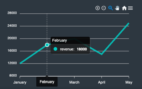
그럴듯 한 차트가 완성되었다.
추가적인 기능
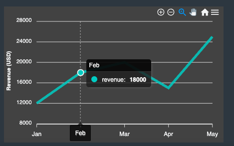
1. 라벨 표시
options 객체의 xaxis, yaxis 프로퍼티를 이용해 라벨을 추가할 수 있다.
const options = {
  xaxis: {
    categories: ['Jan', 'Feb', 'Mar', 'Apr', 'May']
  },
  yaxis: {
    title: {
      text: 'Revenue (USD)'
    }
  }
}
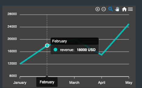
2. 툴팁 추가하기
options 객체의 tooltip 프로퍼티를 이용해 툴팁을 추가할 수 있다.
const options = {
  tooltip: {
    enabled: true,
    shared: true,
    intersect: false,
    y: {
      formatter: function (value) {
        return value + " USD";
      }
    }
  }
}
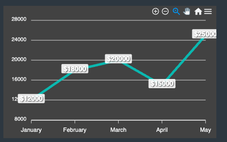
3. 데이터 라벨 표시하기
options 객체의 dataLabels 프로퍼티를 이용해 데이터 라벨을 추가할 수 있다.
const options = {
  dataLabels: {
    enabled: true,
    formatter: function (val, opts) {
      return "$" + val
    },
    style: {
      fontSize: '14px',
      fontFamily: 'Helvetica, Arial, sans-serif',
      fontWeight: 'bold',
      colors: ['#fff']
    },
    dropShadow: {
      enabled: true,
      top: 1,
      left: 1,
      blur: 1,
      opacity: 0.45
    }
  }
}
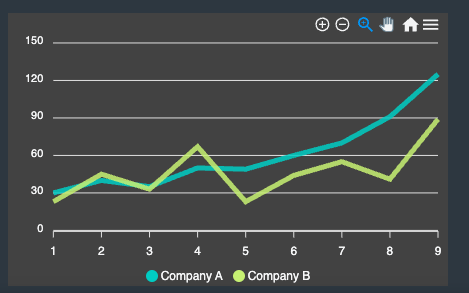
4. 다중 차트
series 배열에 여러 개의 데이터 집합을 추가하면 비교분석에 유리한 다중 차트를 만들 수 있다.
const series = [
  {
    name: "Company A",
    data: [30, 40, 35, 50, 49, 60, 70, 91, 125],
  },
  {
    name: "Company B",
    data: [23, 45, 33, 67, 23, 44, 55, 41, 89],
  },
];
결론
사용법도 생각보다 간단했고 기능도 다양하게 제공하는데다가 공식문서가 굉장히 잘 정리되어 있다.
라이브러리를 사용할 때 가장 어려움을 겪는 부분이 커스티마이징에 관한 부분인데
색이나 애니메이션, 이벤트나 라벨 같은 부분도 자유롭게 커스티마이징이 가능해 굉장히 편했다.
차후에 차트에 관련된 프로젝트를 할 때 사용해볼 것 같다.

Always, we are friend 🧡