RN 코어 컴포넌트 간단 요약
- View : div와 비슷한 컴포넌트
- Text : 텍스트를 넣기 위해 사용
- Button : 텍스트는 title, 클릭 onPress props 사용
- TextInput : input / ref, value, onChangeText placeholderTextColor, editable, spellCheck, autoCorrect, autoCapitalize, inputMode, secureTextEntry props 등 사용
- SafeAreaView : 노치 여백 적용 컴포넌트
- margin, padding : px제외 10%, 10 사용가능
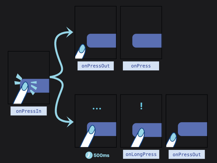
Horizontal, Vertical 로 상하 좌우 개별 적용이 가능하다. - Pressable : 하위 컴포넌트의 다양한 버튼 인터렉션을 감지할 수 있게 해주는 wapper / onPress, onPressIn, onPressOut, onLongPress props 사용
onPress : 일반적인 press
onPressIn : 프레스가 활성화 되었을때
onPressOut : 프레스 체스쳐가 비활성화 되었을때
onLongPress : 500ms 이상 버튼을 활성화 하고 있을때 - Image : 이미지 삽입때 사용 / resizeMode source props 등 사용
Pressable 로직
미니 예시코드
- TextInput onChangeText
...ex1)
const [inputValue, setInputValue] = useState<string>('');

const changeHandler = (text: string) => {
  setInputValue(text);
}

<TextInput value={inputValue} onChangeText={setInputValue} />...ex3)
<TextInput
ref={inputRef}
style={[styles.input, disabled && styles.disabled]}
placeholderTextColor={colors.GRAY_500}
editable={!disabled}
autoCapitalize="none"
spellCheck={false}
autoCorrect={false}
{...props} />

FE developer