Styled-Components 시작하기 #5, attaching additional props, Overriding attrs 와 Animation
styled-components
1. Attaching additional props
렌더링된 컴포넌트에 일부 props를 전달하는 불필요한 wrapper를 피하기 위해서 .attrs사용할 수 있다. 이를 통해서 컴포넌트에 추가적인 props를 연결할 수 있다!
Input 컴포넌트를 렌더링할 때, 우리는 동적 그리고 정적 attributs를 다음과 같이 부여할 수 있다!
const Input = styled.input.attrs((props) => ({
  type: "text",
  size: props.size || "1em",
}))`
  color: palevioletred;
  font-size: 1em;
  border: 2px solid palevioletred;
  border-radius: 3px;

  margin: ${(props) => props.size};
  padding: ${(props) => props.size};
`;
...
    <div>
      <Input placeholder="A small text input" />
      <br />
      <Input placeholder="A bigger text input" size="2em" />
    </div>
...
다 우리가 보던 것들이다. 그래도 무언가 새롭게 조합되어 우리에게 보여준다! 한번 보도록 하자.
const Input = styled.input.attrs((props) => ({
  type: "text",
  size: props.size || "1em",
}))`
Input 컴포넌트에 attrs로 type : "text"를 주어서 모든 Input 컴포넌트에 type attributes를 넘겨주었고, props 를 통해서 접근할 수 있게 되었다. props.size는 있으면 그 값을 넘겨 줄 것이고, 없다면 props.size => "1em"을 넘겨줄 것이다.
따라서, 첫번째 small text input은 margin, padding => "1em"이 될 것이고 두번째 bigger text input에는 margin, padding => "2em"이 될 것이다.
      <Input placeholder="A small text input" />
      <Input placeholder="A bigger text input" size="2em" />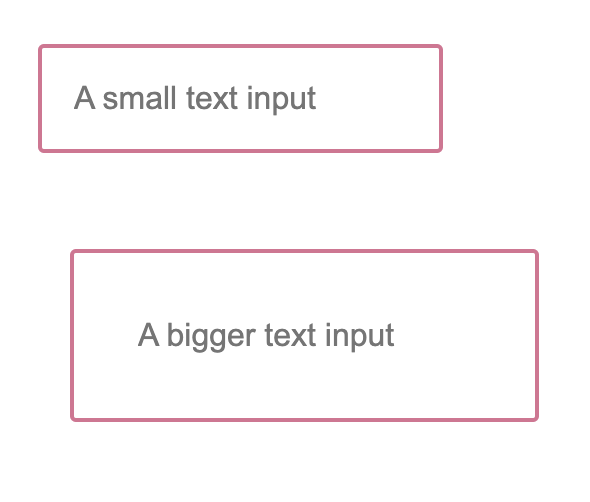
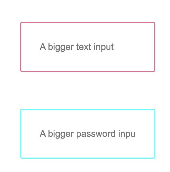
2. Overriding .attrs
.attrs는 styled-components에 추가 attributes를 연결하기 위해 사용된다! 만약 여러개의 components가 중첩되어 있다면, .attrs는 가장 안쪽의 컴포넌트에서 가장 바깥쪽의 컴포넌트로 확장된다. 이렇게 해서 각각은 겹치는 attrs를 덮어쓸 수 있다! -> CSS style sheet에서 속성이 덮어씌워지는 방식과 유사하다!
예시로 위에서 만든 Input을 Password로 동작하게 만들고 싶으면, 나는 type을 수정해, type : "password"로 만들어야 한다. 이때 overriding이 가능하다는 것이다!
const PasswordInput = styled(Input).attrs({
  type: "password",
})`
  border: 2px solid aqua;
`;
...
      <Input placeholder="A bigger text input" size="2em" />
      <br />
      <PasswordInput placeholder="A bigger password input" size="2em" />

...
아주 간단하다! styled로 태그를 불러오는 것이 아닌 styled(Input)을 통해서 컴포넌트를 불러오고, .attrs로 텍스트 타입인 input을 type : "password"로 덮어썼고, 테두리 색을 palevioletred인 것을 border : 2px solid aqua로 덮어씌워 줬다! 결과를 보도록 하자!
3. Animation
보통 CSS animation을 @keyframes로 만드는데, styled-components에서도 keyframes를 사용해서 unique instance를 만들 수 있다! 전역에서 사용할 수 있도록 만들 수 있으며, 이름도 충돌하지 않는다!
const rotate = keyframes`
from {
transform: rotate(0deg);
} to {
transform: rotate(360deg);
}
`;
const Rotate = styled.div`
display: inline-block;
animation: ${rotate} 2s linear infinite;
padding: 2rem 1rem;
font-size: 1.2rem;
`;
...
<Rotate>< 🙇 ></Rotate>
...from ~ to 까지 0도에서 360도 변하는 keyframes를 만들고, Rotate에서 animation : ${rotate}를 통해서 keyframes 가져와서 사용하였다!
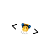
gif 만들기 귀찮아서 그냥 돌아가던 중 한 순간을 포착함.
다음 포스팅은 디자인 시스템을 만들도록 해보자!