Position
div{
	position : static;
	position : relative;ㅍ
	position : absolute;
	position : fixed;
	position : sticky;
}
https://creamilk88.tistory.com/197 relative/absolute
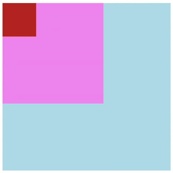
position : relative
<main>
    <div class="foo"></div>
    <div></div>
</main>

<style>
    div {
        width: 100px;
        height: 100px;

        background-color: firebrick;
    }

    div.foo {
        position: relative;
  <--position 기본값은 static -->

        top: 50px;
        left: 40px;
        background-color: violet;
    }

    main {
        width: 500px;
        height: 500px;

        background-color: lightblue;
    }
</style>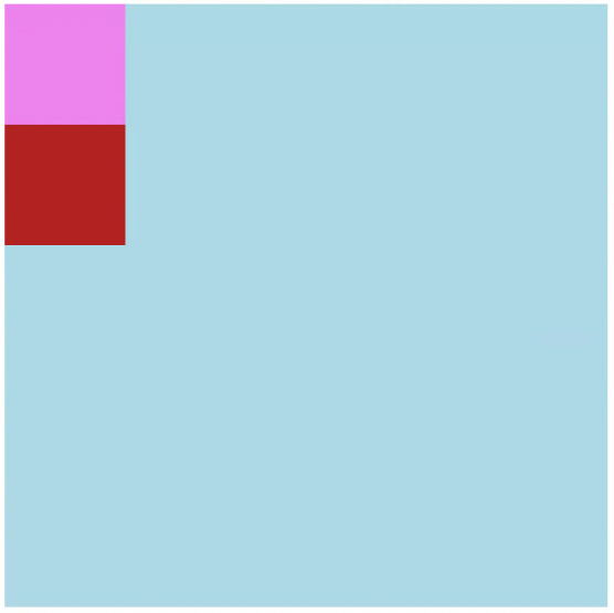
-포지션 초기화시 형태
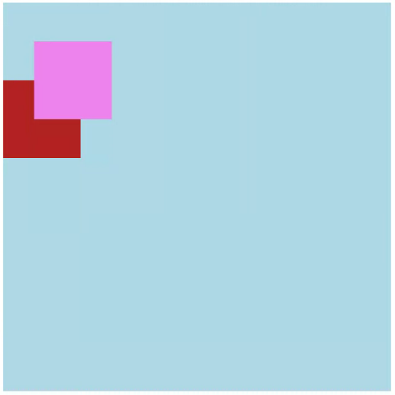
-포지션 적용 형태
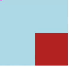
position : ★absolute
<main>
    <div class="foo">
        <div class="bar">

        </div>
    </div>
</main>

<style>
    div.foo {
        position: relative;
        /*
        top: 50px;
        left: 40px;
        */

        width: 300px;
        height: 300px;
        background-color: violet;
    }

    div.bar {
        position: absolute;
        bottom: 30px;
        left: 30px;
<-- absolute는 top/bottom, left/right 중 하나씩만 쓴다. 상반되는 위치 좌표기 때문 -->
        width: 100px;
        height: 100px;
        background-color: firebrick;
    }

    main {
        width: 500px;
        height: 500px;

        background-color: lightblue;
    }
</style>
-포지션 모두 있는 상태
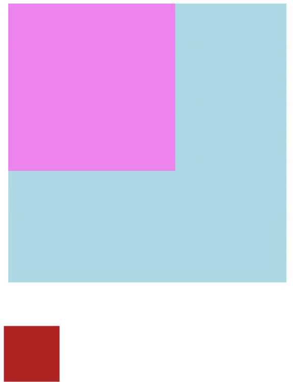
-foo:relative만 없는 상태
-foo:relative가 없고 bar:absolute가 있는 상태
-결론 : absolute는 relative에 영향을 받는다.
- main에 position:relative 부여시에는 영향을 받지 않는다.
- absolute는 가장 가까운 relative를 기준으로 위치를 잡는다.
-absolute vs transform:translate
- abolute : relative 컨테이너 내에서 위치를 기준으로 이동
- transform : 원하는 위치로 이동하려면 px 계산이 필요.
- ex) 위의 경우 absolute는 right:0, bottom:0. 트랜스폼은 px 계산 필요.
position : Relative와 Absolute 응용
<main>
    <button>
      /*button에 relative가 걸려있음*/
        Selected: <span>none</span>
        <ul>
          /* ul에 absolute */
            <li>Finn</li>
            <li>Jake</li>
            <li>Simon</li>
            <li>Bubblegum</li>
            <li>Prismo</li>
        </ul>
      /*버튼에 li가 들어간 이유 : 버튼에 대해 상대적으로 요소 배치를 위해 */
    </button>
</main>

<style>
    button {
        position: relative;

        width: 200px;
        height: 50px;
        color: whitesmoke;
        font-family: monospace;
        background-color: darkslateblue;
        border: none;
        border-radius: 12px;
    }

    button.open {
<-- classList toggle open -->
        border-radius: 12px 12px 0 0;
    }

    ul {
        display: none;

        position: absolute;

        top: 50px;
        left: 0;

        width: 200px;
        background-color: dimgray;
        color: cornsilk;
        border: none;

        list-style: none;

        padding: 10px;
    }

    button.open ul {
        display: block;
        margin: 0;
        padding: 0;

        border-radius: 0 0 12px 12px;
        overflow: hidden;
    }

    li {
        padding: 8px;
        font-family: monospace;
    }

    li:hover {
        background-color: springgreen;
        color:deeppink;
        font-weight: bold;
    }
</style>

<script>
    const button = document.querySelector('button');
    const span = button.querySelector('span');
    const ul = document.querySelector('ul');

    for (const li of document.querySelectorAll('li')) {
        li.addEventListener('click', (e) => {
            e.stopPropagation();
  <-- 버블링 방지가 없으면 계속 닫히자 마자 열림-->

            span.textContent = li.textContent;
            button.classList.remove('open');
        });
    }

    button.addEventListener('click', () => {
        button.classList.toggle('open');
    });
</script>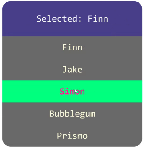
-서랍메뉴를 만들때 쓸 수 있다
position : fixed
<main>
    <h1>hello world</h1>
    <h2>hello world</h2>

    <div>this is fixed</div>

    <h3>hello world</h3>
    <p>hello world world hello</p>
</main>

<style>
    div.fixed {
        position: fixed;
        top: 20px;
        left: 30px;

        width: 200px;
        height: 200px;
        padding: 30px;
        font-size: 30px;;
        background-color: crimson;
        color: white;
    }

    * {
        font-family: sans-serif;
    }
</style>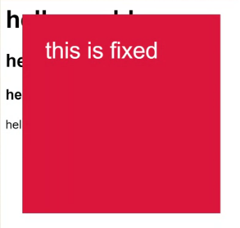
-absolute와의 차이점 : 화면에 고정, 스크롤 무시
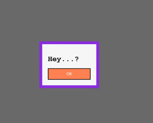
fixed 응용 : 모달창
<main>
    <button>Show me something</button>
</main>

<div class="alert">
    <div>
        <h1>Hey...?</h1>

        <button>OK</button>
    </div>
</div>

<style>
    button {
        width: 150px;
        height: 40px;

        background-color: coral;
        color: white;
    }

    div.alert {
  /*회색배경*/
        display: none;
        position: fixed;

        width: 100%;
        height: 100%;
        top: 0;
        left: 0;

        background-color: dimgray;
    }

    div.alert.open {
        display: block;
    }

    div.alert > div {
        position: absolute;
        top: 35%;
        left: 25%;

        padding: 20px;
        border: 10px solid blueviolet;
        background-color: whitesmoke;
    }

    div {
        font-family: monospace;
    }
</style>

<script>
    const alertBox = document.querySelector('div.alert');
    const showMe = document.querySelector('main > button');
    const ok = document.querySelector('div.alert button');

    showMe.addEventListener('click', () => {
        alertBox.classList.add('open');
    });

    ok.addEventListener('click', () => {
        alertBox.classList.remove('open');
    });
</script>
position : sticky - 드롭다운, 모달창
<main>
    <div>
        <h3>Name</h3>
        <ul>
            <li>Finn the Human</li>
            <li>Jake the Dog</li>
            <li>Ice King</li>
            <li>Simon Petrikove</li>
            <li>Marceline the Vampire Queen</li>
            <li>BMO</li>
            <li>Earl of Lemongrab</li>
            <li>Princess Bubblegum</li>
            <li>Flame Princess</li>
            <li>Peppermint Butler</li>
        </ul>
    </div>
</main>

<style>
    div {
        margin: 50px;
        padding: 10px;
        height: 200px;

        border: 5px solid greenyellow;
        color: white;
        background-color: lightslategrey;

        font-family: sans-serif;
        font-size: 20px;;

        overflow-y: auto;
    }

    ul {
        margin: 0;
        padding: 0;
        list-style: none;
    }

    h3 {
        margin: 0;
        padding: 5px 10px;

        color:cyan;
        background-color: darkorange;
        border-radius: 5px;

        position: sticky;
        top: 0;
    }

    li { margin: 5px; }
</style>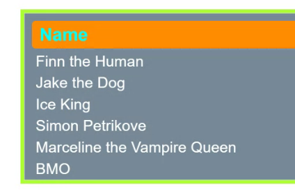
-스크롤에서 한 요소 상단에 고정. : name은 스크롤해도 고정됨.
Flexbox : 1차원 레이아웃
-수평 혹은 수직 방향으로 정렬할 때 사용
div {
display: flex;
/* or */
display: inline-flex;
}
flex-direction
div{
display : flex;

flex-direction: row;
flex-direction: row-reverse;
flex-direction: column;
flex-direction: column-reverse;<main>
<ul>
<li>Finn</li>
<li>Jake</li>
<li>Simon</li>
<li>Marceline</li>
<li>BMO</li>
</ul>
</main>
<style>
ul {
display: flex;
/* display 속성은 요소들을 모으는 부모 요소에 써야 한다 */
flex-direction: column-reverse;
/* width: max-content; */
list-style: none;
margin: 0;
padding: 20px;
background-color: aquamarine;
border-radius: 12px;
}
li {
margin: 10px;
padding: 10px 15px;
width: max-content;
background-color: crimson;
color: white;
border-radius: 8px;
}
main {
padding: 30px;
font-family: sans-serif;
font-size: 20px;
}
</style>flex-direction : column 일때 margin 병합 없음.
margin-overlap

<div>
    <p>Hello</p>
    <p>World</p>
    <p>This is</p>
    <p>World</p>
</div>

<style>
    div {
        margin: 30px;
        font-family: monospace;
        font-weight: bold;
        font-size: 34px;

        /*
        display: flex;
        flex-direction: column;
        */
    }

    p {
        margin: 10px;

        width: max-content;
        padding: 10px 15px;
        background-color: darkolivegreen;
        color: white;
        border-radius: 12px;;
    }
</style>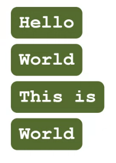
-플렉스가 있을 때
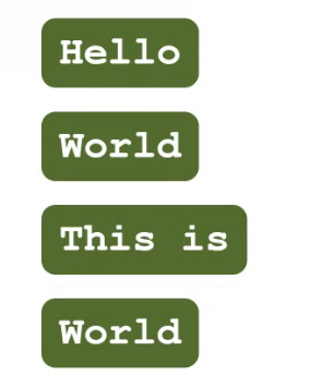
-플렉스가 없을 때
align-items & justify-content
-align-items : flex-direction과 수직 방향에 대한 위치를 결정
-justify-content : flex-direction에 해당하는 방향에 대한 위치 결정
align-items
div {
display : flex;

align-items : stretch; 늘려서 채움
align-items : center;  가운데 정렬
align-items : start;   시작 부 정렬
align-items : end;     끝 부 정렬
}<div>
<p>Hello</p>
<p>World</p>
<p>This is</p>
<p>World</p>
</div>
<style>
div {
margin: 30px;
font-family: monospace;
font-weight: bold;
font-size: 34px;
background-color:peachpuff;
border-radius: 20px;
height: 200px;
display: flex;
flex-direction: row;
/*
align-items: start;
align-items: end;
align-items: stretch;
align-items: center;
*/
}
p {
margin: 10px;
width: max-content;
padding: 10px 15px;
background-color: darkolivegreen;
color: white;
border-radius: 12px;;
}
/*
p:nth-child(3) {
p태그 중 3번째 선택
align-self: flex-start;
해당 요소만 지정
}
*/
</style>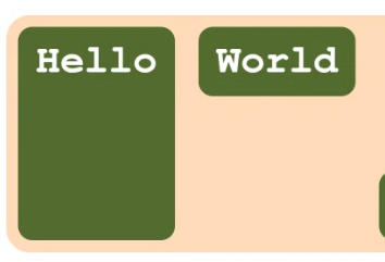
-stretch
-p:nth-child(3)의 align-self : flex-start 자식요소에 넣는 속성. 자기 아이템만 바꿈.
justify-content
div{
display:flex;

justify-content: start; 디폴트값
justify-content: center;
justify-content: space-between; 공간을 꽉 채우고 아이템 사이 일정 간격 배치
justify-content: space-around; 아이템 각 차지 공간(컨테이너)을 동일하게 배치
justify-content: space-evenly; 아이템과 여백 간격을 같게

gap : 30px 아이템 사이 공간 부여
}<div>
<p>Hello</p>
<p>World</p>
<p>This is</p>
</div>
<style>
div {
margin: 30px;
font-family: monospace;
font-weight: bold;
font-size: 34px;
background-color:peachpuff;
border-radius: 20px;
display: flex;
flex-direction: row;
/*
justify-content: start;
justify-content: end;
justify-content: space-between;
justify-content: space-evenly;
justify-content: space-around;
justify-content: center;
*/
}
p {
margin: 10px;
width: max-content;
padding: 10px 15px;
background-color: darkolivegreen;
color: white;
border-radius: 12px;
}
</style>가운데 정렬하기
<main>
    <button>Show me something</button>
</main>

<div class="alert">
    <div>
        <h1>Hey...?</h1>

        <button>OK</button>
    </div>
</div>

<style>
    button {
        width: 150px;
        height: 40px;

        background-color: coral;
        color: white;
    }

    div.alert {
        display: none;
        position: fixed;

        width: 100%;
        height: 100%;
        top: 0;
        left: 0;

        background-color: dimgray;
    }

    div.alert.open {
        /* use display: flex! */
        display: flex;
>         align-items: center;
>         justify-content: center;
    }

    div.alert > div {
        padding: 20px;
        border: 10px solid blueviolet;
        background-color: whitesmoke;
    }

    div {
        font-family: monospace;
    }
</style>

<script>
    const alertBox = document.querySelector('div.alert');
    const showMe = document.querySelector('main > button');
    const ok = document.querySelector('div.alert button');

    showMe.addEventListener('click', () => {
        alertBox.classList.add('open');
    });

    ok.addEventListener('click', () => {
        alertBox.classList.remove('open');
    });
</script>
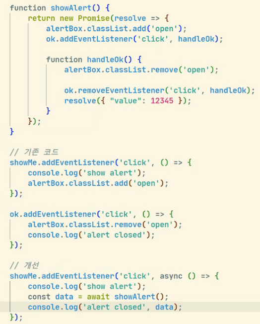
-콜백을 쓰는 경우에도 얼마든지 async await를 통해 동기적인 코드로써 직관적으로 만들 수 있다. 즉 cb 때문에 복잡해보이면 promise를 활용.
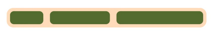
flex-wrap
div{
display : flex;

flex-wrap : nowrap; 줄바꿈 없음, 디폴트값
flex-wrap : wrap; 자동 줄바꿈
flex-wrap : wrap-reverse; 역순 배치 줄바꿈<main>
<ul>
<li>Finn the Human</li>
<li>Jake the Dog</li>
<li>Ice King</li>
<li>Simon Petrikove</li>
<li>Marceline the Vampire Queen</li>
<li>BMO</li>
<li>Earl of Lemongrab</li>
<li>Princess Bubblegum</li>
<li>Flame Princess</li>
<li>Peppermint Butler</li>
</ul>
</main>
<style>
ul {
display: flex;
flex-direction: row;
flex-wrap: wrap-reverse;
flex-wrap: nowrap;
flex-wrap: wrap;
/* width: max-content; */
list-style: none;
margin: 0;
padding: 20px;
background-color: aquamarine;
border-radius: 12px;
}
li {
margin: 10px;
padding: 10px 15px;
width: max-content;
background-color: crimson;
color: white;
border-radius: 8px;
}
main {
padding: 30px;
font-family: sans-serif;
font-size: 20px;
}
</style>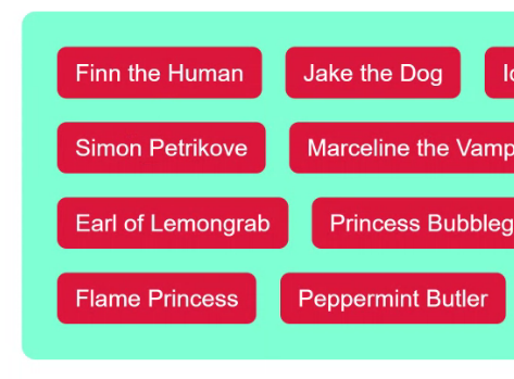
- wrap한상태
child 요소에서 사용하는 flex 속성들
.item{
flex-grow : 1;			요소가 차지하고 남는 공간 비율 배분
flex-shrink: 1;
flex-basis: 100px;
oder: 1;
}
flex-grow
<div>
    <p>Hello</p>
    <p>Items</p>
    <p>World</p>
</div>

<style>
    div {
        margin: 30px;
        font-family: monospace;
        font-weight: bold;
        font-size: 34px;
        background-color:peachpuff;
        border-radius: 20px;

        display: flex;
        flex-direction: row;
    }

    p {
        margin: 10px;

        width: max-content;
  <--자기 공간만큼만 차지-->
        padding: 10px 15px;
        background-color: darkolivegreen;
        color: white;
        border-radius: 12px;
    }

    p:nth-child(1) {
        flex-grow: 2;
    }

    p:nth-child(2) {
        flex-grow: 1;
    }
</style>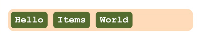
grow : 0
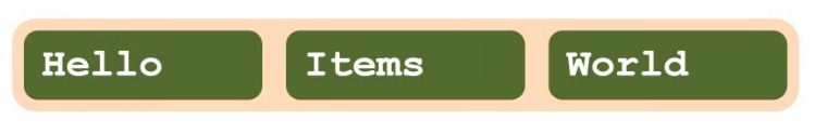
grow : 1, 2, 3, 4, 5... 같은 크기
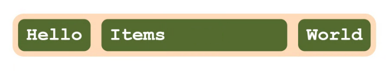
grow : 1, 98, 1
속성이 남는 행 여백을 분배해서 채우는 방법
즉 텍스트, 마진과 같이 각 요소들이 먼저 공간을 차지하고 남는 공간의 차지 비율. 따라서 공간이 남지 않으면 의미가 ㅇ벗음
flex-shrink & flex-basis
<div>
    <p></p>
    <p></p>
    <p></p>
</div>

<style>
    div {
        margin: 30px;
        font-family: monospace;
        font-weight: bold;
        font-size: 34px;
        background-color:peachpuff;
        border-radius: 20px;

        display: flex;
        flex-direction: row;
    }

    p {
        margin: 10px;

        width: 300px;
        height: 20px;

        padding: 10px 15px;
        background-color: darkolivegreen;
        color: white;
        border-radius: 12px;

        flex-grow: 1;
        flex-shrink: 0;
    }

    p:nth-child(1) {
        flex-shrink: 5;
    }

    p:nth-child(2) {
        flex-shrink: 2;
    }
</style>
기준점은 300px인데 width가 600이라 넘침
shrink : 1, 3, 9
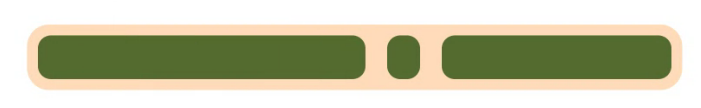
1, 3, 9에 첫번째 300px 자식요소로 부여. -> 절대 줄어들지 않음. 제한점
shrink : 즉, 속성이 레이아웃을 벗어난 아이템 너비를 분배해서 줄이는 방법
basis : flex 폭. 사실상 width와 큰 차이 없음.
order
요소 순서 임의로 결정, index 값을 바꾸는 느낌.
<div>
    <p>HELLO</p>
    <p>World</p>
    <p>This is</p>
</div>

<style>
    div {
        margin: 30px;
        font-family: monospace;
        font-weight: bold;
        font-size: 34px;
        background-color:peachpuff;
        border-radius: 20px;


        display: flex;
        flex-direction: row;
    }

    p {
        margin: 10px;

        width: max-content;
        padding: 10px 15px;
        background-color: darkolivegreen;
        color: white;
        border-radius: 12px;

        order: 1;
    }

    p:nth-child(1) {
        order: 3;
    }

    p:nth-child(1) {
        order: 1;
    }

    p:nth-child(2) {
        order: 2;
    }
</style>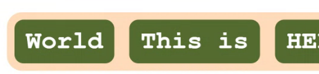
3단 레이아웃
-아래에 grid로 구현한 것도 있음.
<body>
    <header>
    </header>
    <div>
        <aside></aside>
        <main></main>
    </div>
</body>

<style>
    body {
        margin: 0;
        padding: 0;

        display: flex;
        flex-direction: column;
    }

    div {
        display: flex;
        flex-direction: row;
    }


    header {
        width: 100%;
        height: 100px;

        background-color: aqua;
    }

    aside {
        width: 200px;
        height: 500px;

        background-color: blueviolet;
    }

    main {
        width: 100%;
        height: 500px;

        background-color: darksalmon;
    }
</style>
헤더를 위에 둬서 좌우를 채우고 높이 설정, 이를 위에 두고 div에 flex 부여, 거기에 속한 aside와 main을 좌우로 배치. 이를 통해 3단 레이아웃 구성.
Grid : 2차원 레이아웃, 큰 틀에서의 레이아웃.
-그리드 내에 그리드도 사용 가능함.
div{
	display: grid;
	/*or*/
	display: inline-grid;
}
다른 레이아웃 방식과 다른점
-flex : child 요소에 크기 지정
- child 에서 크기 지정
-grid : parent에서 크기 지정
- grid를 선언하는 쪽에서 크기를 지정. 미리 그리드 크기를 지정해둘 수 있음.
grid-template {rows/cloumns}
-flex direction 대체해보기
<main>
    <ul>
        <li>Finn</li>
        <li>Jake</li>
        <li>Simon</li>
        <li>Marceline</li>
        <li>BMO</li>
    </ul>
</main>

<style>
    ul {
        display: grid;

        grid-template-columns: repeat(5, max-content);
 		 /*
        grid-template-rows: repeat(5, max-content);
  						정렬 하려는 갯수, content당 공간

        */

        list-style: none;
        margin: 0;
        padding: 20px;
        background-color: aquamarine;
        border-radius: 12px;
    }

    li {
        margin: 10px;
        padding: 10px 15px;

        width: max-content;
        background-color: crimson;
        color: white;
        border-radius: 8px;
    }

    main {
        padding: 30px;
        font-family: sans-serif;
        font-size: 20px;
    }
</style>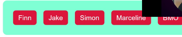
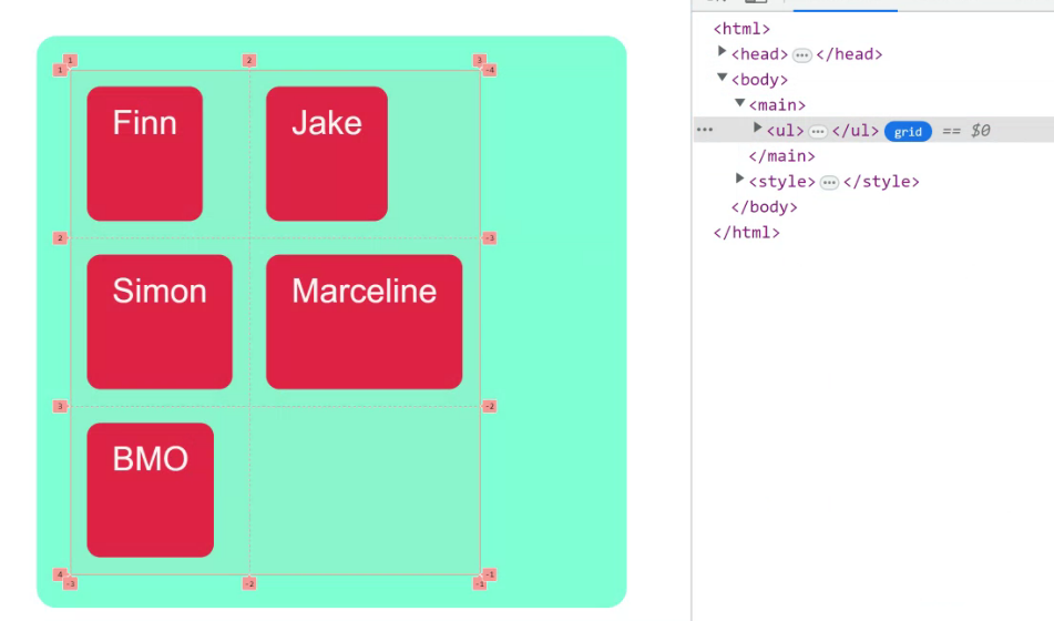
공간을 미리 정해놓고 배치가 가능해서 깔끔하게 정렬 가능.
- grid-template-columns: repeat(3, max-content);
- grid-template-rows: repeat(2, max-content);
flexbox는 축 하나를 기준 잡고 grid는 x,y 축을 유동적으로 쓸 수 있음.
child 배치해보기
.item{
	grid-column-start: 1;
	grid-column-end : 3;

	grid-row-start : 3;
	grid-row-end : 4;
}<main>
<div class="foo"></div>
<div class="bar"></div>
<div class="divana"></div>
<div class="boox"></div>
</main>
<style>
main {
width: max-content;
margin: 30px;
border: 5px solid crimson;
display: grid;
grid-template-columns: repeat(10, 30px);
grid-template-rows: repeat(10, 30px);
}
div.foo {
grid-column: 3;
grid-row: 3;
background-color: darkred;
}
div.bar {
grid-column-start: 5;
grid-column-end: 9;
grid-row-start: 1;
grid-row-end: 11;
/* z-index: 1;
그리드는 서로 겹칠 수 있기 때문에 z-index 부여 가능.
*/
background-color: hotpink;
}
div.divana {
grid-column: 2 / 7;
grid-row: 6 / 7;
background-color: dodgerblue;
}
div.boox {
grid-column: 6 / 10;
grid-row: 8 / 10;
background-color: greenyellow;
}
</style>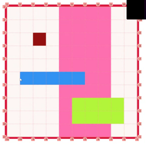
grid-template-areas
-영역에 대한 별칭 부여
<main>
    <div class="a"></div>
    <div class="b"></div>
    <div class="c"></div>
    <div class="d"></div>
    <div class="e"></div>
</main>

<style>
    main {
        display: grid;
        grid-template-areas:
            "apple apple berry"
            "curry dice  berry"
            "curry elice elice";

        grid-template-columns: 80px 160px 120px;
        grid-template-rows: 160px 80px 30px;

        width: max-content;
        border: 5px solid dimgray;
    }
    .a {
        grid-area: apple;
        background-color: crimson;
    }
    .b {
        grid-area: berry;
        background-color: dodgerblue;
    }
    .c {
        grid-area: curry;
        background-color:tomato;
    }
    .d {
        grid-area: dice;
        background-color:aqua;
    }
    .e {
        grid-area: elice;
        background-color:olivedrab;
    }
</style>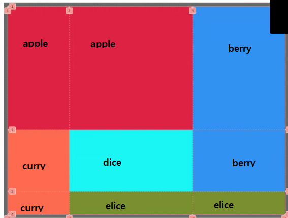
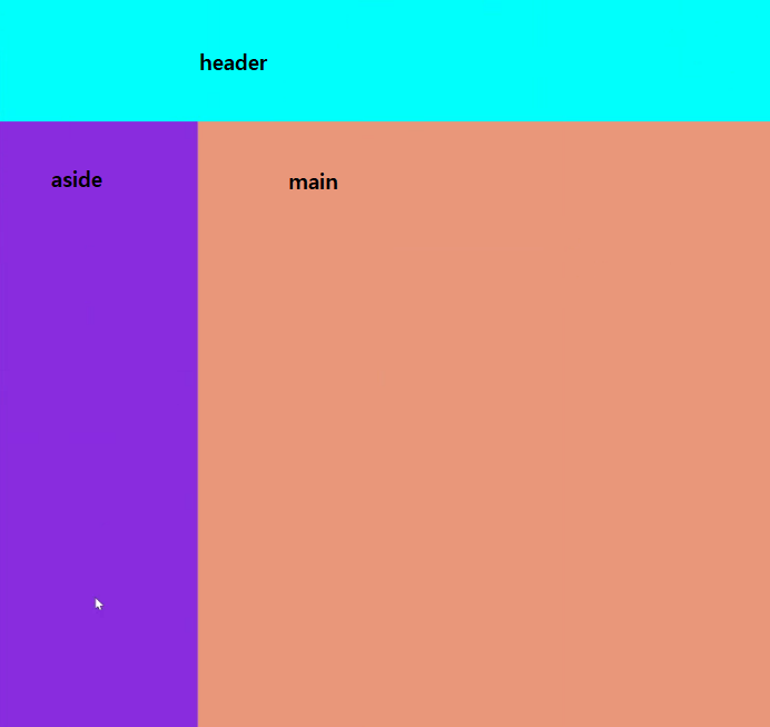
3단 레이아웃 구현
<body>
    <header></header>
    <aside></aside>
    <main></main>
</body>

<style>
    body {
        margin: 0;
        padding: 0;

        display: grid;
        grid-template-areas:
            "header header"
            "aside  main";

        grid-template-columns: 200px 100%;
        grid-template-rows: 100px 500px;
    }
    header {
        grid-area: header;
        background-color: aqua;
    }
    aside {
        grid-area: aside;
        background-color: blueviolet;
    }
    main {
        grid-area: main;
        background-color: darksalmon;
    }
</style>
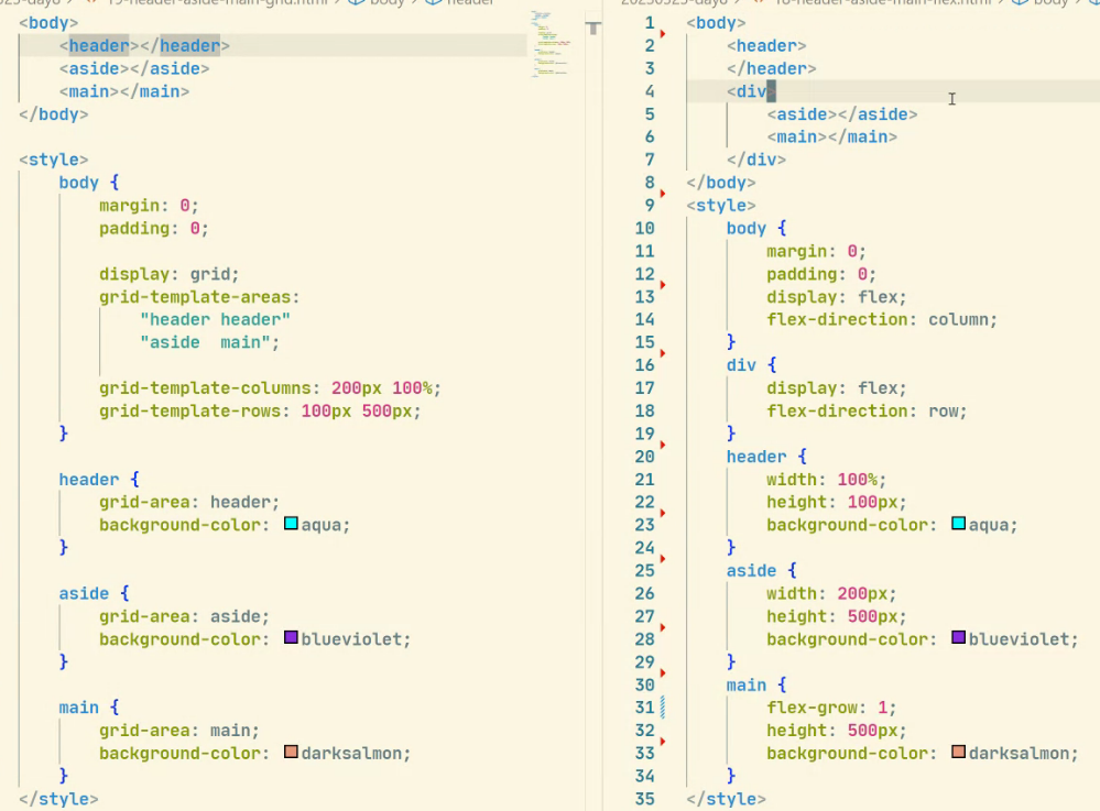
grid는 레이아웃에 특화되어 있으므로 semantic 하게 문서를 구성할 수 있음.
3단 레이아웃의 구조 변형
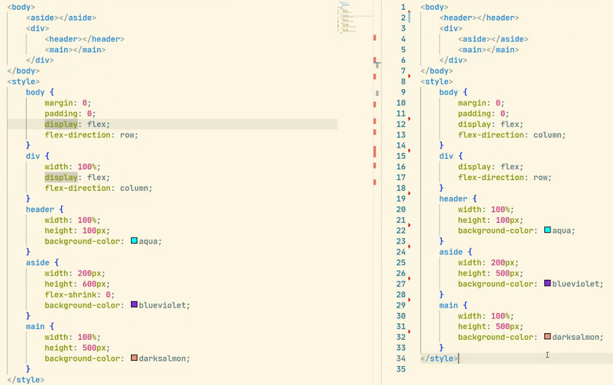
레이아웃의 변경은 flexbox를 썼을 때 non-semantic한 요소들의 수정까지 해야하기 때문에 시간이 더 걸리게 된다.
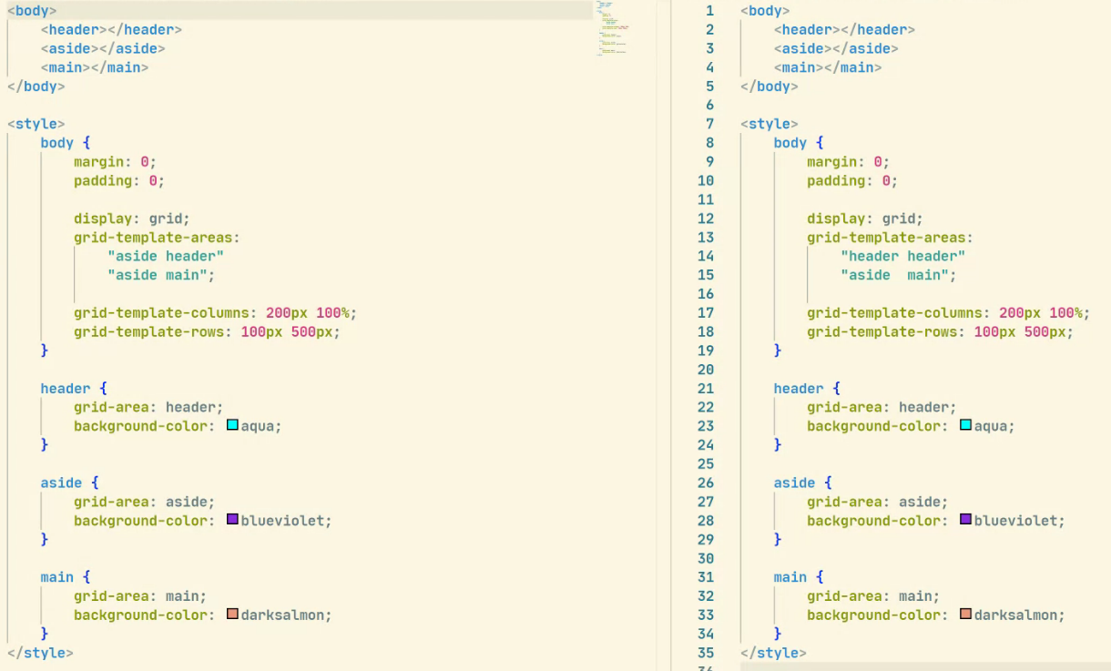
grid는 쉽게 수정이 가능하다.
