시각화 라이브러리 통합하기
Gradio는 다양한 파이썬 시각화 라이브러리인 Matplotlib, Bokeh, Plotly 등을 사용하여 데이터 시각화를 쉽게 할 수 있는 Plot output component를 제공한다.
Matplotlib과 Seaborn을 Gradio에서 사용하기
Gradio에서 Seaborn 또는 Matplotlib을 사용하여 데이터를 시각화하는 방법은 동일하다.
Matplotlib의 경우 matplotlib.plot()을 사용하고, Seaborn의 경우 seaborn.plot()을 사용한다.
Matplotlib
import gradio as gr
from math import log
import matplotlib
matplotlib.use('Agg')
import matplotlib.pyplot as plt
import numpy as np
import pandas as pd


def gdp_change(r, year, country, smoothen):
    years = ['1850', '1900', '1950', '2000', '2050']
    m = years.index(year)
    start_day = 10* m
    final_day = 10* (m + 1)
    x = np.arange(start_day, final_day + 1)
    pop_count = {"USA": 350, "Canada": 40, "Mexico": 300, "UK": 120}
    if smoothen:
        r = log(r)
    df = pd.DataFrame({'day': x})
    df[country] = ( x ** (r) * (pop_count[country] + 1))
    fig = plt.figure()
    plt.plot(df['day'], df[country].to_numpy(), label = country)
    plt.title("GDP in " + year)
    plt.ylabel("GDP (Millions)")
    plt.xlabel("Population Change since 1800")
    plt.grid()
    return fig

inputs = [
        gr.Slider(1, 4, 3.2, label="R"),
        gr.Dropdown(['1850', '1900', '1950', '2000', '2050'], label="Year"),
        gr.Radio(["USA", "Canada", "Mexico", "UK"], label="Countries", ),
        gr.Checkbox(label="Log of GDP Growth Rate?"),
    ]
outputs = gr.Plot()

demo = gr.Interface(fn=gdp_change, inputs=inputs, outputs=outputs)

demo.launch()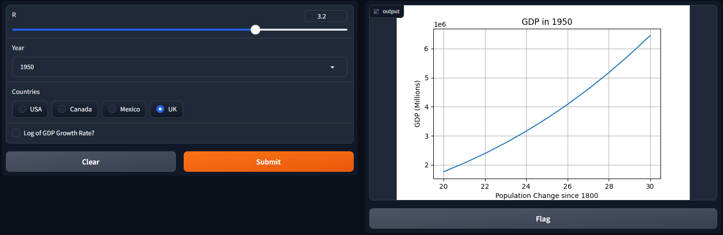
Seaborn
Seaborn은 Matplotlib과 동일한 문법을 따른다.
먼저, 플로팅 함수 인터페이스를 정의하고 차트를 출력한다.
# pip install seaborn
import seaborn as sns

def gdp_change(r, year, country, smoothen):
    years = ['1850', '1900', '1950', '2000', '2050']
    m = years.index(year)
    start_day = 10* m
    final_day = 10* (m + 1)
    x = np.arange(start_day, final_day + 1)
    pop_count = {"USA": 350, "Canada": 40, "Mexico": 300, "UK": 120}
    if smoothen:
        r = log(r)
    df = pd.DataFrame({'day': x})
    df[country] = ( x ** (r) * (pop_count[country] + 1))
    fig = plt.figure()
    sns.lineplot(x = df['day'], y = df[country].to_numpy())
    plt.title("GDP in " + year)
    plt.ylabel("GDP (Millions)")
    plt.xlabel("Population Change since 1800")
    plt.grid()
    return fig

inputs = [
        gr.Slider(1, 4, 3.2, label="R"),
        gr.Dropdown(['1850', '1900', '1950', '2000', '2050'], label="year"),
        gr.Radio(["USA", "Canada", "Mexico", "UK"], label="Countries", ),
        gr.Checkbox(label="Log of GDP Growth Rate?"),
    ]
outputs = gr.Plot()

demo = gr.Interface(fn=gdp_change, inputs=inputs, outputs=outputs)

demo.launch()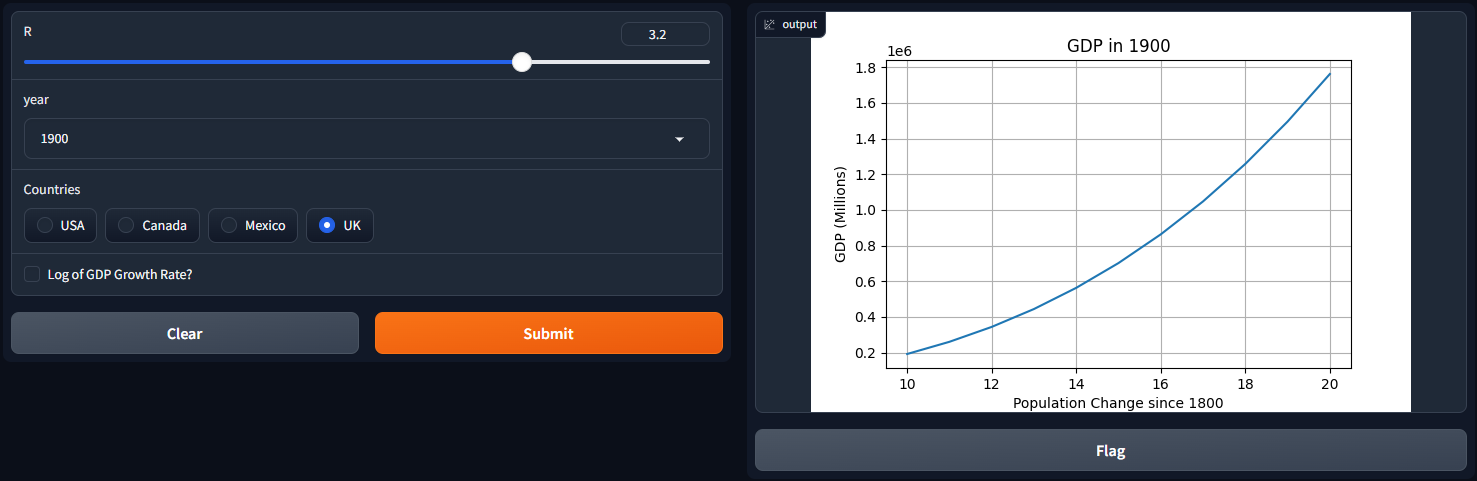
Gradio에서 Plotly 통합하기
gdp_change(...) 함수에서 plotly 시각화 객체를 정의하고, 이를 gradio.Plot()에 전달한다.
import gradio as gr
from math import log
import matplotlib
matplotlib.use('Agg')
import matplotlib.pyplot as plt
import numpy as np
import plotly.express as px
import pandas as pd

def gdp_change(r, year, country, smoothen):
    years = ['1850', '1900', '1950', '2000', '2050']
    m = years.index(year)
    start_day = 10* m
    final_day = 10* (m + 1)
    x = np.arange(start_day, final_day + 1)
    pop_count = {"USA": 350, "Canada": 40, "Mexico": 300, "UK": 120}
    if smoothen:
        r = log(r)
    df = pd.DataFrame({'day': x})
    df[country] = ( x ** (r) * (pop_count[country] + 1))
    fig = px.line(df, x='day', y=df[country].to_numpy())
    fig.update_layout(title="GDP in " + year,
                yaxis_title="GDP",
                xaxis_title="Population change since 1800s")
    return fig

inputs = [
        gr.Slider(1, 4, 3.2, label="R"),
        gr.Dropdown(['1850', '1900', '1950', '2000', '2050'], label="year"),
        gr.Radio(["USA", "Canada", "Mexico", "UK"], label="Countries", ),
        gr.Checkbox(label="Log of GDP Growth Rate?"),
    ]
outputs = gr.Plot()

demo = gr.Interface(fn=gdp_change, inputs=inputs, outputs=outputs)

demo.launch()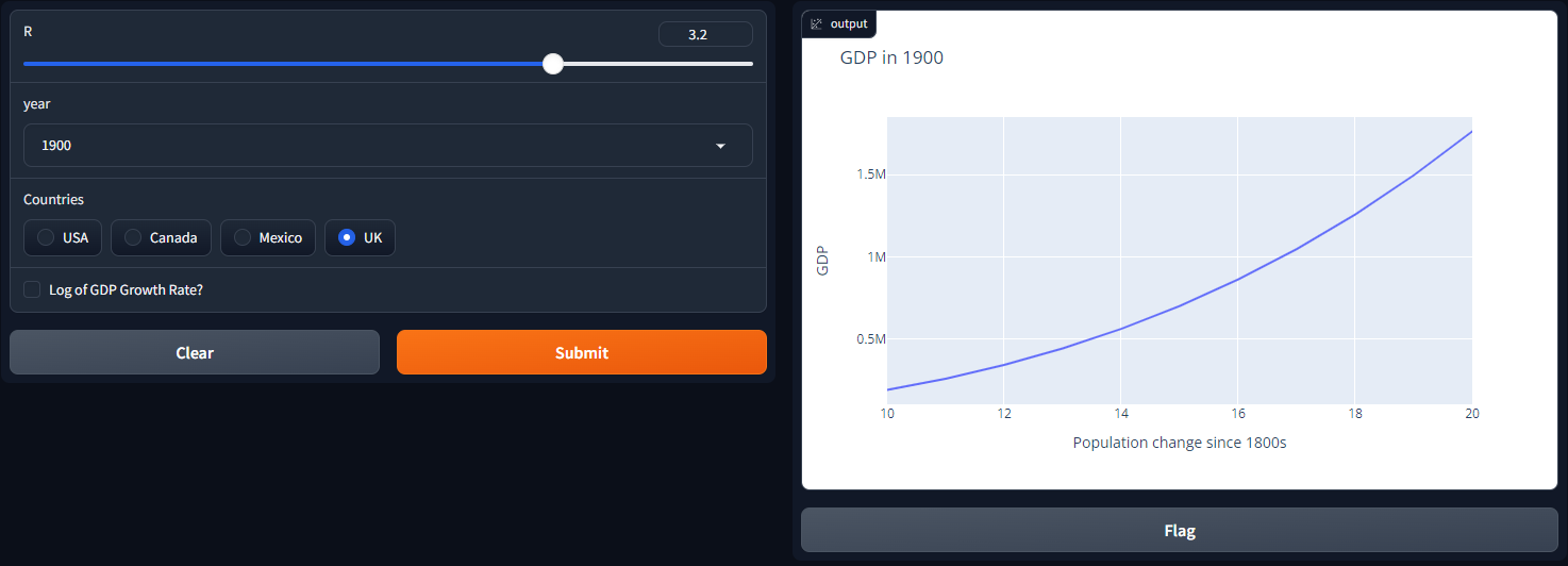
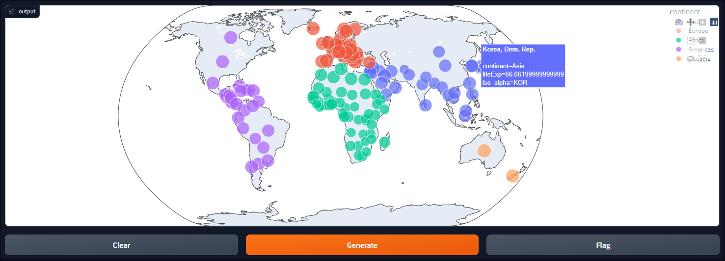
Gradio로 지도 시각화하기
Plotly 또는 Seaborn과 같은 패키지를 사용하여 생성한 지도 객체도 gradio.Plot()을 사용하여 시각화할 수 있다.
import plotly.express as px
import pandas as pd
def map_plot():
  # 지도 요소 정의
    df = px.data.gapminder().query("year==2002")
    fig = px.scatter_geo(df, locations="iso_alpha", color="continent",
                        hover_name="country", size="lifeExp",
                        projection="natural earth")
    return fig
outputs = gr.Plot()

demo = gr.Interface(fn=map_plot, inputs=None, outputs=outputs)

demo.launch()