@charset
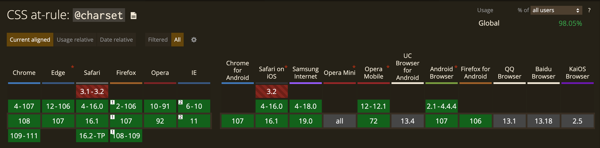
문자 인코딩 방식을 지정한다. 스타일 시트의 첫 번째 요소여야 한다.
@charset "UTF-8";       /* 스타일 시트의 인코딩을 Unicode UTF-8로 설정 */
@charset 'iso-8859-15'; /* 스타일 시트의 인코딩을 Latin-9 (서유럽어, euro sign 있는) 로 설정 */
@charset "UTF-8";      /* X, at-규칙 앞에 문자(공백)가 있음 */
@charset UTF-8;         /* X, ' 또는 " 없는 문자집합 CSS <string> (en-US)이 아님 */
@media
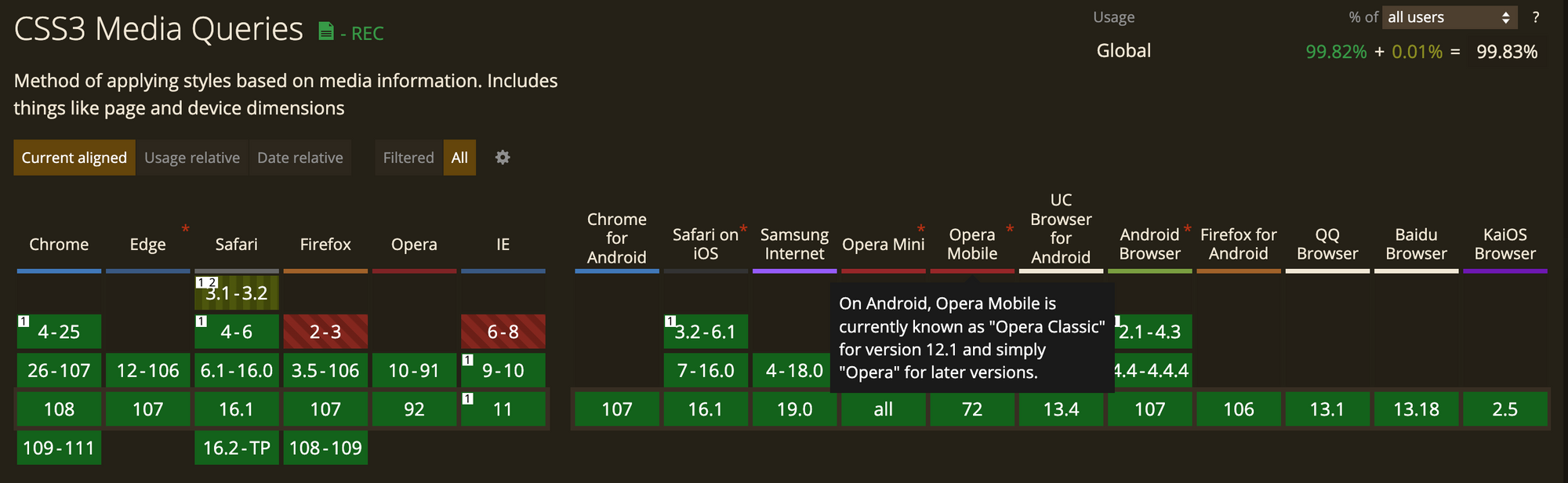
반응형 웹
- 브라우저 사이즈, 디바이스에 따라 설정이 가능
@media only screen and (min-width: 480px) {
	body{font-size:14px;}
}

@media only screen and (min-width: 768px) {
	body{font-size:16px;}
}
레티나 대응
- 2배수, 3배수 설정 가능
// 이미지 스프라이트 작업 시 1.5배짜리로 작업 필요
@media
only screen and (-webkit-min-device-pixel-ratio:1.5),
only screen and (min-device-pixel-ratio:1.5),
only screen and (min-resolution:1.5dppx){
    .img_kabang{background-image:url($imgUrl/m640/img_kabang_180104.png);-webkit-background-size:130px 125px;background-size:130px 125px}
}

// 이미지 스프라이트 작업 시 2배짜리로 작업 필요
@media
only screen and (-webkit-min-device-pixel-ratio:2),
only screen and (min-device-pixel-ratio:2),
only screen and (min-resolution:2dppx){
    .img_kabang{background-image:url($imgUrl/m640/img_kabang_180104.png);-webkit-background-size:130px 125px;background-size:130px 125px}
}
가로모드 | 세로 모드
- 세로 모드: Portrait(포트레이트) 모드
- 가로 모드: Landscape(랜드스케이프) 모드
@media (orientation: portrait) {
	/* Portrait 모드일 때 적용할 CSS */
}

@media (orientation: landscape) {
	/* Landscape 모드일 때 적용할 CSS */
}
프린트 인쇄하는 경우
@media print {
    body {
        font-size: 12pt;
    }
}
@supports
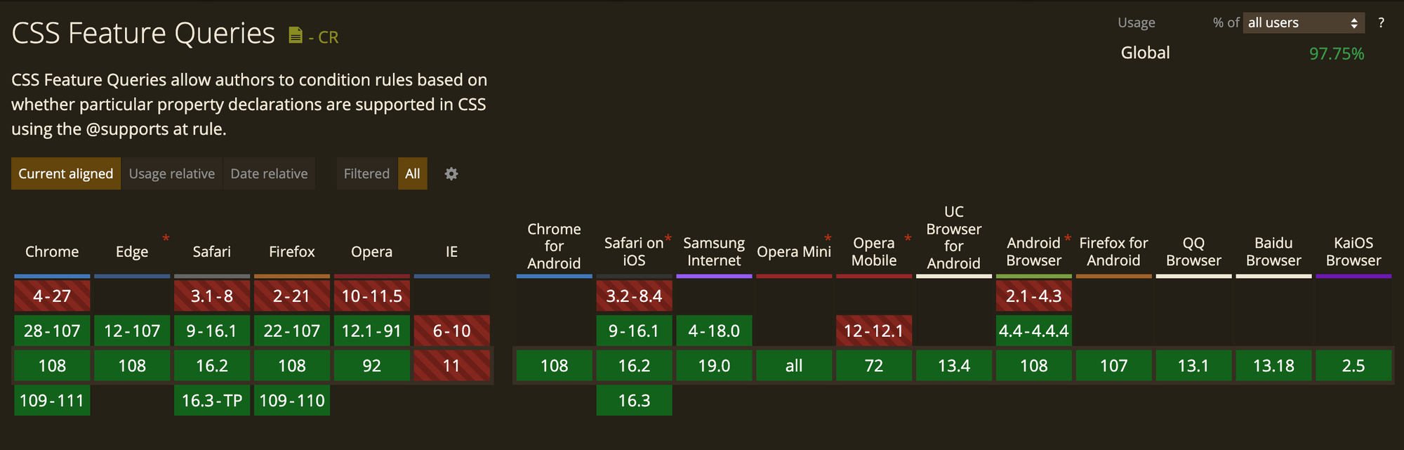
IE 지원 안함
주어진 하나 이상의 css 기능을 브라우저가 지원하는지에 따라서 다른 스타일을 선언할 수 있다.
기능 쿼리 (feature query)라고 부른다.
@support는 스타일의 최상위 단계, 또는 다른 조건부 그룹 규칙에 중첩해 위치할 수 있다.
@supports (display: grid){
	div{
		display: grid;
	}
}

@supports not (display: grid) {
  div {
    float: right;
  }
}

@supports (transform:rotate(45deg)) or (-webkit-transform:rotate(45deg)){
  .box{transform:rotate(45deg);}
}

@supports selector(A > B){
  .contents > .box {background:#000;}
}

@supports not ((text-align-last: justify) or (-moz-text-align-last: justify) ){
    … /* text-align-last: justify를 대체할 CSS */
}

/* 사용자 정의 지원 여부 판별 */
@supports (--foo: green) {
  body {
    color: var(--varName);
  }
}
응용
not - ( ) 안의 스타일을 지원하지 않는 브라우저인 경우 하위 스타일을 적용한다.
and / or - 모두 참, ~중 에 참인 경우로 조건을 줘서 CSS값을 적용할 수 있다.
selector (A > B){ } - 특정 선택자를 지원하는지 분별하고 스타일을 적용한다.
선택자 지원 여부 판별
/* :is()를 지원하지 않는 브라우저에서는 무시함 */
:is(ul, ol) > li {
  … /* :is() 선택자를 지원할 때 적용할 CSS */
}

@supports not selector(:is(a, b)) {
  /* :is()를 지원하지 않을 때 대체할 CSS */
  ul > li,
  ol > li {
    … /* :is()를 지원하지 않을 때 적용할 CSS */
  }
}
Reference
@supports - CSS: Cascading Style Sheets | MDN
@keyframes
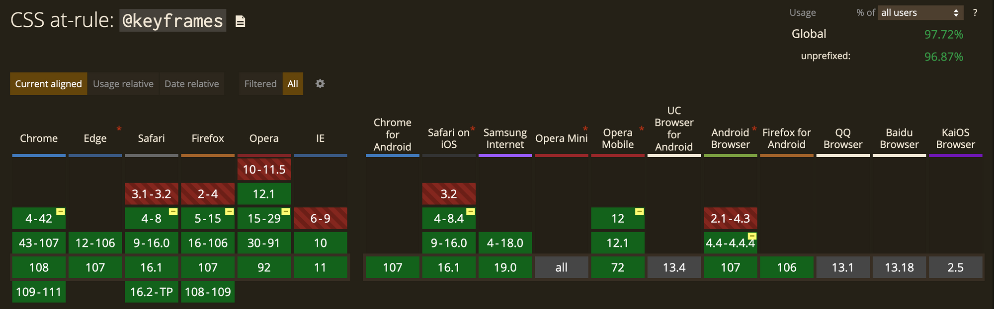
애니메이션 중간 중간의 분기를 설정함으로써 중간 절차를 제어할 수 있게 한다.
@keyframes slidein {
  from {
    margin-left: 100%;
    width: 300%;
  }

  to {
    margin-left: 0%;
    width: 100%;
  }
}

@keyframes identifier {
  0% { top: 0; left: 0; }
  30% { top: 50px; }
  68%, 72% { left: 50px; }
  100% { top: 100px; left: 100%; }
}
@font-face
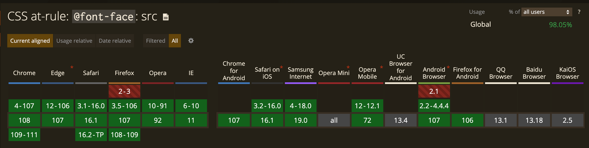
웹 페이지의 텍스트에 온라인 폰트를 적용할 수 있다.
@font-face {
  font-family: MyHelvetica;
  src: local("Helvetica Neue Bold"),
  local("HelveticaNeue-Bold"),
  url(MgOpenModernaBold.ttf);
  font-weight: bold;
}
@nest
모든 브라우저 지원 안함
부모 상속해서 겹쳐서 선언하는 경우 유용하게 사용할 수 있는 스타일
nav { }
nav ul { }
nav ul li { }

nav {
	// style

	& ul {
		// style

		& li {
			// style
		}
	}
}

.foo{
	color: red;
	@nest :not(&) {
		color: blue;
	}
}

// 위 내용은 아래오 같이 변환된다.
.foo{
	color: red
}

:not(.foo){
	color: blue;
}
@scope
모든 브라우저 지원 안함
스타일 범위를 지정하거나 자신만의 버블로 분리할 수 있다.
 @scope (header){
	.title {
		font-size: 14px;
	}
	nav{
		display: flex;
	}
}

@scope (aside){
	.title {
		font-size: 28px;
	}
	nav{
		display: grid;
	}
}
@scope (.dark-theme){
.title {
color: white;
}
nav{
background: black;
}
}
@scope (.light-theme){
.title {
color: black;
}
nav{
background: white;
}
}
@scope (.purple-theme){
.title {
color: black;
}
nav{
background: white;
}}
}@container
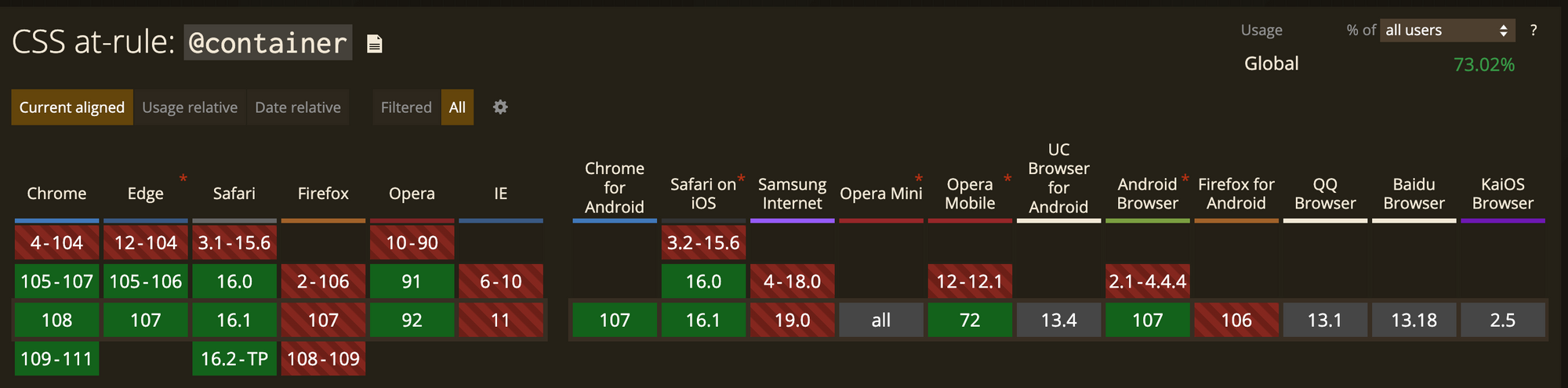
CSS요소는 전체 페이지의 넓이 변경에만 대응할 수 있었는데, 이제는 부모에도 대응할 수 있다.
header {
	container-type: inline-size;
	container-name: header-container;
}

@container header-container (min-width: 600px) {
	nav {
		display: flex;
	}
}
@custom-media
@custom-media로 원하는 변수를 설정하고, 이를 미디어쿼리에서 적용할 수 있다.
// 변수 설정
@custom-media --darkMode (prefers-color-sheme: dark);
@custom-media --lightMode (prefers-color-sheme: light);
@custom-media --landscape (orientation: landscape);
@custom-media --portrait (orientation: portrait);
@custom-media --iPhone (max-device-width: 480px);

// 미디어쿼리 적용
@media(--darkMode) and (--portrait) and (--iPhone) {
	body {
		//...
	}
}

@media (--lightMode) and (--portrait) and (--iPhone) {
	body{
		// ...
	}
}
이것저것 정리하는 공간