html 뼈대를 작성한 것에 css를 붙여 디자인을 붙인다.
부트스트랩 npm 사용 대신 링크만 가져와서 사용한다.
💡 start BootStrap
<head> 태그에는 아래 meta와 link태그 두 줄을,
<body> 태그 가장 아래줄에는 아래의 script 태그를 추가한다.
  <head>
    <meta name="viewport" content="width=device-width, initial-scale=1">
    <link href="https://cdn.jsdelivr.net/npm/bootstrap@5.3.0-alpha1/dist/css/bootstrap.min.css" rel="stylesheet" integrity="sha384-GLhlTQ8iRABdZLl6O3oVMWSktQOp6b7In1Zl3/Jr59b6EGGoI1aFkw7cmDA6j6gD" crossorigin="anonymous">
  </head>

  <body>
    <script src="https://cdn.jsdelivr.net/npm/bootstrap@5.3.0-alpha1/dist/js/bootstrap.bundle.min.js" integrity="sha384-w76AqPfDkMBDXo30jS1Sgez6pr3x5MlQ1ZAGC+nuZB+EYdgRZgiwxhTBTkF7CXvN" crossorigin="anonymous"></script>
  </body>
</html>
Bootdey - Bootstrap을 활용한 더 예쁜 디자인
Bootdey.com
위 사이트에서 검색을 통해 다양한 기능들의 디자인을 참고할 수 있다.
💡 게시판 페이지

search bar
https://www.bootdey.com/snippets/view/General-Search-Results
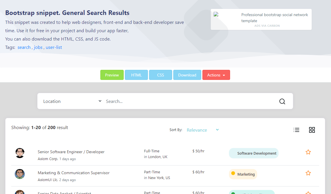
위 사이트의 searh bar 디자인을 활용하여 html을 작성한다.
📢 부트스트랩을 적용하려면 main 태그에 class="container 을 꼭 작성해야 한다.
<main class="container">
        <!--    search bar  -->
        <div class="row">
            <div class="card card-margin search-form">
                <div class="card-body p-0">
                    <form id="card search-form">
                        <div class="row">
                            <div class="col-12">
                                <div class="row no-gutters">
                                    <div class="col-lg-3 col-md-3 col-sm-12 p-0">
                                        <label for="search-type" hidden>검색 유형</label>
                                        <select class="form-control" id="search-type">
                                            <option>제목</option>
                                            <option>본문</option>
                                            <option>id</option>
                                            <option>닉네임</option>
                                            <option>해시태그</option>
                                        </select>
                                    </div>
                                    <div class="col-lg-8 col-md-6 col-sm-12 p-0">
                                        <label for="search-value" hidden>검색어</label>
                                        <input type="text" placeholder="검색어..." class="form-control" id="search-value"
                                               name="search-value">
                                    </div>
                                    <div class="col-lg-1 col-md-3 col-sm-12 p-0">
                                        <button type="submit" class="btn btn-base">
                                            <svg xmlns="http://www.w3.org/2000/svg" width="24" height="24"
                                                 viewBox="0 0 24 24" fill="none" stroke="currentColor" stroke-width="2"
                                                 stroke-linecap="round" stroke-linejoin="round"
                                                 class="feather feather-search">
                                                <circle cx="11" cy="11" r="8"></circle>
                                                <line x1="21" y1="21" x2="16.65" y2="16.65"></line>
                                            </svg>
                                        </button>
                                    </div>
                                </div>
                            </div>
                        </div>
                    </form>
                </div>
            </div>
        </div>
search bar - css
스프링 부트의 css와 js 파일은 기본적으로 resources>static 폴더에 css와 js 폴더를 만들어 관리한다.
html에서 css파일을 link태그로 불러오는 코드를 추가한다.
<link rel="stylesheet" href="/css/search-bar.css">-> searchbar.css
 /* 검색창 */
.search-form {
    width: 80%;
    margin: 0 auto;
    margin-top: 1rem;
}

.search-form input {
    height: 100%;
    background: transparent;
    border: 0;
    display: block;
    width: 100%;
    padding: 1rem;
    height: 100%;
    font-size: 1rem;
}

.search-form select {
    background: transparent;
    border: 0;
    padding: 1rem;
    height: 100%;
    font-size: 1rem;
}

.search-form select:focus {
    border: 0;
}

.search-form button {
    height: 100%;
    width: 100%;
    font-size: 1rem;
}

.search-form button svg {
    width: 24px;
    height: 24px;
}

.card-margin {
    margin-bottom: 1.875rem;
}

@media (min-width: 992px) {
    .col-lg-2 {
        flex: 0 0 16.66667%;
        max-width: 16.66667%;
    }
}

.card {
    border: 0;
    box-shadow: 0px 0px 10px 0px rgba(82, 63, 105, 0.1);
    -webkit-box-shadow: 0px 0px 10px 0px rgba(82, 63, 105, 0.1);
    -moz-box-shadow: 0px 0px 10px 0px rgba(82, 63, 105, 0.1);
    -ms-box-shadow: 0px 0px 10px 0px rgba(82, 63, 105, 0.1);
}
.card {
    position: relative;
    display: flex;
    flex-direction: column;
    min-width: 0;
    word-wrap: break-word;
    background-color: #ffffff;
    background-clip: border-box;
    border: 1px solid #e6e4e9;
    border-radius: 8px;
}
table
기존의 html은 그대로 두고 table 태그에 <table class="table"> 으로 클래스명 table을 추가하여 bootstrap의 table디자인을 참고하도록 한다.
또한 테이블의 간격은 bootstrap의 class=col으로 설정한다.
<tr>
                <th class="col-6">제목</th>
                <th class="col-2">해시태그</th>
                <th class="col">작성자</th>
                <th class="col">작성일</th>
            </tr>
pagination (nav bar)
https://getbootstrap.com/docs/5.2/components/pagination/
위 링크를 참고해 작성했다.
ul태그에 justify-content-center 를 붙여 가운데로 정렬했다.
<nav aria-label="Page navigation example">
            <ul class="pagination justify-content-center" >
                <li class="page-item"><a class="page-link" href="#">Previous</a></li>
                <li class="page-item"><a class="page-link" href="#">1</a></li>
                <li class="page-item"><a class="page-link" href="#">2</a></li>
                <li class="page-item"><a class="page-link" href="#">3</a></li>
                <li class="page-item"><a class="page-link" href="#">Next</a></li>
            </ul>
        </nav>
header와 footer
header

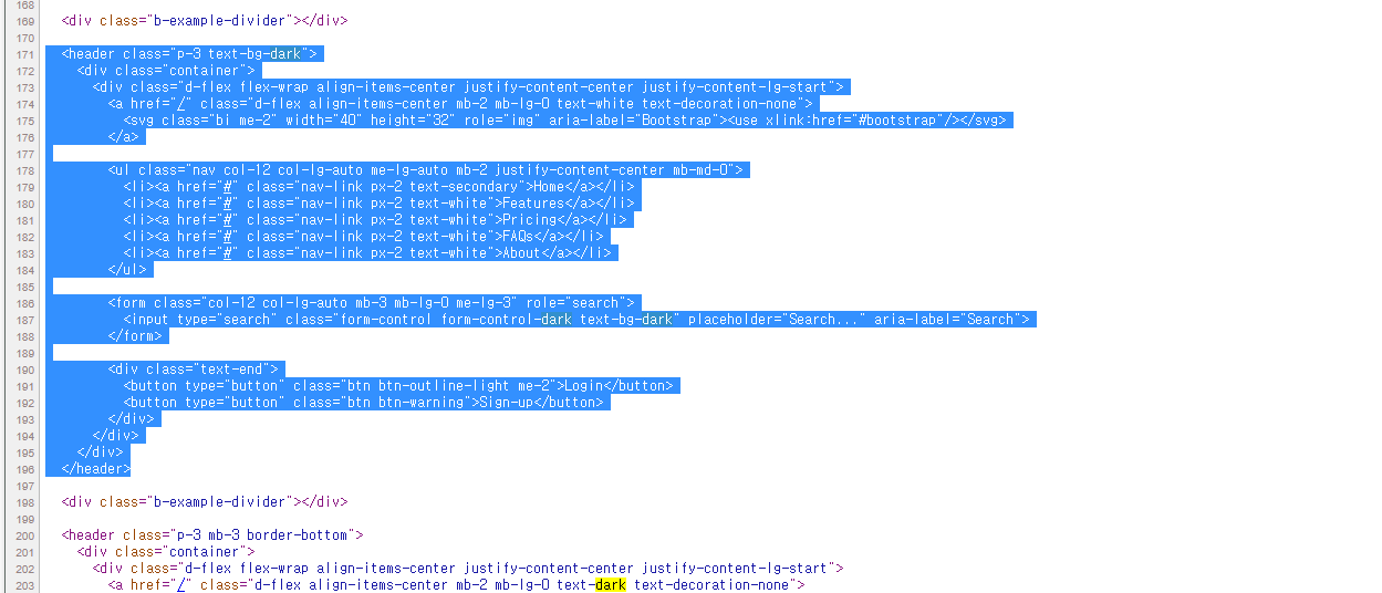
페이지 소스보기를 통해 4번째 컨테이너인 검은색 헤더바를 참고한다.
따로 분리한 header.html 파일에 아래의 코드를 작성한다.
<header class="p-3 bg-dark text-white">
        <div class="container">
            <div class="d-flex flex-wrap align-items-center justify-content-center justify-content-lg-start">
                <ul class="nav col-12 col-lg-auto me-lg-auto mb-2 justify-content-center mb-md-0">
                    <li><a href="/" class="nav-link px-2 text-secondary">Home</a></li>
                </ul>

                <div class="text-end">
                    <button type="button" class="btn btn-outline-light me-2">Login</button>
                    <button type="button" class="btn btn-warning">Sign-up</button>
                </div>
            </div>
        </div>
    </header>
footer

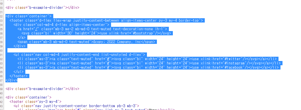
페이지 소스보기를 통해 2번째 푸터를를 참고한다.
따로 분리한 footer.html 파일에 아래의 코드를 작성한다.
<footer class="container d-flex flex-wrap justify-content-between align-items-center py-3 my-4 border-top">
<p class="col-md-4 mb-0 text-muted">© 2022 FastCampus, Inc</p>
<ul class="nav col-md-4 justify-content-end">
<li class="nav-item"><a href="/" class="nav-link px-2 text-muted">Home</a></li>
</ul>
</footer>💡 게시글 페이지 (datail page)
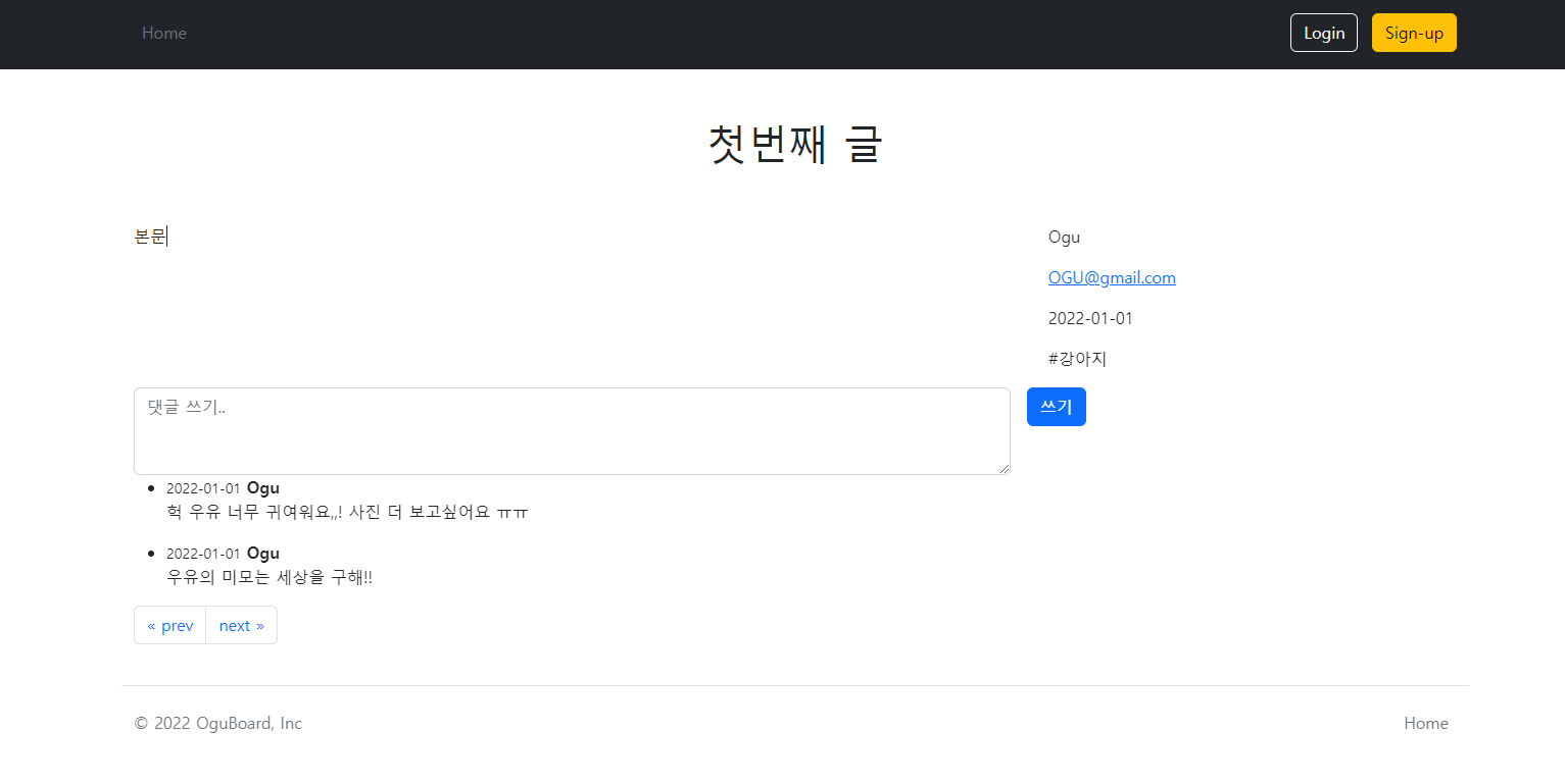
제목 밑에 본문이 있고, 본문 옆에는 작성자, 작성일, 글 관련 정보가 있다.
본문 하단에는 댓글 입력 란과 댓글 목록들이 보인다.
위 작업과 마찬가지로 head태그에 bootstrap 관련 태그들과 body태그 마지막에 에 js 코드를 추가한다.
<main class="container">
<header class="py-5 text-center">
<h1>첫번째 글</h1>
</header>
<div class="row g-5">
<section class="col-md-5 col-lg-4 order-md-last">
<aside>
<p><span class="nick-name">Ogu</span></p>
<p><a class="u-url" rel="me" href="mailto:djkehh@gmail.com">OGU@gmail.com</a></p>
<p><time datetime="2022-01-01T00:00:00">2022-01-01</time></p>
<p>#강아지</p>
</aside>
</section>
<article class="col-md-7 col-lg-8">
<p>본문<br><br></p>
</article>
</div>
<div class="row g-5">
<section>
<form class="row g-3">
<div class="col-8">
<label for="comment-textbox" hidden>댓글</label>
<textarea class="form-control" id="comment-textbox" placeholder="댓글 쓰기.." rows="3"></textarea>
</div>
<div class="col-auto">
<label for="comment-submit" hidden>댓글 쓰기</label>
<button class="btn btn-primary" id="comment-submit" type="submit">쓰기</button>
</div>
</form>
<ul>
<li>
<div>
<time><small>2022-01-01</small></time>
<strong>Ogu</strong>
<p>
헉 우유 너무 귀여워요,,!
사진 더 보고싶어요 ㅠㅠ
</p>
</div>
</li>
<li>
<div>
<time><small>2022-01-01</small></time>
<strong>Ogu</strong>
<p>
우유의 미모는 세상을 구해!!
</p>
</div>
</li>
</ul>
</section>
</div>
<div class="row g-5">
<nav aria-label="Page navigation example">
<ul class="pagination">
<li class="page-item">
<a class="page-link" href="#" aria-label="Previous">
<span aria-hidden="true">« prev</span>
</a>
</li>
<li class="page-item">
<a class="page-link" href="#" aria-label="Next">
<span aria-hidden="true">next »</span>
</a>
</li>
</ul>
</nav>
</div>
</main>