JavaScript
POFO 클론코딩 + 반응형
결과
반응형 결과
HTML
<body>
<ul id="skip">
<li><a href="#header">헤더 바로가기</a></li>
<li><a href="#nav">메뉴 바로가기</a></li>
<li><a href="#main">내용 바로가기</a></li>
</ul>
<div id="wrap">
<header id="header">
<div class="container">
<div class="header_inner">
<div class="left-box">
<h1><a href="#" title="logo"><img src="./img/logo.png" alt="logo"></a></h1>
</div>
<div class="right-box">
<nav id="nav">
<ul>
<li>
<a href="#" title="HOME">home <i class="mian-menu-deco"></i></a>
<div class="sub sub1">
<ul>
<li>
<dl>
<dt><a href="#">CLASSIC HOMEPAGES</a></dt>
<dd><a href="#">Classic Corporate</a></dd>
<dd><a href="#">Classic Digital Agency</a></dd>
<dd><a href="#">Classic Innovation Agency</a></dd>
<dd><a href="#">Classic Web Agency</a></dd>
<dd><a href="#">Classic One Page</a></dd>
<dd><a href="#">Classic Start Up</a></dd>
<dt><a href="#">Classic Interactive Agency</a></dt>
<dd><a href="#">Classic Business</a></dd>
<dd><a href="#">Classic Shop</a></dd>
</dl>
</li>
<li>
<dl>
<dt><a href="#">CREATIVE HOMEPAGES</a></dt>
<dd><a href="#">Creative Studio</a></dd>
<dd><a href="#">Creative Business</a></dd>
<dd><a href="#">Creative Simple Portfolio</a></dd>
<dd><a href="#">Creative Branding Agency</a></dd>
<dd><a href="#">Creative Minimalist Portfolio</a></dd>
<dd><a href="#">Creative Small Business</a></dd>
<dd><a href="#">Creative Designer</a></dd>
<dd><a href="#">Creative Agency</a></dd>
</dl>
</li>
<li>
<dl>
<dt><a href="#">PORTFOLIO HOMEPAGES</a></dt>
<dd><a href="#">Portfolio Minimal</a></dd>
<dd><a href="#">Portfolio Multiple Carousel</a></dd>
<dd><a href="#">Portfolio Centered Slides</a></dd>
<dd><a href="#">Portfolio Personal</a></dd>
<dd><a href="#">Portfolio Metro</a></dd>
<dd><a href="#">Portfolio Full Screen – Vertical</a></dd>
<dd><a href="#">Portfolio Photographer</a></dd>
<dd><a href="#">Portfolio Parallax</a></dd>
</dl>
</li>
<li>
<dl>
<dt><a href="#">BLOG HOMEPAGES</a></dt>
<dd><a href="#">Blog Grid</a></dd>
<dd><a href="#">Blog Masonry</a></dd>
<dd><a href="#">Blog Clean</a></dd>
<dd><a href="#">Blog Personal</a></dd>
</dl>
</li>
</ul>
</div>
</li>
<li>
<a href="#" title="pages">pages <i class="mian-menu-deco"></i></a>
<div class="sub sub2 sub24">
<ul>
<li>
<a href="#" class="sub-btn">About<i class="fa fa-angle-right"></i></a>
<div class="sub-sub sub-sub1">
<ul>
<li><a href="#">About Us Simple</a></li>
<li><a href="#">About Us Classic</a></li>
<li><a href="#">About Us Modern</a></li>
<li><a href="#">About Me</a></li>
</ul>
</div>
</li>
<li>
<a href="#" class="sub-btn">Services<i class="fa fa-angle-right"></i></a>
<div class="sub-sub sub-sub2">
<ul>
<li><a href="#">Services Simple</a></li>
<li><a href="#">Services Classic</a></li>
<li><a href="#">Services Modern</a></li>
</ul>
</div>
</li>
<li>
<a href="#" class="sub-btn">Contact<i class="fa fa-angle-right"></i></a>
<div class="sub-sub sub-sub3">
<ul>
<li><a href="#">Contact Simple</a></li>
<li><a href="#">Contact Classic</a></li>
<li><a href="#">Contact Classic – Style 02</a></li>
<li><a href="#">Contact Modern</a></li>
</ul>
</div>
</li>
<li>
<a href="#" class="sub-btn">Team<i class="fa fa-angle-right"></i></a>
<div class="sub-sub sub-sub4">
<ul>
<li><a href="#">Team Simple</a></li>
<li><a href="#">Team Classic</a></li>
</ul>
</div>
</li>
<li>
<a href="#" class="sub-btn">Addition Pages<i class="fa fa-angle-right"></i></a>
<div class="sub-sub sub-sub5">
<ul>
<li><a href="#">Our Clients</a></li>
<li><a href="#">Error 404</a></li>
<li><a href="#">Coming Soon</a></li>
<li><a href="#">Coming Soon – Style 02</a></li>
<li><a href="#">Faq</a></li>
<li><a href="#">Maintenance</a></li>
<li><a href="#">Search Result</a></li>
<li><a href="#">Pricing</a></li>
</ul>
</div>
</li>
</ul>
</div>
</li>
<li>
<a href="#" title="portfolio">portfolio <i class="mian-menu-deco"></i></a>
<div class="sub sub3">
<ul>
<li>
<dl>
<dt><a href="#">GRID – FULL WIDTH LAYOUTS</a></dt>
<dd><a href="#">Portfolio Grid Overlay</a></dd>
<dd><a href="#">Portfolio Grid With Icon</a></dd>
<dd><a href="#">Portfolio Grid Transform</a></dd>
<dd><a href="#">Portfolio Grid Zooming</a></dd>
<dt><a href="#">MASONRY – FULL WIDTH LAYOUTS</a></dt>
<dd><a href="#">Portfolio Masonry Overlay</a></dd>
<dd><a href="#">Portfolio Masonry With Icon</a></dd>
<dt><a href="#">METRO – FULL WIDTH LAYOUTS</a></dt>
<dd><a href="#">Portfolio Metro Overlay</a></dd>
<dd><a href="#">Portfolio Metro With Icon</a></dd>
<dd><a href="#">Portfolio Metro Transform</a></dd>
<dd><a href="#">Portfolio Metro Zooming</a></dd>
<dt><a href="#">OTHER – FULL WIDTH LAYOUTS</a></dt>
<dd><a href="#">Portfolio Image Gallery</a></dd>
<dd><a href="#">Portfolio Justified</a></dd>
<dd><a href="#">Portfolio Carousel</a></dd>
<dd><a href="#">Portfolio Parallax</a></dd>
</dl>
</li>
<li>
<dl>
<dt><a href="#">GRID – BOXED LAYOUTS</a></dt>
<dd><a href="#">Portfolio Grid Overlay</a></dd>
<dd><a href="#">Portfolio Grid With Icon</a></dd>
<dd><a href="#">Portfolio Grid Transform</a></dd>
<dd><a href="#">Portfolio Grid Zooming</a></dd>
<dt><a href="#">MASONRY – BOXED LAYOUTS</a></dt>
<dd><a href="#">Portfolio Masonry Overlay</a></dd>
<dd><a href="#">Portfolio Masonry With Icon</a></dd>
<dt><a href="#">METRO – BOXED LAYOUTS</a></dt>
<dd><a href="#">Portfolio Metro Overlay</a></dd>
<dd><a href="#">Portfolio Metro With Icon</a></dd>
<dd><a href="#">Portfolio Metro Transform</a></dd>
<dd><a href="#">Portfolio Metro Zooming</a></dd>
<dt><a href="#">OTHER – BOXED LAYOUTS</a></dt>
<dd><a href="#">Portfolio Image Gallery</a></dd>
<dd><a href="#">Portfolio Justified</a></dd>
<dd><a href="#">Portfolio Carousel</a></dd>
<dd><a href="#">Portfolio Parallax</a></dd>
</dl>
</li>
<li>
<dl>
<dt><a href="#">SINGLE PROJECT PAGE</a></dt>
<dd><a href="#">Single Project Page 01</a></dd>
<dd><a href="#">Single Project Page 02</a></dd>
<dd><a href="#">Single Project Page 03</a></dd>
<dd><a href="#">Single Project Page 04</a></dd>
<dd><a href="#">Single Project Page 05</a></dd>
<dd><a href="#">Single Project Page 06</a></dd>
<dd><a href="#">Single Project Page 07</a></dd>
<dd><a href="#">Single Project Page 08</a></dd>
<dt><a href="#">PORTFOLIO COLUMNS</a></dt>
<dd><a href="#">Portfolio Two Columns</a></dd>
<dd><a href="#">Portfolio Three Columns</a></dd>
<dd><a href="#">Portfolio Four Columns</a></dd>
<dd><a href="#">Portfolio Five Columns</a></dd>
</dl>
</li>
<li>
<dl>
<dt><a href="#"><img src="./img/menu-banner-01.jpg" alt=""></a></dt>
<dd><img src="./img/menu-banner-02.jpg" alt=""></dd>
</dl>
</li>
</ul>
</div>
</li>
<li>
<a href="#" title="blog">blog <i class="mian-menu-deco"></i></a>
<div class="sub sub4 sub24">
<ul>
<li>
<a href="#" class="sub-btn">Blog Standard<i class="fa fa-angle-right"></i></a>
<div class="sub-sub sub-sub1">
<ul>
<li><a href="#">Blog Standard – Full Width</a></li>
<li><a href="#">Blog Standard With Left Sidebar</a></li>
<li><a href="#">Blog Standard With Right Sidebar</a></li>
</ul>
</div>
</li>
<li>
<a href="#" class="sub-btn">Blog Classic<i class="fa fa-angle-right"></i></a>
<div class="sub-sub sub-sub2">
<ul>
<li><a href="#">Services Simple</a></li>
<li><a href="#">Services Classic</a></li>
<li><a href="#">Services Modern</a></li>
</ul>
</div>
</li>
<li>
<a href="#" class="sub-btn">Blog List<i class="fa fa-angle-right"></i></a>
<div class="sub-sub sub-sub3">
<ul>
<li><a href="#">Contact Simple</a></li>
<li><a href="#">Contact Classic</a></li>
<li><a href="#">Contact Classic – Style 02</a></li>
<li><a href="#">Contact Modern</a></li>
</ul>
</div>
</li>
<li>
<a href="#" class="sub-btn">Blog Grid<i class="fa fa-angle-right"></i></a>
<div class="sub-sub sub-sub4">
<ul>
<li><a href="#">Team Simple</a></li>
<li><a href="#">Team Classic</a></li>
</ul>
</div>
</li>
<li>
<a href="#" class="sub-btn">Blog Masonary<i class="fa fa-angle-right"></i></a>
<div class="sub-sub sub-sub5">
<ul>
<li><a href="#">Our Clients</a></li>
<li><a href="#">Error 404</a></li>
<li><a href="#">Coming Soon</a></li>
<li><a href="#">Coming Soon – Style 02</a></li>
<li><a href="#">Faq</a></li>
<li><a href="#">Maintenance</a></li>
<li><a href="#">Search Result</a></li>
<li><a href="#">Pricing</a></li>
</ul>
</div>
</li>
<li>
<a href="#" class="sub-btn">Blog Simple<i class="fa fa-angle-right"></i></a>
<div class="sub-sub sub-sub6">
<ul>
<li><a href="#">Our Clients</a></li>
<li><a href="#">Error 404</a></li>
<li><a href="#">Coming Soon</a></li>
<li><a href="#">Coming Soon – Style 02</a></li>
<li><a href="#">Faq</a></li>
<li><a href="#">Maintenance</a></li>
<li><a href="#">Search Result</a></li>
<li><a href="#">Pricing</a></li>
</ul>
</div>
</li>
<li>
<a href="#" class="sub-btn">Blog Clean<i class="fa fa-angle-right"></i></a>
<div class="sub-sub sub-sub7">
<ul>
<li><a href="#">Our Clients</a></li>
<li><a href="#">Error 404</a></li>
<li><a href="#">Coming Soon</a></li>
<li><a href="#">Coming Soon – Style 02</a></li>
<li><a href="#">Faq</a></li>
<li><a href="#">Maintenance</a></li>
<li><a href="#">Search Result</a></li>
<li><a href="#">Pricing</a></li>
</ul>
</div>
</li>
<li>
<a href="#" class="sub-btn">Blog Images<i class="fa fa-angle-right"></i></a>
<div class="sub-sub sub-sub8">
<ul>
<li><a href="#">Our Clients</a></li>
<li><a href="#">Error 404</a></li>
<li><a href="#">Coming Soon</a></li>
<li><a href="#">Coming Soon – Style 02</a></li>
<li><a href="#">Faq</a></li>
<li><a href="#">Maintenance</a></li>
<li><a href="#">Search Result</a></li>
<li><a href="#">Pricing</a></li>
</ul>
</div>
</li>
<li>
<a href="#" class="sub-btn">Blog Only Text<i class="fa fa-angle-right"></i></a>
<div class="sub-sub sub-sub9">
<ul>
<li><a href="#">Our Clients</a></li>
<li><a href="#">Error 404</a></li>
<li><a href="#">Coming Soon</a></li>
<li><a href="#">Coming Soon – Style 02</a></li>
<li><a href="#">Faq</a></li>
<li><a href="#">Maintenance</a></li>
<li><a href="#">Search Result</a></li>
<li><a href="#">Pricing</a></li>
</ul>
</div>
</li>
<li>
<a href="#" class="sub-btn">Post Layout<i class="fa fa-angle-right"></i></a>
<div class="sub-sub sub-sub10">
<ul>
<li><a href="#">Our Clients</a></li>
<li><a href="#">Error 404</a></li>
<li><a href="#">Coming Soon</a></li>
<li><a href="#">Coming Soon – Style 02</a></li>
<li><a href="#">Faq</a></li>
<li><a href="#">Maintenance</a></li>
<li><a href="#">Search Result</a></li>
<li><a href="#">Pricing</a></li>
</ul>
</div>
</li>
<li>
<a href="#" class="sub-btn">Post Type<i class="fa fa-angle-right"></i></a>
<div class="sub-sub sub-sub11">
<ul>
<li><a href="#">Our Clients</a></li>
<li><a href="#">Error 404</a></li>
<li><a href="#">Coming Soon</a></li>
<li><a href="#">Coming Soon – Style 02</a></li>
<li><a href="#">Faq</a></li>
<li><a href="#">Maintenance</a></li>
<li><a href="#">Search Result</a></li>
<li><a href="#">Pricing</a></li>
</ul>
</div>
</li>
</ul>
</div>
</li>
<li>
<a href="#" title="elements">elements <i class="mian-menu-deco"></i></a>
<div class="sub sub5">
<ul>
<li>
<dl>
<dt><a href="#">CLASSIC HOMEPAGES</a></dt>
<dd><a href="#">Classic Corporate</a></dd>
<dd><a href="#">Classic Digital Agency</a></dd>
<dd><a href="#">Classic Innovation Agency</a></dd>
<dd><a href="#">Classic Web Agency</a></dd>
<dd><a href="#">Classic One Page</a></dd>
<dd><a href="#">Classic Start Up</a></dd>
<dt><a href="#">Classic Interactive Agency</a></dt>
<dd><a href="#">Classic Business</a></dd>
<dd><a href="#">Classic Shop</a></dd>
</dl>
</li>
<li>
<dl>
<dt><a href="#">CREATIVE HOMEPAGES</a></dt>
<dd><a href="#">Creative Studio</a></dd>
<dd><a href="#">Creative Business</a></dd>
<dd><a href="#">Creative Simple Portfolio</a></dd>
<dd><a href="#">Creative Branding Agency</a></dd>
<dd><a href="#">Creative Minimalist Portfolio</a></dd>
<dd><a href="#">Creative Small Business</a></dd>
<dd><a href="#">Creative Designer</a></dd>
<dd><a href="#">Creative Agency</a></dd>
</dl>
</li>
<li>
<dl>
<dt><a href="#">PORTFOLIO HOMEPAGES</a></dt>
<dd><a href="#">Portfolio Minimal</a></dd>
<dd><a href="#">Portfolio Multiple Carousel</a></dd>
<dd><a href="#">Portfolio Centered Slides</a></dd>
<dd><a href="#">Portfolio Personal</a></dd>
<dd><a href="#">Portfolio Metro</a></dd>
<dd><a href="#">Portfolio Full Screen – Vertical</a></dd>
<dd><a href="#">Portfolio Photographer</a></dd>
<dd><a href="#">Portfolio Parallax</a></dd>
</dl>
</li>
<li>
<dl>
<dt><a href="#">BLOG HOMEPAGES</a></dt>
<dd><a href="#">Blog Grid</a></dd>
<dd><a href="#">Blog Masonry</a></dd>
<dd><a href="#">Blog Clean</a></dd>
<dd><a href="#">Blog Personal</a></dd>
</dl>
</li>
</ul>
</div>
</li>
<li>
<a href="#" title="features">features <i class="mian-menu-deco"></i></a>
<div class="sub sub6">
<ul>
<li>
<dl>
<dt><a href="#">CLASSIC HOMEPAGES</a></dt>
<dd><a href="#">Classic Corporate</a></dd>
<dd><a href="#">Classic Digital Agency</a></dd>
<dd><a href="#">Classic Innovation Agency</a></dd>
<dd><a href="#">Classic Web Agency</a></dd>
<dd><a href="#">Classic One Page</a></dd>
<dd><a href="#">Classic Start Up</a></dd>
<dt><a href="#">Classic Interactive Agency</a></dt>
<dd><a href="#">Classic Business</a></dd>
<dd><a href="#">Classic Shop</a></dd>
</dl>
</li>
<li>
<dl>
<dt><a href="#">CREATIVE HOMEPAGES</a></dt>
<dd><a href="#">Creative Studio</a></dd>
<dd><a href="#">Creative Business</a></dd>
<dd><a href="#">Creative Simple Portfolio</a></dd>
<dd><a href="#">Creative Branding Agency</a></dd>
<dd><a href="#">Creative Minimalist Portfolio</a></dd>
<dd><a href="#">Creative Small Business</a></dd>
<dd><a href="#">Creative Designer</a></dd>
<dd><a href="#">Creative Agency</a></dd>
</dl>
</li>
<li>
<dl>
<dt><a href="#">PORTFOLIO HOMEPAGES</a></dt>
<dd><a href="#">Portfolio Minimal</a></dd>
<dd><a href="#">Portfolio Multiple Carousel</a></dd>
<dd><a href="#">Portfolio Centered Slides</a></dd>
<dd><a href="#">Portfolio Personal</a></dd>
<dd><a href="#">Portfolio Metro</a></dd>
<dd><a href="#">Portfolio Full Screen – Vertical</a></dd>
<dd><a href="#">Portfolio Photographer</a></dd>
<dd><a href="#">Portfolio Parallax</a></dd>
</dl>
</li>
<li>
<dl>
<dt><a href="#">BLOG HOMEPAGES</a></dt>
<dd><a href="#">Blog Grid</a></dd>
<dd><a href="#">Blog Masonry</a></dd>
<dd><a href="#">Blog Clean</a></dd>
<dd><a href="#">Blog Personal</a></dd>
</dl>
</li>
</ul>
</div>
</li>
</ul>
</nav>
<aside id="aside">
<span><i></i></span>
<span><a href="#" title="search"><i class="fas fa-search"></i></a></span>
<span><i></i></span>
<span><a href="#" class="cart" title="cart"><i class="fas fa-shopping-cart"></i></a></span>
</aside>
</div>
<div class="mobile">
<div class="mobile-menu">
<i class="fas fa-bars"></i>
<nav class="mobile-nav">
<ul>
<li><a href="#" title="HOME">home <i class="mian-menu-deco"></i></a></li>
<li><a href="#" title="pages">pages <i class="mian-menu-deco"></i></a></li>
<li><a href="#" title="portfolio">portfolio <i class="mian-menu-deco"></i></a></li>
<li><a href="#" title="blog">blog <i class="mian-menu-deco"></i></a></li>
<li><a href="#" title="elements">elements <i class="mian-menu-deco"></i></a></li>
<li><a href="#" title="features">features <i class="mian-menu-deco"></i></a></li>
</ul>
</nav>
</div>
</div>
</div>
</div>
</header>
<main id="main">
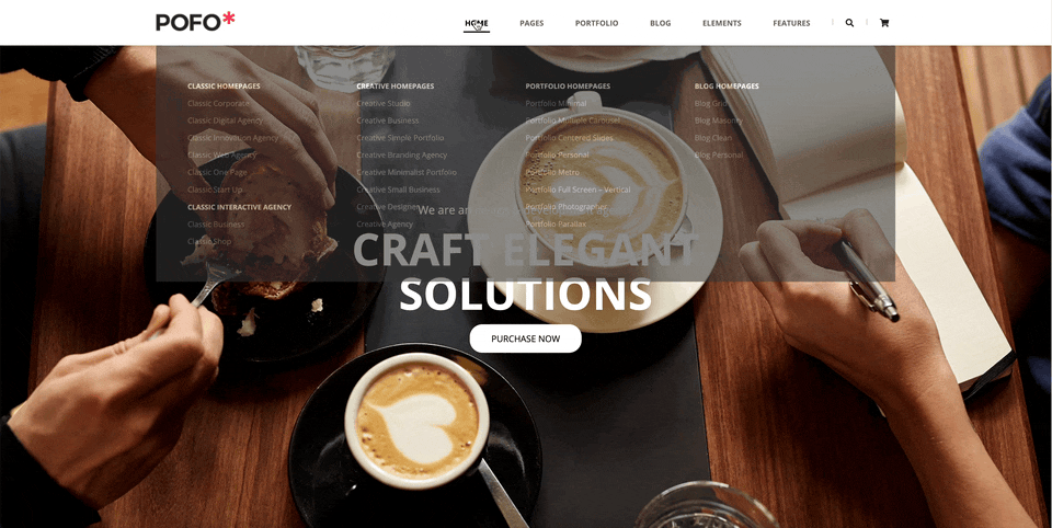
<div class="section1">
<div class="slide-container">
<ul>
<li>
<a href="#">
<img src="./img/homepage-5-slider-img-1-1.jpg" alt="mainslide">
</a>
<div class="title-box">
<div class="title">
<h3>We are an design & development agency</h3>
<h2>CRAFT ELEGANT<br>SOLUTIONS</h2>
<span><a href="#">Purchase Now</a></span>
</div>
</div>
</li>
<li>
<a href="#">
<img src="./img/homepage-5-slider-img-2-1.jpg" alt="mainslide">
</a>
<div class="title-box">
<div class="title">
<h3>we combine design, thinking and technical craft</h3>
<h2>CRAFTING DIGITAL<br> EXPERIENCES</h2>
<span><a href="#">Purchase Now</a></span>
</div>
</div>
</li>
<li>
<a href="#">
<img src="./img/homepage-5-slider-img-3-1.jpg" alt="mainslide">
</a>
<div class="title-box">
<div class="title">
<h3>We are a design studio that believe in the ideas</h3>
<h2>HIGHLY CREATIVE<br>SOLUTIONS</h2>
<span><a href="#">Purchase Now</a></span>
</div>
</div>
</li>
</ul>
</div>
</div>
<div class="section2">
<div class="container">
<div class="setction2-wrap">
<div class="title">
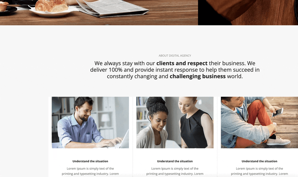
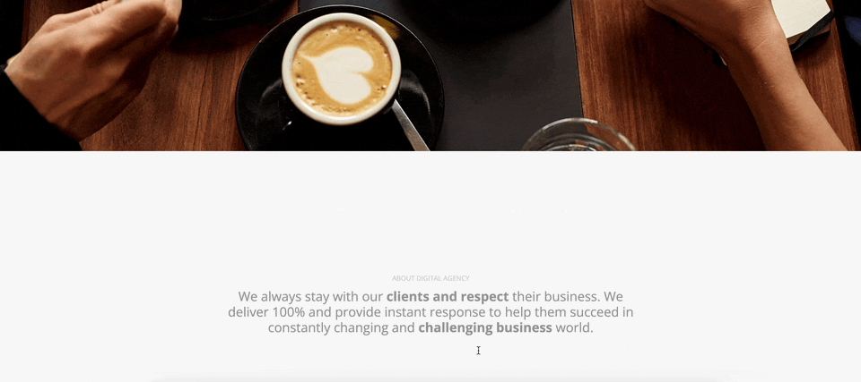
<h2>ABOUT DIGITAL AGENCY</h2>
<h3>
We always stay with our <strong>clients and respect</strong> their business. We <br>
deliver 100% and provide instant response to help them succeed in <br>
constantly changing and <strong>challenging business</strong> world.
</h3>
</div>
<div class="content">
<ul>
<li>
<div class="column-wrap">
<div class="img-box">
<img src="./img/latest-blog5.jpg" alt="blog">
</div>
<div class="text-box">
<div class="text-content">
<h4>Understand the situation</h4>
<p>Lorem Ipsum is simply text of the printing and typesetting industry. Lorem Ipsum has been standard dummy.</p>
<span><a href="#">Ecplore services <i class="fa fa-angle-right"></i></a></span>
</div>
</div>
</div>
</li>
<li>
<div class="column-wrap">
<div class="img-box">
<img src="./img/latest-blog6.jpg" alt="blog">
</div>
<div class="text-box">
<div class="text-content">
<h4>Understand the situation</h4>
<p>Lorem Ipsum is simply text of the printing and typesetting industry. Lorem Ipsum has been standard dummy.</p>
<span><a href="#">Ecplore services <i class="fa fa-angle-right"></i></a></span>
</div>
</div>
</div>
</li>
<li>
<div class="column-wrap">
<div class="img-box">
<img src="./img/latest-blog7.jpg" alt="blog">
</div>
<div class="text-box">
<div class="text-content">
<h4>Understand the situation</h4>
<p>Lorem Ipsum is simply text of the printing and typesetting industry. Lorem Ipsum has been standard dummy.</p>
<span><a href="#">Ecplore services <i class="fa fa-angle-right"></i></a></span>
</div>
</div>
</div>
</li>
</ul>
</div>
</div>
</div>
</div>
<div class="section3">
<div class="container">
<div class="setction3-wrap">
<div class="title">
<h2>WHY CHOOSE US?</h2>
<h3>
We are delivering beautiful <br>
digital products for you
</h3>
</div>
<div class="content">
<ul>
<li>
<div class="column-wrap">
<div class="text-box">
<h4><i class="fas fa-desktop"></i></h4>
<h5>Unique Design</h5>
<p>Lorem Ipsum is simply text of the printing and typesetting industry. Lorem Ipsum has been standard dummy.</p>
</div>
</div>
</li>
<li>
<div class="column-wrap">
<div class="text-box">
<h4><i class="fas fa-ambulance"></i></h4>
<h5>Different Layout</h5>
<p>Lorem Ipsum is simply text of the printing and typesetting industry. Lorem Ipsum has been standard dummy.</p>
</div>
</div>
</li>
<li>
<div class="column-wrap">
<div class="text-box">
<h4><i class="fas fa-laptop"></i></h4>
<h5>Portfolio Styles</h5>
<p>Lorem Ipsum is simply text of the printing and typesetting industry. Lorem Ipsum has been standard dummy.</p>
</div>
</div>
</li>
<li>
<div class="column-wrap">
<div class="text-box">
<h4><i class="fas fa-bullseye"></i></h4>
<h5>WordPress Theme</h5>
<p>Lorem Ipsum is simply text of the printing and typesetting industry. Lorem Ipsum has been standard dummy.</p>
</div>
</div>
</li>
</ul>
</div>
</div>
</div>
</div>
<div class="section4">
<div class="container">
<div class="sec4-wrap">
<div class="title">
<div>
<ul>
<li><a href="javascript:void(0);" class="gallery-btn">ALL</a></li>
<li><a href="javascript:void(0);" class="gallery-btn">BROCHURE</a></li>
<li><a href="javascript:void(0);" class="gallery-btn">BRANDING</a></li>
<li><a href="javascript:void(0);" class="gallery-btn">IDENTITY</a></li>
<li><a href="javascript:void(0);" class="gallery-btn">WEB</a></li>
<li><a href="javascript:void(0);" class="gallery-btn">PHOTOGRAPHY</a></li>
</ul>
</div>
</div>
<div class="content">
<ul class="gallery">
<li>
<div class="img-wrap"><a href="#" class="img-btn"><img src="./img/portfolio-item20.jpg.webp" alt=""></a></div>
</li>
<li>
<div class="img-wrap"><a href="#" class="img-btn"><img src="./img/portfolio-item23.jpg.webp" alt=""></a></div>
</li>
<li>
<div class="img-wrap"><a href="#" class="img-btn"><img src="./img/portfolio-item22.jpg.webp" alt=""></a></div>
</li>
<li>
<div class="img-wrap"><a href="#" class="img-btn"><img src="./img/portfolio-item21.jpg.webp" alt=""></a></div>
</li>
<li>
<div class="img-wrap"><a href="#" class="img-btn"><img src="./img/portfolio-item24.jpg.webp" alt=""></a></div>
</li>
<li>
<div class="img-wrap"><a href="#" class="img-btn"><img src="./img/portfolio-item16.jpg.webp" alt=""></a></div>
</li>
<li>
<div class="img-wrap"><a href="#" class="img-btn"><img src="./img/portfolio-item26.jpg.webp" alt=""></a></div>
</li>
<li>
<div class="img-wrap"><a href="#" class="img-btn"><img src="./img/portfolio-item19.jpg.webp" alt=""></a></div>
</li>
</ul>
</div>
</div>
</div>
</div>
</main>
<footer id="footer">
<div class="container">
<div class="gap">
<div class="foot-t">
<div class="foot_t_left">London Based <br /> Creative Studio</div>
<div class="foot_t_center">
<p>
301 The Greenhouse,<br />
Custard Factory, London, E2 8DY.<br />
<a href="#!">sales@domain.com</a> | +44 (0) 123 456 7890
</p>
</div>
<div class="foot_t_right">
<div class="foot-logo"><a href="#!"><img src="./img/logo-white.png" alt="footImg" /></a></div>
<ul class="sns">
<li><a href="#!" title="TWITTER">TWITTER</a></li>
<li><a href="#!" title=" FACEBOOK"> FACEBOOK</a></li>
<li><a href="#!" title=" INSTAGRAM"> INSTAGRAM</a></li>
<li><a href="#!" title=" DRIBBBLE"> DRIBBBLE</a></li>
</ul>
</div>
</div>
<div class="foot-b">
<div class="Concept">POFO - Portfolio Concept Theme</div>
<div class="copy">© 2021 POFO is Proudly Powered by ThemeZaa</div>
</div>
</div>
</div>
</footer>
</div>
</div>
</body>CSS
@charset "utf-8";
@import url('https://fonts.googleapis.com/css2?family=Open+Sans:wght@400;700&display=swap');
body{font-family: 'Open Sans', sans-serif;}
.container{width: 1170px; margin: 0 auto; /* background-color: rgba(0,0,0,.5); */ height: inherit; }
#header{height: 72px; width: 100%; position: fixed; top: 0; left: 0; background: rgba(255,255,255,1); transition: .6s; box-shadow: 0 2px 5px rgba(0,0,0,.15); z-index: 5;}
#header>.container{position: relative;}
#header.addParallaxUp{animation: headerParalaxUp 0.5s ease-in-out forwards;}
@keyframes headerParalaxUp {
    0%{transform: translateY(0px);}
    100%{transform: translateY(-80px);}
}
#header.addParallaxDown72{animation: addParallaxDown72 0.5s ease-in-out forwards;}
@keyframes addParallaxDown72 {
    0%{height: 60px}
    100%{height: 72px;}
}
#header.addParallaxDown60{animation: addParallaxDown60 0.5s ease-in-out forwards;}
@keyframes addParallaxDown60 {
    0%{transform: translateY(-70px); height: 60px;}
    100%{transform: translateY(0);height: 60px;}
}
.header_inner{display: flex; justify-content: space-between; align-items: center; height: 72px; transition: .5s;}
.header_inner .mobile{display: none;}
.header_inner .mobile .mobile-nav{position: absolute; top: 72px; left: 0; width: 100%; display: none;}
.header_inner .mobile .mobile-nav ul li{border-bottom: 1px solid #ddd; background: #333;}
.header_inner .mobile .mobile-nav ul li a{display: block; padding: 20px 10px;text-transform: uppercase; color: rgba(255,255,255,.8)}
.header_inner .right-box{display: flex;}
.header_inner .right-box nav> ul{display: flex;}
.header_inner .right-box nav> ul> li{margin: 0 20px;}
.header_inner .right-box nav> ul> li >a{font-size: 12px; font-weight: 700; color: rgba(0,0,0,.6); position: relative; text-transform: uppercase; padding: 30px 5px}
.header_inner .right-box nav> ul> li a:hover{color: rgba(0,0,0,1); }
.header_inner .right-box nav> ul> li a .mian-menu-deco{display: block; width: 100%; height: 2px; background: #000; position: absolute; bottom: 30%; left: 0; transform: scale(0,1); transition: .3s}
.header_inner .right-box nav> ul> li a:hover .mian-menu-deco{transform: scale(1,1);}
.header_inner .right-box aside{display: flex;}
.header_inner .right-box aside span{margin: 0 10px;}
.header_inner .right-box aside span > i{display: block; width: 1px; height: 10px; background: rgb(187, 187, 187); position: relative; top: 3px}
.header_inner .right-box nav>ul>li >.sub{background: #333; display: none; }
.header_inner .right-box nav>ul>li:hover >.sub{display:block;}
.header_inner .right-box nav>ul>li >.sub>ul{padding: 50px; display: flex;}
.header_inner .right-box nav>ul>li >.sub>ul>li{width: 25%;}
.header_inner .right-box nav>ul>li >.sub>ul>li>dl{line-height: 210%;}
.header_inner .right-box nav>ul>li >.sub>ul>li>dl>dt{width: 100%}
.header_inner .right-box nav>ul>li >.sub>ul>li>dl>dt a:hover{transform: translateX(6px);}
.header_inner .right-box nav>ul>li >.sub>ul>li>dl>dt>a{color: #fff; font-weight: bold; font-size: 11px; text-transform: uppercase; transition: .3s ease-in-out;}
.header_inner .right-box nav>ul>li >.sub>ul>li>dl>dd{width: 100%}
.header_inner .right-box nav>ul>li >.sub>ul>li>dl>dd>a{color: #939393; font-size: 12px;transition: .3s ease-in-out; display: block;}
.header_inner .right-box nav>ul>li >.sub>ul>li>dl>dd>a:hover{transform: translateX(6px); color: #fff}
.header_inner .right-box nav>ul>li >.sub>ul>li>dl img{width: 100%}
.header_inner .right-box nav>ul>li >.sub1,
.header_inner .right-box nav>ul>li >.sub3,
.header_inner .right-box nav>ul>li >.sub5,
.header_inner .right-box nav>ul>li >.sub6
{position: absolute; top: 72px; left:0; width: 100%}
.header_inner .right-box nav>ul>li >.sub24{
    position: absolute; top: 72px;
    width: 225px;
}
.header_inner .right-box nav>ul>li >.sub24>ul{width: 100%; flex-direction: column; padding: 15px 0;}
.header_inner .right-box nav>ul>li >.sub24>ul >li{width: 100%; line-height: 210%;}
.header_inner .right-box nav>ul>li >.sub24>ul >li> a{color: #939393; display: flex; align-items: center; justify-content: space-between; transition: .3s ease-in-out; padding: 0 25px; }
.header_inner .right-box nav>ul>li >.sub24>ul >li> a:hover{text-indent: 6px; color: #fff}
.header_inner .right-box nav>ul>li >.sub24>ul >li> a i{transition: .3s ease-in-out; margin: auto 6px auto auto;}
.header_inner .right-box nav>ul>li >.sub24>ul >li> a:hover i{margin-right: 0;}
.header_inner .right-box nav>ul>li >.sub24>ul >li>.sub-sub {position: absolute; left:100%; top: 0; width: 225px; background: #333;  display: none;}
.header_inner .right-box nav>ul>li >.sub24>ul >li>.sub-sub>ul {padding: 15px 25px; line-height: 210%;}
.header_inner .right-box nav>ul>li >.sub24>ul >li>.sub-sub2 {top:40px}
.header_inner .right-box nav>ul>li >.sub24>ul >li>.sub-sub3 {top:70px}
.header_inner .right-box nav>ul>li >.sub24>ul >li>.sub-sub4 {top:100px}
.header_inner .right-box nav>ul>li >.sub24>ul >li>.sub-sub5 {top:130px}
.header_inner .right-box nav>ul>li >.sub24>ul >li>.sub-sub6 {top:160px}
.header_inner .right-box nav>ul>li >.sub24>ul >li>.sub-sub7 {top:190px}
.header_inner .right-box nav>ul>li >.sub24>ul >li>.sub-sub8 {top:210px}
.header_inner .right-box nav>ul>li >.sub24>ul >li>.sub-sub9 {top:240px}
.header_inner .right-box nav>ul>li >.sub24>ul >li>.sub-sub10 {top:270px}
.header_inner .right-box nav>ul>li >.sub24>ul >li>.sub-sub11 {top:300px}
.header_inner .right-box nav>ul>li >.sub24>ul >li>.sub-sub>ul>li>a {color: #939393}
/* section1 */
.section1{width: 100%; height: 900px; padding-top: 60px;}
.section1 .slide-container{width: 100%; height: 100%; position: relative;  overflow: hidden; }
.section1 .slide-container ul{width: 100%; height: 100%; position: relative;}
.section1 .slide-container ul li{position: absolute; width: 100%; height: 100%; top: 0; left: 100%; z-index: 4;}
.section1 .slide-container ul li:first-child{left:0}
.section1 .slide-container ul li a{display: block; width: 100%; height: 100%}
.section1 .slide-container ul li a img{width: 100%;}
.section1 .slide-container ul li   .title-box{width: 100%; position: absolute; z-index: 6; height: 100%; top: 0; left: 0; text-align: center; }
.section1 .slide-container ul li   .title-box .title{display: flex; align-items: center; justify-content: center; flex-direction: column; height: 100%}
.section1 .slide-container ul li  .title-box .title h3{ color: #fff; font-size: 18px; }
.section1 .slide-container ul li  .title-box .title h2{ color: #fff; font-size: 70px; font-weight: 700; line-height: 100%; padding: 15px 0;}
.section1 .slide-container ul li  .title-box span{display: block;}
.section1 .slide-container ul li  .title-box span>a{ color: #000; display: inline-block; padding: 10px 32px; font-size: 14px; background: #fff; border: 2px solid #fff; text-transform: uppercase; border-radius: 20px; transition: .3s;}
.section1 .slide-container ul li  .title-box span>a:hover{background: transparent; color: #fff}
.title{text-align: center; padding: 0 15px 80px 15px;}
.title h2{color: #939393; padding: 0 0 10px 0;}
.title h3{font-size: 25px; color: #232323; line-height: 120%;}
.content{width: 100%}
.section2 .content  ul{display: flex;}
.section3 .content  ul{display: flex;}
.section2 .content  ul li{flex-basis: 33.333%; margin: 0 2px;}
.section3 .content  ul li{flex-basis: 25%; margin: 0 2px;}
.content  ul li .column-wrap{padding: 0 15px; background: #fff;}
.content  ul li .column-wrap .img-box{width: 100%}
.content  ul li .column-wrap .img-box img{width: 100%; filter: grayscale(0); transition: .3s ease-in-out;}
/* section2 */
.section2{width: 100%; height: auto; background: #f7f7f7; padding: 130px 0; overflow: hidden;}
.setction2-wrap .content  ul li .column-wrap .img-box{width: 100%}
.setction2-wrap .content  ul li .column-wrap .img-box img{width: 100%; filter: grayscale(0); transition: .3s ease-in-out;}
.setction2-wrap .content  ul li .column-wrap .img-box img:hover{filter: grayscale(1); }
.setction2-wrap .content  ul li .column-wrap .text-box{padding: 45px;}
.setction2-wrap .content  ul li .column-wrap .text-box .text-content{width: 100%; text-align: center;}
.setction2-wrap .content  ul li .column-wrap .text-box .text-content h4{color: #232323; padding: 0 0 12px 0; font-weight: bold;}
.setction2-wrap .content  ul li .column-wrap .text-box .text-content p{font-size: 14px; line-height: 170%; color: #6f6f6f;}
.setction2-wrap .content  ul li .column-wrap .text-box .text-content span{padding: 25px  0 0 0; display: block;}
.setction2-wrap .content  ul li .column-wrap .text-box .text-content span a{display: inline-block; height: 39px; text-align: center;line-height: 34px; padding: 0 40px; border: 2px solid #232323; text-transform: uppercase; border-radius: 19.5px; transition: .3s;}
.setction2-wrap .content  ul li .column-wrap .text-box .text-content span a:hover{background: #232323; color: #fff}
.section2.addParallax .setction2-wrap .title{animation: sec2Ani1 1s ease-in-out forwards;}
.section2.addParallax .setction2-wrap .content ul li:nth-child(1){animation: sec2Ani2 1.2s ease-in-out forwards;}
.section2.addParallax .setction2-wrap .content ul li:nth-child(2){animation: sec2Ani3 1.4s ease-in-out forwards;}
.section2.addParallax .setction2-wrap .content ul li:nth-child(3){animation: sec2Ani4 1.6s ease-in-out forwards;}
@keyframes sec2Ani1 {
    0%{transform: translateY(200px); opacity: 0;}
    100%{transform: translateY(0); opacity: 1;}
}
@keyframes sec2Ani2 {
    0%{transform: translateY(1000px); opacity: 0;}
    100%{transform: translateY(0); opacity: 1;}
}
@keyframes sec2Ani3 {
    0%{transform: translateY(1000px); opacity: 0;}
    100%{transform: translateY(0); opacity: 1;}
}
@keyframes sec2Ani4 {
    0%{transform: translateY(1000px); opacity: 0;}
    100%{transform: translateY(0); opacity: 1;}
}
/* section3 */
.section3{width: 100%; height: auto; background: #212121; padding: 130px 0; overflow: hidden;}
.section3 h3{color: #fff; font-weight: bold;}
.section3 .content ul li .column-wrap{
    background-color: #fff;
    padding: 60px 40px;
    text-align: center;
    position: relative;
}
.section3 .content ul li .column-wrap::after{
    content: "";
    display: block;
    position: absolute;
    width: 100%;
    height:.8%;
    left: 0;
    bottom:0;
    background: #ff214f;
    z-index: 1;
    transition: .2s ease-in-out;
}
.section3 .content ul li .column-wrap:hover::after{height: 100%; background: #2f2f2f;}
.section3 .content ul li .column-wrap .text-box{position: relative; z-index: 2;}
.section3 .content ul li .column-wrap .text-box h4{padding: 0 0 25px 0}
.section3 .content ul li .column-wrap .text-box h4 i{font-size: 50px; transition: .2s; color: #ff214f}
.section3 .content ul li .column-wrap:hover .text-box h4 i{ color: #fff}
.section3 .content ul li .column-wrap .text-box h5{font-size: 14px; padding: 0 0 15px 0; font-weight: bold;}
.section3 .content ul li .column-wrap .text-box p{font-size: 14px; color: #6f6f6f; line-height: 170%;}
.section3 .content ul li .column-wrap:hover .text-box p{color: #fff}

.section3.addParallax .content .title{animation: sec3Ani1 1s ease-in-out forwards;}
.section3.addParallax .content ul li:nth-child(1){animation: sec3Ani2 1.2s ease-in-out forwards;}
.section3.addParallax .content ul li:nth-child(2){animation: sec3Ani2 1.4s ease-in-out forwards;}
.section3.addParallax .content ul li:nth-child(3){animation: sec3Ani2 1.6s ease-in-out forwards;}
.section3.addParallax .content ul li:nth-child(4){animation: sec3Ani2 1.8s ease-in-out forwards;}
@keyframes sec3Ani1 {
    0%{transform: translateY(200px); opacity: 0;}
    100%{transform: translateY(0); opacity: 1;}
}
@keyframes sec3Ani2 {
    0%{transform: translateY(1000px); opacity: 0;}
    100%{transform: translateY(0); opacity: 1;}
}
@keyframes sec3Ani3 {
    0%{transform: translateY(1000px); opacity: 0;}
    100%{transform: translateY(0); opacity: 1;}
}
@keyframes sec3Ani4 {
    0%{transform: translateY(1000px); opacity: 0;}
    100%{transform: translateY(0); opacity: 1;}
}
@keyframes sec3Ani5 {
    0%{transform: translateY(1000px); opacity: 0;}
    100%{transform: translateY(0); opacity: 1;}
}
/* section4 */
.section4{width: 100%; background: #fff;}
.section4 .container{width: 100%;}
.section4 .container .sec4-wrap{width: 100%;}
.section4 .container .sec4-wrap .title{padding: 80px 0; text-align: center;}
.section4 .container .sec4-wrap .title div{display: inline-block;}
.section4 .container .sec4-wrap .title div> ul{display: flex;}
.section4 .container .sec4-wrap .title div> ul li{margin: 0 25px;}
.section4 .container .sec4-wrap .title div> ul li a{display: block; padding: 0 0 5px 0; border-bottom: 1px solid transparent; color: #6f6f6f; font-weight: bold;}
.section4 .container .sec4-wrap .title div ul li a:hover,
.section4 .container .sec4-wrap .title div ul li a:focus{border-bottom: 1px solid #6f6f6f;}
.section4 .container .sec4-wrap .content{overflow: hidden; width: 100%}
.section4 .container .sec4-wrap .content .gallery{ width: 100%;height:auto; display: flex; flex-wrap: wrap;}
.section4 .container .sec4-wrap .content .gallery li{flex-basis: 25%; transition: .3s; }
.section4 .container .sec4-wrap .content .gallery li .img-wrap{width: 100%}
.section4 .container .sec4-wrap .content .gallery li .img-wrap .img-btn{width: 100%}
.section4 .container .sec4-wrap .content .gallery li .img-wrap .img-btn img{width: 100%}
/* footer */
#footer{background: #1c1c1c;}
#footer .foot-t{padding: 96px 0 30px 0; border-bottom: 1px solid rgba(255,255,255,.15); display: flex; justify-content: space-between; color: #6f6f6f}
#footer .foot-t .foot_t_left{font-size: 20px;}
#footer .foot-t .foot_t_center{line-height: 150%;}
#footer .foot-t .foot_t_center p a{color: #6f6f6f}
#footer .foot-t .foot_t_center p a:hover{color: red}
#footer .foot-t .foot_t_right .sns{display: flex; margin-top: 20px;}
#footer .foot-t .foot_t_right .sns li{margin-right: 20px;}
#footer .foot-t .foot_t_right .sns li a{color: #6f6f6f; font-size: 12px;}
#footer .foot-b {padding: 50px 0; display: flex; justify-content: space-between;color: #6f6f6f}
@media screen  and (max-width: 1180px){
    .container{width: 100%; padding: 0 20px;}
}
@media screen  and (max-width: 1060px){
    .setction2-wrap .content  ul{flex-direction: column;}
    .setction2-wrap .content  ul li{flex-basis: 100%; margin:5px 0px;}
    .section4 .container .sec4-wrap .content .gallery li{flex-basis: 33.333%; }

}
@media screen  and (max-width: 980px) {
    .content  ul{flex-wrap: wrap; }
    .setction3-wrap .content  ul li{flex-basis: 50%; margin: 0;padding: 5px}
   }
@media screen  and (max-width: 890px){
    .header_inner .right-box aside{display: none;}
    .section4 .container .sec4-wrap .content .gallery li{flex-basis: 50%; }
}
@media screen  and (max-width: 800px){
    .header_inner .mobile{display:block;}
    .header_inner .right-box{display: none;}
	.setction3-wrap .content  ul li{flex-basis: 100%; margin: 0;padding: 5px}
    .section4 .container .sec4-wrap .content .gallery li{flex-basis: 100%; }
}
JavaScript
(function(){
    let Agency={ //메서드 (함수)
        init:function(){
            this.parallax();
            this.header();
            this.section1();
            this.section2();
            this.section3();
            this.section4();
            this.footer();
        },
        parallax:function(){
            const scrollEvent ={
                init:function(){
                    this.header();
                    this.section2();
                    this.section3();
                },
                header:function(){
                    let newScr=$(window).scrollTop();
                    let oldScr=newScr;
                    let result="";
					$(window).scroll(function(){
                        newScr=$(window).scrollTop();
                        result = (newScr-oldScr) > 0 ? 'DOWN': 'UP';
                        if(result=="DOWN"){
                            $('#header').removeClass('addParallaxDown72');
                            $('#header').removeClass('addParallaxDown60');
                            $('#header').addClass('addParallaxUp');
                            $('#header .header_inner').css('height','72px')
                        }
                        if(result=="UP"){
                            $('#header').removeClass('addParallaxUp');
                            $('#header').removeClass('addParallaxDown72');
                            $('#header').addClass('addParallaxDown60');
                            $('#header .header_inner').css('height','60px')

                            if( $(window).scrollTop()==0){
                                $('#header').removeClass('addParallaxDown60');
                                $('#header').addClass('addParallaxDown72');
                                $('#header .header_inner').css('height','72px')
                            }
                        }
                        oldScr=newScr;
                    });
                },
                section2:function(){
                    const titT=$('.section2 .title').offset().top;
                    let winH=$(window).height();
                    let titTop=titT - winH;
					$(window).scroll(function(){
                        if($(window).scrollTop() > titTop){
                            $('.section2').addClass('addParallax');
                        }
                        if($(window).scrollTop() == 0){
                            $('.section2').removeClass('addParallax');
                        }
                    });
                },
                section3:function(){
                    const titT=$('.section3 .title').offset().top;
                    let winH=$(window).height();
                    let titTop=titT - winH;
					$(window).scroll(function(){
                        if($(window).scrollTop() > titTop){
                            $('.section3').addClass('addParallax');
                        }
                        if($(window).scrollTop() == 0){
                            $('.section3').removeClass('addParallax');
                        }
                    });
                }
            }
            scrollEvent.init();
        },
        header:function(){
            $('.fa-bars').click(function(){
                $('.mobile-nav').slideToggle();
            });
            const container=$('#header .container');
            const mainBtn=$('#nav>ul>li>a');
            const sub=$('.sub');
            const subBtn=$('.sub-btn');
            const subSub=$('.sub-sub');
			mainBtn.on({mouseenter: function(){
                sub.stop().fadeOut(0);
                $(this).next().stop().fadeIn(300);
            }});
			subBtn.on({mouseenter: function(){
                subSub.stop().fadeOut(0);
                $(this).next().stop().fadeIn(300);
            }});
			container.on({mouseleave:function(){
                sub.stop().fadeOut(300);
                subSub.stop().fadeOut(300);
            }})
		},
        section1:function(){
            $(window).resize(function(){
                let imgW=$('.slide-container>ul>li');
                imgW.each(function(){
                    let thisImgW=$(this).find('img').width();
                    if(thisImgW<1920){
                        $('.section1').height(thisImgW*0.46);
                    }
               })
            });
			const imgBanner=$('.slide-container>ul>li');
            let seIn;
            let current=0;
			mainSlide();
            function mainSlide(){
                seIn=setInterval(function(){
                    let prev=imgBanner.eq(current);
                    move(prev, 0, '-100%');
                    current++;
                    if(current==imgBanner.size()) current=0;
                    let next=imgBanner.eq(current);
                    move(next, '100%', 0);
                },3000);
            }
			function move(tg, start, end){
                tg.css('left',start).stop().animate({left: end},500);
            }
			$('.slide-container').on({mouseenter:function(){
                clearInterval(seIn)
            }, mouseleave:function(){
                mainSlide();
            }});
        },
        section2:function(){},
        section3:function(){},
        section4:function(){
            let no=0;
            $('.gallery-btn').eq(0).on({
                click:function(){
                    no=0;
                    gallery()
                }
            });
			//hide 20, 22,19
            //show 23,21,24,16,26
            $('.gallery-btn').eq(1).on({
                click:function(){
                no=1;
                gallery()
                }
            });
            //hide 20,19
            //show 23,22,21,24,16,26
            $('.gallery-btn').eq(2).on({
                click:function(){
                    no=2;
                    gallery()
                }
            });
            $('.gallery-btn').eq(3).on({
                click:function(){
                    no=3;
                    gallery()
                }
            });
            $('.gallery-btn').eq(4).on({
                click:function(){
                    no=4;
                    gallery()
                }
            });
            $('.gallery-btn').eq(5).on({
                click:function(){
                    no=5;
                    gallery()
                }
            });
            function gallery(){
                if(no==0){
                    $('.gallery li').eq(0).show();
                    $('.gallery li').eq(1).show();
                    $('.gallery li').eq(2).show();
                    $('.gallery li').eq(3).show();
                    $('.gallery li').eq(4).show();
                    $('.gallery li').eq(5).show();
                    $('.gallery li').eq(6).show();
                    $('.gallery li').eq(7).show();
                }else if(no==1){
                    //0,2,7
                    $('.gallery li').eq(0).hide();
                    $('.gallery li').eq(2).hide();
                    $('.gallery li').eq(7).hide();

                    $('.gallery li').eq(1).show();
                    $('.gallery li').eq(3).show();
                    $('.gallery li').eq(4).show();
                    $('.gallery li').eq(5).show();
                    $('.gallery li').eq(6).show();
                }else if(no==2){
                    //0,7
                    $('.gallery li').eq(0).hide();
                    $('.gallery li').eq(7).hide();
                    $('.gallery li').eq(1).show();
                    $('.gallery li').eq(2).show();
                    $('.gallery li').eq(3).show();
                    $('.gallery li').eq(4).show();
                    $('.gallery li').eq(5).show();
                    $('.gallery li').eq(6).show();
                }else if(no==3){
                    //hide 0,2,4,7
                    $('.gallery li').eq(0).hide();
                    $('.gallery li').eq(2).hide();
                    $('.gallery li').eq(4).hide();
                    $('.gallery li').eq(7).hide();
                    //show1,3,5,6
                    $('.gallery li').eq(1).show();
                    $('.gallery li').eq(3).show();
                    $('.gallery li').eq(5).show();
                    $('.gallery li').eq(6).show();
                }else if(no==4){
                    //hide 1,2,3,4,5,6
                    $('.gallery li').eq(1).hide();
                    $('.gallery li').eq(2).hide();
                    $('.gallery li').eq(3).hide();
                    $('.gallery li').eq(4).hide();
                    $('.gallery li').eq(5).hide();
                    $('.gallery li').eq(6).hide();
                    //show 0,7
                    $('.gallery li').eq(0).show();
                    $('.gallery li').eq(7).show();
                }else{
                    //hide
                    $('.gallery li').eq(0).hide();
                    $('.gallery li').eq(2).hide();
                    $('.gallery li').eq(4).hide();
                    $('.gallery li').eq(5).hide();
                    $('.gallery li').eq(7).hide();
                    //1,3,6
                    $('.gallery li').eq(1).show();
                    $('.gallery li').eq(3).show();
                    $('.gallery li').eq(6).show();
                }
            }
        },
        footer:function(){}
    }
    Agency.init();
})(jQuery);
#Script 01
(function(){
    let Agency={ //메서드 (함수)
        init:function(){
            this.parallax();
            this.header();
            this.section1();
            this.section2();
            this.section3();
            this.section4();
            this.footer();
        },
        parallax:function(){
            const scrollEvent ={
                init:function(){
                    this.header();
                    this.section2();
                    this.section3();
                },
                header:function(){
                    let newScr=$(window).scrollTop();
                    let oldScr=newScr;
                    let result="";
					$(window).scroll(function(){
                        newScr=$(window).scrollTop();
                        result = (newScr-oldScr) > 0 ? 'DOWN': 'UP';
                        if(result=="DOWN"){
                            $('#header').removeClass('addParallaxDown72');
                            $('#header').removeClass('addParallaxDown60');
                            $('#header').addClass('addParallaxUp');
                            $('#header .header_inner').css('height','72px')
                        }
                        if(result=="UP"){
                            $('#header').removeClass('addParallaxUp');
                            $('#header').removeClass('addParallaxDown72');
                            $('#header').addClass('addParallaxDown60');
                            $('#header .header_inner').css('height','60px')
                            if( $(window).scrollTop()==0){
                                $('#header').removeClass('addParallaxDown60');
                                $('#header').addClass('addParallaxDown72');
                                $('#header .header_inner').css('height','72px')
                            }
                        }
                        oldScr=newScr;
                    });
                },
                section2:function(){
                    const titT=$('.section2 .title').offset().top;
                    let winH=$(window).height();
                    let titTop=titT - winH;
					$(window).scroll(function(){
                        if($(window).scrollTop() > titTop){
                            $('.section2').addClass('addParallax');
                        }
                        if($(window).scrollTop() == 0){
                            $('.section2').removeClass('addParallax');
                        }
                    });
                },
                section3:function(){
                    const titT=$('.section3 .title').offset().top;
                    let winH=$(window).height();
                    let titTop=titT - winH;
					$(window).scroll(function(){
                        if($(window).scrollTop() > titTop){
                            $('.section3').addClass('addParallax');
                        }
                        if($(window).scrollTop() == 0){
                            $('.section3').removeClass('addParallax');
                        }
                    });
                }
            }
            scrollEvent.init();
        },
변수 Agency 함수를 만들고 init 함수 안에 사용 할 함수를 다 넣어놓는다.
this: parallax( );this: header( );this: section1( );this: section2( );this: section3( );this: section4( );this: footer( );그리고
parallax함수를 작성한다. 변수scrollEvent를 사용한다. (스크롤을 내리면 애니메이션화가 되는 부분을 선언해준다.)this: header( );this: section2( );this: section3( );
parallax 함수 (header , section2 , section3)
1. parallax : header 함수
*변수
newScr = window의 scrollTop( );
oldScr = newScr
result = ""; (비워둔다)
window.scroll 함수를 만들고 scrollTop값의 변수를 만들고 result는 newScr - oldScr 은 0보다 크면 DOWN : 작으면 UP 이 되도록 삼항연산자를 넣는다. 이렇게 비워진 result의 값이 대입되면 if 조건문을 만든다
1. result가 DOWN이면
$('#header').removeClass('addParallaxDown72');
$('#header').removeClass('addParallaxDown60');
$('#header').addClass('addParallaxUp');
$('#header .header_inner').css('height','72px')
실행되고
2. result가 UP이면
$('#header').removeClass('addParallaxUp');
z$('#header').removeClass('addParallaxDown72');
$('#header').addClass('addParallaxDown60');
$('#header .header_inner').css('height','60px')
실행되고
제일 상단으로 가게되면 window의 scrollTop의 값은 0 이므로
$(window).scrollTop()==0){
$('#header').removeClass('addParallaxDown60');
$('#header').addClass('addParallaxDown72');
$('#header .header_inner').css('height','72px')}
도 추가해준다. 왜냐하면 최상단으로 가게되면 header의 높이가 조금 더 커진다.

2. parallax : section2 함수
함수 section2를 만들고,
변수 titT = section2 의 title offset( ).top의 값을 담아둔다.
변수 winH = window의 heinght 의 값을 담아둔다.
변수 titTop = titT - winH (타이틀의 offset top값) - (윈도우의 높이값) 을 담아둔다.
-
window의scroll함수를 만들고if 조건문window의scrolltop값이titTop의 값보다 클 때section2에addClassaddParallax 를 추가한다. -
window의scrolltop값이 == 0 이면section2에removeClassaddParallax 를 제거한다.
3. parallax : section3 함수
---parallax : section2 함수와 동일하다---
함수 section3를 만들고,
변수 titT = section3 의 title offset( ).top의 값을 담아둔다.
변수 winH = window의 heinght 의 값을 담아둔다.
변수 titTop = titT - winH (타이틀의 offset top값) - (윈도우의 높이값) 을 담아둔다.
-
window의scroll함수를 만들고if 조건문window의scrolltop값이titTop의 값보다 클 때section2에addClassaddParallax 를 추가한다. -
window의scrolltop값이 == 0 이면section2에removeClassaddParallax 를 제거한다.

#Script 02
 header:function(){
            $('.fa-bars').click(function(){
                $('.mobile-nav').slideToggle();
            });
            const container=$('#header .container');
            const mainBtn=$('#nav>ul>li>a');
            const sub=$('.sub');
            const subBtn=$('.sub-btn');
            const subSub=$('.sub-sub');
			mainBtn.on({mouseenter: function(){
                sub.stop().fadeOut(0);
                $(this).next().stop().fadeIn(300);
            }});
			subBtn.on({mouseenter: function(){
                subSub.stop().fadeOut(0);
                $(this).next().stop().fadeIn(300);
            }});
			container.on({mouseleave:function(){
                sub.stop().fadeOut(300);
                subSub.stop().fadeOut(300);
            }})
		},
        section1:function(){
            $(window).resize(function(){
                let imgW=$('.slide-container>ul>li');
                imgW.each(function(){
                    let thisImgW=$(this).find('img').width();
                    if(thisImgW<1920){
                        $('.section1').height(thisImgW*0.46);
                    }
               })
            });
			const imgBanner=$('.slide-container>ul>li');
            let seIn;
            let current=0;
			mainSlide();
            function mainSlide(){
                seIn=setInterval(function(){
                    let prev=imgBanner.eq(current);
                    move(prev, 0, '-100%');
                    current++;
                    if(current==imgBanner.size()) current=0;
                    let next=imgBanner.eq(current);
                    move(next, '100%', 0);
                },3000);
            }
			function move(tg, start, end){
                tg.css('left',start).stop().animate({left: end},500);
            }
			$('.slide-container').on({mouseenter:function(){
                clearInterval(seIn)
            }, mouseleave:function(){
                mainSlide();
            }});
        },
        section2:function(){},
        section3:function(){},
        section4:function(){
            let no=0;
            $('.gallery-btn').eq(0).on({
                click:function(){
                    no=0;
                    gallery()
                }
            });
			//hide 20, 22,19
            //show 23,21,24,16,26
            $('.gallery-btn').eq(1).on({
                click:function(){
                no=1;
                gallery()
                }
            });
            //hide 20,19
            //show 23,22,21,24,16,26
            $('.gallery-btn').eq(2).on({
                click:function(){
                    no=2;
                    gallery()
                }
            });
            $('.gallery-btn').eq(3).on({
                click:function(){
                    no=3;
                    gallery()
                }
            });
            $('.gallery-btn').eq(4).on({
                click:function(){
                    no=4;
                    gallery()
                }
            });
            $('.gallery-btn').eq(5).on({
                click:function(){
                    no=5;
                    gallery()
                }
            });
          function gallery(){
                if(no==0){
                    $('.gallery li').eq(0).show();
                    $('.gallery li').eq(1).show();
                    $('.gallery li').eq(2).show();
                    $('.gallery li').eq(3).show();
                    $('.gallery li').eq(4).show();
                    $('.gallery li').eq(5).show();
                    $('.gallery li').eq(6).show();
                    $('.gallery li').eq(7).show();
                }else if(no==1){
                    //0,2,7
                    $('.gallery li').eq(0).hide();
                    $('.gallery li').eq(2).hide();
                    $('.gallery li').eq(7).hide();

                    $('.gallery li').eq(1).show();
                    $('.gallery li').eq(3).show();
                    $('.gallery li').eq(4).show();
                    $('.gallery li').eq(5).show();
                    $('.gallery li').eq(6).show();
                }else if(no==2){
                    //0,7
                    $('.gallery li').eq(0).hide();
                    $('.gallery li').eq(7).hide();
                    $('.gallery li').eq(1).show();
                    $('.gallery li').eq(2).show();
                    $('.gallery li').eq(3).show();
                    $('.gallery li').eq(4).show();
                    $('.gallery li').eq(5).show();
                    $('.gallery li').eq(6).show();
                }else if(no==3){
                    //hide 0,2,4,7
                    $('.gallery li').eq(0).hide();
                    $('.gallery li').eq(2).hide();
                    $('.gallery li').eq(4).hide();
                    $('.gallery li').eq(7).hide();
                    //show1,3,5,6
                    $('.gallery li').eq(1).show();
                    $('.gallery li').eq(3).show();
                    $('.gallery li').eq(5).show();
                    $('.gallery li').eq(6).show();
                }else if(no==4){
                    //hide 1,2,3,4,5,6
                    $('.gallery li').eq(1).hide();
                    $('.gallery li').eq(2).hide();
                    $('.gallery li').eq(3).hide();
                    $('.gallery li').eq(4).hide();
                    $('.gallery li').eq(5).hide();
                    $('.gallery li').eq(6).hide();
                    //show 0,7
                    $('.gallery li').eq(0).show();
                    $('.gallery li').eq(7).show();
                }else{
                    //hide
                    $('.gallery li').eq(0).hide();
                    $('.gallery li').eq(2).hide();
                    $('.gallery li').eq(4).hide();
                    $('.gallery li').eq(5).hide();
                    $('.gallery li').eq(7).hide();
                    //1,3,6
                    $('.gallery li').eq(1).show();
                    $('.gallery li').eq(3).show();
                    $('.gallery li').eq(6).show();
                }
            }
        },
        footer:function(){}
    }
    Agency.init();
})(jQuery);
1. 메뉴 : header 함수
함수 header를 만든다. 먼저 모바일 반응형 기준으로 만들어주는데,
fa-bars 메뉴를 클릭하면 mobile-nav가 slideToggle( );이 되게 한다.

*변수
const container=$('#header .container');
const mainBtn=$('#nav>ul>li>a');
const sub=$('.sub');
const subBtn=$('.sub-btn');
const subSub=$('.sub-sub');
로 지정하고
1. mainBtn 함수
mainBtn 에 on 메서드를 사용하여 mouseenter 함수를 만들고 mouseenter가 되면 sub는 stop( ).fadeOut(0) 이 되고 (초기화 개념 sub를 전부 fadeOut) this의 next를 fadeIn(300)을 한다.
2. subBtn 함수
subBtn 에 on 메서드를 사용하여 mouseenter 함수를 만들고 mouseenter가 되면 subSub는 stop( ).fadeOut(0) 이 되고 (초기화 개념 sub를 전부 fadeOut) this의 next를 fadeIn(300)을 한다.
3. container 함수
container 에 on 메서드를 사용하여 mouseleave 함수를 만들고 mouseleave가 되면 sub는 stop( ).fadeOut(300) 이 되고 (마우스가 떠나면 사라지는 효과) subSub도 마찬가지로 fadeOut(300)을 적용하여 사라지는 효과를 만든다.

2. 반응형(resize) , 이미지 슬라이드 : section1 함수
반응형(resize) 함수
section1 함수를 만들고 window.resize 함수를 만든다 (반응형으로 슬라이드의 높이값도 제어하기 위함)
*변수
let imgW=$('.slide-container>ul>li');를 만들고
each 반복문을 만든다.
*변수
let thisImgW=$(this).find('img').width();를 만들고
if 조건문 thisImgW(이미지의 넓이가) 1920'px'보다 작을 경우 section1의 높이값을 thisImgW * 0.46 값을 넣어 높이값을 window가 resize가 될 때 마다 높이값을 바꾼다.
🚩이미지의 사이즈는 W : 1903 , H : 875 이다. 비율을 계산해야 하므로 *비율 = H / W 을 하여 875 / 1903 = 0.459 가 나온다. 비율에 맞게 계산하여 resize 를 한다.

이미지 슬라이드 함수
함수 mainSlide를 만들고 ClearInterval을 위해 setInterval을 seIn 에 담아 만든다.
setInterval 함수를 만들고
*변수
let prev=imgBanner.eq(current);
let next=imgBanner.eq(current);
를 만들고,
매개변수 move(prev , 0 , '-100%') 를 하고 current++; 을 해주고
if 조건문을 만들어 curreont=0 가 imgBanner.size( ) 와 같아지면 current는 0으로 되고,
move(next, '100%' , 0) 다음이미지 위치도 만들어준다.
괄호를 닫고 setInterval의 반복 시간은 3초마다 움직이게 해준다.
위에 만들어 놓은 move를 정의한다 함수 move를 만들어주고 매개변수 (tg , start , end) 를 담아 만든다. tg의 css는 left,start위치에 있고 stop( ) . animate를 left end 로 0.5초 로 움직이게 만든다.
mouseenter , mouseleave 를 하면 멈추었다가 슬라이드가 되어야 한다
slide-container에 on 메서드를 사용하여 mouseenter를 하면 clearInterval(seIn) 을 하여 sein=setInterval을 멈추고, mouseleave가 되면 슬라이드가 움직이는 함수인 mainSlide를 실행하게 한다.

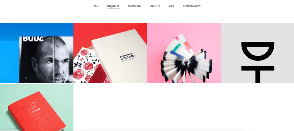
3. 이미지 show() , hide() : section4 함수
section4의 함수를 만들고
*변수
let no=0;를 만든다.
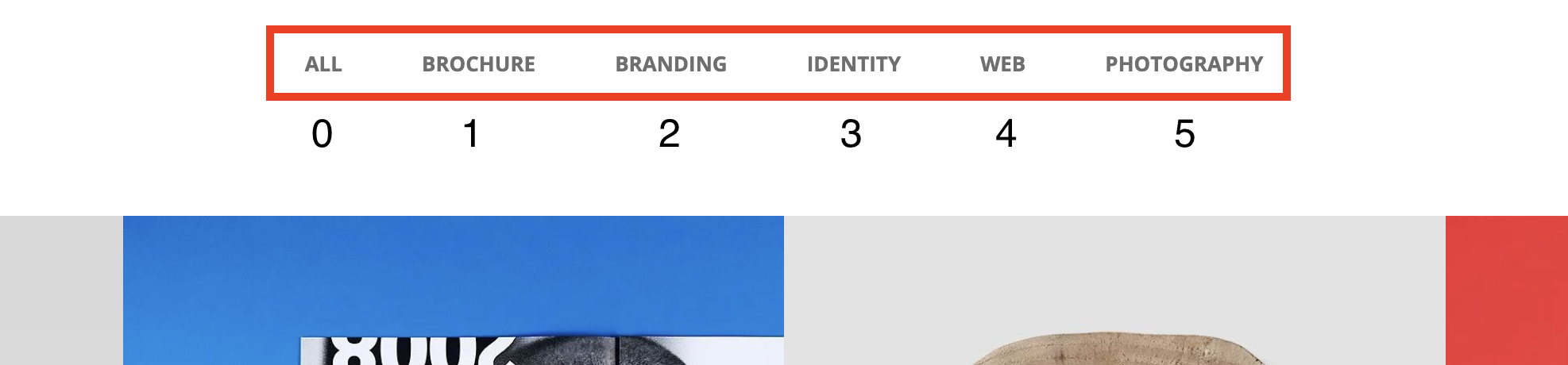
위 그림과 같이 0 , 1 , 2 , 3 , 4 , 5 를 누르면 나타나는 이미지가 다르기 때문에 구별을 먼저한다.
$('.gallery-btn').eq(0).on({
                click:function(){
                    no=0;
                    gallery()
                }
            });
이렇게 eq(x) 와 no=x 를 0번 부터 5번까지 작성을 한다.
그리고 각 메뉴에 나타나야하는 이미지를 show , hide 를 시키기 위해 if 조건문을 만든다.
if(no==0){
	$('.gallery li').eq(0).show();
    $('.gallery li').eq(1).show();
    $('.gallery li').eq(2).show();
    $('.gallery li').eq(3).show();
    $('.gallery li').eq(4).show();
    $('.gallery li').eq(5).show();
    $('.gallery li').eq(6).show();
    $('.gallery li').eq(7).show();
    }else if(no==1){
    	$('.gallery li').eq(0).hide();
        $('.gallery li').eq(2).hide();
        $('.gallery li').eq(7).hide();
        $('.gallery li').eq(1).show();
        $('.gallery li').eq(3).show();
        $('.gallery li').eq(4).show();
        $('.gallery li').eq(5).show();
        $('.gallery li').eq(6).show();
        }
이렇게 나타나야 할 이미지와 숨겨야 할 이미지를 잘 선택하여 show , hide를 시킨다. 여기까지 코드 및 설명이다.