JQuery
JQuery animate
JQuery Scroll animate
스크롤 애니메이트
section 1 결과

HTML
<div id="wrap">
        <header id="header"></header>
        <main id="main"></main>
        <section class="section1">
            <div class="container">
                <div class="left"><img src="./img/1.jpg" alt=""></div>
                <div class="right"><p>Lorem ipsum dolor sit amet consectetur, adipisicing elit. Quas, nostrum atque adipisci sequi earum obcaecati libero est aliquam odit incidunt praesentium, vel voluptas, consequatur quidem facere odio et. Nesciunt, cupiditate?</p></div>
            </div>
        </section>
    </div>
CSS
*{margin: 0; padding: 0;}
img{width: 100%;}
.container{width: 1400px; height: inherit; margin: 0 auto;}
#header{width: 100%; height: 80px; position: relative; left: 0; top: 0; border-bottom: 2px solid #ddd; background: rgba(0, 0, 0, .3);}
#main{width: 100%; height: 700px; background: url(../img/bg.jpg)no-repeat center top/cover fixed;}
.section1{width: 100%; height: 600px; background: tomato;}
.section2{width: 100%; height: 500px; background: skyblue}
.section3{width: 100%; height: 800px; background: navy}
.section4{width: 100%; height: 500px; background: darkseagreen}
#footer{width: 100%; height: 100px; background: rgba(0, 0, 0, .7);}

.section1 .container{position: relative; display: flex; justify-content: space-between; padding: 50px 0; overflow: hidden;}
.section1 .container .left{flex-basis: 50%; }
.section1 .container .left img{background: #ddd; padding: 30px; position: absolute; top: 100px; left: -100%; width: 40%;}
.section1 .container .right{flex-basis: 50%; }
.section1 .container .right p{padding: 50px; font-size: 30px; line-height: 200%; position: absolute; top: -100%; }
script
$(function(){
    let $header=$('#header');

    $(window).scroll(function(){
        let scTop=$(window).scrollTop();
        console.log(scTop);
        $section1=$('.section1').offset();
        if(scTop>$section1.top-200){
            $('.section1 .container .left img').stop().animate({left:'50px'},500)
            $('.section1 .container .right p').stop().animate({top:'90px'},500)
        }else{
            $('.section1 .container .left img').stop().animate({left:'-100%'},1000)
        }
    });
});
id=header 영역을 header로 변수를 지정하고 $(window).scroll의 함수를 생성한다. window의 scrollTop(); 의 값은 scTop의 변수로 담고 if문으로 윈도우의 스크롤 값이 section1의 top 스크롤의 값 -200을 뺀 위치 (section1의 위치에 까지 도달해서 이미지와 텍스트가 나오면 늦기 때문에 내리기 전의 영역부분에서 부터 나타나주는게 좋기때문) 에 도달 하면 animate가 작동하는 원리이다.
기존의 영역이 화면 밖인 -100% 값으로 빠지거나 영역밖으로 빼고 overflow:hidden이 된 상태에 나타나게 되는 방법이다.
section 2 결과

HTML
<section class="section2">
            <div class="container">
                <div class="left"><p>Lorem ipsum dolor sit amet consectetur, adipisicing elit. Quas, nostrum atque adipisci sequi earum obcaecati libero est aliquam odit incidunt praesentium, vel voluptas, consequatur quidem facere odio et. Nesciunt, cupiditate?</p></div>
                <div class="right">
                    <img src="./img/2.jpg" class="img1" alt="">
                    <img src="./img/3.jpg" class="img2" alt="">
                </div>
            </div>
        </section>
CSS
.section2 .container{position: relative; display: flex; justify-content: space-between; overflow: hidden;}
.section2 .container .left{flex-basis: 50%; }
.section2 .container .left p{padding: 10px; font-size: 30px; line-height: 200%; position: absolute; top: 100px; width: 50%; display: none; opacity: 0;}
.section2 .container .right{flex-basis: 50%; }
.section2 .container .right img{background: #ddd; padding: 30px; position: absolute; top: 0; right: 0; width: 40%;}
.section2 .container .right img:nth-child(1){width: 200px; height: 200px; top: 100px; right: -270px;}
.section2 .container .right img:nth-child(2){width: 300px; height: 300px; top: 50px; right: -500px;}
script
$(function(){
    let $header=$('#header');

    $(window).scroll(function(){
        let scTop=$(window).scrollTop();
        console.log(scTop);
        $section1=$('.section1').offset();
        $section2=$('.section2').offset();
        if(scTop>$section2.top-200){
            $('.section2 .container .left p').stop().slideDown(1000).css({opacity:'1'});
            $('.section2 .container .right .img1').delay(1000).stop().animate({right:'400px'},500);
            $('.section2 .container .right .img2').delay(200).stop().animate({right:'10px'},500);
        }else{
            $('.section2 .container .right p').stop().slideUp(1000);
            $('.section2 .container .right img1').stop().animate({right:'-120px'},1000);
            $('.section2 .container .right img2').stop().animate({right:'-500px'},1000);
        }
     });
});
section 3 결과
HTML
<section class="section3">
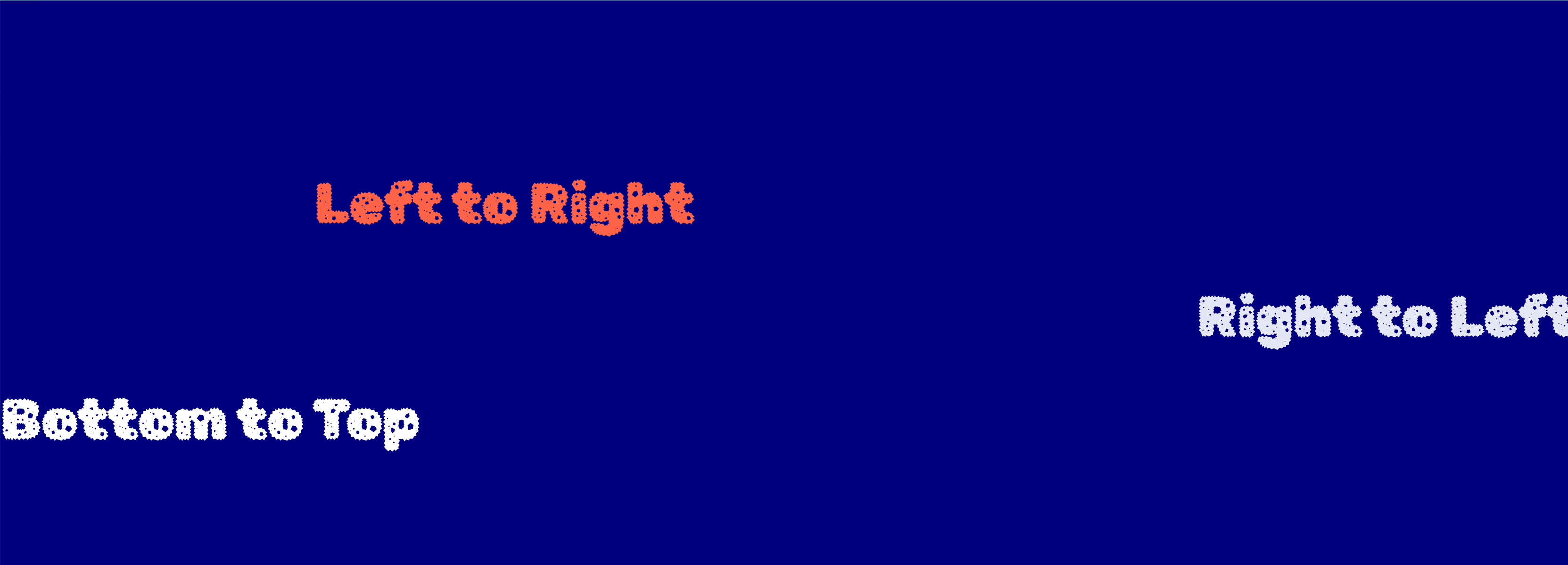
<p class="text1">Right to Left</p>
<p class="text2">Left to Right</p>
<p class="text3">Bottom to Top</p>
</section>CSS
.section3{position: relative; overflow: hidden;}
.section3 p{font-family: 'Rubik Gemstones', cursive; position: absolute;}
.section3 .text1{font-size: 80px; font-weight: 400; color: rgba(255, 255, 255, .9); right: -600px; top: 50%; white-space: nowrap;}
.section3 .text2{font-size: 80px; font-weight: 400; color: tomato; left: -100%; top: 30%; white-space: nowrap;}
.section3 .text3{font-size: 80px; font-weight: 400; color: white; bottom: -20%;}
script
$(function(){
    let $header=$('#header');

    $(window).scroll(function(){
        let scTop=$(window).scrollTop();
        console.log(scTop);
        $section1=$('.section1').offset();
        $section2=$('.section2').offset();
        $section3=$('.section3').offset();
        if(scTop>$section3.top-200){
            $('.section3 .text1').stop().animate({right: '100%'},3000).animate({right: '-10px'},3000)
            $('.section3 .text2').stop().animate({left: '20%'},1000)
            $('.section3 .text3').stop().animate({bottom: '20%'},1000)
        }else{
            $('.section3 .text1').stop().animate({right: '-110%'},8000).animate({top: '50%'},8000)
            $('.section3 .text2').stop().animate({left: '20%'},8000)
            $('.section3 .text3').stop().animate({bottom: '20%'},1000)
        }
     });
});
다른 애니메이션과 마찬가지로 위치값을 조정하여 나타나게 하면 된다.
section 4 결과

HTML
<section class="section4">
            <div class="container">
                <div class="box box1">Lorem ipsum dolor, sit amet consectetur adipisicing elit. Optio molestias</div>
                <div class="box box2">necessitatibus amet ad commodi est doloremque quo nihil perspiciatis quibusdam natus</div>
                <div class="box box3">corrupti nam quia, asperiores porro alias architecto officia aperiam?</div>
            </div>
</section>
CSS
.section4 .container{display: flex; justify-content: center; height: 500px; position: relative;}
.section4 .container .box{width: 300px; height: 450px; background: #fff; border-radius: 5px; position: absolute; top: 20px; padding: 20px 40px; box-sizing: border-box;}
.section4 .container .box1{left: 550px}
.section4 .container .box2{left: 550px}
.section4 .container .box3{left: 550px}
script
$(function(){
    let $header=$('#header');

    $(window).scroll(function(){
        let scTop=$(window).scrollTop();
        console.log(scTop);
        $section1=$('.section1').offset();
        $section2=$('.section2').offset();
        $section3=$('.section3').offset();
        $section4=$('.section4').offset();
		if(scTop>$section4.top-600){
            $('.section4 .container .box1').stop().animate({left:'200px'},500);
            $('.section4 .container .box3').stop().animate({left:'900px'},500);
        }else{
            $('.section4 .container .box1').stop().animate({left:'550px'},500);
            $('.section4 .container .box3').stop().animate({left:'550px'},500);
        }
    });
});
원래 3개의 요소가 겹쳐져있는 상태이다 (absolute가 되어서 같은 곳에 겹쳐져있음) 해당 스크롤 영역에 오면 1번과 3번 박스는 좌우로 떨어지고 중간에 있는 2번 박스는 그대로 위치에 있다. animate하여 값을 1번과 3번의 값을 원하는 위치에 놓는다.
JQuery animate
JQuery Line animate
박스 라인 애니메이션 효과
결과
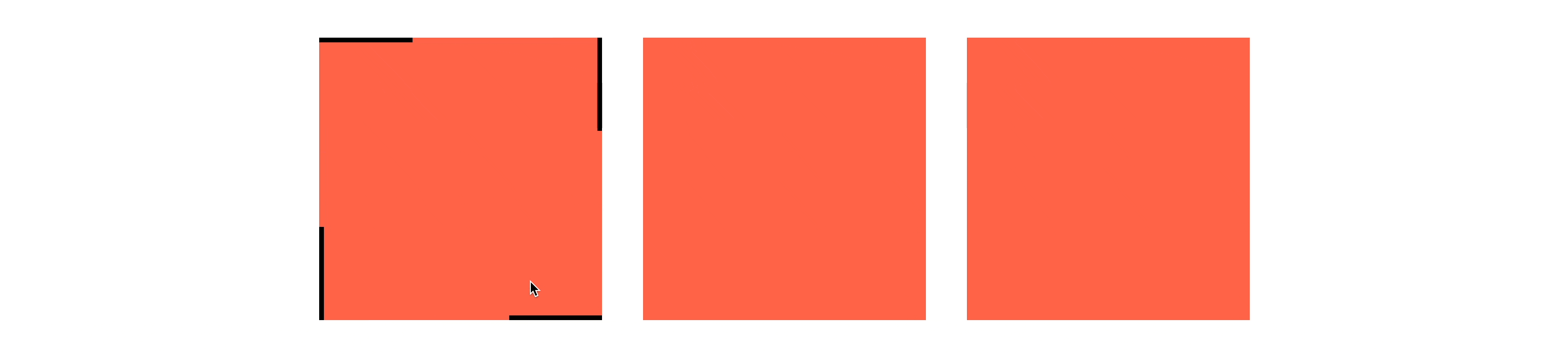
hover를 하게 되면 박스영역 겉에 line 애니메이션 효과가 생긴다.
HTML
 <div id="wrap">
        <div class="animate box1">
            <div class="top-line"></div>
            <div class="bottom-line"></div>
            <div class="right-line"></div>
            <div class="left-line"></div>
        </div>
        <div class="animate box2">
            <div class="top-line"></div>
            <div class="bottom-line"></div>
            <div class="right-line"></div>
            <div class="left-line"></div>
        </div>
        <div class="animate box3">
            <div class="top-line"></div>
            <div class="bottom-line"></div>
            <div class="right-line"></div>
            <div class="left-line"></div>
        </div>
    </div>
CSS
*{margin: 0; padding: 0;}
#wrap{display: flex; width: 1030px; margin: 0 auto;}
.animate{width: 300px; height: 300px; margin: 200px auto; position: relative; background: tomato; overflow: hidden;}
.animate > div{position: absolute;}
.top-line{width: 100%; height: 5px; background: #000; top: 0; left: -100%;}
.bottom-line{width: 100%; height: 5px; background: #000; bottom: 0; left: 100%;}
.right-line{width: 5px; height: 100%; background: #000; right: 0; top: -100%;}
.left-line{width: 5px; height: 100%; background: #000; left: 0; top: 100%;}
script
	let topLine=$('.top-line')
    let bottomLine=$('.bottom-line')
    let rightLine=$('.right-line')
    let leftLine=$('.left-line')
    let box=$('.animate');

    function line(){
            topLine.css('left','-100%').animate({left:'100%'},500).animate({left:'-100%'},500)
            bottomLine.css('left','100%').animate({left:'-100%'},500).animate({left:'100%'},500)
            rightLine.css('top','-100%').animate({top:'100%'},500).animate({top:'-100%'},500)
            leftLine.css('top','100%').animate({top:'-100%'},500).animate({top:'100%'},500)
        };
여기까지는 line의 애니메이션 효과이다.
script
$('.animate').hover(function(){
    $(this).find('.top-line').css('left','-100%').animate({left:'100%'},500)
    $(this).find('.bottom-line').css('left','100%').animate({left:'-100%'},500)
    $(this).find('.right-line').css('top','-100%').animate({top:'100%'},500)
    $(this).find('.left-line').css('top','100%').animate({top:'-100%'},500)
},function(){
    $(this).find('.top-line').animate({left:'-100%'},500)
    $(this).find('.bottom-line').animate({left:'100%'},500)
    $(this).find('.right-line').animate({top:'-100%'},500)
    $(this).find('.left-line').animate({top:'100%'},500)
})
Hover를 하면 this 애니메이션이 작동한다.