Front-end 국비지원 #036일
반응형 페이지 제작 1-2
지난 1-1 header 영역 이어서 제작한다.
HTML
<main>
<div id="mainTop">
<div class="container">
<div class="main-top-wrap">
<div class="main-top-left">
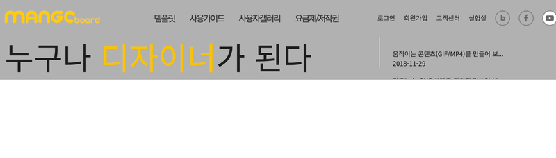
<h2>쉬운 디자인 플랫폼, 망고보드 <span><a href="#"><img src="./images/try_btn.png" alt="btn"></a></span></h2>
<h3>누구나 <span class="colorY">디자이너</span>가 된다</h3>
</div>
<div class="main-top-right">
<div class="news-box">
<h2>News</h2>
<div class="new-box-wrap">
<div class="news-item">
<p>
움직이는 콘텐츠(GIF/MP4)를 만들어 보...
</p>
<span>2018-11-29</span>
<p>
카드뉴스, SNS 콘텐츠 이렇게 만들어 보...
</p>
<span>2019-08-06</span>
</div>
<div class="news-item">
<p>
움직이는 콘텐츠(GIF/MP4)를 만들어 보...
</p>
<span>2018-11-29</span>
<p>
카드뉴스, SNS 콘텐츠 이렇게 만들어 보...
</p>
<span>2019-08-06</span>
</div>
<div class="news-item">
<p>
움직이는 콘텐츠(GIF/MP4)를 만들어 보...
</p>
<span>2018-11-29</span>
<p>
카드뉴스, SNS 콘텐츠 이렇게 만들어 보...
</p>
<span>2019-08-06</span>
</div>
</div>
</div>
</div>
</div>
</div>
</div>
</main>CSS
/* main */
.main-top-wrap{display: flex; justify-content: space-between; height: 100%;}

/* main-top-left */
.main-top-wrap .main-top-left{flex-basis: 70%; height: 100%; position: relative;/* border-right: 1px solid #ddd; */ }
.main-top-wrap .main-top-left::after{position: absolute; content: ''; width: 1px; height: 110px; background: #ddd; top: 30px; right: 0; margin-right: 10px;}
.main-top-wrap .main-top-left h2{font-size: 32px; color: #1e1e1e; font-weight: bold; margin-top: 10px;}
.main-top-wrap .main-top-left h2 span{}
.main-top-wrap .main-top-left h2 span a{position: relative; left: 10px; top: 9px;}
.main-top-wrap .main-top-left h3{font-size: 64px; font-weight: 300; color: #1e1e1e;}
.main-top-wrap .main-top-left h3 .colorY{color: #f9c200;}

/* main-top-right */
.main-top-wrap .main-top-right{flex-basis: 30%; height: 100%; }
.main-top-wrap .main-top-right .news-box{width: 90%; margin: 0 auto;}
.main-top-wrap .main-top-right .news-box h2{font-size: 17px; color: #454545; margin-bottom: 15px;}
.main-top-wrap .main-top-right .news-box .new-box-wrap{width: 100%; height: 123px; overflow: hidden; position: relative;}
.main-top-wrap .main-top-right .news-box .new-box-wrap .news-item{position: absolute;  width: 100%; height: 123px; top: 100%; left: 0;}
.main-top-wrap .main-top-right .news-box .new-box-wrap .news-item:first-child{top: 0;}
.main-top-wrap .main-top-right .news-box .new-box-wrap .news-item p{}
.main-top-wrap .main-top-right .news-box .new-box-wrap .news-item p:first-child{}
.main-top-wrap .main-top-right .news-box .new-box-wrap .news-item span{margin-bottom: 15px; display: block;}
Script
$('.app-btn').on({click:function(){
    $('.bar').toggleClass('add');
    $('.mobile-nav').stop().slideToggle(500);
}});

//news

const newBanner=$('.new-box-wrap .news-item');
let current=0;
//let newsInterval=undefined; // 이렇게 해도 되거나
let newsInterval; // 이렇게 선언만 해도 됨

newsSlide();
function newsSlide(){
    newsInterval=setInterval(function(){
        let prev=newBanner.eq(current);
        newsMove(prev, 0, '-100%');
        current++;
        if(current==newBanner.size()) current=0;
        let next=newBanner.eq(current);
        newsMove(next, '100%', 0);
    },2000);
};
function newsMove(tg, start, end){
    tg.css("top",start).stop().animate({top:end},500);
}

$('.new-box-wrap').hover(function(){
    clearInterval(newsInterval)
},function(){
    newsSlide();
});
뉴스 부분 호버하면 멈추고 마우스를 떼면 뉴스가 하단에서 숨겨진 상태로 계속 슬라이드 된다.
결과
JavaScript
Back To Top (top으로 이동 버튼 만들기)
결과
HTML
<header id="top">
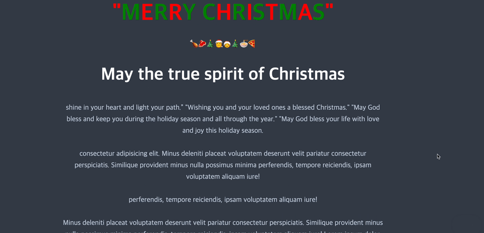
<h1>"<em>M</em>e<em>r</em>r<em>y</em> <em>C</em>h<em>r</em>i<em>s</em>t<em>m</em>a<em>s</em>"</h1>
<h2>May the true spirit of Christmas</h2>
</header>
<main>
<p>shine in your heart and light your path.” "Wishing you and your loved ones a blessed Christmas." "May God bless and keep you during the holiday season and all through the year." "May God bless your life with love and joy this holiday season.</p>
<p>consectetur adipisicing elit. Minus deleniti placeat voluptatem deserunt velit pariatur consectetur perspiciatis. Similique provident minus nulla possimus minima perferendis, tempore reiciendis, ipsam voluptatem aliquam iure!</p>
<p>perferendis, tempore reiciendis, ipsam voluptatem aliquam iure!</p>
<p>Minus deleniti placeat voluptatem deserunt velit pariatur consectetur perspiciatis. Similique provident minus nulla possimus minima perferendis, tempore reiciendis, ipsam voluptatem aliquam iure! Lorem ipsum dolor, sit amet consectetur adipisicing elit. </p>
<p>tempore reiciendis, ipsam voluptatem aliquam iure!Lorem ipsum dolor, sit amet consectetur adipisicing elit. Minus deleniti placeat voluptatem deserunt velit pariatur consectetur perspiciatis. Similique provident minus nulla possimus minima perferendis, </p>
<p>tempore reiciendis, ipsam voluptatem aliquam iure!Lorem ipsum dolor, sit amet consectetur adipisicing elit. Minus deleniti placeat voluptatem deserunt velit pariatur consectetur perspiciatis. Similique provident minus nulla possimus minima perferendis, </p>
</main>
<footer>
<p><small><em>pariatur consectetur perspiciatis.<a href="#">ipsum dolor</a></em></small></p>
<a href="#" id="back-to-top">🎄Top🎅</a>
</footer>CSS
*{box-sizing: border-box;}
body{background-color: #313944; padding: 5em 20em;}
h1{color: red; font-size: 72px; line-height: 72px; margin-bottom: 48px; text-align: center; text-transform: uppercase;}
h1 em{color: green; font-style: normal;}

h1::after{
    content: "🍗🥩🎄🎅🤶🎄🍜🍕";
    color: #1fcfcb;
    line-height: 24px;
    font-size: 26px;
    display: block;
    margin: 48px auto;
}
h2{color: #fff; font-size: 54px; line-height: 72px; margin-bottom: 48px; text-align: center;}
p{
    color: #bbc8d8;
    font-size: 22px;
    line-height: 36px;
    margin-bottom: 36px;
    text-align: center;
}
a{color: #1fcfcb;}
a:hover{color: #fff;}
#back-to-top{position: fixed; bottom: 3em; right: 3em; background: rgba(255, 255, 255, .9); color: #313943; border: none; border-radius: 5px; padding: 1em; text-transform: uppercase; cursor: pointer; font-weight: bold; box-shadow: 0 0 2em 0 rgba(0, 0, 0, .25); transition: .3s ease-in-out; opacity: 0; text-decoration: none; font-size: .75em; display: inline-block;}
#back-to-top:hover{
    background: #fff;
    padding: 1em 3em;
}
#back-to-top.visible{
    opacity: 1;
}
Script
        let bt=document.getElementById('back-to-top');
        let docEl=document.documentElement; //문서 자체를 html가져와서 변수에 대입한거
        let offset; //아직 값이 정해지지 않아서 (스크롤 양을 몰라서) 전역변수에 담아놓은것
        let scrollPos; //스크롤 양이 필요함
        let docHeight; //문서의 높이값

        //문서 높이값 계산
        //docHeight=docEl.scrollHeight; //브러우저마다 다르게 나타날 수 있음 /높이:1365
        //docHeight=docEl.offsetHeight; //높이 : 1365
        //scrollPos=docEl.scrollTop; // 높이 : 743
        //console.log(scrollPos);
        docHeight=Math.max(docEl.offsetHeight, docEl.scrollTop);
        if(docHeight !=0){
            offset=docHeight/10; //끝까지 스크롤되지 않고 1/4만 스크롤 되면
        }
        window.addEventListener('scroll',function(){
            scrollPos=docEl.scrollTop;

            //방법1
            //console.log(scrollPos);//scrollPos 를 보이게 하기
            /* if(scrollPos>offset){
                bt.className='visible';
            }else{
                bt.className='';
            } */

            //방법2
            //중괄호 없이 쓰기
            /* if(scrollPos>offset)bt.className='visible';
            else bt.className=''; */
            //방법3
            /* (scrollPos> offset) ?
            bt.className='visible': bt.className='';  */
            //방법4
            bt.className=(scrollPos> offset) ? 'visible' : '';
        });
        //자연스럽게 올라가게 하기
        bt.addEventListener('click',function(e){
            e.preventDefault();//링크 본연의 기능을 막아줌 a태그의 #기능을 막아줌
            scrollTop();
        });
        function scrollTop(){
            let scrollInterval=setInterval(function(){
                if(scrollPos !=0){
                    window.scrollBy(0,-55)
                }else{
                    clearInterval(scrollInterval);
                }
            },15);
        }
accordion 메뉴 만들기
결과
HTML
<div class="container">
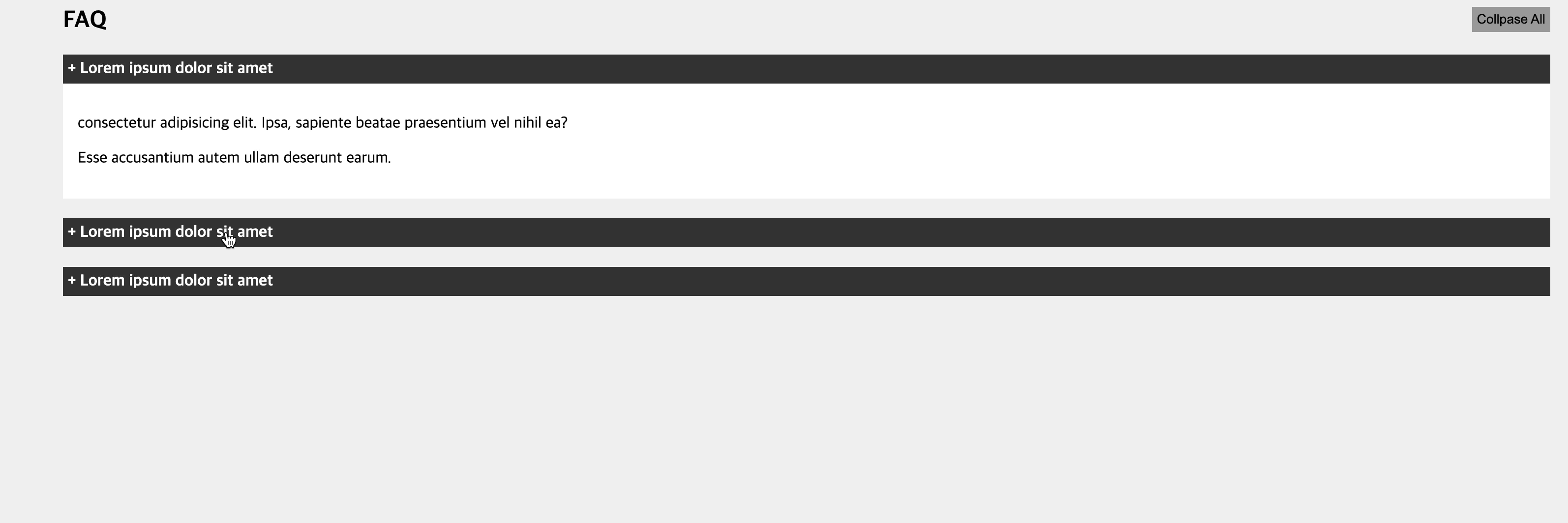
<button id="btn-collapse">Collpase All</button>
<h2>FAQ</h2>
<section id="faq">
<div class="panel-question active">
<div class="panel-heading">
+ Lorem ipsum dolor sit amet
</div>
<div class="panel-body">
<p>consectetur adipisicing elit. Ipsa, sapiente beatae praesentium vel nihil ea?</p>
<p> Esse accusantium autem ullam deserunt earum.</p>
</div>
</div>
<div class="panel-question">
<div class="panel-heading">
+ Lorem ipsum dolor sit amet
</div>
<div class="panel-body">
<p>consectetur adipisicing elit. Ipsa, sapiente beatae praesentium vel nihil ea?</p>
<p> Esse accusantium autem ullam deserunt earum.</p>
</div>
</div>
<div class="panel-question">
<div class="panel-heading">
+ Lorem ipsum dolor sit amet
</div>
<div class="panel-body">
<p>consectetur adipisicing elit. Ipsa, sapiente beatae praesentium vel nihil ea?</p>
<p> Esse accusantium autem ullam deserunt earum.</p>
</div>
</div>
</section>
</div>CSS
html, body{
    background: #f0f0f0;
    margin: 0;
}
.container{width: 90%; margin: 0 auto;}
.panel-question{margin-bottom: 20px; background: #fff;}
.panel-heading{font-weight: bold; padding: 5px; background: #333; color: #fff; cursor: pointer;}
.panel-body{padding: 15px;}
#btn-collapse{float: right; padding: 5px; cursor: pointer; border: none; background-color: #999; margin-bottom: 10px;}
JavaScript 로 구현
const btnCollapse=document.getElementById('btn-collapse');
const question=document.getElementsByClassName('panel-question');
const heading=document.getElementsByClassName('panel-heading');
const answer=document.getElementsByClassName('panel-body');

for(let i=0; i<heading.length; i++){
    heading[i].addEventListener('click', function(e){
        for(let j=0; j<question.length; j++){
            question[j].classList.remove('active');
            e.target.parentNode.classList.add('active')
            activeBody()
        }
    });
}
function activeBody(){
    for(let i=0; i<answer.length; i++){
        answer[i].style.display='none';
    }
    let activePanel=document.querySelector('.panel-question.active .panel-body');
    activePanel.style.display='block';
}
activeBody();

btnCollapse.addEventListener('click',function(){
    for(let i=0; i<answer.length; i++){
        answer[i].style.display='none';
    }
})
JQuery 로 구현
const question=$('.panel-question');
const collapse=$('#btn-collapse');
const heading=$('.panel-heading');
const answer=$('.panel-body');

question.find('.panel-body').hide();
heading.click(function(){
    question.find('.panel-body').hide();
    $(this).next().show();
});
collapse.click(function(){
    question.find('.panel-body').hide();
})